What is BFC? An in-depth analysis of BFC
The content of this article is about what is BFC? The in-depth analysis of BFC has certain reference value. Friends in need can refer to it. I hope it will be helpful to you.
1. What is BFC
Formatting context is W3C CSS2.1 A concept in the specification. It is a rendering area on the page and has a set of rendering rules that determine how its sub-elements will be positioned, as well as their relationship and interaction with other elements. most common Formatting context includes Block fomatting context (BFC for short) and Inline formatting context (IFC for short). Block formatting context is literally translated as "block-level formatting context". It is an independent rendering area in which only the Block-level box participates. It stipulates how the internal Block-level Box is laid out and has nothing to do with the outside of this area. In layman's terms, BFC is a container used to manage block-level elements.
2. How to create BFC
float is left|right
overflow is hidden| auto|scroll
display is table-cell|table-caption|inline-block|inline-flex|flex
position is absolute| fixed
Root element
3. BFC layout rules:
The internal Boxes will be placed one after another in the vertical direction (that is, the block-level elements occupy one row).
The BFC area will not overlap with the float box (Use this to achieve adaptive two-column layout).
The vertical distance of the internal Box is determined by margin. The margins of two adjacent Boxes belonging to the same BFC will overlap (Margin overlaps three conditions: belong to the same BFC; adjacent; block-level elements).
When calculating the height of BFC, floating elements also participate in the calculation. (Clear floating haslayout)
BFC is an isolated independent container on the page. The child elements in the container will not affect the elements outside. And vice versa.
4. What are the features of BFC
Feature 1: BFC will prevent vertical margins from folding
According to the definition of BFC, two elements may have vertical margin overlap only if they belong to the same BFC. This includes adjacent elements or nested elements, as long as there is no obstruction between them (such as borders, non-empty content, padding, etc.) margin overlap will occur.
①The problem of margin overlap of adjacent sibling elements
<style>
p{
        color: #fff;
        background: #888;
        width: 200px;
        line-height: 100px;
        text-align:center;
        margin: 100px;
  }
</style>

    <p>ABC</p>
    <p>abc</p>
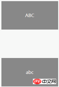
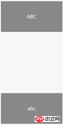
##Between the two P elements in the above example The distance between them should be 200px, but in fact it is only 100px, and margin overlap occurs. How do we deal with this situation?
You only need to wrap a container around p and trigger the container to generate a BFC. Then the two Ps do not belong to the same BFC, and there will be no margin overlap.
<style>
p{
        color: #fff;
        background: #888;
        width: 200px;
        line-height: 100px;
        text-align:center;
        margin: 100px;
    }
.wrap{
  overflow:hidden;
}
</style>

   <p>ABC</p>
  <div>
    <p>abc</p>
  </div>
<style>
.box{
width:100px;
height:100px;
background:#ccc;
}
.wrap {
  background:yellow;
}
.wrap h1{
  background:pink;
  margin:40px;
}
</style>

<div>box</div>
<div>
  <h1 id="h">h1</h1>
</div>

There are actually many processing methods.
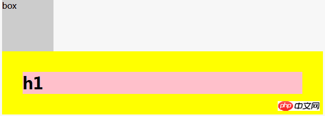
Add: overflow:hidden; or overflow:auto to the wrap element; make its parent element form a BFC; you can also add border: 1px solid; or padding to the wrap element. :1px;These can effectively solve the problem of margin overlap between parent and child elements.
Feature 2: BFC will not overlap floating elements
Using this feature, we can createAdaptive two-column layout.
<style>
.box1{
  height: 100px;
  width: 100px;
  float: left;
  background: lightblue;
}
.box2{width: 200px;
  height: 200px;
  background: #eee;
}
</style>

<div>我是一个左浮动的元素</div>
<div>喂喂喂!大家不要生气嘛,生气会犯嗔戒的。悟空你也太调皮了,
我跟你说过叫你不要乱扔东西,你怎么又……你看,我还没说完你就把棍子给扔掉了!
月光宝盒是宝物,你把它扔掉会污染环境,要是砸到小朋友怎么办,就算砸不到小朋友,
砸到花花草草也是不对的。</div>
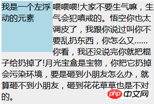
#In the picture above, the text is arranged around the floating elements, but here, this is obviously not what we want . At this time, we can add overflow:hidden to the style of the .box2 element; it will create a BFC so that its content can eliminate the impact on external floating elements .

这个方法可以用来实现两列自适应布局,效果不错,此时左边的宽度固定,右边的内容自适应宽度。如果我们改变文字的大小或者左边浮动元素的大小,两栏布局的结构依然没有改变!
特性3:BFC可以包含浮动----清除浮动
我们都知道浮动会脱离文档流,接下来我们看看下面的例子:
<style>
.box1{
  width:100px;
  height:100px;
  float:left;
  border: 1px solid #000;
}
.box2{
  width:100px;
  height:100px;
  float:left;
  border: 1px solid #000;
}
.box{
  background:yellow
}
</style>

<div>
  <div></div>
  <div></div>
</div>
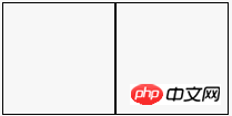
由于容器内两个div元素浮动,脱离了文档流,父容器内容宽度为零(即发生高度塌陷),未能将子元素包裹住。解决这个问题,只需要把把父元素变成一个BFC就行了。常用的办法是给父元素设置overflow:hidden。

The above is the detailed content of What is BFC? An in-depth analysis of BFC. For more information, please follow other related articles on the PHP Chinese website!

Hot AI Tools

Undresser.AI Undress
AI-powered app for creating realistic nude photos

AI Clothes Remover
Online AI tool for removing clothes from photos.

Undress AI Tool
Undress images for free

Clothoff.io
AI clothes remover

Video Face Swap
Swap faces in any video effortlessly with our completely free AI face swap tool!

Hot Article

Hot Tools

Notepad++7.3.1
Easy-to-use and free code editor

SublimeText3 Chinese version
Chinese version, very easy to use

Zend Studio 13.0.1
Powerful PHP integrated development environment

Dreamweaver CS6
Visual web development tools

SublimeText3 Mac version
God-level code editing software (SublimeText3)

Hot Topics
 How to use bootstrap in vue
Apr 07, 2025 pm 11:33 PM
Using Bootstrap in Vue.js is divided into five steps: Install Bootstrap. Import Bootstrap in main.js. Use the Bootstrap component directly in the template. Optional: Custom style. Optional: Use plug-ins.
 The Roles of HTML, CSS, and JavaScript: Core Responsibilities
Apr 08, 2025 pm 07:05 PM
HTML defines the web structure, CSS is responsible for style and layout, and JavaScript gives dynamic interaction. The three perform their duties in web development and jointly build a colorful website.
 Understanding HTML, CSS, and JavaScript: A Beginner's Guide
Apr 12, 2025 am 12:02 AM
WebdevelopmentreliesonHTML,CSS,andJavaScript:1)HTMLstructurescontent,2)CSSstylesit,and3)JavaScriptaddsinteractivity,formingthebasisofmodernwebexperiences.
 React's Role in HTML: Enhancing User Experience
Apr 09, 2025 am 12:11 AM
React combines JSX and HTML to improve user experience. 1) JSX embeds HTML to make development more intuitive. 2) The virtual DOM mechanism optimizes performance and reduces DOM operations. 3) Component-based management UI to improve maintainability. 4) State management and event processing enhance interactivity.
 What Does H5 Refer To? Exploring the Context
Apr 12, 2025 am 12:03 AM
H5referstoHTML5,apivotaltechnologyinwebdevelopment.1)HTML5introducesnewelementsandAPIsforrich,dynamicwebapplications.2)Itsupportsmultimediawithoutplugins,enhancinguserexperienceacrossdevices.3)SemanticelementsimprovecontentstructureandSEO.4)H5'srespo
 Is h5 same as HTML5?
Apr 08, 2025 am 12:16 AM
"h5" and "HTML5" are the same in most cases, but they may have different meanings in certain specific scenarios. 1. "HTML5" is a W3C-defined standard that contains new tags and APIs. 2. "h5" is usually the abbreviation of HTML5, but in mobile development, it may refer to a framework based on HTML5. Understanding these differences helps to use these terms accurately in your project.
 HTML: The Structure, CSS: The Style, JavaScript: The Behavior
Apr 18, 2025 am 12:09 AM
The roles of HTML, CSS and JavaScript in web development are: 1. HTML defines the web page structure, 2. CSS controls the web page style, and 3. JavaScript adds dynamic behavior. Together, they build the framework, aesthetics and interactivity of modern websites.
 The Future of HTML: Evolution and Trends in Web Design
Apr 17, 2025 am 12:12 AM
The future of HTML is full of infinite possibilities. 1) New features and standards will include more semantic tags and the popularity of WebComponents. 2) The web design trend will continue to develop towards responsive and accessible design. 3) Performance optimization will improve the user experience through responsive image loading and lazy loading technologies.


