

Code to create a butterfly flapping its wings using css3

This article mainly introduces the relevant information on the example of making a butterfly flapping its wings using pure CSS3. The content is quite good. I will share it with you now and give it as a reference.
Pure css3 to make a butterfly flapping its wings, let’s see the effect first

, the effect is not bad
Upload the code:
html
<p id="butterfly">
    <p class="leftSide"></p>
    <p class="body"></p>
    <p class="rightSide"></p>
</p>css
body{
            background: url("./images/bg.jpg") no-repeat;
        }
        #butterfly{
            width: 600px;
            height: 500px;
            position: relative;
            transform: scale(0.35);
            transform-style: preserve-3d;
        }
        .leftSide{
            width: 267px;
            height: 421px;
            background: url("./images/leftSide.png") no-repeat;
            position: absolute;
            left: 26px;
            top: 40px;
            animation: left 2s infinite;
            z-index: 9999;
        }
        @keyframes left {
            0%{
                transform: rotateY(0deg);
                transform-origin: right center;
                perspective: 201px;

            }
            50%{
                transform: rotateY(70deg);
                transform-origin: right center;
                perspective: 201px;

            }
            100%{
                transform: rotateY(0deg);
                transform-origin: right center;
                perspective: 201px;
            }
        }
        @keyframes right {
            0%{
                transform: rotateY(0);
                transform-origin: left center;
                perspective: 201px;

            }
            50%{
                transform: rotateY(-70deg);
                transform-origin: left center;
                perspective: 201px;

            }
            100%{
                transform: rotateY(0);
                transform-origin: left center;
                perspective: 201px;

            }
        }
        .body{
            width: 152px;
            height: 328px;
            background: url("./images/body.png") no-repeat;
            position: absolute;
            margin: auto;
            left: 0;
            right: 0;
            bottom: 0;
            top: 0;
            z-index: 9999;
        }
        .rightSide{
            width: 284px;
            height: 460px;
            background: url("./images/rightSide.png") no-repeat;
            position: absolute;
            right: 26px;
            top: 58px;
            animation: right 2s infinite;
            z-index: 9999;
}Introduce a few before this css properties;
@keyframes
Through @keyframes rules, we can create animations
The principle of creating animation is to gradually change one set of CSS styles into another set of styles
Specify the time when the change occurs as a percentage, or through the keywords "from" and "to" , equivalent to 0% and 100%.
0% is the start time of the animation, 100% is the end time of the animation
transform: rotateY()
The transform property applies a 2D or 3D transformation to an element. This property allows us to rotate, scale, move or tilt the element.
rotateY() defines a 3D rotation along the Y axis.
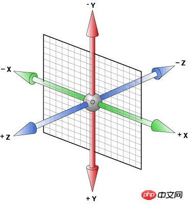
This picture illustrates the xyz axis very intuitively. In fact, students who have studied 3D modeling software such as 3DS MAX should be more familiar with this 3 axis orientation.
Implementation idea: First use the son and father phase to absolutely position the left wing, right wing, and body together, and then use the rotateY of transform to rotate them along the y-axis. The @keyframe animation is used here for rotation. , and then repeat the action.
We also want to focus on the attribute transform-style: preserve-3d;. The description of w3c is to enable the converted sub-elements to retain their 3D transformation. That is to say, all sub-elements are presented in 3D space. On the contrary, if it is set to flat, all sub-elements will be presented in 2D space.
The above is the entire content of this article. I hope it will be helpful to everyone's learning. More Please pay attention to the PHP Chinese website for related content!
Related recommendations:
Use css3 to achieve the effect of balloon style
Use CSS3 to implement imitation WeChat chat bubbles
Implementation method of simulating heartbeat using HTML and CSS3
The above is the detailed content of Code to create a butterfly flapping its wings using css3. For more information, please follow other related articles on the PHP Chinese website!

Hot AI Tools

Undresser.AI Undress
AI-powered app for creating realistic nude photos

AI Clothes Remover
Online AI tool for removing clothes from photos.

Undress AI Tool
Undress images for free

Clothoff.io
AI clothes remover

Video Face Swap
Swap faces in any video effortlessly with our completely free AI face swap tool!

Hot Article
Hot Tools

Notepad++7.3.1
Easy-to-use and free code editor

SublimeText3 Chinese version
Chinese version, very easy to use

Zend Studio 13.0.1
Powerful PHP integrated development environment

Dreamweaver CS6
Visual web development tools

SublimeText3 Mac version
God-level code editing software (SublimeText3)
Hot Topics


 Vue 3
Apr 02, 2025 pm 06:32 PM
Vue 3
Apr 02, 2025 pm 06:32 PM
It's out! Congrats to the Vue team for getting it done, I know it was a massive effort and a long time coming. All new docs, as well.
 Building an Ethereum app using Redwood.js and Fauna
Mar 28, 2025 am 09:18 AM
Building an Ethereum app using Redwood.js and Fauna
Mar 28, 2025 am 09:18 AM
With the recent climb of Bitcoin’s price over 20k $USD, and to it recently breaking 30k, I thought it’s worth taking a deep dive back into creating Ethereum
 Can you get valid CSS property values from the browser?
Apr 02, 2025 pm 06:17 PM
Can you get valid CSS property values from the browser?
Apr 02, 2025 pm 06:17 PM
I had someone write in with this very legit question. Lea just blogged about how you can get valid CSS properties themselves from the browser. That's like this.
 Stacked Cards with Sticky Positioning and a Dash of Sass
Apr 03, 2025 am 10:30 AM
Stacked Cards with Sticky Positioning and a Dash of Sass
Apr 03, 2025 am 10:30 AM
The other day, I spotted this particularly lovely bit from Corey Ginnivan’s website where a collection of cards stack on top of one another as you scroll.
 A bit on ci/cd
Apr 02, 2025 pm 06:21 PM
A bit on ci/cd
Apr 02, 2025 pm 06:21 PM
I'd say "website" fits better than "mobile app" but I like this framing from Max Lynch:
 Comparing Browsers for Responsive Design
Apr 02, 2025 pm 06:25 PM
Comparing Browsers for Responsive Design
Apr 02, 2025 pm 06:25 PM
There are a number of these desktop apps where the goal is showing your site at different dimensions all at the same time. So you can, for example, be writing
 Using Markdown and Localization in the WordPress Block Editor
Apr 02, 2025 am 04:27 AM
Using Markdown and Localization in the WordPress Block Editor
Apr 02, 2025 am 04:27 AM
If we need to show documentation to the user directly in the WordPress editor, what is the best way to do it?
 Why are the purple slashed areas in the Flex layout mistakenly considered 'overflow space'?
Apr 05, 2025 pm 05:51 PM
Why are the purple slashed areas in the Flex layout mistakenly considered 'overflow space'?
Apr 05, 2025 pm 05:51 PM
Questions about purple slash areas in Flex layouts When using Flex layouts, you may encounter some confusing phenomena, such as in the developer tools (d...
