

CSS3 and Javascript realize the effect of progress bar

This article mainly introduces Javascript CSS3 to implement the progress bar effect, which can give users a waiting process. If you need it, you can learn more.
Progress bars can be used in many webs. This article introduces the effect of the progress bar. The specific code is as follows:
1: CSS2 attribute clip realizes web page progress Article;
Before implementing, let’s first introduce the clip attribute, because this attribute is rarely used in CSS2.1, so it is necessary for us to understand it;
Browser support: All major browsers support the clip attribute.
The Clip attribute is described on the w3c official website as follows: the visible area of the element is controlled by cropping the element. By default, the element does not undergo any cropping.
The syntax of Clip clipping is as follows:
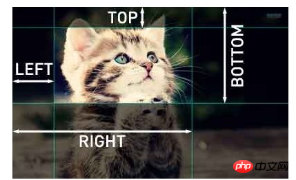
.xx {clip:rect(<top>, <right>, <bottom>, <left>)}The Rect attribute requires four values, top, right, bottom, left; they need to be separated by commas. Follow the clockwise rotation rule, which is the same as the writing order of margin and padding in our CSS.
In css2.1, the offset specified by
We can look at a simple demo again,
The following css
p#one { clip: rect(5px, 40px, 45px, 5px); }
p#two { clip: rect(5px, 55px, 45px, 5px); }The above example is in a 50X55px rectangular box The middle line is cut, and a dotted rectangle is obtained:
As shown below:

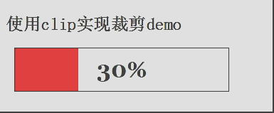
We can now look at a demo of a progress bar;
HTML code is as follows:
<h2>使用clip实现裁剪demo</h2>
<p id="progress-box" class="progress-box">
  <p id="progress-bar" class="progress-bar"></p>
  <p id="progress-text" class="progress-text">0%</p>
</p>
CSS code is as follows:
.progress-box{position:absolute;left:0;width:300px;height:60px;border:1px solid #000;margin-left:20px;}
.progress-bar{position:absolute;left:0;top:0;width:300px;height:60px;clip:rect(0px,0px,60px,0px);background:red;}
.progress-text{position:absolute;left:0;top:0;width:300px;height:60px;color:Black;text-align:center; line-height:60px; font-family:Georgia;font-size:2em;font-weight:bold;}Here we need to explain the three p's of the above HTML. One is the element container (progress-box), which basically wants to highlight the border and let the user know how long the capacity should be at 100%.
The second progress-bar represents the changing background color of the element set to red,
The third one represents the numerical text representing progress display.
In order to demonstrate the effect, we need a simple setInterval code in JS to demonstrate the effect of the progress bar; the following setInterval code;
var bar = document.getElementById("progress-bar"),
   text = document.getElementById("progress-text");
var cent = 0,
   max = 300;
var timer = setInterval(progressFn, 30);
function progressFn() {
  if(cent > max) {
    cent = 0;
    timer = setInterval(arguments.callee(), 30);
  }else {
    bar.style.clip = "rect(0px," + cent + "px,60px,0px)";
    text.innerHTML = Math.ceil((cent / max) * 100) + "%";
    cent++;
  }
}The demo effect is as follows; use clip to achieve cropping demo
2: Use progress events (progress) to interact with the server to realize the web page progress bar;
Progress events (progress): Defines events related to client-server communication. There are the following 6 progress events.
loadstart: Triggered when the first byte of the corresponding data is received.
progress: Triggered continuously during the period of receiving the response.
error: Triggered when an error occurs in the request.
abort: Triggered when the link is terminated due to calling the abort() method.
load: Triggered when complete corresponding data is received.
loadend: Triggered after communication is completed or error, abort or load event is triggered.
Each request does not start by triggering the Loadstart event, followed by one or more progress events, then triggering one of the error, abort or load events, and finally ending with the loadend event being triggered.
Browsers that support the first five events include Firefox 3.5, Safari 4, Chrome, Safari for iOS and WebKit for Android.
This event will be triggered periodically while the browser receives new data. The onprogress event handler will receive an event object whose target attribute is the XHR object, but contains three additional attributes: lengthComputable, position, and totalSize. Among them, lengthComputable is a Boolean value indicating whether progress information is available, position indicates the number of bytes received, and totalSize indicates the expected number of bytes determined based on the corresponding Content-Length header. With this information, we can create a progress indicator for the user. The screenshot below has the three parameters introduced above;

The HTML code is as follows:
<h2>使用clip实现裁剪demo</h2>
<p id="progress-box" class="progress-box">
  <p id="progress-bar" class="progress-bar"></p>
  <p id="progress-text" class="progress-text">0%</p>
</p>
The code for interacting with the server is as follows:
var pbar = document.getElementById("progress-bar"),
  pText = document.getElementById("progress-text");
var cent = 0,
  max = 300;
function createXHR(){
   var xhr;
   if (window.XMLHttpRequest){// code for IE7+, Firefox, Chrome, Opera, Safari
     xhr=new XMLHttpRequest();
   }else{ // code for IE6, IE5
     xhr=new ActiveXObject("Microsoft.XMLHTTP");
   }
   return xhr;
 }
 var xhr = createXHR();
 xhr.onload = function() {
  if((xhr.status >= 200 && xhr.status < 300) || xhr.status == 304) {
     alert(xhr.responseText);
  }else {
     alert("Request was unsuccessful: " + xhr.status);
  }
 }
 xhr.onprogress = function(event) {
  var pStatus = document.getElementById("status");
  if (event.lengthComputable) {
      pStatus.innerHTML = "Recived" + event.position + " of " + event.totalSize + " bytes";
      console.log(event.target);
      var percentComplete = Math.round(event.loaded / event.total);
      // 其中的event.loaded表示当前加载了多少字节流,而event.total表示总共有多少字节流 得到这样一个百分比,
      console.log(event.loaded, event.total, 300 * percentComplete);
      progressFn(300 * percentComplete, max);
   }
 }

 xhr.open("get", "progress.php", true);
 xhr.send(null);
 function progressFn(cent,max) {
   if (cent < max) {
     pbar.style.clip = "rect(0px," + cent + "px,60px,0px)";
     pText.innerHTML = Math.ceil((cent / max) * 100) + "%";
   }
}Write any PHP code for casual simulation. Of course, it will definitely be used in actual use. Not so! I just output a content;
<?php
  header("Content-Type: text/plain");
  header("Content-Length: 27");
  echo "Some data";
  flush();
  echo "Some data";
  flush();
  echo "Some data";
  flush();
?>3: CSS3 animation and linear gradient implementation progress bar demo;
The HTML code is as follows:
<p id="loading-status">
  <p id="process"></p>
</p>
The CSS code is as follows:
#loading-status {width:300px;border:1px solid #669CB8;-webkit-box-shadow: 0px 2px 2px #D0D4D6; -moz-box-shadow:0px 2px 2px #D0D4D6;border-radius: 10px;height:20px;padding: 1px;}
#process {width: 80%;height: 100%;border-radius: 10px;background: -webkit-gradient(linear, 0 0, 0 100%, from(#7BC3FF), color-stop(0.5,#42A9FF), to(#7BC3FF));-webkit-animation: load 3s ease-out infinite;}
@-webkit-keyframes load {
  0% {
    width: 0%;
  }
  100% {
    width: 80%;
  }
}The effect is as follows:

The above is the entire content of this article. I hope it will be helpful to everyone’s study. For more related content, please pay attention to the PHP Chinese website!
related suggestion:
How to use CSS to implement a black navigation menu effect with shadow effect
Code for JS and CSS to implement gradient background effects
The above is the detailed content of CSS3 and Javascript realize the effect of progress bar. For more information, please follow other related articles on the PHP Chinese website!

Hot AI Tools

Undresser.AI Undress
AI-powered app for creating realistic nude photos

AI Clothes Remover
Online AI tool for removing clothes from photos.

Undress AI Tool
Undress images for free

Clothoff.io
AI clothes remover

Video Face Swap
Swap faces in any video effortlessly with our completely free AI face swap tool!

Hot Article
Hot Tools

Notepad++7.3.1
Easy-to-use and free code editor

SublimeText3 Chinese version
Chinese version, very easy to use

Zend Studio 13.0.1
Powerful PHP integrated development environment

Dreamweaver CS6
Visual web development tools

SublimeText3 Mac version
God-level code editing software (SublimeText3)
Hot Topics


 Vue 3
Apr 02, 2025 pm 06:32 PM
Vue 3
Apr 02, 2025 pm 06:32 PM
It's out! Congrats to the Vue team for getting it done, I know it was a massive effort and a long time coming. All new docs, as well.
 Building an Ethereum app using Redwood.js and Fauna
Mar 28, 2025 am 09:18 AM
Building an Ethereum app using Redwood.js and Fauna
Mar 28, 2025 am 09:18 AM
With the recent climb of Bitcoin’s price over 20k $USD, and to it recently breaking 30k, I thought it’s worth taking a deep dive back into creating Ethereum
 Can you get valid CSS property values from the browser?
Apr 02, 2025 pm 06:17 PM
Can you get valid CSS property values from the browser?
Apr 02, 2025 pm 06:17 PM
I had someone write in with this very legit question. Lea just blogged about how you can get valid CSS properties themselves from the browser. That's like this.
 Stacked Cards with Sticky Positioning and a Dash of Sass
Apr 03, 2025 am 10:30 AM
Stacked Cards with Sticky Positioning and a Dash of Sass
Apr 03, 2025 am 10:30 AM
The other day, I spotted this particularly lovely bit from Corey Ginnivan’s website where a collection of cards stack on top of one another as you scroll.
 A bit on ci/cd
Apr 02, 2025 pm 06:21 PM
A bit on ci/cd
Apr 02, 2025 pm 06:21 PM
I'd say "website" fits better than "mobile app" but I like this framing from Max Lynch:
 Comparing Browsers for Responsive Design
Apr 02, 2025 pm 06:25 PM
Comparing Browsers for Responsive Design
Apr 02, 2025 pm 06:25 PM
There are a number of these desktop apps where the goal is showing your site at different dimensions all at the same time. So you can, for example, be writing
 Using Markdown and Localization in the WordPress Block Editor
Apr 02, 2025 am 04:27 AM
Using Markdown and Localization in the WordPress Block Editor
Apr 02, 2025 am 04:27 AM
If we need to show documentation to the user directly in the WordPress editor, what is the best way to do it?
 Why are the purple slashed areas in the Flex layout mistakenly considered 'overflow space'?
Apr 05, 2025 pm 05:51 PM
Why are the purple slashed areas in the Flex layout mistakenly considered 'overflow space'?
Apr 05, 2025 pm 05:51 PM
Questions about purple slash areas in Flex layouts When using Flex layouts, you may encounter some confusing phenomena, such as in the developer tools (d...
