
 WeChat Applet
Mini Program Development
VUE makes a form with data collection, verification and submission functions
WeChat Applet
Mini Program Development
VUE makes a form with data collection, verification and submission functions
VUE makes a form with data collection, verification and submission functions
This time I will bring you VUE to make a form with data collection, verification and submission functions. What are the things to pay attention to when VUE makes a form with data collection, verification and submission functions? The following is a practical case, let’s take a look. Sample
 https://raw.githubusercontent.com/xaboy/form-create/dev/images/sample110.jpg
npm install form-create
git clone https://github.com/xaboy/form-create.git
cd form-create
npm install
<!-- import Vue -->
<script src="node_modules/vue/dist/vue.min.js"></script>
<!-- import iview -->
<link rel="stylesheet" href="node_modules/iview/dist/styles/iview.css" rel="external nofollow" >
<script src="node_modules/iview/dist/iview.min.js"></script>
<!-- 省市区三级联动json数据 -->
<script src="/district/province_city_area.js"></script>
<!-- 模拟数据 -->
<script src="mock.js"></script>
<!-- import formCreate -->
<script src="dist/form-create.min.js"></script>
let rules = window.mock;
new Vue({
 mounted:function(){
 let $f = this.$formCreate(mock,
   {
    onSubmit:function (formData) {
     console.log(formData);
     $f.submitStatus({loading:true});
   }
  });
  //动态添加表单元素
  $f.append($r,'goods_name');
 }
})
- options Initialization configuration parameters (see createOptions at the bottom for details)
- $f Instance method
- formData() Get the value of the form
- getValue(field) Get the value of the specified field
- changeField( field, value) Modify the value of the specified field
- resetFields() Reset the form
- destroy() Destroy the form
- removeField(field) Delete the specified field
- fields() Get the names of all fields in the form
- submit() Form verification After passing the form, submit the form and trigger the onSubmit event
##validate(successFn,errorFn) form verification. If the verification passes, execute successFn. If it fails, execute errorFn
validateField(field,callback) Form validation specifies the field
-
 $f.validateField(field,(errMsg)=>{
  if(errMsg){
   //TODO 验证未通过
  }else{
   //TODO 验证通过
  }
 });
Copy after loginprepend(rule,field = undefined) Enter the specified form element before the field field, no If the field is passed in, it will be placed in the first one by default.
$f.prepend({
  type:"input",
  title:"商品简介",
  field:"goods_info",
  value:"",
  props: {
   "type": "text",
   "placeholder": "请输入商品简介",
  },
  validate:[
   { required: true, message: '请输入商品简介', trigger: 'blur' },
  ],
});$f.append({
type:"input",
title:"商品简介",
field:"goods_info",
value:"",
props: {
"type": "text",
"placeholder": "请输入商品简介",
},
validate:[
{ required: true, message: '请输入商品简介', trigger: 'blur' },
],
});- btn.finish() returns the form submission button to its normal state
rules Form element rules
- hidden hidden field
input input box
$f.submitStatus({
  //按钮类型,可选值为primary、ghost、dashed、text、info、success、warning、error或者不设置
  type:"primary",
  //按钮大小,可选值为large、small、default或者不设置
  size:"large",
  //按钮形状,可选值为circle或者不设置
  shape:undefined,
  //开启后,按钮的长度为 100%
  long:true,
  //设置button原生的type,可选值为button、submit、reset
  htmlType:"button",
  //设置按钮为禁用状态
  disabled:false,
  //设置按钮的图标类型
  icon:"ios-upload",
  //按钮文字提示
  innerText:"提交",
  //设置按钮为加载中状态
  loading:false
 })
Copy after login
hiddenRule:
{
 type:"hidden",//必填!
 //字段名称
 field:"id", //必填!
 //input值
 value:"14" //必填!
}radio radio button
inputRule :
{
  type:"input",//必填!
  //label名称
  title:"商品名称",//必填!
  //字段名称
  field:"goods_name",//必填!
  //input值
  value:"iphone 7",
  props: {
   //输入框类型,可选值为 text、password、textarea、url、email、date
   "type": "text", //必填!
   //是否显示清空按钮
   "clearable":false,
   //设置输入框为禁用状态
   "disabled": false,
   //设置输入框为只读
   "readonly": false,
   //文本域默认行数,仅在 textarea 类型下有效
   "rows": 4,
   //自适应内容高度,仅在 textarea 类型下有效,可传入对象,如 { minRows: 2, maxRows: 6 }
   "autosize": false,
   //将用户的输入转换为 Number 类型
   "number": false,
   //自动获取焦点
   "autofocus": false,
   //原生的自动完成功能,可选值为 off 和 on
   "autocomplete": "off",
   //占位文本
   "placeholder": "请输入商品名称",
   //输入框尺寸,可选值为large、small、default或者不设置
   "size": "default",
   //原生的 spellcheck 属性
   "spellcheck": false,
  },
  event:{
   //按下回车键时触发
   enter:(event)=>{},
   //设置 icon 属性后,点击图标时触发
   click:(event)=>{},
   //数据改变时触发
   change:(event)=>{},
   //输入框聚焦时触发
   focus:(event)=>{},
   //输入框失去焦点时触发
   blur:(event)=>{},
   //原生的 keyup 事件
   keyup:(event)=>{},
   //原生的 keydown 事件
   keydown:(event)=>{},
   //原生的 keypress 事件
   keypress:(event)=>{},
  },
  validate:[
   { required: true, message: '请输入goods_name', trigger: 'blur' },
  ],
}checkbox checkbox
radioRule :
{
  type:"radio",//必填!
  //label名称
  title:"是否包邮",//必填!
  //字段名称
  field:"is_postage",//必填!
  //input值
  value:"0",
  //可选参数
  options:[
   {value:"0",label:"不包邮",disabled:false},
   {value:"1",label:"包邮",disabled:true},
  ],//必填!
  props: {
   //可选值为 button 或不填,为 button 时使用按钮样式
   "type":undefined,
   //单选框的尺寸,可选值为 large、small、default 或者不设置
   "size":"default",
   //是否垂直排列,按钮样式下无效
   "vertical":false,
  },
  event:{
   //在选项状态发生改变时触发,返回当前状态。通过修改外部的数据改变时不会触发
   change:(...arg)=>{},
  },
  validate:[],
}select selector
checkboxRule :
{
  type:"checkbox",//必填!
  //label名称
  title:"标签",//必填!
  //字段名称
  field:"label",//必填!
  //input值
  value:[
   "1","2","3"
  ],
  //可选参数
  options:[
   {value:"1",label:"好用",disabled:true},
   {value:"2",label:"方便",disabled:false},
   {value:"3",label:"实用",disabled:false},
   {value:"4",label:"有效",disabled:false},
  ],//必填!
  props: {
   //多选框组的尺寸,可选值为 large、small、default 或者不设置
   "size":"default",
  },
  event:{
   //只在单独使用时有效。在选项状态发生改变时触发,通过修改外部的数据改变时不会触发
   change:(...arg)=>{},
  },
  validate:[],
}switch switch
selectRule :
{
  type: "select",//必填!
  field: "cate_id",//必填!
  title: "产品分类",//必填!
  //input值
  value: ["104","105"],
  //可选参数
  options: [
   {"value": "104", "label": "生态蔬菜", "disabled": false},
   {"value": "105", "label": "新鲜水果", "disabled": false},
  ],//必填!
  props: {
    //是否支持多选
   "multiple": true,
   //是否可以清空选项,只在单选时有效
   "clearable": false,
   //是否支持搜索
   "filterable": true,
   // 暂不支持远程搜索
   // "remote": false, //是否使用远程搜索
   // "remote-method":Function, //远程搜索的方法
   // "loading": false, //当前是否正在远程搜索
   // "loading-text": "加载中", //远程搜索中的文字提示
   //选择框大小,可选值为large、small、default或者不填
   "size":"default",
   //选择框默认文字
   "placeholder": "请选择",
    //当下拉列表为空时显示的内容
   "not-found-text": "无匹配数据",
   //弹窗的展开方向,可选值为 bottom 和 top
   "placement": "bottom",
   //是否禁用
   "disabled": false,
  },
  event:{
   //选中的Option变化时触发,返回 value
   change:(checked)=>{},
   //搜索词改变时触发
   'query-change':(keyword)=>{},
  },
  validate:[],
}DatePicker Date Picker
switchRule :
{
  type:"switch",//必填!
  //label名称
  title:"是否上架",//必填!
  //字段名称
  field:"is_show",//必填!
  //input值
  value:"1",
  props: {
   //开关的尺寸,可选值为large、small、default或者不写。建议开关如果使用了2个汉字的文字,使用 large。
   "size":"default",
   //禁用开关
   "disabled":false,
   //选中时的值,当使用类似 1 和 0 来判断是否选中时会很有用
   "trueValue":"1",
   //没有选中时的值,当使用类似 1 和 0 来判断是否选中时会很有用
   "falseValue":"0",
  },
  slot: {
   //自定义显示打开时的内容
   open:"上架",
   //自定义显示关闭时的内容
   close:"下架",
  },
  event:{
   //开关变化时触发,返回当前的状态 0 | 1
   change:(bool)=>{},
  },
  validate:[],
}TimePickerRule :
{
type: "TimePicker",//必填!
field: "section_time",//必填!
title: "活动时间",//必填!
//input值, type为timerange value为数组 [start_value,end_value]
value: [],
props: {
//显示类型,可选值为 time、timerange
"type": "timerange", //必填!
//展示的时间格式
"format": "HH:mm:ss",
//下拉列表的时间间隔,数组的三项分别对应小时、分钟、秒。例如设置为 [1, 15] 时,分钟会显示:00、15、30、45。
"steps": [],
//时间选择器出现的位置,可选值为toptop-starttop-endbottombottom-startbottom-endleftleft-startleft-endrightright-startright-end
"placement": "bottom-start",
//占位文本
"placeholder":"请选择获得时间",
//是否显示底部控制栏,开启后,选择完日期,选择器不会主动关闭,需用户确认后才可关闭
"confirm":false,
//尺寸,可选值为large、small、default或者不设置
"size":"default",
//是否禁用选择器
"disabled":false,
//是否显示清除按钮
"clearable":true,
//完全只读,开启后不会弹出选择器
"readonly":false,
//文本框是否可以输入
"editable":false,
},
event:{
//时间发生变化时触发 已经格式化后的时间,比如 09:41:00
change:(checked)=>{},
//弹出浮层和关闭浮层时触发 true | false
'open-change':(bool)=>{},
//在清空日期时触发
clear:(...arg)=>{},
},
validate:[],
}InputNumberRule :
{
type: "InputNumber",//必填!
field: "sort",//必填!
title: "排序",//必填!
//input值
value: 1,
props: {
//最大值
"max": undefined,
//最小值
"min": undefined,
//每次改变的步伐,可以是小数
"step": 1,
//输入框尺寸,可选值为large、small、default或者不填
"size":"default",
//设置禁用状态
"disabled":false,
//是否设置为只读
"readonly":false,
//是否可编辑
"editable":true,
//数值精度
"precision":0,
},
event:{
//数值改变时的回调,返回当前值
change:(value)=>{},
//聚焦时触发
focus:(event)=>{},
//失焦时触发
blur:(event)=>{},
},
validate:[],
}Cascader Multi-level linkage
ColorPickerRule :
{
  type: "ColorPicker",//必填!
  field: "color",//必填!
  title: "颜色",//必填!
  //input值
  value: '#ff7271',
  props: {
   //是否支持透明度选择
   "alpha": false,
   //是否支持色彩选择
   "hue": true,
   //是否显示推荐的颜色预设
   "recommend": false,
   //尺寸,可选值为large、small、default或者不设置
   "size":"default",
   //自定义颜色预设
   "colors":[],
   //颜色的格式,可选值为 hsl、hsv、hex、rgb,开启 alpha 时为 rgb,其它为 hex
   "format":"hex",
  },
  event:{
   //当绑定值变化时触发,返回当前值
   change:(color)=>{},
   //聚焦时触发 面板中当前显示的颜色发生改变时触发
   'active-change':(color)=>{},
  },
  validate:[],
}Upload Upload
CascaderRule:
{
  type:"cascader",//必填!
  title:"所在区域",//必填!
  field:"address",//必填!
  //input值
  value:['陕西省','西安市','新城区'],
  props:{
   //可选项的数据源,格式参照示例说明
   data:window.province || [],//必填!
   //选择后展示的函数,用于自定义显示格式
   renderFormat:label => label.join(' / '),
   //是否禁用选择器
   disabled:false,
   //是否支持清除
   clearable:true,
   //输入框占位符
   placeholder:'请选择',
   //次级菜单展开方式,可选值为 click 或 hover
   trigger:'click',
   //当此项为 true 时,点选每级菜单选项值都会发生变化,具体见上面的示例
   changeOnSelect:false,
   //输入框大小,可选值为large和small或者不填
   size:undefined,
   //动态获取数据,数据源需标识 loading
   loadData:()=>{},
   //是否支持搜索
   filterable:false,
   //当搜索列表为空时显示的内容
   notFoundText:'无匹配数据',
   //是否将弹层放置于 body 内,在 Tabs、带有 fixed 的 Table 列内使用时,建议添加此属性,它将不受父级样式影响,从而达到更好的效果
   transfer:false,
  },
  event:{
   //选择完成后的回调,返回值 value 即已选值 value,selectedData 为已选项的具体数据
   change:(value, selectedData)=>{},
   //展开和关闭弹窗时触发
   'visible-change':bool=>{}
  },
  validate:[],
}Global configuration createOptions
UploadRule :
{
  type: "Upload",//必填!
  field: "pic",//必填!
  title: "轮播图",//必填!
  //input值,当maxLength等与1时值为字符串,大于1时值为数组
  value: ['http://img1.touxiang.cn/uploads/20131030/30-075657_191.jpg','http://img1.touxiang.cn/uploads/20131030/30-075657_191.jpg'], //input值
  props: {
   //上传控件的类型,可选值为 select(点击选择),drag(支持拖拽)
   "type":"select", //必填!
   //上传文件类型,可选值为 image(图片上传),file(文件上传)
   "uploadType":"image", //必填!
   //上传的地址
   "action": "", //必填!
   //上传的文件字段名
   "name":"",
   //上传时附带的额外参数
   "data":{},
   //设置上传的请求头部
   "headers": {},
   //是否支持多选文件
   "multiple": true,
   //支持发送 cookie 凭证信息
   "withCredentials":false,
   //不支持
   // "showUploadList":false, //是否显示已上传文件列表
   // "defaultFileList":[], // 默认已上传的文件列表
   //接受上传的文件类型
   "accept":"",
   //支持的文件类型,与 accept 不同的是,format 是识别文件的后缀名,accept 为 input 标签原生的 accept 属性,会在选择文件时过滤,可以两者结合使用
   "format":[],
   //文件大小限制,单位 kb
   "maxSize":undefined,
   //可上传文件数量
   "maxLength":1,
   //上传文件之前的钩子,参数为上传的文件,若返回 false 或者 Promise 则停止上传
   "beforeUpload":()=>{},
   //文件上传时的钩子,返回字段为 event, file, fileList
   "onProgress":()=>{},
   //文件上传成功时的钩子,返回字段为 response, file, fileList,若需有把文件添加到文件列表中,在函数值返回即可
   "onSuccess":function () {
    return 'http://img1.touxiang.cn/uploads/20131030/30-075657_191.jpg';
   }, //必填!
   //文件上传失败时的钩子,返回字段为 error, file, fileList
   "onError":(error, file, fileList)=>{},
   //点击已上传的文件链接时的钩子,返回字段为 file, 可以通过 file.response 拿到服务端返回数据
   "onPreview":()=>{},
   //文件列表移除文件时的钩子,返回字段为 file, fileList
   "onRemove":()=>{},
   //文件格式验证失败时的钩子,返回字段为 file, fileList
   "onFormatError":()=>{},
   //文件超出指定大小限制时的钩子,返回字段为 file, fileList
   "onExceededSize":()=>{},
   //辅助操作按钮的图标 ,设置为false将不显示
   handleIcon:'ionic',
   //点击辅助操作按钮事件
   onHandle:(src)=>{},
   //是否可删除,设置为false是不显示删除按钮
   allowRemove:true,
  },
}Recommended reading:
How to use Vue to operate DIV
##Use Node.js to convert file encoding formats
The above is the detailed content of VUE makes a form with data collection, verification and submission functions. For more information, please follow other related articles on the PHP Chinese website!

Hot AI Tools

Undresser.AI Undress
AI-powered app for creating realistic nude photos

AI Clothes Remover
Online AI tool for removing clothes from photos.

Undress AI Tool
Undress images for free

Clothoff.io
AI clothes remover

Video Face Swap
Swap faces in any video effortlessly with our completely free AI face swap tool!

Hot Article
Hot Tools

Notepad++7.3.1
Easy-to-use and free code editor

SublimeText3 Chinese version
Chinese version, very easy to use

Zend Studio 13.0.1
Powerful PHP integrated development environment

Dreamweaver CS6
Visual web development tools

SublimeText3 Mac version
God-level code editing software (SublimeText3)
Hot Topics
 1676
1676
 14
1429
52
1333
25
1278
29
1257
24
14
1429
52
1333
25
1278
29
1257
24

 Use ddrescue to recover data on Linux
Mar 20, 2024 pm 01:37 PM
Use ddrescue to recover data on Linux
Mar 20, 2024 pm 01:37 PM
DDREASE is a tool for recovering data from file or block devices such as hard drives, SSDs, RAM disks, CDs, DVDs and USB storage devices. It copies data from one block device to another, leaving corrupted data blocks behind and moving only good data blocks. ddreasue is a powerful recovery tool that is fully automated as it does not require any interference during recovery operations. Additionally, thanks to the ddasue map file, it can be stopped and resumed at any time. Other key features of DDREASE are as follows: It does not overwrite recovered data but fills the gaps in case of iterative recovery. However, it can be truncated if the tool is instructed to do so explicitly. Recover data from multiple files or blocks to a single
 Open source! Beyond ZoeDepth! DepthFM: Fast and accurate monocular depth estimation!
Apr 03, 2024 pm 12:04 PM
Open source! Beyond ZoeDepth! DepthFM: Fast and accurate monocular depth estimation!
Apr 03, 2024 pm 12:04 PM
0.What does this article do? We propose DepthFM: a versatile and fast state-of-the-art generative monocular depth estimation model. In addition to traditional depth estimation tasks, DepthFM also demonstrates state-of-the-art capabilities in downstream tasks such as depth inpainting. DepthFM is efficient and can synthesize depth maps within a few inference steps. Let’s read about this work together ~ 1. Paper information title: DepthFM: FastMonocularDepthEstimationwithFlowMatching Author: MingGui, JohannesS.Fischer, UlrichPrestel, PingchuanMa, Dmytr
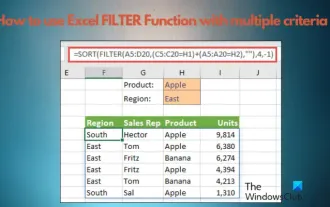 How to use Excel filter function with multiple conditions
Feb 26, 2024 am 10:19 AM
How to use Excel filter function with multiple conditions
Feb 26, 2024 am 10:19 AM
If you need to know how to use filtering with multiple criteria in Excel, the following tutorial will guide you through the steps to ensure you can filter and sort your data effectively. Excel's filtering function is very powerful and can help you extract the information you need from large amounts of data. This function can filter data according to the conditions you set and display only the parts that meet the conditions, making data management more efficient. By using the filter function, you can quickly find target data, saving time in finding and organizing data. This function can not only be applied to simple data lists, but can also be filtered based on multiple conditions to help you locate the information you need more accurately. Overall, Excel’s filtering function is a very practical
 Google is ecstatic: JAX performance surpasses Pytorch and TensorFlow! It may become the fastest choice for GPU inference training
Apr 01, 2024 pm 07:46 PM
Google is ecstatic: JAX performance surpasses Pytorch and TensorFlow! It may become the fastest choice for GPU inference training
Apr 01, 2024 pm 07:46 PM
The performance of JAX, promoted by Google, has surpassed that of Pytorch and TensorFlow in recent benchmark tests, ranking first in 7 indicators. And the test was not done on the TPU with the best JAX performance. Although among developers, Pytorch is still more popular than Tensorflow. But in the future, perhaps more large models will be trained and run based on the JAX platform. Models Recently, the Keras team benchmarked three backends (TensorFlow, JAX, PyTorch) with the native PyTorch implementation and Keras2 with TensorFlow. First, they select a set of mainstream
 Slow Cellular Data Internet Speeds on iPhone: Fixes
May 03, 2024 pm 09:01 PM
Slow Cellular Data Internet Speeds on iPhone: Fixes
May 03, 2024 pm 09:01 PM
Facing lag, slow mobile data connection on iPhone? Typically, the strength of cellular internet on your phone depends on several factors such as region, cellular network type, roaming type, etc. There are some things you can do to get a faster, more reliable cellular Internet connection. Fix 1 – Force Restart iPhone Sometimes, force restarting your device just resets a lot of things, including the cellular connection. Step 1 – Just press the volume up key once and release. Next, press the Volume Down key and release it again. Step 2 – The next part of the process is to hold the button on the right side. Let the iPhone finish restarting. Enable cellular data and check network speed. Check again Fix 2 – Change data mode While 5G offers better network speeds, it works better when the signal is weaker
 Tesla robots work in factories, Musk: The degree of freedom of hands will reach 22 this year!
May 06, 2024 pm 04:13 PM
Tesla robots work in factories, Musk: The degree of freedom of hands will reach 22 this year!
May 06, 2024 pm 04:13 PM
The latest video of Tesla's robot Optimus is released, and it can already work in the factory. At normal speed, it sorts batteries (Tesla's 4680 batteries) like this: The official also released what it looks like at 20x speed - on a small "workstation", picking and picking and picking: This time it is released One of the highlights of the video is that Optimus completes this work in the factory, completely autonomously, without human intervention throughout the process. And from the perspective of Optimus, it can also pick up and place the crooked battery, focusing on automatic error correction: Regarding Optimus's hand, NVIDIA scientist Jim Fan gave a high evaluation: Optimus's hand is the world's five-fingered robot. One of the most dexterous. Its hands are not only tactile
 The vitality of super intelligence awakens! But with the arrival of self-updating AI, mothers no longer have to worry about data bottlenecks
Apr 29, 2024 pm 06:55 PM
The vitality of super intelligence awakens! But with the arrival of self-updating AI, mothers no longer have to worry about data bottlenecks
Apr 29, 2024 pm 06:55 PM
I cry to death. The world is madly building big models. The data on the Internet is not enough. It is not enough at all. The training model looks like "The Hunger Games", and AI researchers around the world are worrying about how to feed these data voracious eaters. This problem is particularly prominent in multi-modal tasks. At a time when nothing could be done, a start-up team from the Department of Renmin University of China used its own new model to become the first in China to make "model-generated data feed itself" a reality. Moreover, it is a two-pronged approach on the understanding side and the generation side. Both sides can generate high-quality, multi-modal new data and provide data feedback to the model itself. What is a model? Awaker 1.0, a large multi-modal model that just appeared on the Zhongguancun Forum. Who is the team? Sophon engine. Founded by Gao Yizhao, a doctoral student at Renmin University’s Hillhouse School of Artificial Intelligence.
 Alibaba 7B multi-modal document understanding large model wins new SOTA
Apr 02, 2024 am 11:31 AM
Alibaba 7B multi-modal document understanding large model wins new SOTA
Apr 02, 2024 am 11:31 AM
New SOTA for multimodal document understanding capabilities! Alibaba's mPLUG team released the latest open source work mPLUG-DocOwl1.5, which proposed a series of solutions to address the four major challenges of high-resolution image text recognition, general document structure understanding, instruction following, and introduction of external knowledge. Without further ado, let’s look at the effects first. One-click recognition and conversion of charts with complex structures into Markdown format: Charts of different styles are available: More detailed text recognition and positioning can also be easily handled: Detailed explanations of document understanding can also be given: You know, "Document Understanding" is currently An important scenario for the implementation of large language models. There are many products on the market to assist document reading. Some of them mainly use OCR systems for text recognition and cooperate with LLM for text processing.
