

How CSS handles browser default styles
This time I will show you how CSS handles the default style of the browser and how CSS handles the default style of the browser. What are the precautions?The following is a practical case, let’s take a look.
Discovered
Recently when adjusting the format of the web page, I found that there is always a space of about 10 pixels at the bottom of the web page.
By using the Chrome browser to inspect elements, I found that there is a margin-botton called user agent stylesheet that sets the entire form's margin-botton:1em;
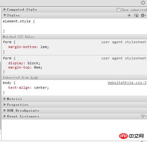
After searching for information on the Internet, I found that this user agent stylesheet is some of the default styles of the browser. If you are not satisfied with this default style, the simplest solution is to reset the attributes of the style. Because the user agent stylesheet has a very low priority and will be overwritten, it will not affect our style. For example, here I will talk about form. The margin-bottom is set to 0px.
User Agent Stylesheet Introduction
Different browsers have different default styles for the same elements, which is why we need to Write * {padding:0;marging:0};
But that’s not all I’m talking about now. Basically, two browsers with different kernels will have differences in the performance of certain elements, such as indent size, font selection, character style, etc. Maybe a beautiful CSS style sheet performs well in one browser, but becomes cluttered in another browser even without CSS bugs. I think it's the browser's default style that's to blame.
Therefore, when we generate CSS style rules, one of the necessary steps is to reset the browser's default style, that is, to overwrite the browser's default style. Different from using * {padding:0;margin:0}, not all elements have differences in padding and margin (the difference between element lists and ordered lists in Internet Xplorer and Firefox is due to their indentation. margin indentation and padding indentation).
For example, the following paragraph:

The font used by this code in Internet Explorer is Times New Roman, while the font used in Firefox and Opera is System default font. Therefore, we need to set a unified style in CSS for
.
However, if we use the wildcard "*" to simply set the global style like using * {padding:0;margin:0}, then an obvious problem will arise, such as form Elements, input elements, textareas, etc. will ignore their reset in some browsers. More importantly, this will seriously damage the appearance of these elements, so you have to manually reset them one by one. Set a padding value and margin value. So we should give up simply using "*" and reset the first element with inconsistent performance, such as body, p, dl, dt, dd, ul, ol, li, h1, h2, h3, h4 ,h5,h6,pre etc.
At the same time, the default styling of elements may ruin the appearance of the page. For example, the element will bold the text, the will indent the text, and the will tilt the text. If you want the text on the page to have a consistent appearance, you should also change the appearance of these elements in CSS. reset. At the same time, sometimes we require the appearance of these elements to be the same as the parent element. We can directly use inherit to inherit from the parent element.
Processing method
As for which elements should be reset? Yahoo! has made a comparative summary for us. According to Yahoo's suggestion, you need to put these rules into a file called Reset.css and reference them separately (this is recommended):
html{color:#000;background:#FFF;}
body,p,dl,dt,dd,ul,ol,li,h1,h2,h3,h4,h5,h6,pre,form,
fieldset,input,textarea,p,blockquote,th,td {
margin:0;
padding:0;
}
table {
border-collapse:collapse;
border-spacing:0;
}
fieldset,img {
border:0;
}
address,caption,cite,code,dfn,em,strong,th,var {
font-style:normal;
font-weight:normal;
}
ol,ul {
list-style:none;
}
caption,th {
text-align:left;
}
h1,h2,h3,h4,h5,h6 {
font-size:100%;
font-weight:normal;
}
q:before,q:after {
content:'';
}
abbr,acronym { border:0;
}All you have to do is simply save these rules to reset .css and then use it in the page. When you need to add new styles to these elements, it is no different from the settings of other elements.
Note: Input, textarea, select{*font-size:100%;} in reset.css above can only be recognized by Internet Explorer. Such settings This is to enable the font size of form controls to be scaled in Internet Explorer.
I believe you have mastered the method after reading the case in this article. For more exciting information, please pay attention to other related articles on the php Chinese website!
Recommended reading:
Use HTML+CSS to implement drop-down menu
Use CSS3 to create a progress bar
The above is the detailed content of How CSS handles browser default styles. For more information, please follow other related articles on the PHP Chinese website!

Hot AI Tools

Undresser.AI Undress
AI-powered app for creating realistic nude photos

AI Clothes Remover
Online AI tool for removing clothes from photos.

Undress AI Tool
Undress images for free

Clothoff.io
AI clothes remover

Video Face Swap
Swap faces in any video effortlessly with our completely free AI face swap tool!

Hot Article
Hot Tools

Notepad++7.3.1
Easy-to-use and free code editor

SublimeText3 Chinese version
Chinese version, very easy to use

Zend Studio 13.0.1
Powerful PHP integrated development environment

Dreamweaver CS6
Visual web development tools

SublimeText3 Mac version
God-level code editing software (SublimeText3)
Hot Topics


 How to use bootstrap in vue
Apr 07, 2025 pm 11:33 PM
How to use bootstrap in vue
Apr 07, 2025 pm 11:33 PM
Using Bootstrap in Vue.js is divided into five steps: Install Bootstrap. Import Bootstrap in main.js. Use the Bootstrap component directly in the template. Optional: Custom style. Optional: Use plug-ins.
 The Roles of HTML, CSS, and JavaScript: Core Responsibilities
Apr 08, 2025 pm 07:05 PM
The Roles of HTML, CSS, and JavaScript: Core Responsibilities
Apr 08, 2025 pm 07:05 PM
HTML defines the web structure, CSS is responsible for style and layout, and JavaScript gives dynamic interaction. The three perform their duties in web development and jointly build a colorful website.
 Understanding HTML, CSS, and JavaScript: A Beginner's Guide
Apr 12, 2025 am 12:02 AM
Understanding HTML, CSS, and JavaScript: A Beginner's Guide
Apr 12, 2025 am 12:02 AM
WebdevelopmentreliesonHTML,CSS,andJavaScript:1)HTMLstructurescontent,2)CSSstylesit,and3)JavaScriptaddsinteractivity,formingthebasisofmodernwebexperiences.
 How to write split lines on bootstrap
Apr 07, 2025 pm 03:12 PM
How to write split lines on bootstrap
Apr 07, 2025 pm 03:12 PM
There are two ways to create a Bootstrap split line: using the tag, which creates a horizontal split line. Use the CSS border property to create custom style split lines.
 How to set up the framework for bootstrap
Apr 07, 2025 pm 03:27 PM
How to set up the framework for bootstrap
Apr 07, 2025 pm 03:27 PM
To set up the Bootstrap framework, you need to follow these steps: 1. Reference the Bootstrap file via CDN; 2. Download and host the file on your own server; 3. Include the Bootstrap file in HTML; 4. Compile Sass/Less as needed; 5. Import a custom file (optional). Once setup is complete, you can use Bootstrap's grid systems, components, and styles to create responsive websites and applications.
 How to insert pictures on bootstrap
Apr 07, 2025 pm 03:30 PM
How to insert pictures on bootstrap
Apr 07, 2025 pm 03:30 PM
There are several ways to insert images in Bootstrap: insert images directly, using the HTML img tag. With the Bootstrap image component, you can provide responsive images and more styles. Set the image size, use the img-fluid class to make the image adaptable. Set the border, using the img-bordered class. Set the rounded corners and use the img-rounded class. Set the shadow, use the shadow class. Resize and position the image, using CSS style. Using the background image, use the background-image CSS property.
 How to use bootstrap button
Apr 07, 2025 pm 03:09 PM
How to use bootstrap button
Apr 07, 2025 pm 03:09 PM
How to use the Bootstrap button? Introduce Bootstrap CSS to create button elements and add Bootstrap button class to add button text
 How to resize bootstrap
Apr 07, 2025 pm 03:18 PM
How to resize bootstrap
Apr 07, 2025 pm 03:18 PM
To adjust the size of elements in Bootstrap, you can use the dimension class, which includes: adjusting width: .col-, .w-, .mw-adjust height: .h-, .min-h-, .max-h-
