

WebKit CSS extension effects
This time I will bring you the CSS extension effect of WebKit. What are the precautions for using CSS WebKit. The following is a practical case, let’s take a look.
-webkit-line-clamp is an unsupported WebKit property. It does not appear in the CSS draft specification, but we often use this parameter in text overflow
- webkit-line-clamp
Overview:
-webkit-line-clamp is an unsupported WebKit property that does not appear in the CSS draft specification.
Limit the number of lines of text displayed in a block element. In order to achieve this effect, it needs to be combined with other foreign WebKit properties. Commonly combined attributes:
display: -webkit-box; Attributes that must be combined to display the object as an elastic scaling box model.
-webkit-box-orient must be combined with the attribute to set or retrieve the arrangement of the child elements of the flex box object.
text-overflow can be used to hide out-of-range text with the ellipses "..." in the case of multi-line text.
Syntax:
-webkit-line-clamp:
Default value: ? indicates unclear;
Applies to: Block elements
Inheritance: None
Animation: No
Calculated value: Specified value
Value:
Block The number of lines of text displayed by the element.
* There may be description errors and changes in the new attributes of CSS3. They are for reference only and will be continuously updated.
Compatibility:
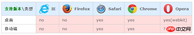
?Unclear
Example code: css overflow hidden
<!DOCTYPE HTML>
<html>
<head>
    <meta charset="utf-8">
    <title>无标题文档</title>
	<style type="text/css">
.jb51{
	overflow : hidden;
	text-overflow: ellipsis;
	display: -webkit-box;
	-webkit-line-clamp: 2;
	-webkit-box-orient: vertical;
	line-height: 20px;
  max-height:40px;
  width:500px;
	height: 200px;
}
    </style>
</head>

<body>
<p class="jb51">
 static:对象遵循常规流。top,right,bottom,left等属性不会被应用。 relative: 对象遵循常规流,并且参照自身在常规流中的位置通过top,right,bottom,left属性进行偏移时不影响常规流中的任何元素。 absolute:对象脱离常规流,使用top,right,bottom,left等属性进行绝对定位,盒子的偏移位置不影响常规流中的任何元素,其margin不与其他任何margin折叠。fixed:对象脱离常规流,使用top,right,bottom,left等属性以窗口为参考点进行定位,当出现滚动条时,对象不会随着滚动。center:对象脱离常规流,使用top,right,bottom,left等属性指定盒子的位置或尺寸大小。盒子在其包含容器垂直水平居中。盒子的偏移位置不影响常规流中的任何元素,其margin不与其他任何margin折叠。(CSS3)page:盒子的位置计算参照absolute。盒子在分页媒体或者区域块内,盒子的包含块始终是初始包含块,否则取决于每个absolute模式。(CSS3) sticky: 对象在常态时遵循常规流。它就像是 relative 和 fixed 的合体,当在屏幕中时按常规流排版,当卷动到屏幕外时则表现如fixed。该属性的表现是现实中你见到的吸附效果。(CSS3)* CSS3新增属性可能存在描述错误及变更,仅供参考,持续更新
</p>
</body>
</html>Core code
overflow: hidden;
text-overflow: ellipsis;
display: -webkit-box;
-webkit-line-clamp: 2;
-webkit-box-orient: vertical;
If your label is in English, English It will not wrap automatically, so you need to let it wrap automatically by adding the following code
word-wrap:break-word;
word-break:break-all;
You can also use the plug-in
clamp.js
I believe you have mastered the method after reading the case in this article. For more exciting information, please pay attention to other related articles on the php Chinese website!
Recommended reading:
Front-end technology to realize text texture overlay
##h5 realizes multi-image preview uploading and click-to-drag Drag control
#H5 APP listening return event processing
The above is the detailed content of WebKit CSS extension effects. For more information, please follow other related articles on the PHP Chinese website!

Hot AI Tools

Undresser.AI Undress
AI-powered app for creating realistic nude photos

AI Clothes Remover
Online AI tool for removing clothes from photos.

Undress AI Tool
Undress images for free

Clothoff.io
AI clothes remover

Video Face Swap
Swap faces in any video effortlessly with our completely free AI face swap tool!

Hot Article
Hot Tools

Notepad++7.3.1
Easy-to-use and free code editor

SublimeText3 Chinese version
Chinese version, very easy to use

Zend Studio 13.0.1
Powerful PHP integrated development environment

Dreamweaver CS6
Visual web development tools

SublimeText3 Mac version
God-level code editing software (SublimeText3)
Hot Topics
 1665
1665
 14
1423
52
1321
25
1269
29
1249
24
14
1423
52
1321
25
1269
29
1249
24

 How to use bootstrap in vue
Apr 07, 2025 pm 11:33 PM
How to use bootstrap in vue
Apr 07, 2025 pm 11:33 PM
Using Bootstrap in Vue.js is divided into five steps: Install Bootstrap. Import Bootstrap in main.js. Use the Bootstrap component directly in the template. Optional: Custom style. Optional: Use plug-ins.
 Understanding HTML, CSS, and JavaScript: A Beginner's Guide
Apr 12, 2025 am 12:02 AM
Understanding HTML, CSS, and JavaScript: A Beginner's Guide
Apr 12, 2025 am 12:02 AM
WebdevelopmentreliesonHTML,CSS,andJavaScript:1)HTMLstructurescontent,2)CSSstylesit,and3)JavaScriptaddsinteractivity,formingthebasisofmodernwebexperiences.
 The Roles of HTML, CSS, and JavaScript: Core Responsibilities
Apr 08, 2025 pm 07:05 PM
The Roles of HTML, CSS, and JavaScript: Core Responsibilities
Apr 08, 2025 pm 07:05 PM
HTML defines the web structure, CSS is responsible for style and layout, and JavaScript gives dynamic interaction. The three perform their duties in web development and jointly build a colorful website.
 How to write split lines on bootstrap
Apr 07, 2025 pm 03:12 PM
How to write split lines on bootstrap
Apr 07, 2025 pm 03:12 PM
There are two ways to create a Bootstrap split line: using the tag, which creates a horizontal split line. Use the CSS border property to create custom style split lines.
 How to insert pictures on bootstrap
Apr 07, 2025 pm 03:30 PM
How to insert pictures on bootstrap
Apr 07, 2025 pm 03:30 PM
There are several ways to insert images in Bootstrap: insert images directly, using the HTML img tag. With the Bootstrap image component, you can provide responsive images and more styles. Set the image size, use the img-fluid class to make the image adaptable. Set the border, using the img-bordered class. Set the rounded corners and use the img-rounded class. Set the shadow, use the shadow class. Resize and position the image, using CSS style. Using the background image, use the background-image CSS property.
 How to set up the framework for bootstrap
Apr 07, 2025 pm 03:27 PM
How to set up the framework for bootstrap
Apr 07, 2025 pm 03:27 PM
To set up the Bootstrap framework, you need to follow these steps: 1. Reference the Bootstrap file via CDN; 2. Download and host the file on your own server; 3. Include the Bootstrap file in HTML; 4. Compile Sass/Less as needed; 5. Import a custom file (optional). Once setup is complete, you can use Bootstrap's grid systems, components, and styles to create responsive websites and applications.
 How to resize bootstrap
Apr 07, 2025 pm 03:18 PM
How to resize bootstrap
Apr 07, 2025 pm 03:18 PM
To adjust the size of elements in Bootstrap, you can use the dimension class, which includes: adjusting width: .col-, .w-, .mw-adjust height: .h-, .min-h-, .max-h-
 How to use bootstrap button
Apr 07, 2025 pm 03:09 PM
How to use bootstrap button
Apr 07, 2025 pm 03:09 PM
How to use the Bootstrap button? Introduce Bootstrap CSS to create button elements and add Bootstrap button class to add button text
