

About the pitfalls encountered by CSS3 inline-block

Many people may not be familiar with inline-block. In terms of layout, many people use flex or float. There is no doubt that flex is very powerful, but its compatibility is not very satisfactory. Although float is very compatible, it is not very satisfactory. I feel that clearing floats is very troublesome, so I used inline-block as the layout for the homepage navigation display of some large websites, such as our segmentfault. I thought that inline-block can be used for a while, but suddenly I found that there are also some small problems in it. , first post the code
<p style="background-color:green">
      <p style="width:40px;height:30px;background-color:red;">

      </p>
      <p style="width:40px;height:30px;background-color:red;">

      </p>
      <p style="width:40px;height:30px;background-color:red;">

      </p>
</p>
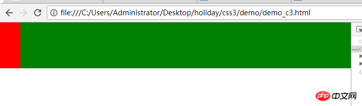
At this time we use inline-block for layout, and the magic happens
<p style="background-color:green;">
      <p style="width:40px;height:30px;background-color:red;display:inline-block;">

        </p>
      <p style="width:40px;height:30px;background-color:red;display:inline-block;">

        </p>
      <p style="width:40px;height:30px;background-color:red;display:inline-block;">

        </p>
    </p>
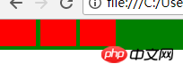
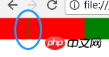
The original three p's are side by side. Because the three p's have become inline elements, they should also be side by side, but...
appears here Two questions: There is a gap between
p

There is a gap between the child p and the parent p A 4px spacing
The reason why this problem occurs here is because the horizontally rendered elements of inline-block are displayed with line breaks or separated by spaces. In some cases, there will be a gap between
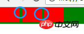
Solution to the gap between p
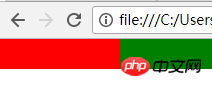
One method I tried here is to set margin-right to a negative value,
<p style="background-color:green">
      <p style="width:40px;height:30px;background-color:red;display:inline-block;margin-bottom:-4px;margin-right:-4px">

      </p>
      <p style="width:40px;height:30px;background-color:red;display:inline-block;margin-bottom:-4px;margin-right:-4px">

      </p>
      <p style="width:40px;height:30px;background-color:red;display:inline-block;margin-bottom:-4px;margin-right:-4px">

      </p>
    </p>
Here we can see that the first p and the second p still have a 1px spacing, while the second and third have no spacing, the child p and the parent There is no spacing between p, which shows that our problem is not here.
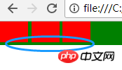
I was referring to Zhang Xuxin’s blog and I was deeply impressed and thought that this method is the best:
Add such css attributes to the parent p
font-size:0
-webkit-text-size-adjust:none;
po code
<p style="background-color:green;font-size:0;-webkit-text-size-adjust:none;">

        <p style="width:40px;height:30px;background-color:red;display:inline-block;">

        </p>

        <p style="width:40px;height:30px;background-color:red;display:inline-block;">

        </p>

        <p style="width:40px;height:30px;background-color:red;display:inline-block;">

        </p>
So there is another question, what is -webkit-text-size-adjust?? ??
In the webkit-based browser (chrome), when the Chinese font-size defined in css is less than 12px, the browser still uses 12px, then you can use -webkit-text-size -adjust:none;
Haha, this solves our problem
Finally, let’s talk about the compatibility of inline-block: refer to this article
-->
IE6 and IE7 do not recognize inline-block but can trigger block elements. Other mainstream browsers support inline-block. This is enough. IE6 and 7 will not be considered. You know the reason...
Related recommendations:
display: inline-block and float in css Differences used when making elements line up
css: block, inline and inline-block usage and differences
css solution display:inline- block; method of laying out the gaps created
The above is the detailed content of About the pitfalls encountered by CSS3 inline-block. For more information, please follow other related articles on the PHP Chinese website!

Hot AI Tools

Undresser.AI Undress
AI-powered app for creating realistic nude photos

AI Clothes Remover
Online AI tool for removing clothes from photos.

Undress AI Tool
Undress images for free

Clothoff.io
AI clothes remover

Video Face Swap
Swap faces in any video effortlessly with our completely free AI face swap tool!

Hot Article
Hot Tools

Notepad++7.3.1
Easy-to-use and free code editor

SublimeText3 Chinese version
Chinese version, very easy to use

Zend Studio 13.0.1
Powerful PHP integrated development environment

Dreamweaver CS6
Visual web development tools

SublimeText3 Mac version
God-level code editing software (SublimeText3)
Hot Topics


 How to achieve wave effect with pure CSS3? (code example)
Jun 28, 2022 pm 01:39 PM
How to achieve wave effect with pure CSS3? (code example)
Jun 28, 2022 pm 01:39 PM
How to achieve wave effect with pure CSS3? This article will introduce to you how to use SVG and CSS animation to create wave effects. I hope it will be helpful to you!
 Use CSS skillfully to realize various strange-shaped buttons (with code)
Jul 19, 2022 am 11:28 AM
Use CSS skillfully to realize various strange-shaped buttons (with code)
Jul 19, 2022 am 11:28 AM
This article will show you how to use CSS to easily realize various weird-shaped buttons that appear frequently. I hope it will be helpful to you!
 How to hide elements in css without taking up space
Jun 01, 2022 pm 07:15 PM
How to hide elements in css without taking up space
Jun 01, 2022 pm 07:15 PM
Two methods: 1. Using the display attribute, just add the "display:none;" style to the element. 2. Use the position and top attributes to set the absolute positioning of the element to hide the element. Just add the "position:absolute;top:-9999px;" style to the element.
 How to implement lace borders in css3
Sep 16, 2022 pm 07:11 PM
How to implement lace borders in css3
Sep 16, 2022 pm 07:11 PM
In CSS, you can use the border-image attribute to achieve a lace border. The border-image attribute can use images to create borders, that is, add a background image to the border. You only need to specify the background image as a lace style; the syntax "border-image: url (image path) offsets the image border width inward. Whether outset is repeated;".
 It turns out that text carousel and image carousel can also be realized using pure CSS!
Jun 10, 2022 pm 01:00 PM
It turns out that text carousel and image carousel can also be realized using pure CSS!
Jun 10, 2022 pm 01:00 PM
How to create text carousel and image carousel? The first thing everyone thinks of is whether to use js. In fact, text carousel and image carousel can also be realized using pure CSS. Let’s take a look at the implementation method. I hope it will be helpful to everyone!
 How to enlarge the image by clicking the mouse in css3
Apr 25, 2022 pm 04:52 PM
How to enlarge the image by clicking the mouse in css3
Apr 25, 2022 pm 04:52 PM
Implementation method: 1. Use the ":active" selector to select the state of the mouse click on the picture; 2. Use the transform attribute and scale() function to achieve the picture magnification effect, the syntax "img:active {transform: scale(x-axis magnification, y Axis magnification);}".
 How to set animation rotation speed in css3
Apr 28, 2022 pm 04:32 PM
How to set animation rotation speed in css3
Apr 28, 2022 pm 04:32 PM
In CSS3, you can use the "animation-timing-function" attribute to set the animation rotation speed. This attribute is used to specify how the animation will complete a cycle and set the speed curve of the animation. The syntax is "element {animation-timing-function: speed attribute value;}".
 Does css3 animation effect have deformation?
Apr 28, 2022 pm 02:20 PM
Does css3 animation effect have deformation?
Apr 28, 2022 pm 02:20 PM
The animation effect in css3 has deformation; you can use "animation: animation attribute @keyframes ..{..{transform: transformation attribute}}" to achieve deformation animation effect. The animation attribute is used to set the animation style, and the transform attribute is used to set the deformation style. .
