

Layui tab effect implementation code sharing

This article mainly introduces the implementation code of layui pop-up layer effect in detail. It has certain reference value. Interested friends can refer to it. I hope it can help everyone.
<!DOCTYPE html>
<html>
<head>
<meta charset="UTF-8">
<title>选项卡</title>
<link rel="stylesheet" href="layui/css/layui.css">
</head>
<body>
<fieldset class="layui-elem-field layui-field-title" style="margin-top: 20px;">
<legend>默认风格的Tab</legend>
</fieldset>
<p class="layui-tab">
<ul class="layui-tab-title">
<li class="layui-this">网站设置</li>
<li>用户管理</li>
<li>权限分配</li>
<li>商品管理</li>
<li>订单管理</li>
</ul>
<p class="layui-tab-content">
<p class="layui-tab-item layui-show">
1. 高度默认自适应,也可以随意固宽。
<br>2. Tab进行了响应式处理,所以无需担心数量多少。
</p>
<p class="layui-tab-item">内容2</p>
<p class="layui-tab-item">内容3</p>
<p class="layui-tab-item">内容4</p>
<p class="layui-tab-item">内容5</p>
</p>
</p>
<fieldset class="layui-elem-field layui-field-title" style="margin-top: 50px;">
<legend>动态操作Tab</legend>
</fieldset>
<p class="layui-tab" lay-filter="demo" lay-allowclose="true">
<ul class="layui-tab-title">
<li class="layui-this" lay-id="11">网站设置</li>
<li lay-id="22">用户管理</li>
<li lay-id="33">权限分配</li>
<li lay-id="44">商品管理</li>
<li lay-id="55">订单管理</li>
</ul>
<p class="layui-tab-content">
<p class="layui-tab-item layui-show">内容1</p>
<p class="layui-tab-item">内容2</p>
<p class="layui-tab-item">内容3</p>
<p class="layui-tab-item">内容4</p>
<p class="layui-tab-item">内容5</p>
</p>
</p>
<p class="site-demo-button" style="margin-bottom: 0;">
<button class="layui-btn site-demo-active" data-type="tabAdd">新增Tab项</button>
<button class="layui-btn site-demo-active" data-type="tabDelete">删除:商品管理</button>
<button class="layui-btn site-demo-active" data-type="tabChange">切换到:用户管理</button>
</p>
<!-- 通用-970*90 -->
<p>
<ins class="adsbygoogle" style="display:inline-block;width:970px;height:90px" data-ad-client="ca-pub-6111334333458862" data-ad-slot="6835627838"></ins>
</p>
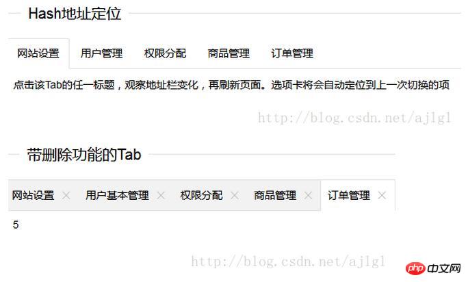
<fieldset class="layui-elem-field layui-field-title" style="margin-top: 50px;">
<legend>Hash地址定位</legend>
</fieldset>
<p class="layui-tab" lay-filter="test">
<ul class="layui-tab-title">
<li class="layui-this" lay-id="11">网站设置</li>
<li lay-id="22">用户管理</li>
<li lay-id="33">权限分配</li>
<li lay-id="44">商品管理</li>
<li lay-id="55">订单管理</li>
</ul>
<p class="layui-tab-content">
<p class="layui-tab-item layui-show">
点击该Tab的任一标题,观察地址栏变化,再刷新页面。选项卡将会自动定位到上一次切换的项
</p>
<p class="layui-tab-item">内容2</p>
<p class="layui-tab-item">内容3</p>
<p class="layui-tab-item">内容4</p>
<p class="layui-tab-item">内容5</p>
</p>
</p>
<fieldset class="layui-elem-field layui-field-title" style="margin-top: 50px;">
<legend>简洁风格的Tab</legend>
</fieldset>
<p class="layui-tab layui-tab-brief" lay-filter="docDemoTabBrief">
<ul class="layui-tab-title">
<li class="layui-this">网站设置</li>
<li>用户管理</li>
<li>权限分配</li>
<li>商品管理</li>
<li>订单管理</li>
</ul>
<p class="layui-tab-content" style="height: 100px;">
<p class="layui-tab-item layui-show">内容不一样是要有,因为你可以监听tab事件(阅读下文档就是了)</p>
<p class="layui-tab-item">内容2</p>
<p class="layui-tab-item">内容3</p>
<p class="layui-tab-item">内容4</p>
<p class="layui-tab-item">内容5</p>
</p>
</p>
<fieldset class="layui-elem-field layui-field-title" style="margin-top: 50px;">
<legend>卡片风格的Tab</legend>
</fieldset>
<p class="layui-tab layui-tab-card">
<ul class="layui-tab-title">
<li class="layui-this">网站设置</li>
<li>用户管理</li>
<li>权限分配</li>
<li>商品管理</li>
<li>订单管理</li>
</ul>
<p class="layui-tab-content" style="height: 100px;">
<p class="layui-tab-item layui-show">默认宽度是相对于父元素100%适应的,你也可以固定宽度。</p>
<p class="layui-tab-item">2</p>
<p class="layui-tab-item">3</p>
<p class="layui-tab-item">4</p>
<p class="layui-tab-item">5</p>
<p class="layui-tab-item">6</p>
</p>
</p>
<fieldset class="layui-elem-field layui-field-title" style="margin-top: 50px;">
<legend>当Tab数超过一定宽度</legend>
</fieldset>
<p class="layui-tab layui-tab-card" style="width: 290px;">
<ul class="layui-tab-title">
<li class="layui-this">网站设置</li>
<li>用户管理</li>
<li>权限分配</li>
<li>商品管理</li>
<li>订单管理</li>
</ul>
<p class="layui-tab-content" style="height: 100px;">
<p class="layui-tab-item layui-show">
1. 宽度足够,就不会出现右上图标;宽度不够,就会开启展开功能。
<br>2. 如果你的宽度是自适应的,Tab会自动判断是否需要展开,并适用于所有风格。
</p>
<p class="layui-tab-item">2</p>
<p class="layui-tab-item">3</p>
<p class="layui-tab-item">4</p>
<p class="layui-tab-item">5</p>
<p class="layui-tab-item">6</p>
</p>
</p>
<fieldset class="layui-elem-field layui-field-title" style="margin-top: 50px;">
<legend>带删除功能的Tab</legend>
</fieldset>
<p class="layui-tab layui-tab-card" lay-allowclose="true">
<ul class="layui-tab-title">
<li class="layui-this">网站设置</li>
<li>用户基本管理</li>
<li>权限分配</li>
<li>商品管理</li>
<li>订单管理</li>
</ul>
<p class="layui-tab-content" style="height: 150px;">
<p class="layui-tab-item layui-show">
1. 我个人比较喜欢卡片风格的,所以你发现又是以卡片的风格举例
2. 删除功能适用于所有风格
</p>
<p class="layui-tab-item">2</p>
<p class="layui-tab-item">3</p>
<p class="layui-tab-item">4</p>
<p class="layui-tab-item">5</p>
<p class="layui-tab-item">6</p>
</p>
</p>
<script src="layui/layui.js" charset="utf-8"></script>
<script>
layui.use('element', function(){
var $ = layui.jquery
,element = layui.element(); //Tab的切换功能,切换事件监听等,需要依赖element模块
//触发事件
var active = {
tabAdd: function(){
//新增一个Tab项
element.tabAdd('demo', {
title: '新选项'+ (Math.random()*1000|0) //用于演示
,content: '内容'+ (Math.random()*1000|0)
,id: new Date().getTime() //实际使用一般是规定好的id,这里以时间戳模拟下
})
}
,tabDelete: function(othis){
//删除指定Tab项
element.tabDelete('demo', '44'); //删除:“商品管理”
othis.addClass('layui-btn-disabled');
}
,tabChange: function(){
//切换到指定Tab项
element.tabChange('demo', '22'); //切换到:用户管理
}
};
$('.site-demo-active').on('click', function(){
var othis = $(this), type = othis.data('type');
active[type] ? active[type].call(this, othis) : '';
});
//Hash地址的定位
var layid = location.hash.replace(/^#test=/, '');
element.tabChange('test', layid);
element.on('tab(test)', function(elem){
location.hash = 'test='+ $(this).attr('lay-id');
});
});
</script>
</body>
</html>Rendering:
Related recommendations:
Jquery plug-in development tab production technology sharing
JS+jQuery example of writing a simple tab
The above is the detailed content of Layui tab effect implementation code sharing. For more information, please follow other related articles on the PHP Chinese website!

Hot AI Tools

Undresser.AI Undress
AI-powered app for creating realistic nude photos

AI Clothes Remover
Online AI tool for removing clothes from photos.

Undress AI Tool
Undress images for free

Clothoff.io
AI clothes remover

Video Face Swap
Swap faces in any video effortlessly with our completely free AI face swap tool!

Hot Article
Hot Tools

Notepad++7.3.1
Easy-to-use and free code editor

SublimeText3 Chinese version
Chinese version, very easy to use

Zend Studio 13.0.1
Powerful PHP integrated development environment

Dreamweaver CS6
Visual web development tools

SublimeText3 Mac version
God-level code editing software (SublimeText3)
Hot Topics


 How to set up jump on layui login page
Apr 04, 2024 am 03:12 AM
How to set up jump on layui login page
Apr 04, 2024 am 03:12 AM
Layui login page jump setting steps: Add jump code: Add judgment in the login form submit button click event, and jump to the specified page through window.location.href after successful login. Modify the form configuration: add a hidden input field to the form element of lay-filter="login", with the name "redirect" and the value being the target page address.
 How to get form data in layui
Apr 04, 2024 am 03:39 AM
How to get form data in layui
Apr 04, 2024 am 03:39 AM
layui provides a variety of methods for obtaining form data, including directly obtaining all field data of the form, obtaining the value of a single form element, using the formAPI.getVal() method to obtain the specified field value, serializing the form data and using it as an AJAX request parameter, and listening Form submission event gets data.
 How to implement the WeChat clone function on Huawei mobile phones
Mar 24, 2024 pm 06:03 PM
How to implement the WeChat clone function on Huawei mobile phones
Mar 24, 2024 pm 06:03 PM
How to implement the WeChat clone function on Huawei mobile phones With the popularity of social software and people's increasing emphasis on privacy and security, the WeChat clone function has gradually become the focus of people's attention. The WeChat clone function can help users log in to multiple WeChat accounts on the same mobile phone at the same time, making it easier to manage and use. It is not difficult to implement the WeChat clone function on Huawei mobile phones. You only need to follow the following steps. Step 1: Make sure that the mobile phone system version and WeChat version meet the requirements. First, make sure that your Huawei mobile phone system version has been updated to the latest version, as well as the WeChat App.
 How layui implements self-adaptation
Apr 26, 2024 am 03:00 AM
How layui implements self-adaptation
Apr 26, 2024 am 03:00 AM
Adaptive layout can be achieved by using the responsive layout function of the layui framework. The steps include: referencing the layui framework. Define an adaptive layout container and set the layui-container class. Use responsive breakpoints (xs/sm/md/lg) to hide elements under specific breakpoints. Specify element width using the grid system (layui-col-). Create spacing via offset (layui-offset-). Use responsive utilities (layui-invisible/show/block/inline) to control the visibility of elements and how they appear.
 What is the difference between layui and vue?
Apr 04, 2024 am 03:54 AM
What is the difference between layui and vue?
Apr 04, 2024 am 03:54 AM
The difference between layui and Vue is mainly reflected in functions and concerns. Layui focuses on rapid development of UI elements and provides prefabricated components to simplify page construction; Vue is a full-stack framework that focuses on data binding, component development and state management, and is more suitable for building complex applications. Layui is easy to learn and suitable for quickly building pages; Vue has a steep learning curve but helps build scalable and easy-to-maintain applications. Depending on the project needs and developer skill level, the appropriate framework can be selected.
 How to transfer data in layui
Apr 26, 2024 am 03:39 AM
How to transfer data in layui
Apr 26, 2024 am 03:39 AM
The method of using layui to transmit data is as follows: Use Ajax: Create the request object, set the request parameters (URL, method, data), and process the response. Use built-in methods: Simplify data transfer using built-in methods such as $.post, $.get, $.postJSON, or $.getJSON.
 What does layui mean?
Apr 04, 2024 am 04:33 AM
What does layui mean?
Apr 04, 2024 am 04:33 AM
layui is a front-end UI framework that provides a wealth of UI components, tools and functions to help developers quickly build modern, responsive and interactive web applications. Its features include: flexible and lightweight, modular design, rich components, Powerful tools and easy customization. It is widely used in the development of various web applications, including management systems, e-commerce platforms, content management systems, social networks and mobile applications.
 Tsinghua University and Zhipu AI open source GLM-4: launching a new revolution in natural language processing
Jun 12, 2024 pm 08:38 PM
Tsinghua University and Zhipu AI open source GLM-4: launching a new revolution in natural language processing
Jun 12, 2024 pm 08:38 PM
Since the launch of ChatGLM-6B on March 14, 2023, the GLM series models have received widespread attention and recognition. Especially after ChatGLM3-6B was open sourced, developers are full of expectations for the fourth-generation model launched by Zhipu AI. This expectation has finally been fully satisfied with the release of GLM-4-9B. The birth of GLM-4-9B In order to give small models (10B and below) more powerful capabilities, the GLM technical team launched this new fourth-generation GLM series open source model: GLM-4-9B after nearly half a year of exploration. This model greatly compresses the model size while ensuring accuracy, and has faster inference speed and higher efficiency. The GLM technical team’s exploration has not
