

css grid layout GRID tutorial

Grid is a real layout artifact. Css only really had the concept of layout after the introduction of Flex layout and Grid layout modules. I don’t know if the initial table layout was crazy, but then floats were flying all over the place. You may have to use abosulte to realize the layout of the page. In short, it is very awkward to implement. You must always pay attention to: will it collapse if I write it this way, will it affect the subsequent elements, and why is it wrong? The author boldly calls these implementations structural tricks. Flex and Grid are the real cloth. bureau. Flex is responsible for one-dimensional layout, and Grid is responsible for two-dimensional layout. Both layouts are very powerful, but one is more difficult than the other. There are so many attributes that I want to vomit blood. What makes me awesome is the module instead of the attribute. Woolen cloth. Today we will only introduce the concepts related to Grid layout around the following figure
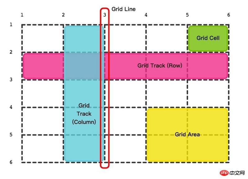
Grid container
The place where Grid layout begins, the grid module carrier. From the outside, it looks like a block or it may be an inline-block block, and the inside of the container is one grid after another. Like Flex layout, it is also divided into container properties and item properties.
Grid lines
Grid lines include horizontal and vertical lines. The criss-crossing lines cut the grid container into the smallest unitsCell. Grid lines are numbered, starting with the number 1. There are 6 horizontal lines and 6 vertical lines in the picture above. You can also name the threads if you like, and a thread can have multiple names. 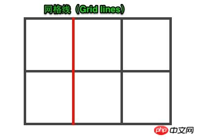
Cell
Grid Cell The green background block in the picture is the cell, the smallest unit of measurement for the grid layout, and the container has a total of 25 cells. 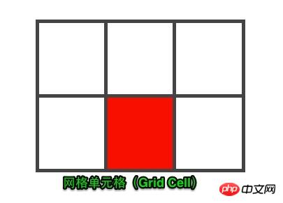
Grid Track
The middle part of two adjacent grid lines is the track. Why is there the concept of track? Because The width of the track needs to be set. If the width and height are set to the cells separately, it is likely to become a waterfall flow, and the complexity will rise sharply. Take another look at the light blue and light pink tracks in the picture above to get a feel for it. 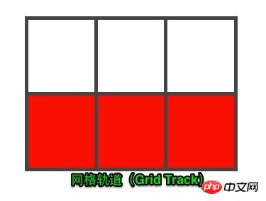
Grid area
The meaning of the existence of grid lines, cells, and tracks is to divide the container into the areas you need Grid Area. A region is a whole block that can contain multiple cells, so how to divide it? The area where two horizontal grid lines and two vertical grid lines intersect is the area. If the container is divided into multiple areas reasonably, the layout purpose will be achieved. Regions can overlap, so it has a z-index. 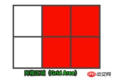
#That’s it for today’s concept part. The knowledge related to grid layout programming will be introduced in detail later.
ps: The picture is excerpted from CSS Grid Layout: What is Grid Layout
Companion article in-depth understanding of the layout artifact flexbox
Grid, a real layout artifact. Css only really had the concept of layout after the introduction of Flex layout and Grid layout modules. I don’t know if the initial table layout was crazy, but then floats were flying all over the place. You may have to use abosulte to realize the layout of the page. In short, it is very awkward to implement. You must always pay attention to: will it collapse if I write it this way, will it affect the subsequent elements, and why is it wrong? The author boldly calls these implementations layout tricks. Flex and Grid are the real layouts. Flex is responsible for one-dimensional layout, and Grid is responsible for two-dimensional layout. Both layouts are very powerful, but one is more difficult than the other. There are so many attributes that I want to vomit blood. What makes me awesome is the module instead of the attribute. Woolen cloth. Today we will only introduce the concepts related to Grid layout based on the figure below.
Grid container
The place where the Grid layout starts, the carrier of the grid module. From the outside, it looks like a block or it may be an inline-block block, and the inside of the container is one grid after another. Like Flex layout, it is also divided into container properties and item properties.
Grid lines
Grid lines include horizontal and vertical lines. The criss-crossing lines cut the grid container into the smallest unitsCell. Grid lines are numbered, starting with the number 1. There are 6 horizontal lines and 6 vertical lines in the picture above. You can also name the threads if you like, and a thread can have multiple names.
Cell
Grid Cell The green background block in the picture is the cell, the smallest unit of measurement for the grid layout. The container has a total of 25 cells.
Grid Track
The middle part of two adjacent grid lines is the track. Why is there the concept of track? Because You need to set the width of the track. If you set the width and height separately to the cells, it is likely to become a waterfall flow, and the complexity will rise sharply. Take another look at the light blue and light pink tracks in the picture above to get a feel for it.
Grid area
The meaning of the existence of grid lines, cells, and tracks is to divide the container into the areas you need Grid Area. A region is a whole block that can contain multiple cells, so how to divide it? The area where two horizontal grid lines and two vertical grid lines intersect is the area. If the container is divided into multiple areas reasonably, the layout purpose will be achieved. Regions can overlap, so it has a z-index.
The above content is the css grid layout GRID tutorial, I hope it can help everyone.
Related recommendations:
CSS Introduction to Grid layout module_html/css_WEB-ITnose
Teach you CSS Grid layout in five minutes
The above is the detailed content of css grid layout GRID tutorial. For more information, please follow other related articles on the PHP Chinese website!

Hot AI Tools

Undresser.AI Undress
AI-powered app for creating realistic nude photos

AI Clothes Remover
Online AI tool for removing clothes from photos.

Undress AI Tool
Undress images for free

Clothoff.io
AI clothes remover

Video Face Swap
Swap faces in any video effortlessly with our completely free AI face swap tool!

Hot Article
Hot Tools

Notepad++7.3.1
Easy-to-use and free code editor

SublimeText3 Chinese version
Chinese version, very easy to use

Zend Studio 13.0.1
Powerful PHP integrated development environment

Dreamweaver CS6
Visual web development tools

SublimeText3 Mac version
God-level code editing software (SublimeText3)
Hot Topics


 How to use bootstrap in vue
Apr 07, 2025 pm 11:33 PM
How to use bootstrap in vue
Apr 07, 2025 pm 11:33 PM
Using Bootstrap in Vue.js is divided into five steps: Install Bootstrap. Import Bootstrap in main.js. Use the Bootstrap component directly in the template. Optional: Custom style. Optional: Use plug-ins.
 The Roles of HTML, CSS, and JavaScript: Core Responsibilities
Apr 08, 2025 pm 07:05 PM
The Roles of HTML, CSS, and JavaScript: Core Responsibilities
Apr 08, 2025 pm 07:05 PM
HTML defines the web structure, CSS is responsible for style and layout, and JavaScript gives dynamic interaction. The three perform their duties in web development and jointly build a colorful website.
 Understanding HTML, CSS, and JavaScript: A Beginner's Guide
Apr 12, 2025 am 12:02 AM
Understanding HTML, CSS, and JavaScript: A Beginner's Guide
Apr 12, 2025 am 12:02 AM
WebdevelopmentreliesonHTML,CSS,andJavaScript:1)HTMLstructurescontent,2)CSSstylesit,and3)JavaScriptaddsinteractivity,formingthebasisofmodernwebexperiences.
 How to write split lines on bootstrap
Apr 07, 2025 pm 03:12 PM
How to write split lines on bootstrap
Apr 07, 2025 pm 03:12 PM
There are two ways to create a Bootstrap split line: using the tag, which creates a horizontal split line. Use the CSS border property to create custom style split lines.
 How to set up the framework for bootstrap
Apr 07, 2025 pm 03:27 PM
How to set up the framework for bootstrap
Apr 07, 2025 pm 03:27 PM
To set up the Bootstrap framework, you need to follow these steps: 1. Reference the Bootstrap file via CDN; 2. Download and host the file on your own server; 3. Include the Bootstrap file in HTML; 4. Compile Sass/Less as needed; 5. Import a custom file (optional). Once setup is complete, you can use Bootstrap's grid systems, components, and styles to create responsive websites and applications.
 How to insert pictures on bootstrap
Apr 07, 2025 pm 03:30 PM
How to insert pictures on bootstrap
Apr 07, 2025 pm 03:30 PM
There are several ways to insert images in Bootstrap: insert images directly, using the HTML img tag. With the Bootstrap image component, you can provide responsive images and more styles. Set the image size, use the img-fluid class to make the image adaptable. Set the border, using the img-bordered class. Set the rounded corners and use the img-rounded class. Set the shadow, use the shadow class. Resize and position the image, using CSS style. Using the background image, use the background-image CSS property.
 How to use bootstrap button
Apr 07, 2025 pm 03:09 PM
How to use bootstrap button
Apr 07, 2025 pm 03:09 PM
How to use the Bootstrap button? Introduce Bootstrap CSS to create button elements and add Bootstrap button class to add button text
 How to resize bootstrap
Apr 07, 2025 pm 03:18 PM
How to resize bootstrap
Apr 07, 2025 pm 03:18 PM
To adjust the size of elements in Bootstrap, you can use the dimension class, which includes: adjusting width: .col-, .w-, .mw-adjust height: .h-, .min-h-, .max-h-
