

Introduction to BootStrap basic styles

Usage of basic styles of Bootstrap
1. Preparation
1, Responsive layout
Bootstrap is a responsive layout framework that can automatically adapt to different devices Size display mode, usage method: introduce the following code in the head tag:
[Related recommendations: Bootstrap tutorial]
where initial-scale=1 means the scaling ratio is 1.
2, introduce bootstrap.css
You can download the bootstrap.css file locally for local import, or you can use CDN to import. The CDN import method is as follows:
<!-- 最新版本的 Bootstrap 核心 CSS 文件 -->
<link rel="stylesheet" href="https://cdn.bootcss.com/bootstrap/3.3.7/css/bootstrap.min.css">

<!-- 可选的 Bootstrap 主题文件(一般不用引入) -->
<link rel="stylesheet" href="https://cdn.bootcss.com/bootstrap/3.3.7/css/bootstrap-theme.min.css">

<!-- 最新的 Bootstrap 核心 JavaScript 文件 -->
<script src="https://cdn.bootcss.com/bootstrap/3.3.7/js/bootstrap.min.js"></script>
Advantages and disadvantages of using CDN: 1. It must be introduced in a network environment; 2. If there are files on the local server, the loading speed will be very fast. For example, the CDN exists on a server in Qingdao bootstrap.css file, users in the Qingdao area will import the file very quickly, otherwise it will be slower and the loading delay will be higher; 3. There is no code prompt in the Webstorm software when using CDN to load css files. If you need code prompts, It is recommended to download bootstrap.css locally and then import it.
3, introduce bootstrap.js and jQuery.js
You can download the bootstrap.js and jQuery.js files locally for local import, or you can use CDN to import. The CDN import method is as follows :
<!-- jQuery 某些bootstrap插件需要使用 -->
<script src="https://cdn.bootcss.com/jquery/1.12.4/jquery.min.js"></script>
<!-- 所有的bootstrap插件都需要引入 -->
<script src="js/bootstrap.min.js"></script>
Note: Try to place the introduction of the js file at the end of the body tag to improve the performance of the browser rendering the page.
2. Styles commonly used in development
1. Grid system
Bootstrap provides a responsive, mobile device-first fluid grid system that can be easily As the screen or viewport size increases, the system will automatically divide it into up to 12 columns.
"Row" must be contained in
.container(fixed width) or.container-fluid(100% width) , in order to give it appropriate alignment and padding. Fluid layout container (.container-fluid), change the outermost layout element.containerto.container-fluid, you can layout the fixed-width grid Convert to 100% width layout. The difference from .container is that the maximum width of the container is always set to 100% of the device screen.#Columns in the grid system represent the range they span by specifying a value from 1 to 12. For example, three equal-width columns can be created using three
.col-xs-4.If the "column" contained in a "row" is greater than 12, the elements where the extra "column" is located will be treated as a whole. Arrange in a row.
The code snippet is as follows:
<p class="container">
//将一行按照8:4分成两列
  <p class="row">
    <p class="col-md-8">.col-md-8</p>
    <p class="col-md-4">.col-md-4</p>
  </p>
//将一行三等分为三列
  <p class="row">
    <p class="col-md-4">.col-md-4</p>
    <p class="col-md-4">.col-md-4</p>
    <p class="col-md-4">.col-md-4</p>
  </p>
//将一行等分为两列
  <p class="row">
    <p class="col-md-6">.col-md-6</p>
    <p class="col-md-6">.col-md-6</p>
  </p>
</p>Grid parameters
You can view the Bootstrap grid in detail through the following table How the grid system works on a variety of screen devices;
The compatibility mode is backward compatible. For example, when using .col-md-, it will still be arranged according to the layout of the medium screen on the large screen. For small or ultra-small screens, they are arranged in a stacked manner. In the same principle, if .col-xs- is set, the set layout will be displayed on all devices because the grid system is backward compatible;
The grid layout uses a left-floating layout. You can clear the floating by defining the class attribute value as .clearfix;
.col-md-offset-5 to set the grid The 5 empty spaces on the left, .col-md-push-3, means that the grid is moved 3 spaces to the right, .col-md-pull-3 means that the grid is moved 3 spaces to the left;
| 超小屏幕 手机 (<768px) | 小屏幕 平板 (≥768px) | 中等屏幕 桌面显示器 (≥992px) | 大屏幕 大桌面显示器 (≥1200px) | |
|---|---|---|---|---|
| 栅格系统行为 | 总是水平排列 | 开始是堆叠在一起的,当大于这些阈值时将变为水平排列C | ||
.container 最大宽度 | None (自动) | 750px | 970px | 1170px |
| 类前缀 | .col-xs- | .col-sm- | .col-md- | .col-lg- |
| 列(column)数 | 12 | |||
| 最大列(column)宽 | 自动 | ~62px | ~81px | ~97px |
| 槽(gutter)宽 | 30px (每列左右均有 15px) | |||
| 可嵌套 | 是 | |||
| 偏移(Offsets) | 是 | |||
| 列排序 | 是 | |||
通过栅格系统的布局方式,可以很简洁的设计出自己需要的响应式布局排版,能够在不同设备上达到不同的显示效果。
通过下面的实例说明栅格布局在手机、平板、电脑设备上的动态布局的强大:
<p class="container">
 <p class="row">
   <p class="col-xs-12 col-sm-6 col-md-8">.col-xs-12 .col-sm-6 .col-md-8</p>
   <p class="col-xs-6 col-md-4">.col-xs-6 .col-md-4</p>
 </p>
</p>
其中第三行的class属性值表示的意思是,在超小屏幕(<768px)上显示为12个栅格,在小屏幕(>768px)上显示为6个栅格,在中等屏幕(>=992px)上显示的为8个栅格,大屏幕上未定义,根据栅格的向后兼容,在大屏幕上显示的为中等屏幕的布局。
媒体查询
很容易理解,如下代码:
-width: @screen-sm--width: @screen-md--width: @screen-lg-min) { ... }

e.g:
p{
/* 中等屏幕(桌面显示器,大于等于 992px) 此时执行{}里面的样式*/@media (min-width: @screen-md-min) { width:100% }
/* 大屏幕(大桌面显示器,大于等于 1200px) 此时执行{}里面的样式*/@media (min-width: @screen-lg-min) { width:80%}}2、表格的常用样式
基础样式.table
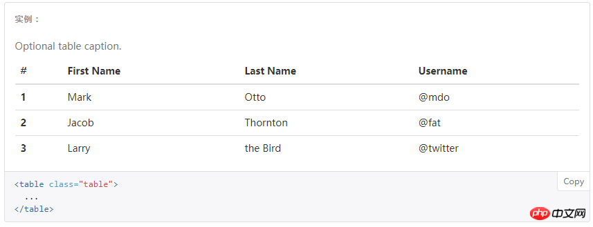
带条纹区分行的表格.table-striped

带边框的表格.table-border

带鼠标悬停是区分的表格.table-hover

表格行显示的样式,通过设置tr的class属性值来控制,常用属性值有.info/.success/.warning/.active/.danger

The above is the detailed content of Introduction to BootStrap basic styles. For more information, please follow other related articles on the PHP Chinese website!

Hot AI Tools

Undresser.AI Undress
AI-powered app for creating realistic nude photos

AI Clothes Remover
Online AI tool for removing clothes from photos.

Undress AI Tool
Undress images for free

Clothoff.io
AI clothes remover

Video Face Swap
Swap faces in any video effortlessly with our completely free AI face swap tool!

Hot Article
Hot Tools

Notepad++7.3.1
Easy-to-use and free code editor

SublimeText3 Chinese version
Chinese version, very easy to use

Zend Studio 13.0.1
Powerful PHP integrated development environment

Dreamweaver CS6
Visual web development tools

SublimeText3 Mac version
God-level code editing software (SublimeText3)
Hot Topics


 How to use bootstrap in vue
Apr 07, 2025 pm 11:33 PM
How to use bootstrap in vue
Apr 07, 2025 pm 11:33 PM
Using Bootstrap in Vue.js is divided into five steps: Install Bootstrap. Import Bootstrap in main.js. Use the Bootstrap component directly in the template. Optional: Custom style. Optional: Use plug-ins.
 How to get the bootstrap search bar
Apr 07, 2025 pm 03:33 PM
How to get the bootstrap search bar
Apr 07, 2025 pm 03:33 PM
How to use Bootstrap to get the value of the search bar: Determines the ID or name of the search bar. Use JavaScript to get DOM elements. Gets the value of the element. Perform the required actions.
 How to do vertical centering of bootstrap
Apr 07, 2025 pm 03:21 PM
How to do vertical centering of bootstrap
Apr 07, 2025 pm 03:21 PM
Use Bootstrap to implement vertical centering: flexbox method: Use the d-flex, justify-content-center, and align-items-center classes to place elements in the flexbox container. align-items-center class method: For browsers that do not support flexbox, use the align-items-center class, provided that the parent element has a defined height.
 How to write split lines on bootstrap
Apr 07, 2025 pm 03:12 PM
How to write split lines on bootstrap
Apr 07, 2025 pm 03:12 PM
There are two ways to create a Bootstrap split line: using the tag, which creates a horizontal split line. Use the CSS border property to create custom style split lines.
 How to set up the framework for bootstrap
Apr 07, 2025 pm 03:27 PM
How to set up the framework for bootstrap
Apr 07, 2025 pm 03:27 PM
To set up the Bootstrap framework, you need to follow these steps: 1. Reference the Bootstrap file via CDN; 2. Download and host the file on your own server; 3. Include the Bootstrap file in HTML; 4. Compile Sass/Less as needed; 5. Import a custom file (optional). Once setup is complete, you can use Bootstrap's grid systems, components, and styles to create responsive websites and applications.
 How to insert pictures on bootstrap
Apr 07, 2025 pm 03:30 PM
How to insert pictures on bootstrap
Apr 07, 2025 pm 03:30 PM
There are several ways to insert images in Bootstrap: insert images directly, using the HTML img tag. With the Bootstrap image component, you can provide responsive images and more styles. Set the image size, use the img-fluid class to make the image adaptable. Set the border, using the img-bordered class. Set the rounded corners and use the img-rounded class. Set the shadow, use the shadow class. Resize and position the image, using CSS style. Using the background image, use the background-image CSS property.
 How to use bootstrap button
Apr 07, 2025 pm 03:09 PM
How to use bootstrap button
Apr 07, 2025 pm 03:09 PM
How to use the Bootstrap button? Introduce Bootstrap CSS to create button elements and add Bootstrap button class to add button text
 How to resize bootstrap
Apr 07, 2025 pm 03:18 PM
How to resize bootstrap
Apr 07, 2025 pm 03:18 PM
To adjust the size of elements in Bootstrap, you can use the dimension class, which includes: adjusting width: .col-, .w-, .mw-adjust height: .h-, .min-h-, .max-h-
