
 Web Front-end
CSS Tutorial
Detailed explanation of examples of using box-shadow to realize curved edge shadow and warped edge shadow in css
Web Front-end
CSS Tutorial
Detailed explanation of examples of using box-shadow to realize curved edge shadow and warped edge shadow in css
Detailed explanation of examples of using box-shadow to realize curved edge shadow and warped edge shadow in css
This article mainly introduces CSS box-shadow to realize curved edge shadow and warped edge shadow. The editor thinks it is quite good. Now I will share it with you and give it as a reference. Let’s follow the editor and take a look.
Everyone knows that box-shadow is a new attribute of h5, which is used to achieve the effect of shadow on the edge of the box, but we often see various shadow styles in many scenes. , it is not simply the effect of shadows all around. How are they achieved? Today I will share with you two methods of achieving shadows.
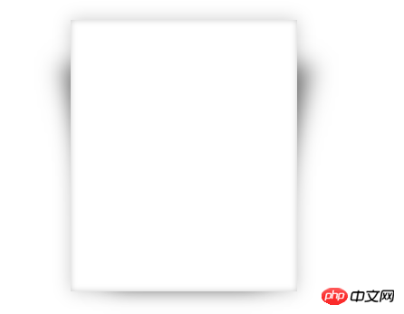
1. Curved edge shadow
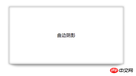
The effect picture is as follows: It is not only surrounded by shadows, but also has a layer of curved edge shadow at the bottom. The principle is actually very simple. First, the box itself has a shadow, and then another box with a shadow is used to overlap it to form the curved shadow in the rendering.

First let’s talk about the syntax of box-shadow. It supports the writing of multiple shadows, separated by commas, as follows
Create a box and use box-shadow to give the box an outer shadow and an inner shadow with a zero bloom radius of 10px in the x-axis and y-axis directions.
style{
      .box1{
                width: 400px;
                height: 200px;
                background: white;
                border: 1px solid lightgrey;
                margin: 100px auto;
                text-align: center;
                line-height: 200px;
                box-shadow: 0 0 10px rgba(0,0,0,0.3), 0 0 10px rgba(0,0,0,0.3) inset;
        }
}
body{
      <p class="box1">
      <span>曲边阴影</span>
      </p>
}Use the after pseudo-class selector to add a virtual label behind the box1 subset. Since it is a virtual label, the browser cannot recognize it, and the display attribute needs to be defined. Also add a shadow to this label. Since it is a curved surface, you need to set the border-radius to give it a curvature. Then use positioning to overlap the virtual label with the original box, and use z-index to change the level so that it is below p. The code is as follows
.box1::after{
                display: block;  //必须写
                content: "";     //必须写
                z-index: -1;
                width: 390px;
                height: 150px;
                background: red;
                position: absolute;
                bottom: 0;
                left: 4px;
                border-radius: 30px/10px;
                box-shadow: 0 8px 10px rgba(0,0,0,0.3);
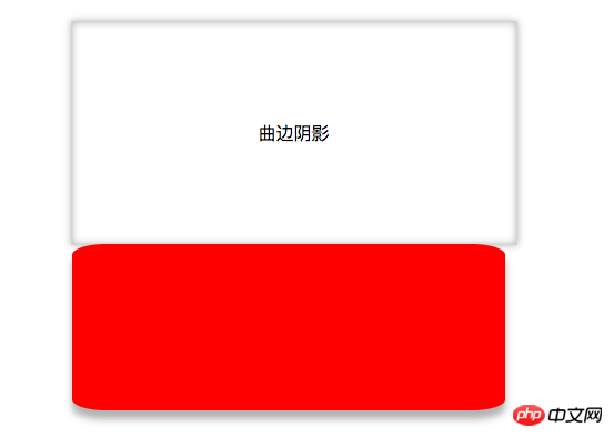
}When there is no positioning, the two boxes are arranged as follows:
It will be implemented after positioning Curved edge shadow: The result is as follows:
2. Curved edge shadow
Principle and curved edge shadow The same as the edge shadow, use the pseudo-class selectors ::afteryu and ::before to add two virtual labels, and use the overlap of shadows to achieve edge-warping shadows.
The code is as follows:
.box2::after,.box2::before{
                display: block;
                content: "";
                z-index: -1;
                width: 170px;
                height: 240px;
                background: red;
                position: absolute;
                bottom: 20px;
                left: 38px;
                box-shadow: 30px 10px 40px rgba(0,0,0,0.5);
                transform: skewX(-15deg);
            }
            .box2::before{
                box-shadow: -20px 10px 40px rgba(0,0,0,0.5);
                transform: skewX(15deg);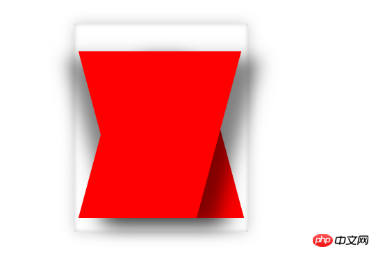
}In order to make it easier for us to see, a red background is given. The result without changing the level is as follows:
Adjust the levels of the two boxes, the effect is as follows:
The above is the detailed content of Detailed explanation of examples of using box-shadow to realize curved edge shadow and warped edge shadow in css. For more information, please follow other related articles on the PHP Chinese website!

Hot AI Tools

Undresser.AI Undress
AI-powered app for creating realistic nude photos

AI Clothes Remover
Online AI tool for removing clothes from photos.

Undress AI Tool
Undress images for free

Clothoff.io
AI clothes remover

Video Face Swap
Swap faces in any video effortlessly with our completely free AI face swap tool!

Hot Article
Hot Tools

Notepad++7.3.1
Easy-to-use and free code editor

SublimeText3 Chinese version
Chinese version, very easy to use

Zend Studio 13.0.1
Powerful PHP integrated development environment

Dreamweaver CS6
Visual web development tools

SublimeText3 Mac version
God-level code editing software (SublimeText3)
Hot Topics


 How to use bootstrap in vue
Apr 07, 2025 pm 11:33 PM
How to use bootstrap in vue
Apr 07, 2025 pm 11:33 PM
Using Bootstrap in Vue.js is divided into five steps: Install Bootstrap. Import Bootstrap in main.js. Use the Bootstrap component directly in the template. Optional: Custom style. Optional: Use plug-ins.
 The Roles of HTML, CSS, and JavaScript: Core Responsibilities
Apr 08, 2025 pm 07:05 PM
The Roles of HTML, CSS, and JavaScript: Core Responsibilities
Apr 08, 2025 pm 07:05 PM
HTML defines the web structure, CSS is responsible for style and layout, and JavaScript gives dynamic interaction. The three perform their duties in web development and jointly build a colorful website.
 Understanding HTML, CSS, and JavaScript: A Beginner's Guide
Apr 12, 2025 am 12:02 AM
Understanding HTML, CSS, and JavaScript: A Beginner's Guide
Apr 12, 2025 am 12:02 AM
WebdevelopmentreliesonHTML,CSS,andJavaScript:1)HTMLstructurescontent,2)CSSstylesit,and3)JavaScriptaddsinteractivity,formingthebasisofmodernwebexperiences.
 How to write split lines on bootstrap
Apr 07, 2025 pm 03:12 PM
How to write split lines on bootstrap
Apr 07, 2025 pm 03:12 PM
There are two ways to create a Bootstrap split line: using the tag, which creates a horizontal split line. Use the CSS border property to create custom style split lines.
 How to insert pictures on bootstrap
Apr 07, 2025 pm 03:30 PM
How to insert pictures on bootstrap
Apr 07, 2025 pm 03:30 PM
There are several ways to insert images in Bootstrap: insert images directly, using the HTML img tag. With the Bootstrap image component, you can provide responsive images and more styles. Set the image size, use the img-fluid class to make the image adaptable. Set the border, using the img-bordered class. Set the rounded corners and use the img-rounded class. Set the shadow, use the shadow class. Resize and position the image, using CSS style. Using the background image, use the background-image CSS property.
 How to use bootstrap button
Apr 07, 2025 pm 03:09 PM
How to use bootstrap button
Apr 07, 2025 pm 03:09 PM
How to use the Bootstrap button? Introduce Bootstrap CSS to create button elements and add Bootstrap button class to add button text
 How to set up the framework for bootstrap
Apr 07, 2025 pm 03:27 PM
How to set up the framework for bootstrap
Apr 07, 2025 pm 03:27 PM
To set up the Bootstrap framework, you need to follow these steps: 1. Reference the Bootstrap file via CDN; 2. Download and host the file on your own server; 3. Include the Bootstrap file in HTML; 4. Compile Sass/Less as needed; 5. Import a custom file (optional). Once setup is complete, you can use Bootstrap's grid systems, components, and styles to create responsive websites and applications.
 How to resize bootstrap
Apr 07, 2025 pm 03:18 PM
How to resize bootstrap
Apr 07, 2025 pm 03:18 PM
To adjust the size of elements in Bootstrap, you can use the dimension class, which includes: adjusting width: .col-, .w-, .mw-adjust height: .h-, .min-h-, .max-h-
