

Detailed explanation of graphic code about box-sizing in css3

1. Read through the introduction on w3cschool: CSS3 box-sizing attribute_w3cschool.
2. I don’t understand it deeply enough after reading the introduction, and I am one of those people who can forget it in the blink of an eye after reading it. Out of concern for myself, I still take the example offline and take a look:
<!DOCTYPE html><html><head>
<meta charset="utf-8">
<title></title>
<style>
.container {
width:30em;
border:1em solid;
}
.box {
box-sizing:border-box;
-moz-box-sizing:border-box; /* Firefox */
width:50%;
border:1em solid red;
float:left;
}
</style></head><body><p class="container">
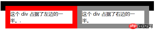
<p class="box">这个 p 占据了左边的一半。.</p>
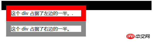
<p class="box" style="border:1em solid #888;">这个 p 占据了右边的一半。</p></p></body></html>Use firebug in Firefox to look at the layout, and change the box-sizing attribute to content-box (or After removing box-sizing (default box-sizing:content-box), as shown in the figure below.
After comparison, we found:
When the box-sizing of the parent element with the class name .container is not set, which is the default value content-box or box-sizing: border-box, There are two situations:
 (outermost parent element)
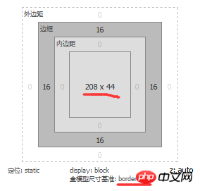
1) When the box-sizing: border-box of two child elements , the width is 208px, including the set border-left-width and border-right-width (both 16px), the result is 240px, which is half of the width of the parent element, as shown in the figure below (the left is the layout diagram, the right is the page Actual effect): (i.e. half of the parent element width+border-left-width+border-right-width)
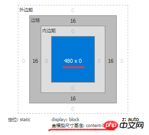
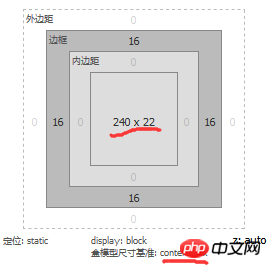
2 ) When the box-sizing:content-box of two sub-elements, the width is 240px, padding and margin are excluded, as shown in the following figure (the left is the layout diagram, the right is the actual page effect):
3. When setting box-sizing:border-box on an element, it actually makes its width = padding-left + padding-right + border- left-width + border-right-width, but does not include margin-left and margin-right.
Okay, I finally understand.
The above is the detailed content of Detailed explanation of graphic code about box-sizing in css3. For more information, please follow other related articles on the PHP Chinese website!

Hot AI Tools

Undresser.AI Undress
AI-powered app for creating realistic nude photos

AI Clothes Remover
Online AI tool for removing clothes from photos.

Undress AI Tool
Undress images for free

Clothoff.io
AI clothes remover

Video Face Swap
Swap faces in any video effortlessly with our completely free AI face swap tool!

Hot Article
Hot Tools

Notepad++7.3.1
Easy-to-use and free code editor

SublimeText3 Chinese version
Chinese version, very easy to use

Zend Studio 13.0.1
Powerful PHP integrated development environment

Dreamweaver CS6
Visual web development tools

SublimeText3 Mac version
God-level code editing software (SublimeText3)
Hot Topics


 How to achieve wave effect with pure CSS3? (code example)
Jun 28, 2022 pm 01:39 PM
How to achieve wave effect with pure CSS3? (code example)
Jun 28, 2022 pm 01:39 PM
How to achieve wave effect with pure CSS3? This article will introduce to you how to use SVG and CSS animation to create wave effects. I hope it will be helpful to you!
 Use CSS skillfully to realize various strange-shaped buttons (with code)
Jul 19, 2022 am 11:28 AM
Use CSS skillfully to realize various strange-shaped buttons (with code)
Jul 19, 2022 am 11:28 AM
This article will show you how to use CSS to easily realize various weird-shaped buttons that appear frequently. I hope it will be helpful to you!
 How to hide elements in css without taking up space
Jun 01, 2022 pm 07:15 PM
How to hide elements in css without taking up space
Jun 01, 2022 pm 07:15 PM
Two methods: 1. Using the display attribute, just add the "display:none;" style to the element. 2. Use the position and top attributes to set the absolute positioning of the element to hide the element. Just add the "position:absolute;top:-9999px;" style to the element.
 How to implement lace borders in css3
Sep 16, 2022 pm 07:11 PM
How to implement lace borders in css3
Sep 16, 2022 pm 07:11 PM
In CSS, you can use the border-image attribute to achieve a lace border. The border-image attribute can use images to create borders, that is, add a background image to the border. You only need to specify the background image as a lace style; the syntax "border-image: url (image path) offsets the image border width inward. Whether outset is repeated;".
 How to enlarge the image by clicking the mouse in css3
Apr 25, 2022 pm 04:52 PM
How to enlarge the image by clicking the mouse in css3
Apr 25, 2022 pm 04:52 PM
Implementation method: 1. Use the ":active" selector to select the state of the mouse click on the picture; 2. Use the transform attribute and scale() function to achieve the picture magnification effect, the syntax "img:active {transform: scale(x-axis magnification, y Axis magnification);}".
 It turns out that text carousel and image carousel can also be realized using pure CSS!
Jun 10, 2022 pm 01:00 PM
It turns out that text carousel and image carousel can also be realized using pure CSS!
Jun 10, 2022 pm 01:00 PM
How to create text carousel and image carousel? The first thing everyone thinks of is whether to use js. In fact, text carousel and image carousel can also be realized using pure CSS. Let’s take a look at the implementation method. I hope it will be helpful to everyone!
 How to set animation rotation speed in css3
Apr 28, 2022 pm 04:32 PM
How to set animation rotation speed in css3
Apr 28, 2022 pm 04:32 PM
In CSS3, you can use the "animation-timing-function" attribute to set the animation rotation speed. This attribute is used to specify how the animation will complete a cycle and set the speed curve of the animation. The syntax is "element {animation-timing-function: speed attribute value;}".
 Does css3 animation effect have deformation?
Apr 28, 2022 pm 02:20 PM
Does css3 animation effect have deformation?
Apr 28, 2022 pm 02:20 PM
The animation effect in css3 has deformation; you can use "animation: animation attribute @keyframes ..{..{transform: transformation attribute}}" to achieve deformation animation effect. The animation attribute is used to set the animation style, and the transform attribute is used to set the deformation style. .
