

Detailed introduction to flexible layout (Flex layout)

1. Flexible Layout
In normal times, the layout types we commonly use include the following:
1. Floating +Positioning
2. Adaptive (percentage)
3.Responsive layout
4. Flexible layout (Flex layout)
What to sort out today It is a more commonly used flexible layout, but there is a difference between block tags and inline block tags.
{:;
}
input{
  :;
}Of course not everything can be liked by everyone like money, it also has its own advantages and disadvantages.
Advantages: Compatibility supports all browsers (Webkit-based browsers must add -webkit-), can be adjusted according to user preferences, and any container can be designated as Flex layout.
Disadvantages: Because the flexible layout is adjustable, there are huge possibilities and it takes a lot of time to adjust; some flexible designs require separate styles for IE6, but...how many people are still using IE6 ( ⊙﹏⊙)b.
Note: When we use flexible layout, float, clear and vertical-align in CSS will become invalid.
2. Properties of flexible layout
The first is the property of the container that serves as flexible layout.
1.flex-direction property
flex-direction determines the direction of the container.
div {
  flex-direction: row | row-reverse | column | column-reverse;
}The four values are: row (default value) from left to right, row-reverse from right to left, column from top to bottom, column-reverse from bottom to top .
2.flex-wrap attribute
The default layout is generally in the same row, when the flex-wrap attribute is set, the content that cannot be arranged will be automatically wrapped.
div{
  flex-wrap: nowrap | wrap | wrap-reverse;
}The four values are: nowrap (default value) does not wrap, wrap wraps downwards, and wrap-reverse wraps upwards.
3.flex-flow attribute
The flex-flow attribute is the above two The shorthand form of the attribute, the default value is row nowrap.
div {
  flex-flow: <flex-direction> || <flex-wrap>;
}
4.justify-content attribute
The justify-content attribute defines the alignment in the direction of the container.
div {
  justify-content: flex-start | flex-end | center | space-between | space-around;
} flex-start(Default value): Align to the left.
flex-end: Align to the right.
center: Center alignment.
Space-between: Align both ends, each sub-element is equally spaced, and there is no gap between the sub-element and the container border.
space-around: The space on both sides of each child element is equal. The spacing between child elements is twice as large as the spacing between the child elements and the container border.
5.align-items attribute
The align-items attribute is defined in the vertical container Alignment in direction.
div {
  align-items: flex-start | flex-end | center | baseline | stretch;
} flex-start: Align the starting point in the vertical direction.
flex-end: Vertical endpoint alignment.
Center: Align the midpoint in the vertical direction.
baseline: Aligned with the baseline of the text in the first child element.
stretch(Default value): If the child element has no height set or the height is set to auto, then it will occupy the entire height of the container.
6.align-content attribute
The align-content attribute defines the child element Alignment in both directions.
div {
  align-content: flex-start | flex-end | center | space-between | space-around | stretch;
} flex-start:当容器方向子元素刚好填满时,与垂直方向的起点对齐。
flex-end:当容器方向子元素刚好填满时,与垂直方向的终点对齐。
center:当容器方向子元素刚好填满时,与垂直方向的中点对齐。
space-between:当容器方向子元素刚好填满时,垂直方向两端对齐,子元素之间的等距离间隔。
space-around:两个方向两侧的间隔都相等。所以,轴线之间的间隔比轴线与边框的间隔大一倍。
stretch(默认值):占满整个垂直方向。
下面就是具有弹性布局容器中子元素的属性
1.order属性
order属性定义了子元素的排列顺序,数值小的在前。
.son {
  order: <integer>;
}
2.flex-grow属性
flex-grow属性定义了子元素的放大比例,默认值为0。
.son {
flex-grow: <number>; /* default 0 */}当给所有子元素设置该属性为1,那么将等分所有空间,如果单独给某一个子元素设置n倍,那么该子元素将占据的空间比其他子元素多n倍。
3.flex-shrink属性
flex-shrink属性定义了子元素的缩小比例,默认值为1。
.son {
flex-shrink: <number>; /* default 1 */}给所有子元素设置该属性为1,当空间不足时那么所有子元素将等比例缩小平分所有空间,如果单独给某一个子元素设置0,那么该子元素将在空间不足时不缩小。
4.flex-basis属性
该属性定义了给子元素分配空间时其占据的空间为多少,可以设置为与其width和height属性一样的值,那么它将被分配固定的空间大小。
5.flex属性
该属性为flex-grow, flex-shrink 和 flex-basis的简写。
6.align-self属性
该属性允许设置过的子元素有与其他子元素不一样的对齐方式,可以覆盖align-items属性。
.son {
  align-self: auto | flex-start | flex-end | center | baseline | stretch;
}auto: Default value, indicating that the align-items attribute of the parent is inherited by default.
flex-start: Align the starting point in the vertical direction.
flex-end: Vertical endpoint alignment.
Center: Align the midpoint in the vertical direction.
baseline: Aligned with the baseline of the text in the first child element.
stretch(Default value): If the child element has no height set or the height is set to auto, then it will occupy the entire height of the container.
Flex layout (flexible layout)
1. The properties of the container are: flex-direction: (determines the direction of the main axis) (that is, the direction of the arrangement of items) value :row/row-reverse/column/column-reverse/ flex-wrap: (How to wrap if one axis cannot be arranged) Value: nowrap (default): no line wrapping. wrap: wrap, with the first line at the top. wrap-reverse: wrap, first line below. flex-flow: (The flex-flow property is the abbreviation of the flex-direction property and the flex-wrap property. The default value is row nowrap) justify-content: (The justify-content property defines the alignment of the item on the main axis.) Take Values: flex-start (default): left-aligned flex-end: right-aligned center: centered space-between: aligned on both ends, with equal spacing between items. space-around: Each item is equally spaced on both sides. Therefore, the space between items is twice as large as the space between items and the border. align-items (how to align on the cross axis) Value: flex-start/flex-end/center/baseline/stretch align-content (defines the alignment of multiple axes. If the item has only one axis, this attribute has no effect Function) Value: flex-start: Align with the starting point of the cross axis. flex-end: aligned with the end point of the cross axis. center: Aligned with the midpoint of the cross axis. space-between: Align with both ends of the cross axis, and the intervals between the axes are evenly distributed. space-around: Each axis is equally spaced on both sides. Therefore, the distance between the axes is twice as large as the distance between the axes and the frame. stretch (default): The axis occupies the entire cross axis. . The smaller the value, the farther forward the arrangement is. The default is 0. The flex-grow attribute defines the enlargement ratio of the item. The default is 0, that is, if there is remaining space, it will not be enlarged. The flex-shrink attribute defines the reduction ratio of the item. The default is 1. i.e. if there is insufficient space, the item will shrink. The main axis space occupied by flex-basis items (main size). The browser uses this attribute to calculate whether there is extra space on the main axis. Its default value is auto, which is the original size of the project. flex align-self allows a single item to be aligned differently from other items, overriding the align-items property. The default value is auto, which means inheriting the align-items attribute of the parent element. If there is no parent element, it is equivalent to stretch.
The above is the detailed content of Detailed introduction to flexible layout (Flex layout). For more information, please follow other related articles on the PHP Chinese website!

Hot AI Tools

Undresser.AI Undress
AI-powered app for creating realistic nude photos

AI Clothes Remover
Online AI tool for removing clothes from photos.

Undress AI Tool
Undress images for free

Clothoff.io
AI clothes remover

Video Face Swap
Swap faces in any video effortlessly with our completely free AI face swap tool!

Hot Article
Hot Tools

Notepad++7.3.1
Easy-to-use and free code editor

SublimeText3 Chinese version
Chinese version, very easy to use

Zend Studio 13.0.1
Powerful PHP integrated development environment

Dreamweaver CS6
Visual web development tools

SublimeText3 Mac version
God-level code editing software (SublimeText3)
Hot Topics


 Windows 11: The easy way to import and export start layouts
Aug 22, 2023 am 10:13 AM
Windows 11: The easy way to import and export start layouts
Aug 22, 2023 am 10:13 AM
In Windows 11, the Start menu has been redesigned and features a simplified set of apps arranged in a grid of pages, unlike its predecessor, which had folders, apps, and apps on the Start menu. Group. You can customize the Start menu layout and import and export it to other Windows devices to personalize it to your liking. In this guide, we’ll discuss step-by-step instructions for importing Start Layout to customize the default layout on Windows 11. What is Import-StartLayout in Windows 11? Import Start Layout is a cmdlet used in Windows 10 and earlier versions to import customizations for the Start menu into
 How to save desktop icon position layout in Windows 11
Aug 23, 2023 pm 09:53 PM
How to save desktop icon position layout in Windows 11
Aug 23, 2023 pm 09:53 PM
Windows 11 brings a lot to the table in terms of user experience, but the iteration isn't entirely error-proof. Users run into issues from time to time, and changes to icon positioning are common. So how to save desktop layout in Windows 11? There are built-in and third-party solutions for this task, whether it's saving the screen resolution of the current window or the arrangement of desktop icons. This becomes even more important for users who have a bunch of icons on their desktop. Read on to learn how to save desktop icon locations in Windows 11. Why doesn't Windows 11 save icon layout positions? Here are the main reasons why Windows 11 does not save desktop icon layout: Changes to display settings: Typically, when you modify display settings, the configured customizations
 Guide to solving misalignment of WordPress web pages
Mar 05, 2024 pm 01:12 PM
Guide to solving misalignment of WordPress web pages
Mar 05, 2024 pm 01:12 PM
Guide to solving misaligned WordPress web pages In WordPress website development, sometimes we encounter web page elements that are misaligned. This may be due to screen sizes on different devices, browser compatibility, or improper CSS style settings. To solve this misalignment, we need to carefully analyze the problem, find possible causes, and debug and repair it step by step. This article will share some common WordPress web page misalignment problems and corresponding solutions, and provide specific code examples to help develop
 How to create a responsive carousel layout using HTML and CSS
Oct 20, 2023 pm 04:24 PM
How to create a responsive carousel layout using HTML and CSS
Oct 20, 2023 pm 04:24 PM
How to create a responsive carousel layout using HTML and CSS Carousels are a common element in modern web design. It can attract the user's attention, display multiple contents or images, and switch automatically. In this article, we will introduce how to create a responsive carousel layout using HTML and CSS. First, we need to create a basic HTML structure and add the required CSS styles. The following is a simple HTML structure: <!DOCTYPEhtml&g
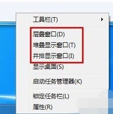 Introducing the window arrangement method in win7
Dec 26, 2023 pm 04:37 PM
Introducing the window arrangement method in win7
Dec 26, 2023 pm 04:37 PM
When we open multiple windows at the same time, win7 has the function of arranging multiple windows in different ways and then displaying them at the same time, which allows us to view the contents of each window more clearly. So how many window arrangements are there in win7? What do they look like? Let’s take a look with the editor. There are several ways to arrange Windows 7 windows: three, namely cascading windows, stacked display windows and side-by-side display windows. When we open multiple windows, we can right-click on an empty space on the taskbar. You can see three window arrangements. 1. Cascading windows: 2. Stacked display windows: 3. Display windows side by side:
 Flexible application skills of position attribute in H5
Dec 27, 2023 pm 01:05 PM
Flexible application skills of position attribute in H5
Dec 27, 2023 pm 01:05 PM
How to flexibly use the position attribute in H5. In H5 development, the positioning and layout of elements are often involved. At this time, the CSS position property will come into play. The position attribute can control the positioning of elements on the page, including relative positioning, absolute positioning, fixed positioning and sticky positioning. This article will introduce in detail how to flexibly use the position attribute in H5 development.
 What are the commonly used Flex layout properties?
Feb 25, 2024 am 10:42 AM
What are the commonly used Flex layout properties?
Feb 25, 2024 am 10:42 AM
What are the common properties of flex layout? Specific code examples are required. Flex layout is a powerful tool for designing responsive web page layouts. It makes it easy to control the arrangement and size of elements in a web page by using a flexible set of properties. In this article, I will introduce the common properties of Flex layout and provide specific code examples. display: Set the display mode of the element to Flex. .container{display:flex;}flex-directi
 Syntax usage scenarios of contain in CSS
Feb 21, 2024 pm 02:00 PM
Syntax usage scenarios of contain in CSS
Feb 21, 2024 pm 02:00 PM
Syntax usage scenarios of contain in CSS In CSS, contain is a useful attribute that specifies whether the content of an element is independent of its external style and layout. It helps developers better control page layout and optimize performance. This article will introduce the syntax usage scenarios of the contain attribute and provide specific code examples. The syntax of the contain attribute is as follows: contain:layout|paint|size|style|'none'|'stric
