
 Web Front-end
CSS Tutorial
Detailed explanation on CSS3 multiple backgrounds and background image cropping, positioning and size
Web Front-end
CSS Tutorial
Detailed explanation on CSS3 multiple backgrounds and background image cropping, positioning and size
Detailed explanation on CSS3 multiple backgrounds and background image cropping, positioning and size

Before CSS3 we could add a image to the background
CSS3 allowed us to add multiple images to one element
Multiple background images
<p class="demo"></p>
.demo { width: 600px; height: 200px; border: 1px solid black; background: url('1.png') no-repeat;}
Multiple backgrounds You can add multiple image resources to the background attribute, separate them with commas
and then use background -position Position them where you want
.demo { width: 600px; height: 200px; border: 1px solid black; background: url('1.png') no-repeat, url('2.png') no-repeat 200px 0, url('3.png') no-repeat 400px 0;}
If no-repeat is not set, the image resources below will overwrite the image resources above
Pictures Starting positionbackground-origin
background-origin allows us to define where the image starts to be positioned
optional attribute valuepadding-box (default), border-box, content-box;
padding-box default image starts from padding
We can add padding to prove this
.demo { width: 600px; height: 200px; border: 20px solid gray/*改*/; padding: 20px/*增*/; background: url('1.png') no-repeat, url('2.png') no-repeat 200px 0, url('3.png') no-repeat 400px 0;}[Note: Comments cannot be used in css. I am commenting like this for the purpose of highlighting. Don’t be misled] 
border-box defines the image starting from the border
.demo { width: 600px; height: 200px; border: 20px solid gray; padding: 20px; background: url('1.png') no-repeat, url('2.png') no-repeat 200px 0, url('3.png') no-repeat 400px 0; background-origin: border-box/*增*/;}
After changing to border-box, we found that part of the image was blocked at the bottom of the gray background color
It can be understood that the border should actually be above the element
.demo { width: 600px; height: 200px; border: 20px solid gray; padding: 20px; background: url('1.png') no-repeat, url('2.png') no-repeat 200px 0, url('3.png') no-repeat 400px 0; background-origin: content-box/*改*/;}content-box defines the starting position from the content part of the element
Picture croppingbackground-clip
Although we The starting position is set to the content area
But this does not mean that our picture is limited to the content area
It can be drawn within the entire element border and within the border
You can slightly modify the above code to prove This
.demo { width: 600px; height: 200px; border: 20px solid transparent/*改*/; padding: 20px; background: url('1.png') no-repeat, url('2.png') no-repeat 200px 0, url('3.png')/*删掉no-repeat 默认repeat*/ 400px 0; background-origin: content-box;}
So is there a way to set the range of image display?
This uses our background-clip attribute
and content-origin attributes The values are similar
There are padding-box (default), border-box, content-box;
Set the image display range, as if it has been cropped
.demo { width: 600px; height: 200px; border: 20px solid transparent; padding: 20px; background: url('1.png') no-repeat, url('2.png') no-repeat 200px 0, url('3.png') 400px 0; background-origin: content-box; background-clip: content-box/*增*/;}
In this way, the excess part of the image will not be visible.
The image cropping attribute in our webkit also has a special attribute value which is text
It means that the background image is limited to the text
Combined with text-fill-color, a unique masking text effect can be formed. Learn about
<p class="demo">某科学的超电磁炮</p> <--添加内容
.demo {    width: 600px;    height: 200px;    border: 20px solid transparent;    padding: 20px;    background: url('1.png') no-repeat,                url('2.png') no-repeat 200px 0,                url('3.png') 400px 0;    background-origin: content-box;    -webkit-background-clip: text;/*增*/
    -webkit-text-fill-color: transparent;/*增*/
    font: 75px/200px bold;/*增*/}
background-size
Back to one of our picturesBackground-size This attribute allows us to control the size of the picture
For example, write two pixel values to control the width and height
.demo {/*新*/
width: 600px; height: 200px; border: 1px solid black; background: url('1.png') no-repeat; background-size: 180px 140px;} Write one pixel The value means that the width and height are the same in pixels
Of course it can also be written in percentage form
In addition, there are two keywords: cover and contain
cover covers the entire area. In our example, the width will be full
.demo { width: 600px; height: 200px; border: 1px solid black; background: url('1.png') no-repeat; background-size: cover/*改*/;}
contain is to ensure that the image is displayed at its maximum within the area, and in our example the height will be full
.demo { width: 600px; height: 200px; border: 1px solid black; background: url('1.png') no-repeat; background-size: contain;}
The above is the detailed content of Detailed explanation on CSS3 multiple backgrounds and background image cropping, positioning and size. For more information, please follow other related articles on the PHP Chinese website!

Hot AI Tools

Undresser.AI Undress
AI-powered app for creating realistic nude photos

AI Clothes Remover
Online AI tool for removing clothes from photos.

Undress AI Tool
Undress images for free

Clothoff.io
AI clothes remover

Video Face Swap
Swap faces in any video effortlessly with our completely free AI face swap tool!

Hot Article
Hot Tools

Notepad++7.3.1
Easy-to-use and free code editor

SublimeText3 Chinese version
Chinese version, very easy to use

Zend Studio 13.0.1
Powerful PHP integrated development environment

Dreamweaver CS6
Visual web development tools

SublimeText3 Mac version
God-level code editing software (SublimeText3)
Hot Topics


 How to achieve wave effect with pure CSS3? (code example)
Jun 28, 2022 pm 01:39 PM
How to achieve wave effect with pure CSS3? (code example)
Jun 28, 2022 pm 01:39 PM
How to achieve wave effect with pure CSS3? This article will introduce to you how to use SVG and CSS animation to create wave effects. I hope it will be helpful to you!
 How do I crop an IFrame in HTML?
Aug 29, 2023 pm 04:33 PM
How do I crop an IFrame in HTML?
Aug 29, 2023 pm 04:33 PM
Inline frames are called iframes in HTML. A label specifies a rectangular area within the content where the browser can display different documents with scroll bars and borders. To embed another document within the current HTML document, use inline frames. A reference to an element can be specified using the HTMLiframe name attribute. In JavaScript, references to elements are also made using the name attribute. An iframe is essentially used to display a web page within the currently displayed web page. The URL of the document containing the iframe is specified using the "src" attribute. Syntax The following is the syntax of HTML <iframesrc="URL"title="d
 How to crop crooked pictures in photoshop? PS crop and tilt photo tutorial
Mar 25, 2024 pm 10:07 PM
How to crop crooked pictures in photoshop? PS crop and tilt photo tutorial
Mar 25, 2024 pm 10:07 PM
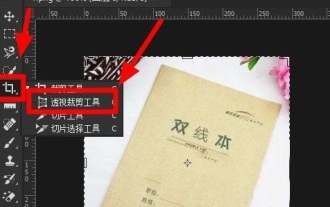
Some users find that some things in the picture are crooked and cannot be directly selected and cropped. Is there any way to straighten the things in the picture? In fact, this operation is very simple for PS masters. Here, the editor will tell the novice PS users how to crop crooked pictures into straight ones in Photoshop. This method is very easy to operate. I hope it can help everyone. PS tutorial for cropping tilted photos 1. Open Photoshop, move the mouse to the cropping tool on the left, then right-click the mouse and select "Perspective Cropping Tool". 2. Select the picture that needs to be straightened and determine the four points. 3. Then press the Enter key to straighten it successfully. 4. In this way, the things in the photo will be corrected, and
 Use CSS skillfully to realize various strange-shaped buttons (with code)
Jul 19, 2022 am 11:28 AM
Use CSS skillfully to realize various strange-shaped buttons (with code)
Jul 19, 2022 am 11:28 AM
This article will show you how to use CSS to easily realize various weird-shaped buttons that appear frequently. I hope it will be helpful to you!
 How to hide elements in css without taking up space
Jun 01, 2022 pm 07:15 PM
How to hide elements in css without taking up space
Jun 01, 2022 pm 07:15 PM
Two methods: 1. Using the display attribute, just add the "display:none;" style to the element. 2. Use the position and top attributes to set the absolute positioning of the element to hide the element. Just add the "position:absolute;top:-9999px;" style to the element.
 iOS 17: How to use one-click cropping in photos
Sep 20, 2023 pm 08:45 PM
iOS 17: How to use one-click cropping in photos
Sep 20, 2023 pm 08:45 PM
With the iOS 17 Photos app, Apple makes it easier to crop photos to your specifications. Read on to learn how. Previously in iOS 16, cropping an image in the Photos app involved several steps: Tap the editing interface, select the crop tool, and then adjust the crop using a pinch-to-zoom gesture or dragging the corners of the crop tool. In iOS 17, Apple has thankfully simplified this process so that when you zoom in on any selected photo in your Photos library, a new Crop button automatically appears in the upper right corner of the screen. Clicking on it will bring up the full cropping interface with the zoom level of your choice, so you can crop to the part of the image you like, rotate the image, invert the image, or apply screen ratio, or use markers
 How to implement lace borders in css3
Sep 16, 2022 pm 07:11 PM
How to implement lace borders in css3
Sep 16, 2022 pm 07:11 PM
In CSS, you can use the border-image attribute to achieve a lace border. The border-image attribute can use images to create borders, that is, add a background image to the border. You only need to specify the background image as a lace style; the syntax "border-image: url (image path) offsets the image border width inward. Whether outset is repeated;".
 How to enlarge the image by clicking the mouse in css3
Apr 25, 2022 pm 04:52 PM
How to enlarge the image by clicking the mouse in css3
Apr 25, 2022 pm 04:52 PM
Implementation method: 1. Use the ":active" selector to select the state of the mouse click on the picture; 2. Use the transform attribute and scale() function to achieve the picture magnification effect, the syntax "img:active {transform: scale(x-axis magnification, y Axis magnification);}".
