
 Web Front-end
H5 Tutorial
HTML5 practice-an introduction to how to use the ViewPort meta tag in non-responsive design
Web Front-end
H5 Tutorial
HTML5 practice-an introduction to how to use the ViewPort meta tag in non-responsive design
HTML5 practice-an introduction to how to use the ViewPort meta tag in non-responsive design

Everyone knows the significance of the viewport tag for responsive design, but you may not know that it also plays a significant role in non-responsive design. If your site is still non-responsive, then in this article you will learn how to use the viewport tag to enhance the display effect of your site on mobile devices.
General use of the Viewport tag
The Viewport meta tag is generally used in responsive design to design the width and initial-scale of the viewport of mobile devices.
<meta name="viewport" content="width=device-width, initial-scale=1.0">
Use Viewport in non-responsive design
As we all know, the default viewport width of iPhone is 980px. But your design may not fit within this range. Sometimes it’s wider, sometimes it’s narrower. The following two examples will show you when you can use the viewport tag to enhance the display effect of non-responsive designs on mobile devices.
Example
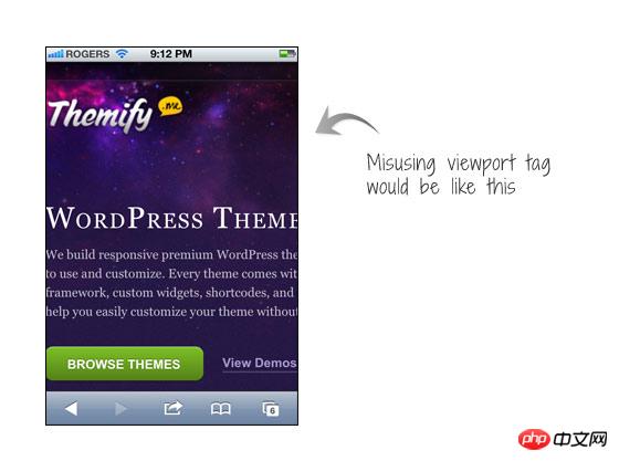
View the Themify site on iPhone.

The picture on the left side of the screenshot shows the effect of the site when the viewport tag is not used. We can see that the page reaches the edge of the screen. The picture on the right side of the screenshot is the effect after I added the viewport tag. I set the width of the viewport to 1024. At this time, the page and the mobile phone screen will maintain a certain distance on the left and right.
<meta name="viewport" content="width=1024">
Another example
If your design is too narrow, problems will also occur. Assume that your design is non-responsive and the container width is 700px. The effect will be like the picture on the left side of the screenshot, which will create a large gap on the right side of the mobile phone screen.
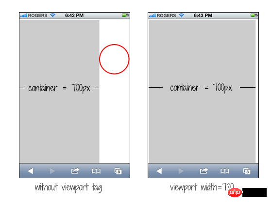
We can fix this problem by simply adding a viewport with a width of 720px. We haven't made any changes to your design, but iPhone will adjust to accommodate your 720px width.
<meta name="viewport" content="width=720">
Common Mistakes
A common mistake is that people will set the initial-scale=1 parameter for non-responsive designs. In this way, the page will be displayed at 100% proportion and the proportion will not be adjusted. This forces people to move the page or perform a zoom-out operation to view the entire page. The worst case scenario is when people use user-scalable=no or maximum-scale=1 together with initial-scale=1. This disables the site's ability to zoom, making it impossible for users to view the entire page this way. So you must remember that if your site is not designed to be responsive, then don’t set it up like this!
<meta name="viewport" content="initial-scale=1, maximum-scale=1, user-scalable=no">
The above is the detailed content of HTML5 practice-an introduction to how to use the ViewPort meta tag in non-responsive design. For more information, please follow other related articles on the PHP Chinese website!

Hot AI Tools

Undresser.AI Undress
AI-powered app for creating realistic nude photos

AI Clothes Remover
Online AI tool for removing clothes from photos.

Undress AI Tool
Undress images for free

Clothoff.io
AI clothes remover

Video Face Swap
Swap faces in any video effortlessly with our completely free AI face swap tool!

Hot Article
Hot Tools

Notepad++7.3.1
Easy-to-use and free code editor

SublimeText3 Chinese version
Chinese version, very easy to use

Zend Studio 13.0.1
Powerful PHP integrated development environment

Dreamweaver CS6
Visual web development tools

SublimeText3 Mac version
God-level code editing software (SublimeText3)
Hot Topics


 Table Border in HTML
Sep 04, 2024 pm 04:49 PM
Table Border in HTML
Sep 04, 2024 pm 04:49 PM
Guide to Table Border in HTML. Here we discuss multiple ways for defining table-border with examples of the Table Border in HTML.
 Nested Table in HTML
Sep 04, 2024 pm 04:49 PM
Nested Table in HTML
Sep 04, 2024 pm 04:49 PM
This is a guide to Nested Table in HTML. Here we discuss how to create a table within the table along with the respective examples.
 HTML margin-left
Sep 04, 2024 pm 04:48 PM
HTML margin-left
Sep 04, 2024 pm 04:48 PM
Guide to HTML margin-left. Here we discuss a brief overview on HTML margin-left and its Examples along with its Code Implementation.
 HTML Table Layout
Sep 04, 2024 pm 04:54 PM
HTML Table Layout
Sep 04, 2024 pm 04:54 PM
Guide to HTML Table Layout. Here we discuss the Values of HTML Table Layout along with the examples and outputs n detail.
 HTML Input Placeholder
Sep 04, 2024 pm 04:54 PM
HTML Input Placeholder
Sep 04, 2024 pm 04:54 PM
Guide to HTML Input Placeholder. Here we discuss the Examples of HTML Input Placeholder along with the codes and outputs.
 HTML Ordered List
Sep 04, 2024 pm 04:43 PM
HTML Ordered List
Sep 04, 2024 pm 04:43 PM
Guide to the HTML Ordered List. Here we also discuss introduction of HTML Ordered list and types along with their example respectively
 Moving Text in HTML
Sep 04, 2024 pm 04:45 PM
Moving Text in HTML
Sep 04, 2024 pm 04:45 PM
Guide to Moving Text in HTML. Here we discuss an introduction, how marquee tag work with syntax and examples to implement.
 HTML onclick Button
Sep 04, 2024 pm 04:49 PM
HTML onclick Button
Sep 04, 2024 pm 04:49 PM
Guide to HTML onclick Button. Here we discuss their introduction, working, examples and onclick Event in various events respectively.
