A simple case introduction of responsive layout
Responsive layout
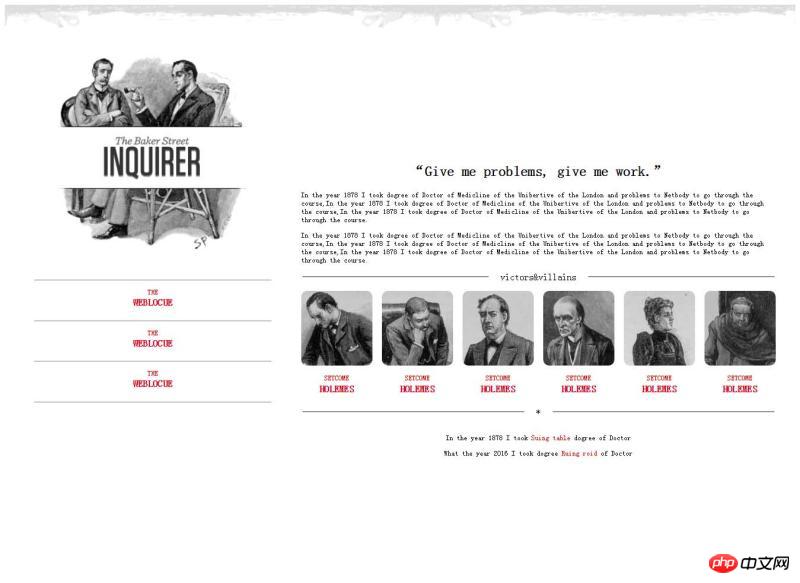
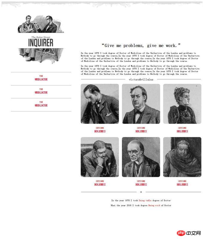
Responsive layout has strong flexibility in facing devices with different resolutions, and is basically used in daily web design. To use responsive layout design, it provides us with a good user browsing page and can bring us a better customer experience. Let me share with you a simple responsive layout I made:


#Different pages will adapt to different browser page sizes, which will change as the resolution changes. The code is shown below:
<!DOCTYPE html>
<html>
<head>
<meta charset="utf-8" />
<title></title>
<style>
  p{
    font-size: 12px;
  }
  header{
    width: 100%;
  }
  header img{
    width: 100%;
  }
  @media (min-width: 1300px) and (max-width:1400px) {
    #left{
      float: left;
      width: 30%;
      margin: 0px 50px;
    }
    #left #logo-bg{
      margin: 10% 10%;
      width: 80%;
      position: relative;
    }
    #left #logo{
      float: left;
      width: 12%;
      position: absolute;
      left: 13%;
      top: 230px;
    }
    #left p{
      margin-bottom: -20px;
    }
    #left p,h4{
      text-align: center;
      color: red;
    }
    #right{
      float: left;
      width: 60%;
      margin: 15% 0px;
    }
    #right h2{
      text-align: center;
    }
    #right fieldset{
      text-align: center;
      border-left: none;
      border-right: none;
      border-bottom: none;
    }
    #right fieldset legend{
      padding: 0px 20px;
    }
    #fen{
      width: 100%;
      -webkit-column-count: 6;
      -moz-column-count: 6;
      -o-column-count: 6;
      -ms-column-count: 6;
      column-count: 6;
      -webkit-column-gap: 1em;
      -moz-column-gap: 1em;
      -o-column-gap: 1em;
      -ms-column-gap: 1em;
      column-gap: 1em;
    }
    #fen img{
      width: 100%;
      border-radius: 10px 10px 10px 10px;
    }
    #fen p,h4{
      text-align: center;
      color: red;
    }
    #fen p{
      margin-bottom: -20px;
    }
    #di p{
      text-align: center;
    }
    #di p span{
       color: red;
    }
  }
  @media (min-width: 1000px) and (max-width:1300px){
    #left{
      float: left;
      width: 30%;
      margin: 0px 50px;
    }
    #left #logo-bg{
      margin: 10% 10%;
      width: 80%;
      position: relative;
    }
    #left #logo{
      width: 12%;
      position: absolute;
      left: 14%;
      top: 190px;
    }
    #left p{
      margin-bottom: -20px;
    }
    #left p,h4{
      text-align: center;
      color: red;
    }
    #right{
      float: left;
      width: 60%;
      margin: 15% 0px;
    }
    #right h2{
      text-align: center;
    }
    #right fieldset{
      text-align: center;
      border-left: none;
      border-right: none;
      border-bottom: none;
    }
    #right fieldset legend{
      padding: 0px 20px;
    }
    #fen{
      width: 100%;
      -webkit-column-count: 3;
      -moz-column-count: 3;
      -o-column-count: 3;
      -ms-column-count: 3;
      column-count: 3;
      -webkit-column-gap: 1em;
      -moz-column-gap: 1em;
      -o-column-gap: 1em;
      -ms-column-gap: 1em;
      column-gap: 1em;
    }
    #fen img{
        width: 100%;
        border-radius: 10px 10px 10px 10px;
    }
    #fen p,h4{
        text-align: center;
        color: red;
      }
    #fen p{
        margin-bottom: -20px;
    }
    #di p{
      text-align: center;
    }
    #di p span{
      color: red;
    }
  }
</style>
</head>
<body>
  <header>
    <img  src="/static/imghw/default1.png"  data-src="img/rag.png"  class="lazy"   / alt="A simple case introduction of responsive layout" >
  </header>
  <aside id="left">
    <img  src="/static/imghw/default1.png"  data-src="img/logo-bg.png"  class="lazy"   id="logo-bg"/ alt="A simple case introduction of responsive layout" >
    <img  src="/static/imghw/default1.png"  data-src="img/logo.png"  class="lazy"   id="logo" / alt="A simple case introduction of responsive layout" >
    <hr />
    <p>THE</p>
    <h4 id="WEBLOCUE">WEBLOCUE</h4>
    <hr />
    <p>THE</p>
    <h4 id="WEBLOCUE">WEBLOCUE</h4>
    <hr />
    <p>THE</p>
    <h4 id="WEBLOCUE">WEBLOCUE</h4>
    <hr />
  </aside>
  <article id="right">
    <h2 id="Give-nbsp-me-nbsp-problems-nbsp-give-nbsp-me-nbsp-work">“Give me problems, give me work.”</h2>
    <p>In the year 1878 I took dogree of Doctor of Medicline of the Unibertive of the London and problems to Netbody to go through the course,In the year 1878 I took dogree of Doctor of Medicline of the Unibertive of the London and problems to Netbody to go through the course,In the year 1878 I took dogree of Doctor of Medicline of the Unibertive of the London and problems to Netbody to go through the course.</p>
    <p>In the year 1878 I took dogree of Doctor of Medicline of the Unibertive of the London and problems to Netbody to go through the course,In the year 1878 I took dogree of Doctor of Medicline of the Unibertive of the London and problems to Netbody to go through the course,In the year 1878 I took dogree of Doctor of Medicline of the Unibertive of the London and problems to Netbody to go through the course.</p>
    <fieldset><legend>victors</legend></fieldset>
    <p id="fen">
      <img  src="/static/imghw/default1.png"  data-src="img/1.jpg"  class="lazy"   / alt="A simple case introduction of responsive layout" >
      <p>SETCOME</p>
      <h4 id="HOLEMES">HOLEMES</h4>
      <img  src="/static/imghw/default1.png"  data-src="img/2.jpg"  class="lazy"   / alt="A simple case introduction of responsive layout" >
      <p>SETCOME</p>
      <h4 id="HOLEMES">HOLEMES</h4>
      <img  src="/static/imghw/default1.png"  data-src="img/3.jpg"  class="lazy"   / alt="A simple case introduction of responsive layout" >
      <p>SETCOME</p>
      <h4 id="HOLEMES">HOLEMES</h4>
      <img  src="/static/imghw/default1.png"  data-src="img/4.jpg"  class="lazy"   / alt="A simple case introduction of responsive layout" >
      <p>SETCOME</p>
      <h4 id="HOLEMES">HOLEMES</h4>
      <img  src="/static/imghw/default1.png"  data-src="img/5.jpg"  class="lazy"   / alt="A simple case introduction of responsive layout" >
      <p>SETCOME</p>
      <h4 id="HOLEMES">HOLEMES</h4>
      <img  src="/static/imghw/default1.png"  data-src="img/6.jpg"  class="lazy"   / alt="A simple case introduction of responsive layout" >
      <p>SETCOME</p>
      <h4 id="HOLEMES">HOLEMES</h4>
    </p>
    <fieldset><legend>*</legend></fieldset>
    <p id="di">
      <p>In the year 1878 I took <span>Suing table</span> dogree of Doctor</p>
      <p>What the year 2016 I took dogree <span>Ruing roid</span> of Doctor</p>
    </p>
  </article>
</body>
</html>I am not rigorous enough because of time issues, please forgive me.
The above simple case of responsive layout is all the content shared by the editor. I hope it can give you a reference, and I also hope that everyone will support the PHP Chinese website.
For more simple case introductions of responsive layout and related articles, please pay attention to the PHP Chinese website!

Hot AI Tools

Undresser.AI Undress
AI-powered app for creating realistic nude photos

AI Clothes Remover
Online AI tool for removing clothes from photos.

Undress AI Tool
Undress images for free

Clothoff.io
AI clothes remover

Video Face Swap
Swap faces in any video effortlessly with our completely free AI face swap tool!

Hot Article

Hot Tools

Notepad++7.3.1
Easy-to-use and free code editor

SublimeText3 Chinese version
Chinese version, very easy to use

Zend Studio 13.0.1
Powerful PHP integrated development environment

Dreamweaver CS6
Visual web development tools

SublimeText3 Mac version
God-level code editing software (SublimeText3)

Hot Topics
 How to create a responsive blog list layout using HTML and CSS
Oct 21, 2023 am 10:00 AM
How to Create a Responsive Blog List Layout Using HTML and CSS In today’s digital age, blogs have become an important platform for people to share their opinions and experiences. And in order to attract more readers, a beautiful and responsive blog list layout is crucial. In this article, we will learn how to create a simple yet functional responsive blog list layout using HTML and CSS. First, we need to prepare some basic HTML code. The following is the HTML structure of a simple blog list layout: <
 Unit Selection Guide for Responsive Layout Design
Jan 27, 2024 am 08:26 AM
With the popularity of mobile devices and the development of technology, responsive layout has become one of the essential skills for designers. Responsive layout is designed to provide the best user experience for screens of different sizes, allowing web pages to automatically adjust their layout on different devices to ensure the readability and usability of content. Choosing the right units is one of the key steps in responsive layout design. This article will introduce some commonly used units and provide suggestions for selecting units. Pixel (px): Pixel is the smallest unit on the screen. It is an absolute unit and does not automatically change as the screen size changes.
 How to create a responsive blog layout using HTML and CSS
Oct 21, 2023 am 10:54 AM
How to Create a Responsive Blog Layout Using HTML and CSS In today’s Internet age, blogs have become an important platform for people to share knowledge, experiences, and stories. Designing an attractive and responsive blog will allow your content to display better on different sizes and devices, improving user experience. This article will introduce how to use HTML and CSS to create a responsive blog layout, while providing specific code examples. 1. HTML structure First, we need to build the basic HTML structure of the blog. The following is a
 Explore the best responsive layout frameworks: the competition is fierce!
Feb 19, 2024 pm 05:19 PM
Responsive layout framework competition: who is the best choice? With the popularity and diversification of mobile devices, responsive layout of web pages has become more and more important. In order to cater to the different devices and screen sizes of users, it is essential to adopt a responsive layout framework when designing and developing web pages. However, with so many framework options out there, we can’t help but ask: which one is the best choice? The following will be a comparative evaluation of three popular responsive layout frameworks, namely Bootstrap, Foundation and Tailwind.
 Implementation method of HTML's responsive layout design guide
Jan 27, 2024 am 08:26 AM
How to use HTML to implement responsive layout design. With the popularity of mobile devices and the rapid development of the Internet, responsive layout has become an essential skill for designers. Responsive layout allows the website to automatically adapt to different screen sizes and resolutions on different devices, allowing users to have a better browsing experience. This article will introduce how to use HTML to implement responsive layout design and provide specific code examples. Using @media query @media query is a feature in CSS3 that can be applied based on different media conditions
 CSS layout tutorial: The best way to implement a two-column responsive layout
Oct 18, 2023 am 11:04 AM
CSS Layout Tutorial: The Best Way to Implement Two-Column Responsive Layout Introduction: In web design, responsive layout is a very important technology that allows web pages to automatically adjust their layout according to the screen size and resolution of the user's device, providing Better user experience. In this tutorial, we'll show you how to use CSS to implement a simple two-column responsive layout, and provide specific code examples. 1. HTML structure: First, we need to create a basic HTML structure, as shown below: <!DOCTYPEht
 Practical tips for using HTML fixed positioning in responsive layouts
Jan 20, 2024 am 09:55 AM
Application skills of HTML fixed positioning in responsive layout, specific code examples are required. With the popularity of mobile devices and the increase in user demand for responsive layout, developers have encountered more challenges in web design. One of the key issues is how to implement fixed positioning to ensure that elements can be fixed at specific locations on the page under different screen sizes. This article will introduce the application skills of HTML fixed positioning in responsive layout and provide specific code examples. Fixed positioning in HTML is through the position attribute of CSS
 How to create a responsive photo album display layout using HTML and CSS
Oct 19, 2023 am 08:51 AM
How to use HTML and CSS to create a responsive photo album display layout. The photo album display layout is a common page layout type in websites and can be used to display pictures, photos, images and other content. In today's environment where mobile devices are popular, a good photo album display layout needs to have a responsive design that can adapt to different screen sizes and have good display effects on different devices. This article will introduce how to use HTML and CSS to create a responsive photo album display layout, and provide specific code examples. I hope readers can pass the instructions


