







在styled components中,使用themeprovider切换全局css的核心做法是将主题对象包裹在应用顶层,子组件通过usetheme钩子或withtheme高阶组件获取该对象,并在样式定义中引用它。具体操作是导入themeprovider和usetheme,创建一个包含颜色、字体等属性的主题对象,将其作为props.theme传递给themeprovider的子树。这样,所有嵌套的styled components都能自动访问到最新的全局主题配置,实现样式的动态切换。

如何定义并传递一个基础主题对象?
要定义并传递基础主题对象,需要创建一个包含键值对的普通JavaScript对象,并将其作为theme属性传给ThemeProvider。这个对象通常包含设计令牌(Design Tokens),如主色调、背景色、字体大小等。在React应用中,将ThemeProvider包裹在根组件外层,确保其子组件都能访问到这些属性。例如,定义一个包含primaryColor和bgColor的对象,然后在ThemeProvider中使用它,子组件即可通过props.theme.primaryColor来引用这些值。
{/* App.js */}
import React from 'react';
import { ThemeProvider, useTheme } from 'styled-components';

const theme = {
  primaryColor: '#3498db',
  bgColor: '#ecf0f1'
};

const ThemedButton = () => {
  const theme = useTheme();
  return <button style={{ backgroundColor: theme.primaryColor }}>Click Me</button>;
};

export default function App() {
  return (
    <ThemeProvider theme={theme}>
      <div style={{ padding: '20px' }}>
        <ThemedButton />
      </div>
    </ThemeProvider>
  );
}预期结果:按钮的背景色变为#3498db,因为ThemedButton成功从useTheme()中获取了primaryColor。
立即学习“前端免费学习笔记(深入)”;
如何在运行时动态切换主题?
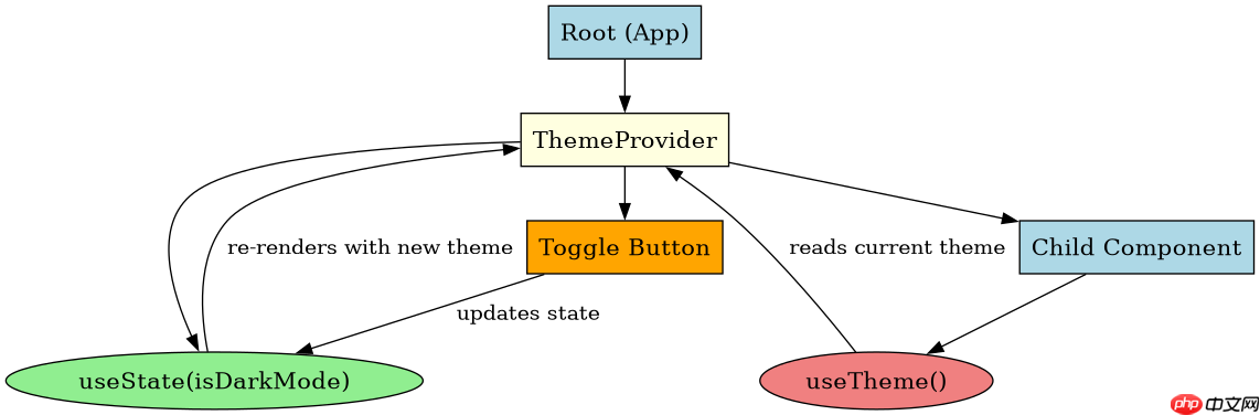
要在运行时动态切换主题,需要在状态管理中存储当前主题,并将该状态作为theme属性传递给ThemeProvider。当用户触发切换动作时,更新状态,ThemeProvider会自动重新渲染子组件,应用新的主题对象。可以使用一个简单的布尔值或字符串来标识当前主题模式(如'light'或'dark'),并根据该值选择对应的主题对象。这种方法允许在不刷新页面的情况下实时改变整个应用的视觉风格。

{/* DynamicThemeApp.js */}
import React, { useState } from 'react';
import { ThemeProvider, useTheme } from 'styled-components';

const lightTheme = {
  primaryColor: '#3498db',
  bgColor: '#ffffff',
  textColor: '#333333'
};

const darkTheme = {
  primaryColor: '#e74c3c',
  bgColor: '#2c3e50',
  textColor: '#ecf0f1'
};

const ThemedText = () => {
  const theme = useTheme();
  return <p style={{ color: theme.textColor, backgroundColor: theme.bgColor }}>Current Theme Text</p>;
};

export default function DynamicThemeApp() {
  const [isDarkMode, setIsDarkMode] = useState(false);
  const currentTheme = isDarkMode ? darkTheme : lightTheme;

  return (
    <ThemeProvider theme={currentTheme}>
      <div style={{ padding: '20px' }}>
        <ThemedText />
        <button onClick={() => setIsDarkMode(!isDarkMode)}>
          Toggle Theme
        </button>
      </div>
    </ThemeProvider>
  );
}
预期结果:点击“Toggle Theme”按钮后,文本颜色和背景色会根据isDarkMode的状态在浅色和深色主题之间切换。
如果未提供theme属性会发生什么?
如果在ThemeProvider中没有提供theme属性,或者子组件尝试访问一个不存在的主题键,Styled Components会回退到默认的主题对象。默认主题通常包含一些基本的CSS变量,如colors、fonts等,但具体取决于Styled Components的版本和配置。如果子组件引用的主题键在默认主题中也不存在,样式可能会失效或显示为浏览器默认样式。因此,始终确保ThemeProvider提供了完整的主题对象,以避免意外的样式回退行为。