







利用 ::after 伪元素绘制 css tooltip 提示气泡,核心做法是设置父容器为 position: relative,将 ::after 设为 position: absolute 并配合 content 属性显示文本,再通过 border 属性绘制三角形箭头。默认情况下气泡位于元素上方居中位置,通过调整 top、left 和 transform 可改变其方位。
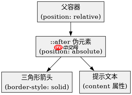
如何控制 Tooltip 的显示与隐藏交互
通过 :hover 伪类控制 opacity 和 visibility 属性来实现 Tooltip 的显隐,避免使用 display: none 以便保留动画过渡效果。初始状态下 opacity: 0 且 pointer-events: none 防止遮挡鼠标事件,悬停时恢复可见性。

.tooltip-container {
  position: relative;
  display: inline-block;
  cursor: pointer;
}

.tooltip-text {
  visibility: hidden;
  opacity: 0;
  width: 120px;
  background-color: #333;
  color: #fff;
  text-align: center;
  border-radius: 6px;
  padding: 5px 0;
  position: absolute;
  z-index: 1;
  bottom: 125%;
  left: 50%;
  margin-left: -60px;
  transition: opacity 0.3s;
  font-size: 14px;
}

.tooltip-container:hover .tooltip-text {
  visibility: visible;
  opacity: 1;
}
如何通过边框技巧绘制三角形箭头
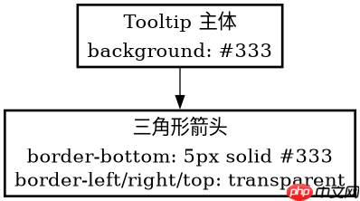
利用 CSS 边框的透明特性绘制三角形,将 ::after 元素的宽高设为 0,并通过设置特定方向的边框颜色和非透明边框实现尖角指向。例如向上指的箭头需设置底部边框为实色,左右及顶部边框为透明。
立即学习“前端免费学习笔记(深入)”;
.tooltip-text::after {
  content: "";
  position: absolute;
  top: 100%;
  left: 50%;
  margin-left: -5px;
  border-width: 5px;
  border-style: solid;
  border-color: #333 transparent transparent transparent;
}
当 Tooltip 内容超出容器宽度时会发生什么
当 Tooltip 文本内容超过设定的 width 时,默认块级行为会导致文本换行或撑开容器,若未设置 white-space 属性则可能破坏布局美观。可通过 white-space: nowrap 强制单行显示,或允许自动换行但需确保父容器有足够空间。