

Summary of element centering in css

Many times, we need to center the elements: 1. A paragraph of text is horizontally centered, 2. A picture is horizontally centered, 3. A block-level element is horizontally centered; 4. A single line of text is vertically centered, 5. No A piece of text with a determined height is centered vertically, 6. A block-level element with a determined height is centered vertically, and so on. Now let’s summarize them separately (this article has also been published as notes in imooc, but it is not easy to read because of the format.):
1. To center the element horizontally, use text-align: center;
<span style="color: #800000;"><div class="text-center">水平居中</div>

.text-center </span>{<span style="color: #ff0000;">
    width</span>:<span style="color: #0000ff;"> 200px</span>;<span style="color: #ff0000;">
    height</span>:<span style="color: #0000ff;"> 100px</span>;<span style="color: #ff0000;">
    text-align</span>:<span style="color: #0000ff;"> center</span>;  <span style="color: #008000;">/*</span><span style="color: #008000;"> 让文本水平居中 </span><span style="color: #008000;">*/</span><span style="color: #ff0000;">
    color</span>:<span style="color: #0000ff;"> #fff</span>;<span style="color: #ff0000;">
    background-color</span>:<span style="color: #0000ff;"> #f54</span>;
}
2. Center the image horizontally and use text-align: center;
on the parent element<span style="color: #800000;"><div class="img-center">
<img src="/static/imghw/default1.png" data-src="fenjing.jpg" class="lazy" alt="Summary of element centering in css">
</div>
.img-center </span>{<span style="color: #ff0000;">
width</span>:<span style="color: #0000ff;"> 200px</span>;<span style="color: #ff0000;">
height</span>:<span style="color: #0000ff;"> 120px</span>;<span style="color: #ff0000;">
text-align</span>:<span style="color: #0000ff;"> center</span>; /* 让图片水平居中 */<span style="color: #ff0000;">
background-color</span>:<span style="color: #0000ff;"> #f54</span>;
}
Description:
Pictures are inline elements. From the beginning of my video learning, a teacher seemed to have said that pictures are inline-block elements. It sounds reasonable, because pictures can use text-align: center ; Center it horizontally and also set the width and height, no doubt about it for a long time! Later, I fell in love with "tracing back to the origin" and found out that it was not the case:
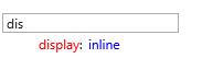
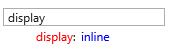
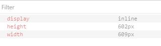
The default display mode for img in ie, edge, chrome, firefox, and opera is: display: inline;
ie:
edge:
chrome:

firefox:

opera:
Img is inline, which is easier to figure out. Like text, it can be set to be horizontally centered through text-align: center;
3. To center block-level elements horizontally, use margin-right: auto; margin-left: auto;
<span style="color: #800000;"><div class="parent-box">
    <div class="child-box">块级元素水平居中</div>
</div>

.parent-box </span>{<span style="color: #ff0000;">
    width</span>:<span style="color: #0000ff;"> 250px</span>;<span style="color: #ff0000;">
    height</span>:<span style="color: #0000ff;"> 150px</span>;<span style="color: #ff0000;">
    background-color</span>:<span style="color: #0000ff;"> #f98</span>;
}<span style="color: #800000;">
.child-box </span>{<span style="color: #ff0000;">
    width</span>:<span style="color: #0000ff;"> 200px</span>;<span style="color: #ff0000;">
    height</span>:<span style="color: #0000ff;"> 100px</span>;<span style="color: #ff0000;">
    background-color</span>:<span style="color: #0000ff;"> #f00</span>;<span style="color: #ff0000;">
    margin-left</span>:<span style="color: #0000ff;"> auto</span>;<span style="color: #ff0000;">
    margin-right</span>:<span style="color: #0000ff;"> auto</span>;
}
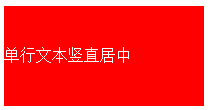
4. Vertically center a single line of text, making line-height and height equal.
<span style="color: #800000;"><div class="text-middle">单行文本竖直居中</div>

.text-middle </span>{<span style="color: #ff0000;">
    width</span>:<span style="color: #0000ff;"> 200px</span>;<span style="color: #ff0000;">
    height</span>:<span style="color: #0000ff;"> 100px</span>;<span style="color: #ff0000;">
    line-height</span>:<span style="color: #0000ff;"> 100px</span>;<span style="color: #ff0000;">
    background-color</span>:<span style="color: #0000ff;"> #f00</span>;<span style="color: #ff0000;">
    color</span>:<span style="color: #0000ff;"> #fff</span>;
}
Attention:
Height and line-height mentioned here are equal, there is one note:
When box-sizing: content-box; (this is also the default value). Just set the values of height and line-height to be the same; when box-sizing: border-box;, the value of line-height should be subtracted from height by padding-top, padding-bottom, border-top, border- The four values of bottom are equal to the effective height assigned to the content.
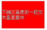
5. To center a text of uncertain height vertically, the height does not apply here, use padding-top: ...; padding-bottom: ...; padding-top and padding-bottom have the same value.
<span style="color: #800000;"><div class="text-middle-padding">不确定高度的一段文本竖直居中</div>

.text-middle-padding </span>{<span style="color: #ff0000;">
    width</span>:<span style="color: #0000ff;"> 150px</span>;<span style="color: #ff0000;">
    padding-top</span>:<span style="color: #0000ff;"> 30px</span>;<span style="color: #ff0000;">
    padding-bottom</span>:<span style="color: #0000ff;"> 30px</span>;<span style="color: #ff0000;">
    color</span>:<span style="color: #0000ff;"> #fff</span>;<span style="color: #ff0000;">
    background-color</span>:<span style="color: #0000ff;"> #f00</span>;
}
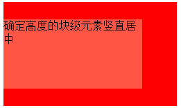
6. To center the block-level element with a determined height vertically, use position: absolute; top: 50%; margin-top: ...; (the value of margin-top is a negative value that is half of its own height);
<span style="color: #800000;"><div class="parent-box">
    <div class="child-box">确定高度的块级元素竖直居中</div>
</div>

.parent-box </span>{<span style="color: #ff0000;">
  position</span>:<span style="color: #0000ff;"> relative</span>;<span style="color: #ff0000;">
  width</span>:<span style="color: #0000ff;"> 250px</span>;<span style="color: #ff0000;">
  height</span>:<span style="color: #0000ff;"> 150px</span>;<span style="color: #ff0000;">
  background-color</span>:<span style="color: #0000ff;"> #f00</span>;
}<span style="color: #800000;">
.child-box </span>{<span style="color: #ff0000;">
    position</span>:<span style="color: #0000ff;"> absolute</span>;<span style="color: #ff0000;">
    top</span>:<span style="color: #0000ff;"> 50%</span>;<span style="color: #ff0000;">
    width</span>:<span style="color: #0000ff;"> 200px</span>;<span style="color: #ff0000;">
    height</span>:<span style="color: #0000ff;"> 100px</span>;<span style="color: #ff0000;">
    margin-top</span>:<span style="color: #0000ff;"> -50px</span>;<span style="color: #ff0000;">
    background-color</span>:<span style="color: #0000ff;"> #f54</span>;
}
<span style="color: #800000;"><div class="parent-box">
    <div class="child-box">绝对定位实现水平垂直居中居中</div>
</div>

.parent-box </span>{<span style="color: #ff0000;">
    position</span>:<span style="color: #0000ff;"> relative</span>;<span style="color: #ff0000;">
    width</span>:<span style="color: #0000ff;"> 250px</span>;<span style="color: #ff0000;">
    height</span>:<span style="color: #0000ff;"> 150px</span>;<span style="color: #ff0000;">
    background-color</span>:<span style="color: #0000ff;"> #f00</span>;
}<span style="color: #800000;">
.child-box </span>{<span style="color: #ff0000;">
    position</span>:<span style="color: #0000ff;"> absolute</span>;<span style="color: #ff0000;">
    top</span>:<span style="color: #0000ff;"> 0</span>;<span style="color: #ff0000;">
    right</span>:<span style="color: #0000ff;"> 0</span>;<span style="color: #ff0000;">
    bottom</span>:<span style="color: #0000ff;"> 0</span>;<span style="color: #ff0000;">
    left</span>:<span style="color: #0000ff;"> 0</span>;<span style="color: #ff0000;">
    width</span>:<span style="color: #0000ff;"> 200px</span>;<span style="color: #ff0000;">
    height</span>:<span style="color: #0000ff;"> 100px</span>;<span style="color: #ff0000;">
    margin</span>:<span style="color: #0000ff;"> auto</span>;<span style="color: #ff0000;">
    background-color</span>:<span style="color: #0000ff;"> #f54</span>;
}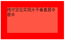
说明:对于块儿级元素的垂直居中,推荐这么做,这也是我比较喜欢的方法。
需要注意的地方是,对父元素要使用 position: relative; 对子元素要使用 position: absolute; top: 0; right: 0; bottom: 0; left: 0; margin: auto; 缺一不可。如果只需要垂直居中,right: 0; 和 left: 0; 可以省略不写,margin: auto; 可以换成 margin-top: auto; margin-bottom: auto;;如果只需要水平居中,top: 0; bottom: 0; 可以省略不写,margin: auto; 可以换成 margin-rihgt: auto; margin-left: auto; 。
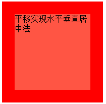
8. 平移实现水平垂直居中法:通过使用 transform: translate(-50%,-50%); 添加厂商前缀 -webkit- 兼容 Safari 和 Chrome
<span style="color: #800000;"><div class="parent-box">
    <div class="child-box">平移实现水平垂直居中法</div>
</div>

.parent-box </span>{<span style="color: #ff0000;">
    width</span>:<span style="color: #0000ff;"> 200px</span>;<span style="color: #ff0000;">
    height</span>:<span style="color: #0000ff;"> 200px</span>;<span style="color: #ff0000;">
    background-color</span>:<span style="color: #0000ff;"> #f00</span>;
}<span style="color: #800000;">
.child-box </span>{<span style="color: #ff0000;">
    position</span>:<span style="color: #0000ff;"> relative</span>;<span style="color: #ff0000;">
    top</span>:<span style="color: #0000ff;"> 50%</span>;<span style="color: #ff0000;">
    left</span>:<span style="color: #0000ff;"> 50%</span>;<span style="color: #ff0000;">
    width</span>:<span style="color: #0000ff;"> 150px</span>;<span style="color: #ff0000;">
    height</span>:<span style="color: #0000ff;"> 150px</span>;<span style="color: #ff0000;">
    background-color</span>:<span style="color: #0000ff;"> #f54</span>;<span style="color: #ff0000;">
    -webkit-transform</span>:<span style="color: #0000ff;"> translate(-50%,-50%)</span>;<span style="color: #ff0000;">
            transform</span>:<span style="color: #0000ff;"> translate(-50%,-50%)</span>;
}
9. 让浏览器计算子元素的宽高并让其水平垂直居中:通过使用定位position: absolute; top:...; right: ...; bottom: ...; left: ...; 四个方向上的值缺一不可。
<span style="color: #800000;"><div class="parent-box">
    <div class="child-box">让浏览器计算子元素的宽高并让其水平垂直居中</div>
</div>

.parent-box </span>{<span style="color: #ff0000;">
    position</span>:<span style="color: #0000ff;"> relative</span>;<span style="color: #ff0000;">
    width</span>:<span style="color: #0000ff;"> 200px</span>;<span style="color: #ff0000;">
    height</span>:<span style="color: #0000ff;"> 200px</span>;<span style="color: #ff0000;">
    background-color</span>:<span style="color: #0000ff;"> #f00</span>;
}<span style="color: #800000;">
.child-box </span>{<span style="color: #ff0000;">
    position</span>:<span style="color: #0000ff;"> absolute</span>;<span style="color: #ff0000;">
    top</span>:<span style="color: #0000ff;"> 20%</span>;<span style="color: #ff0000;">
    right</span>:<span style="color: #0000ff;"> 20%</span>;<span style="color: #ff0000;">
    bottom</span>:<span style="color: #0000ff;"> 20%</span>;<span style="color: #ff0000;">
    left</span>:<span style="color: #0000ff;"> 20%</span>;<span style="color: #ff0000;">
    background-color</span>:<span style="color: #0000ff;"> #f54</span>;
}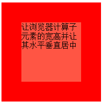
对于子元素,上下左右的定位值可以用 px 作为单位,也可以用 % 作为单位。
10. css3伸缩布局实现元素水平垂直居中,通过使用 display:flex; align-items: center; justify-content: center;
<span style="color: #800000;"><div class="parent-box">
    <div class="child-box">我是子元素,这里使用了 css3 的弹性伸缩布局</div>
</div>

.parent-box </span>{<span style="color: #ff0000;">
    width</span>:<span style="color: #0000ff;"> 400px</span>;<span style="color: #ff0000;">
    height</span>:<span style="color: #0000ff;"> 150px</span>;<span style="color: #ff0000;">
    display</span>:<span style="color: #0000ff;"> flex</span>;<span style="color: #ff0000;">
    justify-content</span>:<span style="color: #0000ff;"> center</span>; /* 让子元素水平居中 */<span style="color: #ff0000;">
    align-items</span>:<span style="color: #0000ff;"> center</span>; /* 让子元素垂直居中 */<span style="color: #ff0000;">
    border</span>:<span style="color: #0000ff;"> 1px solid #999</span>;
}<span style="color: #800000;">
.child-box </span>{<span style="color: #ff0000;">
    background-color</span>:<span style="color: #0000ff;"> #fe5454</span>;<span style="color: #ff0000;">
    color</span>:<span style="color: #0000ff;"> #fff</span>;
}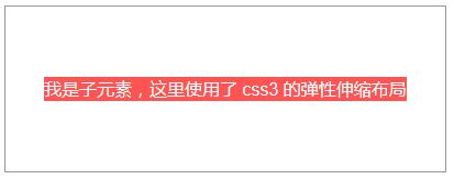
说明:
ie 10 及以上版本浏览器支持,chrome, firefox, opera, edge 均支持,不需要添加厂商前缀。
另外:这里也解释了第5点中“对于高度确定的元素,它的文本的行数不确定的情况下,怎么让文本垂直居中呢?”的问题,使用这里提到的 css3 弹性布局方式。对付元素使用 display: flex; justify-content: center; align-items: center; 来解决。
注意:
1. 如果不添加 justify-content: center; 子元素不会水平居中;
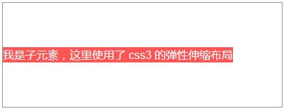
2. 如果不添加 align-items: center; 子元素会铺满父元素的高度,而不是我们希望的只有包含住文本的高度!
记忆方法:
我们知道:text-align: justify; 能将文本按照两端对其的方式对文本进行布局,这个处理的是水平方向上的问题。联想记忆,justify-content 也是处理水平方向上的事情,所以 justify-contnet: center; 就是让元素水平居中了。
扩展:
需求:我们经常做分页时,需要将分页的列表项置于水平居中的位置,就像下面的 dom 一样:
<span style="color: #0000ff;"><span style="color: #800000;">ul </span><span style="color: #ff0000;">class</span><span style="color: #0000ff;">="pagination"</span><span style="color: #0000ff;">></span>
    <span style="color: #0000ff;"><span style="color: #800000;">li</span><span style="color: #0000ff;">><span style="color: #800000;">a </span><span style="color: #ff0000;">href</span><span style="color: #0000ff;">="#"</span><span style="color: #0000ff;">></span><span style="color: #ff0000;">«</span><span style="color: #0000ff;"></span><span style="color: #800000;">a</span><span style="color: #0000ff;">></span><span style="color: #800000;">li</span><span style="color: #0000ff;">></span>
    <span style="color: #0000ff;"><span style="color: #800000;">li</span><span style="color: #0000ff;">><span style="color: #800000;">a </span><span style="color: #ff0000;">href</span><span style="color: #0000ff;">="#"</span><span style="color: #0000ff;">></span>1<span style="color: #0000ff;"></span><span style="color: #800000;">a</span><span style="color: #0000ff;">></span><span style="color: #800000;">li</span><span style="color: #0000ff;">></span>
    <span style="color: #0000ff;"><span style="color: #800000;">li</span><span style="color: #0000ff;">><span style="color: #800000;">a </span><span style="color: #ff0000;">href</span><span style="color: #0000ff;">="#"</span><span style="color: #0000ff;">></span>2<span style="color: #0000ff;"></span><span style="color: #800000;">a</span><span style="color: #0000ff;">></span><span style="color: #800000;">li</span><span style="color: #0000ff;">></span>
    <span style="color: #0000ff;"><span style="color: #800000;">li</span><span style="color: #0000ff;">><span style="color: #800000;">a </span><span style="color: #ff0000;">href</span><span style="color: #0000ff;">="#"</span><span style="color: #0000ff;">></span>3<span style="color: #0000ff;"></span><span style="color: #800000;">a</span><span style="color: #0000ff;">></span><span style="color: #800000;">li</span><span style="color: #0000ff;">></span>
    <span style="color: #0000ff;"><span style="color: #800000;">li</span><span style="color: #0000ff;">><span style="color: #800000;">a </span><span style="color: #ff0000;">href</span><span style="color: #0000ff;">="#"</span><span style="color: #0000ff;">></span>4<span style="color: #0000ff;"></span><span style="color: #800000;">a</span><span style="color: #0000ff;">></span><span style="color: #800000;">li</span><span style="color: #0000ff;">></span>
    <span style="color: #0000ff;"><span style="color: #800000;">li</span><span style="color: #0000ff;">><span style="color: #800000;">a </span><span style="color: #ff0000;">href</span><span style="color: #0000ff;">="#"</span><span style="color: #0000ff;">></span>5<span style="color: #0000ff;"></span><span style="color: #800000;">a</span><span style="color: #0000ff;">></span><span style="color: #800000;">li</span><span style="color: #0000ff;">></span>
    <span style="color: #0000ff;"><span style="color: #800000;">li</span><span style="color: #0000ff;">><span style="color: #800000;">a </span><span style="color: #ff0000;">href</span><span style="color: #0000ff;">="#"</span><span style="color: #0000ff;">></span><span style="color: #ff0000;">»</span><span style="color: #0000ff;"></span><span style="color: #800000;">a</span><span style="color: #0000ff;">></span><span style="color: #800000;">li</span><span style="color: #0000ff;">></span>
<span style="color: #0000ff;"></span><span style="color: #800000;">ul</span><span style="color: #0000ff;">></span> </span></span></span></span></span></span></span></span></span></span></span></span></span></span></span>解决方法:
可以为父元素 ul 添加 text-align: center; 同时给子元素 li 添加 display: inline-block;
完整的代码:
<span style="color: #0000ff;"><span style="color: #800000;">ul </span><span style="color: #ff0000;">class</span><span style="color: #0000ff;">="pagination"</span><span style="color: #0000ff;">></span>
    <span style="color: #0000ff;"><span style="color: #800000;">li</span><span style="color: #0000ff;">><span style="color: #800000;">a </span><span style="color: #ff0000;">href</span><span style="color: #0000ff;">="#"</span><span style="color: #0000ff;">></span><span style="color: #ff0000;">«</span><span style="color: #0000ff;"></span><span style="color: #800000;">a</span><span style="color: #0000ff;">></span><span style="color: #800000;">li</span><span style="color: #0000ff;">></span>
    <span style="color: #0000ff;"><span style="color: #800000;">li</span><span style="color: #0000ff;">><span style="color: #800000;">a </span><span style="color: #ff0000;">href</span><span style="color: #0000ff;">="#"</span><span style="color: #0000ff;">></span>1<span style="color: #0000ff;"></span><span style="color: #800000;">a</span><span style="color: #0000ff;">></span><span style="color: #800000;">li</span><span style="color: #0000ff;">></span>
    <span style="color: #0000ff;"><span style="color: #800000;">li</span><span style="color: #0000ff;">><span style="color: #800000;">a </span><span style="color: #ff0000;">href</span><span style="color: #0000ff;">="#"</span><span style="color: #0000ff;">></span>2<span style="color: #0000ff;"></span><span style="color: #800000;">a</span><span style="color: #0000ff;">></span><span style="color: #800000;">li</span><span style="color: #0000ff;">></span>
    <span style="color: #0000ff;"><span style="color: #800000;">li</span><span style="color: #0000ff;">><span style="color: #800000;">a </span><span style="color: #ff0000;">href</span><span style="color: #0000ff;">="#"</span><span style="color: #0000ff;">></span>3<span style="color: #0000ff;"></span><span style="color: #800000;">a</span><span style="color: #0000ff;">></span><span style="color: #800000;">li</span><span style="color: #0000ff;">></span>
    <span style="color: #0000ff;"><span style="color: #800000;">li</span><span style="color: #0000ff;">><span style="color: #800000;">a </span><span style="color: #ff0000;">href</span><span style="color: #0000ff;">="#"</span><span style="color: #0000ff;">></span>4<span style="color: #0000ff;"></span><span style="color: #800000;">a</span><span style="color: #0000ff;">></span><span style="color: #800000;">li</span><span style="color: #0000ff;">></span>
    <span style="color: #0000ff;"><span style="color: #800000;">li</span><span style="color: #0000ff;">><span style="color: #800000;">a </span><span style="color: #ff0000;">href</span><span style="color: #0000ff;">="#"</span><span style="color: #0000ff;">></span>5<span style="color: #0000ff;"></span><span style="color: #800000;">a</span><span style="color: #0000ff;">></span><span style="color: #800000;">li</span><span style="color: #0000ff;">></span>
    <span style="color: #0000ff;"><span style="color: #800000;">li</span><span style="color: #0000ff;">><span style="color: #800000;">a </span><span style="color: #ff0000;">href</span><span style="color: #0000ff;">="#"</span><span style="color: #0000ff;">></span><span style="color: #ff0000;">»</span><span style="color: #0000ff;"></span><span style="color: #800000;">a</span><span style="color: #0000ff;">></span><span style="color: #800000;">li</span><span style="color: #0000ff;">></span>
<span style="color: #0000ff;"></span><span style="color: #800000;">ul</span><span style="color: #0000ff;">></span></span></span></span></span></span></span></span></span></span></span></span></span></span></span></span><span style="color: #800000;">ul.pagination </span>{<span style="color: #ff0000;">
margin-top</span>:<span style="color: #0000ff;"> 20px</span>;<span style="color: #ff0000;">
text-align</span>:<span style="color: #0000ff;"> center</span>;<span style="color: #ff0000;">
font-size</span>:<span style="color: #0000ff;"> 0</span>; /* 设置 font-size 的大小为 0,目的是让显示方式为 inline-block 的子元素去除外边距(外边距是由于 html 的空格所导致的) */
}<span style="color: #800000;">
ul.pagination li </span>{<span style="color: #ff0000;"> display</span>:<span style="color: #0000ff;"> inline-block</span>; }<span style="color: #800000;">
ul.pagination li a </span>{<span style="color: #ff0000;">
display</span>:<span style="color: #0000ff;"> inline-block</span>;<span style="color: #ff0000;">
padding</span>:<span style="color: #0000ff;"> 7px 14px</span>;<span style="color: #ff0000;">
border-width</span>:<span style="color: #0000ff;"> 1px 0 1px 1px</span>;<span style="color: #ff0000;">
border-style</span>:<span style="color: #0000ff;"> solid</span>;<span style="color: #ff0000;">
border-color</span>:<span style="color: #0000ff;"> #f1f2f3</span>;<span style="color: #ff0000;">
font-size</span>:<span style="color: #0000ff;"> 15px</span>; /* 这里一定要设置 font-size,别指望去继承了,因为如果不设置,将会继承 ul 的大小 0 */<span style="color: #ff0000;">
transition</span>:<span style="color: #0000ff;"> all .3s ease 0</span>;
}<span style="color: #800000;">
ul.pagination li:first-child a </span>{<span style="color: #ff0000;">
border-top-left-radius</span>:<span style="color: #0000ff;"> 5px</span>;<span style="color: #ff0000;">
border-bottom-left-radius</span>:<span style="color: #0000ff;"> 5px</span>;
}<span style="color: #800000;">
ul.pagination li:last-child a </span>{<span style="color: #ff0000;">
border-right</span>:<span style="color: #0000ff;"> 1px solid #f1f2f3</span>;<span style="color: #ff0000;">
border-top-right-radius</span>:<span style="color: #0000ff;"> 5px</span>;<span style="color: #ff0000;">
border-bottom-right-radius</span>:<span style="color: #0000ff;"> 5px</span>;
}<span style="color: #800000;">
ul.pagination li a:hover </span>{<span style="color: #ff0000;">
background-color</span>:<span style="color: #0000ff;"> #fe5454</span>;<span style="color: #ff0000;">
color</span>:<span style="color: #0000ff;"> #fff</span>;<span style="color: #ff0000;">
border-color</span>:<span style="color: #0000ff;"> #fe5454</span>;
}
Hot AI Tools

Undresser.AI Undress
AI-powered app for creating realistic nude photos

AI Clothes Remover
Online AI tool for removing clothes from photos.

Undress AI Tool
Undress images for free

Clothoff.io
AI clothes remover

Video Face Swap
Swap faces in any video effortlessly with our completely free AI face swap tool!

Hot Article
Hot Tools

Notepad++7.3.1
Easy-to-use and free code editor

SublimeText3 Chinese version
Chinese version, very easy to use

Zend Studio 13.0.1
Powerful PHP integrated development environment

Dreamweaver CS6
Visual web development tools

SublimeText3 Mac version
God-level code editing software (SublimeText3)
Hot Topics
 1664
1664
 14
1423
52
1317
25
1268
29
1246
24
14
1423
52
1317
25
1268
29
1246
24

 Understanding HTML, CSS, and JavaScript: A Beginner's Guide
Apr 12, 2025 am 12:02 AM
Understanding HTML, CSS, and JavaScript: A Beginner's Guide
Apr 12, 2025 am 12:02 AM
WebdevelopmentreliesonHTML,CSS,andJavaScript:1)HTMLstructurescontent,2)CSSstylesit,and3)JavaScriptaddsinteractivity,formingthebasisofmodernwebexperiences.
 HTML: The Structure, CSS: The Style, JavaScript: The Behavior
Apr 18, 2025 am 12:09 AM
HTML: The Structure, CSS: The Style, JavaScript: The Behavior
Apr 18, 2025 am 12:09 AM
The roles of HTML, CSS and JavaScript in web development are: 1. HTML defines the web page structure, 2. CSS controls the web page style, and 3. JavaScript adds dynamic behavior. Together, they build the framework, aesthetics and interactivity of modern websites.
 The Future of HTML, CSS, and JavaScript: Web Development Trends
Apr 19, 2025 am 12:02 AM
The Future of HTML, CSS, and JavaScript: Web Development Trends
Apr 19, 2025 am 12:02 AM
The future trends of HTML are semantics and web components, the future trends of CSS are CSS-in-JS and CSSHoudini, and the future trends of JavaScript are WebAssembly and Serverless. 1. HTML semantics improve accessibility and SEO effects, and Web components improve development efficiency, but attention should be paid to browser compatibility. 2. CSS-in-JS enhances style management flexibility but may increase file size. CSSHoudini allows direct operation of CSS rendering. 3.WebAssembly optimizes browser application performance but has a steep learning curve, and Serverless simplifies development but requires optimization of cold start problems.
 The Future of HTML: Evolution and Trends in Web Design
Apr 17, 2025 am 12:12 AM
The Future of HTML: Evolution and Trends in Web Design
Apr 17, 2025 am 12:12 AM
The future of HTML is full of infinite possibilities. 1) New features and standards will include more semantic tags and the popularity of WebComponents. 2) The web design trend will continue to develop towards responsive and accessible design. 3) Performance optimization will improve the user experience through responsive image loading and lazy loading technologies.
 HTML vs. CSS vs. JavaScript: A Comparative Overview
Apr 16, 2025 am 12:04 AM
HTML vs. CSS vs. JavaScript: A Comparative Overview
Apr 16, 2025 am 12:04 AM
The roles of HTML, CSS and JavaScript in web development are: HTML is responsible for content structure, CSS is responsible for style, and JavaScript is responsible for dynamic behavior. 1. HTML defines the web page structure and content through tags to ensure semantics. 2. CSS controls the web page style through selectors and attributes to make it beautiful and easy to read. 3. JavaScript controls web page behavior through scripts to achieve dynamic and interactive functions.
 HTML: Building the Structure of Web Pages
Apr 14, 2025 am 12:14 AM
HTML: Building the Structure of Web Pages
Apr 14, 2025 am 12:14 AM
HTML is the cornerstone of building web page structure. 1. HTML defines the content structure and semantics, and uses, etc. tags. 2. Provide semantic markers, such as, etc., to improve SEO effect. 3. To realize user interaction through tags, pay attention to form verification. 4. Use advanced elements such as, combined with JavaScript to achieve dynamic effects. 5. Common errors include unclosed labels and unquoted attribute values, and verification tools are required. 6. Optimization strategies include reducing HTTP requests, compressing HTML, using semantic tags, etc.
 The Role of HTML: Structuring Web Content
Apr 11, 2025 am 12:12 AM
The Role of HTML: Structuring Web Content
Apr 11, 2025 am 12:12 AM
The role of HTML is to define the structure and content of a web page through tags and attributes. 1. HTML organizes content through tags such as , making it easy to read and understand. 2. Use semantic tags such as, etc. to enhance accessibility and SEO. 3. Optimizing HTML code can improve web page loading speed and user experience.
 HTML: Is It a Programming Language or Something Else?
Apr 15, 2025 am 12:13 AM
HTML: Is It a Programming Language or Something Else?
Apr 15, 2025 am 12:13 AM
HTMLisnotaprogramminglanguage;itisamarkuplanguage.1)HTMLstructuresandformatswebcontentusingtags.2)ItworkswithCSSforstylingandJavaScriptforinteractivity,enhancingwebdevelopment.
