

Brief discussion and examples of flex layout

Archimedes once said that if you give me a fulcrum, I can move the earth, and with flex, you can basically move all layouts.
1.Basic introduction and effect display of flex layout
If you want to do your job well, you must first sharpen your tools. Come on, let’s take a look at the basic knowledge first (ha~, it’s corny, but it’s useful).
**flex-direction
Direction (direction), layout direction, as the name implies, is to set the order of elements. Queuing up is nothing more than lining up horizontally or vertically, you guessed it. (praising you)
Imagine that there is now a class teacher (parent element) who wants to organize students (child elements) to dance the third set of radio gymnastics for primary and secondary school students.
We set the direction from low to high by default.
Okay, get in line. The class teacher said to stand in a horizontal row from low to high: felx-direction: row
Like this:

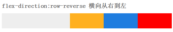
The one-meter-two class teacher standing at the end of the line felt that the pear was very big, so he had an idea: row from high to lowfelx-direction: row-reverse
You guessed it, it’s the opposite order from the beginning (as smart as you)
The head teacher likes the youngest Lu child in the class, but if we sit horizontally, we can’t see her...
So he ordered everyone to arrange them vertically from low to high: flex-direction:column
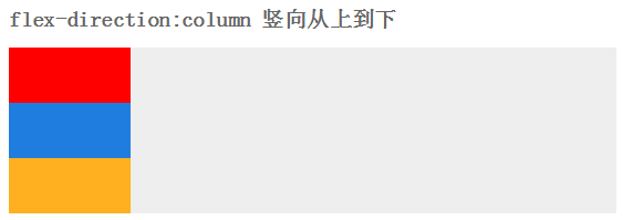
Well, that’s probably it, but the girl in the first row said that the sun was so hot that she wanted to go to the back
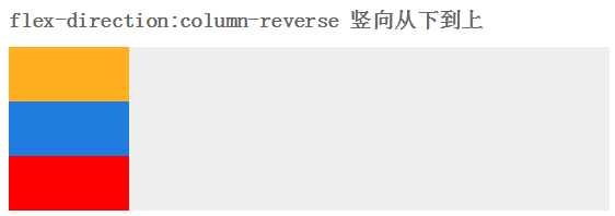
The class teacher then asked the students to line up vertically from high to low: flex-direction: column-reverse
After lining up, we started to do aerobics and walk in unison. . .
**flex-wrap
After finally finishing the dance, the class teacher noticed that a boy was wearing slippers. How could this be possible? It was like a red flag in the class flow
"Take the slippers and throw them away", the slipper boy had no choice but to leave the team. The nearest trash can is two kilometers outside the school (exaggeration, meaning very far)
With the slipper man gone, the team is not neat and orderly. The leader wants to check it out
Yes, it’s a fill-in (as smart as me).
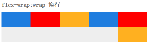
The class teacher has limited the maximum number of people in a row, and those who exceed it will be moved to the next row, and the line will be changed flex-wrap:wrap
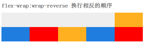
This is the message from the principal: We must be united, it is shameful to change careers. so, everyone had to huddle together flex-wrap: no-wrap

Everyone has stood up again. Basically, you can listen to the principal’s brief words and then go back to the classroom. At this time a strong wind came.
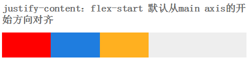
The wind is blowing, justify-content:flex-start
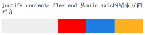
Yeah, the wind is blowing in the opposite direction againjustify-content:flex-end
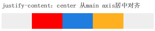
It’s scary, the wind blows from both sides justify-content:center
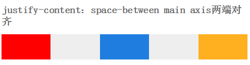
Finally, the wind blows from top to bottom, justify-content:space-between
Originally, there is another way to blow the wind, justify-content:space-around.
But the students were too tired to stand still, so we imagined by ourselves
Same as vertical.
This gust of wind also blew away the principal's speech. The principal said wittily: It's that simple. Let's call it a day. .
The students went back to the classroom.
2.felx app
2.1 Vertical Centering
Before we do vertical centering, we can use margin: 50vh auto 0; transform: translateY (-50%); of course, we can also use positioning.
But with flex, hahahahahahahahahahahahahahahaha (actually I can’t laugh for so long, exaggeration)
Guess, how to achieve it?
I guess you can’t guess. Because I wrote the answer. As witty as you
We add display: flex;align-items:center; justify-content:center;
to the parent elementAdd display: inline-flex;
to the child elementsThe effect is like this:
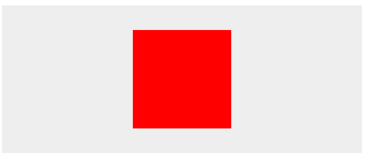
Yes, you read that right, it’s so simple (stealing the principal’s lines, it’s a sin)
2.2 Layout application
Take the page below as an example
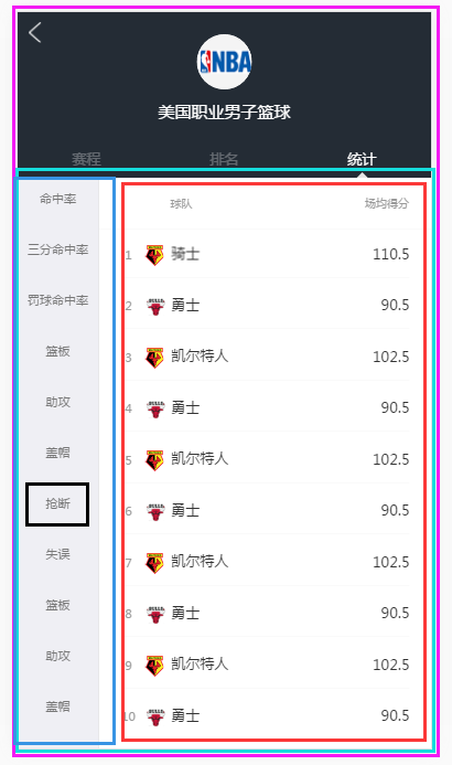
This page needs to keep the head fixed when the content in the sky blue box slides;
The content in the dark blue box on the left and the red box on the right can be slid independently.
Let’s think about it together. The elements inside the red one on the outside should be lined up vertically. What do you think? If you think so, praise you
.l-flex-column{ display:-webkit-box; -webkit-box-orient: vertical; display:flex; flex-flow: column;height: 100% }
Then pinch, the dark blue and bright red sub-elements are lined up horizontally in the sky blue element. Right, you are right again
.l-flex-row{ display:-webkit-box; -webkit-box-orient: horizontal; display:flex; flex-flow: row; width: 100%}
Secondly, the sub-projects in dark blue and the sub-projects in bright red seem to be lined up vertically. They look really good.
Finally, the dark blue and bright red parts must slide freely inside, add a scroll, you guessed it again (I admire you)
.l-scroll-y{overflow: auto;-webkit-overflow-scrolling:touch;}
To view details, please click: I am detailed
Did you get a little bit of it? If so, I would like to praise you.
If not, then there is none. . O(∩_∩)O
******It’s over******

Hot AI Tools

Undresser.AI Undress
AI-powered app for creating realistic nude photos

AI Clothes Remover
Online AI tool for removing clothes from photos.

Undress AI Tool
Undress images for free

Clothoff.io
AI clothes remover

Video Face Swap
Swap faces in any video effortlessly with our completely free AI face swap tool!

Hot Article
Hot Tools

Notepad++7.3.1
Easy-to-use and free code editor

SublimeText3 Chinese version
Chinese version, very easy to use

Zend Studio 13.0.1
Powerful PHP integrated development environment

Dreamweaver CS6
Visual web development tools

SublimeText3 Mac version
God-level code editing software (SublimeText3)
Hot Topics
 1664
1664
 14
1423
52
1318
25
1269
29
1248
24
14
1423
52
1318
25
1269
29
1248
24

 Understanding HTML, CSS, and JavaScript: A Beginner's Guide
Apr 12, 2025 am 12:02 AM
Understanding HTML, CSS, and JavaScript: A Beginner's Guide
Apr 12, 2025 am 12:02 AM
WebdevelopmentreliesonHTML,CSS,andJavaScript:1)HTMLstructurescontent,2)CSSstylesit,and3)JavaScriptaddsinteractivity,formingthebasisofmodernwebexperiences.
 HTML: The Structure, CSS: The Style, JavaScript: The Behavior
Apr 18, 2025 am 12:09 AM
HTML: The Structure, CSS: The Style, JavaScript: The Behavior
Apr 18, 2025 am 12:09 AM
The roles of HTML, CSS and JavaScript in web development are: 1. HTML defines the web page structure, 2. CSS controls the web page style, and 3. JavaScript adds dynamic behavior. Together, they build the framework, aesthetics and interactivity of modern websites.
 The Future of HTML, CSS, and JavaScript: Web Development Trends
Apr 19, 2025 am 12:02 AM
The Future of HTML, CSS, and JavaScript: Web Development Trends
Apr 19, 2025 am 12:02 AM
The future trends of HTML are semantics and web components, the future trends of CSS are CSS-in-JS and CSSHoudini, and the future trends of JavaScript are WebAssembly and Serverless. 1. HTML semantics improve accessibility and SEO effects, and Web components improve development efficiency, but attention should be paid to browser compatibility. 2. CSS-in-JS enhances style management flexibility but may increase file size. CSSHoudini allows direct operation of CSS rendering. 3.WebAssembly optimizes browser application performance but has a steep learning curve, and Serverless simplifies development but requires optimization of cold start problems.
 The Future of HTML: Evolution and Trends in Web Design
Apr 17, 2025 am 12:12 AM
The Future of HTML: Evolution and Trends in Web Design
Apr 17, 2025 am 12:12 AM
The future of HTML is full of infinite possibilities. 1) New features and standards will include more semantic tags and the popularity of WebComponents. 2) The web design trend will continue to develop towards responsive and accessible design. 3) Performance optimization will improve the user experience through responsive image loading and lazy loading technologies.
 HTML vs. CSS vs. JavaScript: A Comparative Overview
Apr 16, 2025 am 12:04 AM
HTML vs. CSS vs. JavaScript: A Comparative Overview
Apr 16, 2025 am 12:04 AM
The roles of HTML, CSS and JavaScript in web development are: HTML is responsible for content structure, CSS is responsible for style, and JavaScript is responsible for dynamic behavior. 1. HTML defines the web page structure and content through tags to ensure semantics. 2. CSS controls the web page style through selectors and attributes to make it beautiful and easy to read. 3. JavaScript controls web page behavior through scripts to achieve dynamic and interactive functions.
 HTML: Building the Structure of Web Pages
Apr 14, 2025 am 12:14 AM
HTML: Building the Structure of Web Pages
Apr 14, 2025 am 12:14 AM
HTML is the cornerstone of building web page structure. 1. HTML defines the content structure and semantics, and uses, etc. tags. 2. Provide semantic markers, such as, etc., to improve SEO effect. 3. To realize user interaction through tags, pay attention to form verification. 4. Use advanced elements such as, combined with JavaScript to achieve dynamic effects. 5. Common errors include unclosed labels and unquoted attribute values, and verification tools are required. 6. Optimization strategies include reducing HTTP requests, compressing HTML, using semantic tags, etc.
 The Role of HTML: Structuring Web Content
Apr 11, 2025 am 12:12 AM
The Role of HTML: Structuring Web Content
Apr 11, 2025 am 12:12 AM
The role of HTML is to define the structure and content of a web page through tags and attributes. 1. HTML organizes content through tags such as , making it easy to read and understand. 2. Use semantic tags such as, etc. to enhance accessibility and SEO. 3. Optimizing HTML code can improve web page loading speed and user experience.
 HTML: Is It a Programming Language or Something Else?
Apr 15, 2025 am 12:13 AM
HTML: Is It a Programming Language or Something Else?
Apr 15, 2025 am 12:13 AM
HTMLisnotaprogramminglanguage;itisamarkuplanguage.1)HTMLstructuresandformatswebcontentusingtags.2)ItworkswithCSSforstylingandJavaScriptforinteractivity,enhancingwebdevelopment.
