

How to make a pie chart in Excel

This Excel pie chart tutorial guides you through creating and customizing pie charts. Learn to build effective pie charts, avoiding common pitfalls.

Pie charts, also called circular graphs, visually represent proportions of a whole. Each slice represents a percentage of the total. While popular, they can be misinterpreted due to the difficulty in accurately comparing angles. This tutorial shows you how to create and refine them in Excel.
Creating a pie chart in Excel is straightforward. Proper data organization is key.
1. Prepare your data: Excel pie charts need data in a single column or row, representing one data series. A separate column or row for category names is beneficial for labels and legends. Ideal pie charts have:
- One data series.
- All values greater than zero.
- No empty rows or columns.
- 7-9 data categories maximum (avoid clutter).
Example data:

2. Insert the chart: Select your data, go to the "Insert" tab, and choose your desired pie chart type (explained below). This example uses a 2-D pie chart:

Including column/row headings in the selection adds them to the chart title.
3. Choose a style (optional): Explore different styles under the "Design" tab > "Chart Styles" group for visual enhancements.

Pie Chart Types:
- 2-D Pie Chart: The standard and most frequently used type.

- 3-D Pie Chart: Adds depth for a different perspective. Offers 3-D rotation and perspective controls.

- Pie of Pie/Bar of Pie: Useful for charts with numerous small slices. Small slices are displayed on a secondary pie or bar chart. You can manually select which categories to move to the secondary chart using the "Format Data Series" options, specifying a percentage threshold or custom selection.


- Doughnut Chart: Suitable for multiple data series related to the whole. The hole size is customizable via "Format Data Series".

Customizing your Pie Chart:
- Data Labels: Add labels for clarity. Choose label location (inside, outside, etc.) and include category names and values/percentages.


- Exploding Slices: Emphasize individual slices by moving them away from the center. Control explosion amount via "Format Data Series".


- Rotation: Rotate the chart for better visual appeal, especially to bring smaller slices to the front. Use "Format Data Series" to adjust the angle. 3-D charts offer additional rotation controls.


- Sorting: Sort slices by size (largest to smallest) for improved readability. Use a PivotTable for easy sorting without altering source data.


- Color: Change the color theme or individual slice colors for visual appeal and clarity.


- Formatting: Enhance the chart's appearance using shadow, glow, and soft edges under "Format Data Series". Additional formatting options are available on the "Format" tab.


Key Tips:
- Sort slices by size.
- Group or grey out small slices.
- Rotate for optimal viewing.
- Limit data categories (7-9 max).
- Consider direct labeling instead of a legend.
- Use 3-D effects sparingly.
Mastering these techniques will enable you to create clear, informative, and visually appealing pie charts in Excel.
The above is the detailed content of How to make a pie chart in Excel. For more information, please follow other related articles on the PHP Chinese website!

Hot AI Tools

Undresser.AI Undress
AI-powered app for creating realistic nude photos

AI Clothes Remover
Online AI tool for removing clothes from photos.

Undress AI Tool
Undress images for free

Clothoff.io
AI clothes remover

Video Face Swap
Swap faces in any video effortlessly with our completely free AI face swap tool!

Hot Article
Hot Tools

Notepad++7.3.1
Easy-to-use and free code editor

SublimeText3 Chinese version
Chinese version, very easy to use

Zend Studio 13.0.1
Powerful PHP integrated development environment

Dreamweaver CS6
Visual web development tools

SublimeText3 Mac version
God-level code editing software (SublimeText3)
Hot Topics
 1655
1655
 14
1413
52
1306
25
1252
29
1226
24
14
1413
52
1306
25
1252
29
1226
24

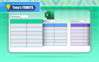 If You Don't Rename Tables in Excel, Today's the Day to Start
Apr 15, 2025 am 12:58 AM
If You Don't Rename Tables in Excel, Today's the Day to Start
Apr 15, 2025 am 12:58 AM
Quick link Why should tables be named in Excel How to name a table in Excel Excel table naming rules and techniques By default, tables in Excel are named Table1, Table2, Table3, and so on. However, you don't have to stick to these tags. In fact, it would be better if you don't! In this quick guide, I will explain why you should always rename tables in Excel and show you how to do this. Why should tables be named in Excel While it may take some time to develop the habit of naming tables in Excel (if you don't usually do this), the following reasons illustrate today
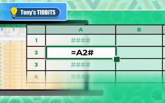 You Need to Know What the Hash Sign Does in Excel Formulas
Apr 08, 2025 am 12:55 AM
You Need to Know What the Hash Sign Does in Excel Formulas
Apr 08, 2025 am 12:55 AM
Excel Overflow Range Operator (#) enables formulas to be automatically adjusted to accommodate changes in overflow range size. This feature is only available for Microsoft 365 Excel for Windows or Mac. Common functions such as UNIQUE, COUNTIF, and SORTBY can be used in conjunction with overflow range operators to generate dynamic sortable lists. The pound sign (#) in the Excel formula is also called the overflow range operator, which instructs the program to consider all results in the overflow range. Therefore, even if the overflow range increases or decreases, the formula containing # will automatically reflect this change. How to list and sort unique values in Microsoft Excel
 How to change Excel table styles and remove table formatting
Apr 19, 2025 am 11:45 AM
How to change Excel table styles and remove table formatting
Apr 19, 2025 am 11:45 AM
This tutorial shows you how to quickly apply, modify, and remove Excel table styles while preserving all table functionalities. Want to make your Excel tables look exactly how you want? Read on! After creating an Excel table, the first step is usual
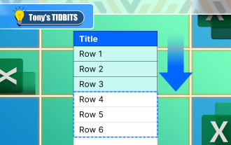 How to Format a Spilled Array in Excel
Apr 10, 2025 pm 12:01 PM
How to Format a Spilled Array in Excel
Apr 10, 2025 pm 12:01 PM
Use formula conditional formatting to handle overflow arrays in Excel Direct formatting of overflow arrays in Excel can cause problems, especially when the data shape or size changes. Formula-based conditional formatting rules allow automatic formatting to be adjusted when data parameters change. Adding a dollar sign ($) before a column reference applies a rule to all rows in the data. In Excel, you can apply direct formatting to the values or background of a cell to make the spreadsheet easier to read. However, when an Excel formula returns a set of values (called overflow arrays), applying direct formatting will cause problems if the size or shape of the data changes. Suppose you have this spreadsheet with overflow results from the PIVOTBY formula,

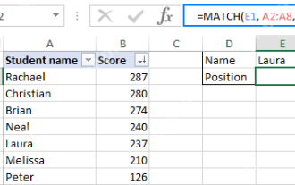 Excel MATCH function with formula examples
Apr 15, 2025 am 11:21 AM
Excel MATCH function with formula examples
Apr 15, 2025 am 11:21 AM
This tutorial explains how to use MATCH function in Excel with formula examples. It also shows how to improve your lookup formulas by a making dynamic formula with VLOOKUP and MATCH. In Microsoft Excel, there are many different lookup/ref
 How to Use Excel's AGGREGATE Function to Refine Calculations
Apr 12, 2025 am 12:54 AM
How to Use Excel's AGGREGATE Function to Refine Calculations
Apr 12, 2025 am 12:54 AM
Quick Links The AGGREGATE Syntax
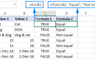 Excel: Compare strings in two cells for matches (case-insensitive or exact)
Apr 16, 2025 am 11:26 AM
Excel: Compare strings in two cells for matches (case-insensitive or exact)
Apr 16, 2025 am 11:26 AM
The tutorial shows how to compare text strings in Excel for case-insensitive and exact match. You will learn a number of formulas to compare two cells by their values, string length, or the number of occurrences of a specific character, a
