

Bootstrap: From Layouts to Components

Bootstrap is a front-end framework developed by Twitter that integrates HTML, CSS and JavaScript to help developers quickly build responsive websites. Its core functions include: Grid system and layout: based on 12 columns, using flexbox layout, and supporting responsive pages of different device sizes. Components and styles: Provide a rich library of component, such as buttons, modal boxes, etc., and you can achieve beautiful effects by adding class names. How it works: Rely on CSS and JavaScript, CSS uses LESS or SASS preprocessors, and JavaScript relies on jQuery to achieve interactive and dynamic effects. Through these features, Bootstrap greatly improves development efficiency and page aesthetics.
introduction
Do you know? Bootstrap is not only a CSS framework, it is more like a Swiss Army knife for a front-end developer. Whether you are a beginner or a senior developer, mastering Bootstrap can greatly improve your development efficiency and page aesthetics. This article will take you through the power of Bootstrap from layout to components. After reading this article, you will learn how to quickly build responsive web pages, customize styles, and use a rich library of components using Bootstrap.
Basics of Bootstrap
Bootstrap is a front-end framework developed by Twitter that integrates HTML, CSS and JavaScript to help developers quickly build responsive websites. At its core is the raster system, which makes the layout extremely simple. At the same time, Bootstrap provides a large number of predefined styles and components, such as buttons, forms, navigation bars, etc., allowing you to have a beautiful interface without having to design from scratch.
To give a simple example, Bootstrap's raster system allows you to easily divide the page into 12 columns, so you can control the page layout with different column counts. for example:
 <div class="container">
  <div class="row">
    <div class="col-md-6">Column 1</div>
    <div class="col-md-6">Column 2</div>
  </div>
</div>Analysis of the core functions of Bootstrap
Grid system and layout
Bootstrap's raster system is one of its core, and it uses flexbox layouts to make it easy to create responsive pages. The raster system is based on a 12-column design, which means you can control the page layout with different column counts. Its advantage is that you can define the width of the column according to different device sizes, so that your website can maintain a good display on different devices.
For example, if you want an element to occupy 6 columns on medium devices and 4 columns on large devices, you can write this:
<div class="col-md-6 col-lg-4">Content</div>
Components and Styles
Bootstrap provides a rich library of components, from simple buttons to complex modal boxes. These components are not only beautiful but also easy to use. You just need to add the corresponding class name to quickly achieve the effect you want.
For example, a simple button can be implemented like this:
<button class="btn btn-primary">Click me</button>
How it works
Bootstrap works mainly based on CSS and JavaScript. The CSS part is responsible for style and layout, while JavaScript is responsible for interaction and dynamic effects. Bootstrap uses LESS or SASS preprocessors to write CSS, which makes the style more flexible and maintainable. Meanwhile, the JavaScript component of Bootstrap relies on jQuery, which allows developers to easily add interactive effects.
Example of usage
Basic usage
Let's start with a simple navigation bar. Bootstrap's navigation bar component can help you quickly build a responsive navigation menu:
 <nav class="navbar navbar-expand-lg navbar-light bg-light">
  <a class="navbar-brand" href="#">Logo</a>
  <button class="navbar-toggler" type="button" data-toggle="collapse" data-target="#navbarNav" aria-controls="navbarNav" aria-expanded="false" aria-label="Toggle navigation">
    <span class="navbar-toggler-icon"></span>
  </button>
  <div class="collapse navbar-collapse" id="navbarNav">
    <ul class="navbar-nav">
      <li class="nav-item active">
        <a class="nav-link" href="#">Homepage<span class="sr-only">(current)</span></a>
      </li>
      <li class="nav-item">
        <a class="nav-link" href="#">About</a>
      </li>
      <li class="nav-item">
        <a class="nav-link" href="#">Contact us</a>
      </li>
    </ul>
  </div>
</nav>This navigation bar will automatically collapse on a small screen device, and the menu will be expanded after clicking the button, which is very convenient.
Advanced Usage
If you want to go a step further, try using Bootstrap's card components to build a product display page. The card components are very flexible and can be used to display a variety of contents:
 <div class="card" style="width: 18rem;">
  <img src="Bootstrap: From Layouts to Components" class="card-img-top" alt="Bootstrap: From Layouts to Components">
  <div class="card-body">
    <h5 id="Product-name">Product name</h5>
    <p class="card-text">Product description</p>
    <a href="#" class="btn btn-primary">Buy</a>
  </div>
</div>You can adjust the style and content of the card as needed, which is very flexible.
Common Errors and Debugging Tips
Common errors when using Bootstrap include style conflicts and responsive problems. Style conflicts are usually caused by the conflict between your custom CSS and the default styles of Bootstrap. To avoid this problem, you can use higher CSS priority to override Bootstrap's styles, or use Bootstrap's customization options to modify the default styles.
For responsive questions, make sure you are using Bootstrap's raster system and media queries correctly. If your page does not display properly on some devices, check that your HTML structure and class name are correct.
Performance optimization and best practices
Performance optimization is an important topic when using Bootstrap. Bootstrap's default style and JavaScript files may be relatively large, affecting the loading speed of the page. To optimize performance, you can consider the following points:
- Load only the components and styles you need. Bootstrap provides customization options, and you can generate a thin version of CSS file as you want.
- Use CDN to load Bootstrap files, which can use browser cache to increase loading speed.
- Compress and merge your CSS and JavaScript files to reduce HTTP requests.
It is important to keep the code readable and maintained in terms of programming habits and best practices. Use meaningful class names and IDs and add comments to explain complex code blocks so that your team members and your future self can understand and maintain the code more easily.
Overall, Bootstrap is a powerful and flexible front-end framework that helps you quickly build beautiful and responsive web pages. By mastering its layout systems, component libraries and best practices, you can greatly improve your development efficiency and user experience on the page. I hope this article can bring you some inspiration and help, and I wish you to go further and further on the road of front-end development!
The above is the detailed content of Bootstrap: From Layouts to Components. For more information, please follow other related articles on the PHP Chinese website!

Hot AI Tools

Undresser.AI Undress
AI-powered app for creating realistic nude photos

AI Clothes Remover
Online AI tool for removing clothes from photos.

Undress AI Tool
Undress images for free

Clothoff.io
AI clothes remover

Video Face Swap
Swap faces in any video effortlessly with our completely free AI face swap tool!

Hot Article
Hot Tools

Notepad++7.3.1
Easy-to-use and free code editor

SublimeText3 Chinese version
Chinese version, very easy to use

Zend Studio 13.0.1
Powerful PHP integrated development environment

Dreamweaver CS6
Visual web development tools

SublimeText3 Mac version
God-level code editing software (SublimeText3)
Hot Topics
 1675
1675
 14
1429
52
1333
25
1278
29
1257
24
14
1429
52
1333
25
1278
29
1257
24

 How to install the Windows 10 old version component DirectPlay
Dec 28, 2023 pm 03:43 PM
How to install the Windows 10 old version component DirectPlay
Dec 28, 2023 pm 03:43 PM
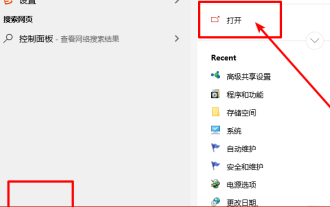
Many users always encounter some problems when playing some games on win10, such as screen freezes and blurred screens. At this time, we can solve the problem by turning on the directplay function, and the operation method of the function is also Very simple. How to install directplay, the old component of win10 1. Enter "Control Panel" in the search box and open it 2. Select large icons as the viewing method 3. Find "Programs and Features" 4. Click on the left to enable or turn off win functions 5. Select the old version here Just check the box
 How to implement calendar component using Vue?
Jun 25, 2023 pm 01:28 PM
How to implement calendar component using Vue?
Jun 25, 2023 pm 01:28 PM
Vue is a very popular front-end framework. It provides many tools and functions, such as componentization, data binding, event handling, etc., which can help developers build efficient, flexible and easy-to-maintain Web applications. In this article, I will introduce how to implement a calendar component using Vue. 1. Requirements analysis First, we need to analyze the requirements of this calendar component. A basic calendar should have the following functions: display the calendar page of the current month; support switching to the previous month or next month; support clicking on a certain day,
 VUE3 development basics: using extends to inherit components
Jun 16, 2023 am 08:58 AM
VUE3 development basics: using extends to inherit components
Jun 16, 2023 am 08:58 AM
Vue is one of the most popular front-end frameworks currently, and VUE3 is the latest version of the Vue framework. Compared with VUE2, VUE3 has higher performance and a better development experience, and has become the first choice of many developers. In VUE3, using extends to inherit components is a very practical development method. This article will introduce how to use extends to inherit components. What is extends? In Vue, extends is a very practical attribute, which can be used for child components to inherit from their parents.
 How to open the settings of the old version of win10 components
Dec 22, 2023 am 08:45 AM
How to open the settings of the old version of win10 components
Dec 22, 2023 am 08:45 AM
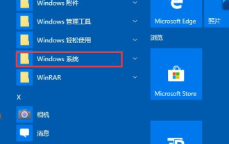
Win10 old version components need to be turned on by users themselves in the settings, because many components are usually closed by default. First we need to enter the settings. The operation is very simple. Just follow the steps below. Where are the win10 old version components? Open 1. Click Start, then click "Win System" 2. Click to enter the Control Panel 3. Then click the program below 4. Click "Enable or turn off Win functions" 5. Here you can choose what you want to open
 Angular components and their display properties: understanding non-block default values
Mar 15, 2024 pm 04:51 PM
Angular components and their display properties: understanding non-block default values
Mar 15, 2024 pm 04:51 PM
The default display behavior for components in the Angular framework is not for block-level elements. This design choice promotes encapsulation of component styles and encourages developers to consciously define how each component is displayed. By explicitly setting the CSS property display, the display of Angular components can be fully controlled to achieve the desired layout and responsiveness.
 VSCode plug-in sharing: a plug-in for real-time preview of Vue/React components
Mar 17, 2022 pm 08:07 PM
VSCode plug-in sharing: a plug-in for real-time preview of Vue/React components
Mar 17, 2022 pm 08:07 PM
When developing Vue/React components in VSCode, how to preview the components in real time? This article will share with you a plug-in for real-time preview of Vue/React components in VSCode. I hope it will be helpful to you!
 Let's talk about how Vue dynamically renders components through JSX
Dec 05, 2022 pm 06:52 PM
Let's talk about how Vue dynamically renders components through JSX
Dec 05, 2022 pm 06:52 PM
How does Vue dynamically render components through JSX? The following article will introduce to you how Vue can efficiently dynamically render components through JSX. I hope it will be helpful to you!
 Vue component practice: paging component development
Nov 24, 2023 am 08:56 AM
Vue component practice: paging component development
Nov 24, 2023 am 08:56 AM
Vue component practice: Introduction to paging component development In web applications, the paging function is an essential component. A good paging component should be simple and clear in presentation, rich in functions, and easy to integrate and use. In this article, we will introduce how to use the Vue.js framework to develop a highly customizable paging component. We will explain in detail how to develop using Vue components through code examples. Technology stack Vue.js2.xJavaScript (ES6) HTML5 and CSS3 development environment
