

Add vertical line to Excel chart: scatter plot, bar and line graph

This tutorial demonstrates how to add vertical lines to Excel charts, including scatter plots, bar charts, and line graphs. You'll also learn to create an interactive vertical line controlled by a scroll bar. While Excel easily adds horizontal lines, vertical lines require a workaround.
- Adding Vertical Lines to Scatter Charts
- Inserting Vertical Lines into Bar Charts
- Adding Vertical Lines to Line Charts
- Creating an Interactive Vertical Line with a Scroll Bar
Adding a Vertical Line to a Scatter Plot
To highlight a data point on a scatter chart, create a vertical line marking its x-axis (or x and y axes) position. The line will dynamically adjust to data changes.

Here's how:
- Create a scatter plot from your data.
- In separate cells, calculate the vertical line's data. For an average line, use the
AVERAGEfunction for x and y values (example shown below):

- Right-click the chart and select "Select Data...".
- Click "Add" under "Legend Entries (Series)".
- In "Edit Series," name the series (e.g., "Average"), select the x-value and y-value cells for your data point. Click "OK" twice.

- Select the new data point and add percentage error bars ("Chart Elements" > "Error Bars" > "Percentage").
- Right-click the vertical error bar, select "Format Error Bars...", set "Percentage" to 100, and choose the direction ("Both," "Minus," etc.).

- Adjust the horizontal error bar (set percentage to 0 to hide, or 100 to show).
- Customize the line's color, dash type, and width ("Fill & Line" tab).
The resulting vertical line will appear as configured.
Adding a Vertical Line to a Bar Chart
To compare values against an average or target, add a vertical line to a bar chart:

Follow these steps:
- Create a bar chart from your data.
- In empty cells, input data for the vertical line (example below, using
AVERAGEfor the x-value):
| X | Y |
| =AVERAGE($B$2:$B$7) | 0 |
| =AVERAGE($B$2:$B$7) | 1 |

- Right-click the chart, select "Select Data...", and click "Add".
- Name the series, select the x-values, and click "OK" twice.
- Change the series chart type to "Combo" (Excel 2013 ) or "X Y (Scatter)" > "Scatter with Straight Lines" (Excel 2010 and earlier).
- Re-select data, edit the series, selecting both X and Y values.
- Format the secondary y-axis (set maximum to 1, hide labels).
Adding a Vertical Line to a Line Chart
Use either method above to add a vertical line to a line chart.
Creating an Interactive Vertical Line with a Scroll Bar
To make the vertical line interactive, use a scroll bar:

- Enable the Developer tab.
- Insert a scroll bar ("Developer" > "Insert" > "Scroll Bar").
- Format the scroll bar, linking it to a cell (e.g., D5), setting the maximum value to the number of data points.
- Update the x-value cells for the vertical line to reference the scroll bar's linked cell (
=$D$5). Optionally, use=IFERROR(INDEX($A$2:$A$7, $D$5, 1), "")to display the corresponding data label.
Download the sample workbook for hands-on practice.
The above is the detailed content of Add vertical line to Excel chart: scatter plot, bar and line graph. For more information, please follow other related articles on the PHP Chinese website!

Hot AI Tools

Undresser.AI Undress
AI-powered app for creating realistic nude photos

AI Clothes Remover
Online AI tool for removing clothes from photos.

Undress AI Tool
Undress images for free

Clothoff.io
AI clothes remover

Video Face Swap
Swap faces in any video effortlessly with our completely free AI face swap tool!

Hot Article
Hot Tools

Notepad++7.3.1
Easy-to-use and free code editor

SublimeText3 Chinese version
Chinese version, very easy to use

Zend Studio 13.0.1
Powerful PHP integrated development environment

Dreamweaver CS6
Visual web development tools

SublimeText3 Mac version
God-level code editing software (SublimeText3)
Hot Topics


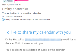 How to add calendar to Outlook: shared, Internet calendar, iCal file
Apr 03, 2025 am 09:06 AM
How to add calendar to Outlook: shared, Internet calendar, iCal file
Apr 03, 2025 am 09:06 AM
This article explains how to access and utilize shared calendars within the Outlook desktop application, including importing iCalendar files. Previously, we covered sharing your Outlook calendar. Now, let's explore how to view calendars shared with
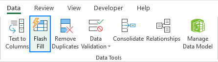 How to use Flash Fill in Excel with examples
Apr 05, 2025 am 09:15 AM
How to use Flash Fill in Excel with examples
Apr 05, 2025 am 09:15 AM
This tutorial provides a comprehensive guide to Excel's Flash Fill feature, a powerful tool for automating data entry tasks. It covers various aspects, from its definition and location to advanced usage and troubleshooting. Understanding Excel's Fla
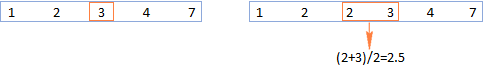 MEDIAN formula in Excel - practical examples
Apr 11, 2025 pm 12:08 PM
MEDIAN formula in Excel - practical examples
Apr 11, 2025 pm 12:08 PM
This tutorial explains how to calculate the median of numerical data in Excel using the MEDIAN function. The median, a key measure of central tendency, identifies the middle value in a dataset, offering a more robust representation of central tenden
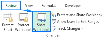 Excel shared workbook: How to share Excel file for multiple users
Apr 11, 2025 am 11:58 AM
Excel shared workbook: How to share Excel file for multiple users
Apr 11, 2025 am 11:58 AM
This tutorial provides a comprehensive guide to sharing Excel workbooks, covering various methods, access control, and conflict resolution. Modern Excel versions (2010, 2013, 2016, and later) simplify collaborative editing, eliminating the need to m
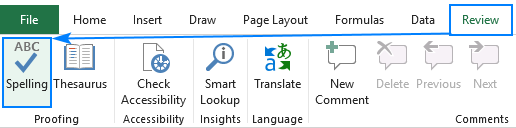 How to spell check in Excel
Apr 06, 2025 am 09:10 AM
How to spell check in Excel
Apr 06, 2025 am 09:10 AM
This tutorial demonstrates various methods for spell-checking in Excel: manual checks, VBA macros, and using a specialized tool. Learn to check spelling in cells, ranges, worksheets, and entire workbooks. While Excel isn't a word processor, its spel
 Absolute value in Excel: ABS function with formula examples
Apr 06, 2025 am 09:12 AM
Absolute value in Excel: ABS function with formula examples
Apr 06, 2025 am 09:12 AM
This tutorial explains the concept of absolute value and demonstrates practical Excel applications of the ABS function for calculating absolute values within datasets. Numbers can be positive or negative, but sometimes only positive values are neede
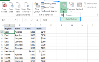 Excel: Group rows automatically or manually, collapse and expand rows
Apr 08, 2025 am 11:17 AM
Excel: Group rows automatically or manually, collapse and expand rows
Apr 08, 2025 am 11:17 AM
This tutorial demonstrates how to streamline complex Excel spreadsheets by grouping rows, making data easier to analyze. Learn to quickly hide or show row groups and collapse the entire outline to a specific level. Large, detailed spreadsheets can be
 Google Spreadsheet COUNTIF function with formula examples
Apr 11, 2025 pm 12:03 PM
Google Spreadsheet COUNTIF function with formula examples
Apr 11, 2025 pm 12:03 PM
Master Google Sheets COUNTIF: A Comprehensive Guide This guide explores the versatile COUNTIF function in Google Sheets, demonstrating its applications beyond simple cell counting. We'll cover various scenarios, from exact and partial matches to han
