

How to Build Responsive Images with srcset

This article, part of Microsoft's web development series, explores responsive images – a crucial aspect of creating websites that function flawlessly across diverse devices. It's no longer optional; it's a necessity in our multi-device world.
Key Takeaways:
- Use the
srcsetattribute to offer various image sources optimized for different device pixel ratios. - Combine
srcsetwith thesizesattribute to specify image display sizes relative to the viewport, guiding the browser to choose the best image. - Leverage the
<picture></picture>element for enhanced flexibility, enabling image selection based on media conditions (like CSS media queries) and supporting various image formats via thetypeattribute. - Always include a default image using the
srcattribute as a fallback for browsers lackingsrcsetsupport. - Thoroughly test responsiveness and performance across various devices and browsers using tools like those offered by Microsoft for compatibility checks and web experience optimization.
Understanding Responsive Images:
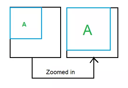
A responsive image adapts its presentation to the viewing device. "Best form" means different things:
- Displaying different image assets based on screen size (e.g., a different image for a 13.5-inch laptop versus a 5-inch phone).
- Using different images based on device resolution (or device-pixel ratio – the ratio of device pixels to CSS pixels).
- Selecting an image format (like JPEG XR) if supported by the browser, potentially for better compression.
Enabling Responsive Images:
While older scripting methods exist, they're not recommended due to potential issues with multiple downloads or missing images. The preferred approach uses:
-
srcsetattribute -
sizesattribute -
<picture></picture>element
The srcset Attribute:
Before diving into srcset usage, let's define:
Device-Pixel Ratio: This is the number of device pixels per CSS pixel, influenced by:
- Device pixel density (physical pixels per inch): Higher resolution devices have higher density and thus a higher device-pixel ratio at the same zoom level.
- Browser zoom level: Higher zoom levels increase the device-pixel ratio for a given device.
Basic srcset implementation uses the x descriptor for device-pixel ratio:
1 |
|
- 1x:
space-needle.jpgfor a device-pixel ratio of 1. - 2x:
space-needle-2x.jpgfor a device-pixel ratio of 2. - 3x:
space-needle-hd.jpgfor a device-pixel ratio of 3.
The src attribute serves as a fallback for browsers without srcset support. The w descriptor specifies image width:
1 |
|
The sizes Attribute:
To control image size based on viewport size, use the sizes attribute with the w descriptor in srcset.
Example 1 (Image at half viewport width):
1 |
|
Example 2 (Responsive sizing based on viewport width):
1 |
|
The <picture> Element:
The <picture> element allows for image selection based on rendered size and browser capabilities. It contains <source> elements with srcset, sizes, media, and type attributes. An <img src="/static/imghw/default1.png" data-src="https://img.php.cn/upload/article/000/000/000/174027748575415.png" class="lazy" alt="How to Build Responsive Images with srcset " />
</picture>
(Note: Image sources and sizes are illustrative.)


Conclusion:
Responsive images enhance user experience across devices. Implement them for optimal website performance. Further resources and tools from Microsoft are available for cross-browser testing and web development best practices. A detailed FAQ section follows, addressing common questions about srcset implementation.
The above is the detailed content of How to Build Responsive Images with srcset. For more information, please follow other related articles on the PHP Chinese website!

Hot AI Tools

Undresser.AI Undress
AI-powered app for creating realistic nude photos

AI Clothes Remover
Online AI tool for removing clothes from photos.

Undress AI Tool
Undress images for free

Clothoff.io
AI clothes remover

Video Face Swap
Swap faces in any video effortlessly with our completely free AI face swap tool!
Hot Article
Hot Tools

Notepad++7.3.1
Easy-to-use and free code editor

SublimeText3 Chinese version
Chinese version, very easy to use

Zend Studio 13.0.1
Powerful PHP integrated development environment

Dreamweaver CS6
Visual web development tools

SublimeText3 Mac version
God-level code editing software (SublimeText3)
Hot Topics
 1664
1664
 14
1423
52
1318
25
1268
29
1248
24
14
1423
52
1318
25
1268
29
1248
24

 How to Create an Animated Countdown Timer With HTML, CSS and JavaScript
Apr 11, 2025 am 11:29 AM
How to Create an Animated Countdown Timer With HTML, CSS and JavaScript
Apr 11, 2025 am 11:29 AM
Have you ever needed a countdown timer on a project? For something like that, it might be natural to reach for a plugin, but it’s actually a lot more
 HTML Data Attributes Guide
Apr 11, 2025 am 11:50 AM
HTML Data Attributes Guide
Apr 11, 2025 am 11:50 AM
Everything you ever wanted to know about data attributes in HTML, CSS, and JavaScript.
 A Proof of Concept for Making Sass Faster
Apr 16, 2025 am 10:38 AM
A Proof of Concept for Making Sass Faster
Apr 16, 2025 am 10:38 AM
At the start of a new project, Sass compilation happens in the blink of an eye. This feels great, especially when it’s paired with Browsersync, which reloads
 While You Weren't Looking, CSS Gradients Got Better
Apr 11, 2025 am 09:16 AM
While You Weren't Looking, CSS Gradients Got Better
Apr 11, 2025 am 09:16 AM
One thing that caught my eye on the list of features for Lea Verou's conic-gradient() polyfill was the last item:
 How to Build Vue Components in a WordPress Theme
Apr 11, 2025 am 11:03 AM
How to Build Vue Components in a WordPress Theme
Apr 11, 2025 am 11:03 AM
The inline-template directive allows us to build rich Vue components as a progressive enhancement over existing WordPress markup.
 A Comparison of Static Form Providers
Apr 16, 2025 am 11:20 AM
A Comparison of Static Form Providers
Apr 16, 2025 am 11:20 AM
Let’s attempt to coin a term here: "Static Form Provider." You bring your HTML
 PHP is A-OK for Templating
Apr 11, 2025 am 11:04 AM
PHP is A-OK for Templating
Apr 11, 2025 am 11:04 AM
PHP templating often gets a bad rap for facilitating subpar code — but that doesn't have to be the case. Let’s look at how PHP projects can enforce a basic
 The Three Types of Code
Apr 11, 2025 pm 12:02 PM
The Three Types of Code
Apr 11, 2025 pm 12:02 PM
Every time I start a new project, I organize the code I’m looking at into three types, or categories if you like. And I think these types can be applied to
