
 Web Front-end
CSS Tutorial
How We Created a Futuristic Newsletter Sign-Up Form with Premium UI/UX
Web Front-end
CSS Tutorial
How We Created a Futuristic Newsletter Sign-Up Form with Premium UI/UX
How We Created a Futuristic Newsletter Sign-Up Form with Premium UI/UX

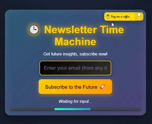
Creating an engaging, visually stunning, and functional newsletter sign-up form is no small feat. For this project, we set out to break away from the typical designs, aiming for something truly innovative: a futuristic, time-machine-inspired sign-up form. Here’s how we brought it to life.
Vision and Concept
The goal was simple: to make a newsletter sign-up form that:
- Captures attention immediately.
- Feels fun, interactive, and premium.
- Demonstrates the power of creative UI/UX design.
We wanted users to feel like they were stepping into a time machine when subscribing. With glowing neon effects, animated transitions, and a fully responsive layout, the design needed to stand out while remaining functional.
Step 1: The Core Structure
We started by structuring the form in HTML. This included:
Header Section:
- A title and subtitle to set the theme (time travel!).
Form Body:
- An email input field.
- A “Subscribe” button that triggers interactive animations.
Footer Section:
- A status message for feedback.
- A loading bar for visual progress after submission.
To make it more engaging, we added a “Buy Me a Coffee” button at the top-right corner, subtly encouraging users to support the project.
<div>


<p>Step 2: Styling for a Futuristic Look</p>

<p>The design needed to feel high-tech, so we focused on:</p>

<ul>
<li>Neon Colors: Bright, glowing colors for a sci-fi vibe.</li>
<li>Smooth Transitions: Subtle animations to make the UI feel alive.</li>
<li>Responsive Design: Ensuring the form looked great on all devices.</li>
</ul>

<p>Key styles included:</p>

<p>A glowing neon effect using text-shadow.<br>
Background animations with @keyframes to create a dynamic atmosphere.<br>
Button hover effects for an interactive feel.</p>

<p>CSS Code<br>
</p>

<pre class="brush:php;toolbar:false">body {
  font-family: 'Orbitron', sans-serif;
  background: radial-gradient(circle, #1b2735, #090a0f);
  color: #fff;
  margin: 0;
  padding: 0;
  overflow: hidden;
  animation: backgroundGlow 10s infinite alternate;
}

@keyframes backgroundGlow {
  0% {
    background: radial-gradient(circle, #1b2735, #090a0f);
  }
  100% {
    background: radial-gradient(circle, #202d42, #0d0f1a);
  }
}

.newsletter-container {
  position: relative;
  width: 80%;
  max-width: 500px;
  margin: 100px auto;
  background: linear-gradient(135deg, #2b5876, #4e4376);
  border-radius: 20px;
  padding: 20px;
  box-shadow: 0 15px 50px rgba(0, 0, 0, 0.5), inset 0 0 30px rgba(255, 255, 255, 0.1);
}

.coffee-button {
  position: absolute;
  top: 10px;
  right: 10px;
  display: inline-block;
  transition: transform 0.3s ease, box-shadow 0.3s ease;
}

.coffee-button img {
  width: 150px;
  border-radius: 10px;
  box-shadow: 0 5px 15px rgba(0, 0, 0, 0.3);
}

.coffee-button:hover img {
  transform: scale(1.1);
  box-shadow: 0 10px 30px rgba(255, 223, 0, 0.5);
}
Step 3: Adding Interactivity
We wanted the form to feel alive and responsive, so we used JavaScript to:
- Validate the email field.
- Display dynamic messages (error, success, loading).
- Animate a loading bar for visual feedback.
JavaScript Code
const subscribeBtn = document.getElementById('subscribe-btn');
const emailInput = document.getElementById('email');
const statusMessage = document.querySelector('.status-message');

subscribeBtn.addEventListener('click', () => {
  const email = emailInput.value.trim();

  if (!email) {
    statusMessage.textContent = '⛔️ Please enter a valid email address!';
    statusMessage.style.color = '#ff4d4d';
    return;
  }

  statusMessage.textContent = '⏳ Calculating time coordinates...';
  statusMessage.style.color = '#ffc107';

  setTimeout(() => {
    statusMessage.textContent = '✅ Coordinates verified! Welcome to the future.';
    statusMessage.style.color = '#00ff99';
    emailInput.value = '';
  }, 3000);
});
Step 4: Testing and Deployment
To ensure a smooth experience:
- We tested on different browsers and devices for responsiveness.
- We optimized the code for performance (minimizing CSS and JS).
Finally, we published the project on CodePen to showcase it to the community.
Key Takeaways
- Innovative Design Sells: A unique theme like time travel can elevate a simple form into something extraordinary.
- Interactivity is Key: Engaging animations and dynamic feedback keep users invested.
- Premium Feel: Glowing neon effects and smooth transitions give the form a high-end look.
Check It Out!
Explore the live demo here: Futuristic Newsletter Sign-Up Form on https://codepen.io/HanGPIIIErr/pen/oNKKXqg
For more creative designs and fun projects, visit https://gladiatorsbattle.com/ and dive into the world of gladiator-themed mini-games and premium designs. ?

The above is the detailed content of How We Created a Futuristic Newsletter Sign-Up Form with Premium UI/UX. For more information, please follow other related articles on the PHP Chinese website!

Hot AI Tools

Undresser.AI Undress
AI-powered app for creating realistic nude photos

AI Clothes Remover
Online AI tool for removing clothes from photos.

Undress AI Tool
Undress images for free

Clothoff.io
AI clothes remover

Video Face Swap
Swap faces in any video effortlessly with our completely free AI face swap tool!

Hot Article
Hot Tools

Notepad++7.3.1
Easy-to-use and free code editor

SublimeText3 Chinese version
Chinese version, very easy to use

Zend Studio 13.0.1
Powerful PHP integrated development environment

Dreamweaver CS6
Visual web development tools

SublimeText3 Mac version
God-level code editing software (SublimeText3)
Hot Topics


 Vue 3
Apr 02, 2025 pm 06:32 PM
Vue 3
Apr 02, 2025 pm 06:32 PM
It's out! Congrats to the Vue team for getting it done, I know it was a massive effort and a long time coming. All new docs, as well.
 Building an Ethereum app using Redwood.js and Fauna
Mar 28, 2025 am 09:18 AM
Building an Ethereum app using Redwood.js and Fauna
Mar 28, 2025 am 09:18 AM
With the recent climb of Bitcoin’s price over 20k $USD, and to it recently breaking 30k, I thought it’s worth taking a deep dive back into creating Ethereum
 Can you get valid CSS property values from the browser?
Apr 02, 2025 pm 06:17 PM
Can you get valid CSS property values from the browser?
Apr 02, 2025 pm 06:17 PM
I had someone write in with this very legit question. Lea just blogged about how you can get valid CSS properties themselves from the browser. That's like this.
 Stacked Cards with Sticky Positioning and a Dash of Sass
Apr 03, 2025 am 10:30 AM
Stacked Cards with Sticky Positioning and a Dash of Sass
Apr 03, 2025 am 10:30 AM
The other day, I spotted this particularly lovely bit from Corey Ginnivan’s website where a collection of cards stack on top of one another as you scroll.
 A bit on ci/cd
Apr 02, 2025 pm 06:21 PM
A bit on ci/cd
Apr 02, 2025 pm 06:21 PM
I'd say "website" fits better than "mobile app" but I like this framing from Max Lynch:
 Comparing Browsers for Responsive Design
Apr 02, 2025 pm 06:25 PM
Comparing Browsers for Responsive Design
Apr 02, 2025 pm 06:25 PM
There are a number of these desktop apps where the goal is showing your site at different dimensions all at the same time. So you can, for example, be writing
 Using Markdown and Localization in the WordPress Block Editor
Apr 02, 2025 am 04:27 AM
Using Markdown and Localization in the WordPress Block Editor
Apr 02, 2025 am 04:27 AM
If we need to show documentation to the user directly in the WordPress editor, what is the best way to do it?
 Why are the purple slashed areas in the Flex layout mistakenly considered 'overflow space'?
Apr 05, 2025 pm 05:51 PM
Why are the purple slashed areas in the Flex layout mistakenly considered 'overflow space'?
Apr 05, 2025 pm 05:51 PM
Questions about purple slash areas in Flex layouts When using Flex layouts, you may encounter some confusing phenomena, such as in the developer tools (d...
