

Image Swap in Pure CSS

Image Swap in Pure CSS
Let's create Image Swap tutorial in Pure CSS without using JavaScript.
- Let's create few elements in html using input radios, labels. At the end, also let's add **
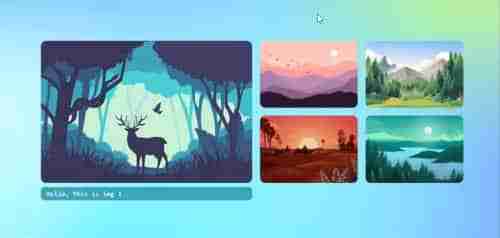
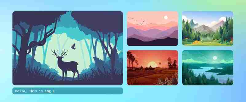
<div>


<p>Let's create <strong>CSS</strong><br>
</p>

<pre class="brush:php;toolbar:false"> * {
    margin: 0;
    padding: 0;
}

html {
    height: 100%;
    scroll-behavior: smooth;
}

body {
    display: flex;
    flex-direction: column;
    height: 100%;
    font-family: monospace;
    place-content: center;
    background-size: 100% 100%;
    background-position: 0px 0px;
    background-image: radial-gradient(18% 28% at 24% 50%, #CEFAFFFF 7%,
 #073AFF00 100%), radial-gradient(18% 28% at 18% 71%, #FFFFFF59 6%,
#073AFF00 100%), radial-gradient(70% 53% at 36% 76%, #73F2FFFF 0%,
#073AFF00 100%), radial-gradient(42% 53% at 15% 94%, #FFFFFFFF 7%,
 #073AFF00 100%), radial-gradient(42% 53% at 34% 72%, #FFFFFFFF 7%,
 #073AFF00 100%), radial-gradient(18% 28% at 35% 87%, #FFFFFFFF 7%,
 #073AFF00 100%), radial-gradient(31% 43% at 7% 98%, #FFFFFFFF 24%,
 #073AFF00 100%), radial-gradient(21% 37% at 72% 23%, #D3FF6D9C 24%,
 #073AFF00 100%), radial-gradient(35% 56% at 91% 74%, #8A4FFFF5 9%,
 #073AFF00 100%), radial-gradient(74% 86% at 67% 38%, #84d9ff 24%,
 #073AFF00 100%), linear-gradient(125deg, #4EB5FFFF 1%, #4C00FCFF 100%);
}

.wrapper {
    width: 860px;
    height: 283px;
    position: relative;
    margin: 0 auto;
}

.wrapper label {
    width: 200px;
    height: 134px;
    cursor: pointer;
    position: absolute;
    transition: 0.25s;
    border-radius: 10px;
}

.wrapper label img{
    max-width: 100%;
    height: 100%;
    border-radius: 10px;
}

.wrapper input[type="radio"] {
    padding: 5px 5px 5px 10px;
    height: 134px;
    width: 200px;
    cursor: pointer;
    position: absolute;
    z-index: -1;
    opacity: 0;
}

.wrapper input[type="radio"]+label span {
    opacity: 0;
    background: var(--bg);
    display: inline-block;
    border-radius: 7px;
    padding: 5px 0 5px 10px;
    margin-top: 5px;
    width: calc(100% - 10px);
    color: white;
}

.wrapper input[type="radio"]:checked+label span {
    opacity: 1;
    animation-delay: 1s;
    animation: fade 1s;
}

/* static positions */
.wrapper input[type="radio"]#s1,
.wrapper input[type="radio"]#s1+label {
    left: 0;
    top: 0;
}

.wrapper input[type="radio"]#s2,
.wrapper input[type="radio"]#s2+label {
    left: 440px;
    top: 0;
}

.wrapper input[type="radio"]#s3,
.wrapper input[type="radio"]#s3+label {
    left: 655px;
    top: 0;
}

.wrapper input[type="radio"]#s4,
.wrapper input[type="radio"]#s4+label {
    left: 440px;
    top: 150px;
}

.wrapper input[type="radio"]#s5,
.wrapper input[type="radio"]#s5+label {
    left: 655px;
    top: 150px;
}

/* onclick shows large image and caption*/
.wrapper input[type="radio"]:checked,
.wrapper input[type="radio"]:checked+label {
    left: 0 !important;
    top: 0 !important;
    width: 425px;
    height: 100%;
}

/* placing first item position when clickced on other thumbnails */
.wrapper input[type="radio"]#s2:checked~#s1+label {
    left: 440px;
}

.wrapper input[type="radio"]#s3:checked~#s1+label {
    left: 660px;
}

.wrapper input[type="radio"]#s4:checked~#s1+label {
    left: 440px;
    top: 150px;
}

.wrapper input[type="radio"]#s5:checked~#s1+label {
    left: 660px;
    top: 150px;
}

@keyframes fade {
    from {
        opacity: 0;
    }

    to {
        opacity: 1;
    }
}

/* changing background color when clicked on thumbnails */
.bg {
    position: fixed;
    left: 0;
    top: 0;
    width: 100vw;
    height: 100vh;
    z-index: -1;
}

.wrapper input[type="radio"]#s2:checked~.bg {
    background-image: radial-gradient(circle, rgba(238, 174, 202, 1) 0%, rgba(148, 187, 233, 1) 100%);
}

.wrapper input[type="radio"]#s3:checked~.bg {
    background-image: radial-gradient(circle, rgb(197, 218, 196) 0%, rgb(88, 167, 204) 100%);
}

.wrapper input[type="radio"]#s4:checked~.bg {
    background-image: radial-gradient(circle, rgb(238, 226, 174) 0%, rgb(177, 139, 131) 100%);
}

.wrapper input[type="radio"]#s5:checked~.bg {
    background-image: radial-gradient(circle, rgb(174, 238, 225) 0%, rgb(36, 163, 136) 100%);
}
Copy after loginNow, we have done the swap animations with static positions. Check the output in below gif animation if it plays else go to the end of this article and view the codepen link for demo.

Now let's try with dynamic width and height using CSS custom variables. Using custom css variables is very useful because just by changing at only 2 places, all the sizes(large and thumbnails) including gaps will get automatically fixed. Let's create variables in :root
 :root {
     --w: 800px;
     --h: 270px;
     --m: 15px;
     --thumbw: calc(var(--w)/4 - 15px);
     --thumbh: calc(50% - var(--m));
     --top: calc(var(--h)/2 + var(--m)/2 + 0px);
 }
Copy after loginNow ignore all the previous CSS and replace with below CSS. You can find below the previous CSS are commented and replaced with custom variables.
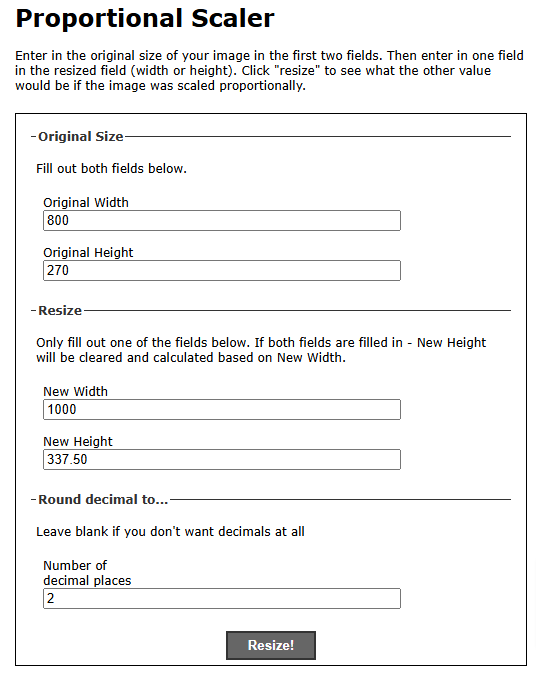
:root {
    --w: 800px;
    --h: 270px;
    --m: 15px;
    --thumbw: calc(var(--w)/4 - 15px);
    --thumbh: calc(50% - var(--m));
    --top: calc(var(--h)/2 + var(--m)/2 + 0px);
}

 * {
     margin: 0;
     padding: 0;
 }

 html {
     height: 100%;
     scroll-behavior: smooth;
 }

body {
    display: flex;
    flex-direction: column;
    height: 100%;
    font-family: monospace;
    place-content: center;
    background-size: 100% 100%;
    background-position: 0px 0px;
    background-image: radial-gradient(18% 28% at 24% 50%, #CEFAFFFF 7%,
 #073AFF00 100%), radial-gradient(18% 28% at 18% 71%, #FFFFFF59 6%,
#073AFF00 100%), radial-gradient(70% 53% at 36% 76%, #73F2FFFF 0%,
#073AFF00 100%), radial-gradient(42% 53% at 15% 94%, #FFFFFFFF 7%,
 #073AFF00 100%), radial-gradient(42% 53% at 34% 72%, #FFFFFFFF 7%,
 #073AFF00 100%), radial-gradient(18% 28% at 35% 87%, #FFFFFFFF 7%,
 #073AFF00 100%), radial-gradient(31% 43% at 7% 98%, #FFFFFFFF 24%,
 #073AFF00 100%), radial-gradient(21% 37% at 72% 23%, #D3FF6D9C 24%,
 #073AFF00 100%), radial-gradient(35% 56% at 91% 74%, #8A4FFFF5 9%,
 #073AFF00 100%), radial-gradient(74% 86% at 67% 38%, #84d9ff 24%,
 #073AFF00 100%), linear-gradient(125deg, #4EB5FFFF 1%, #4C00FCFF 100%);
}

 .wrapper {
     /* width: 860px; */
     /* height: 283px; */
     width: var(--w);
     height: var(--h);
     position: relative;
     margin: 0 auto;
 }

 .wrapper label {
     /* width: 200px; */
     width: var(--thumbw);
     height: calc(50% - var(--m) / 2);
     cursor: pointer;
     position: absolute;
     transition: 0.25s;
     border-radius: 10px;
 }

 .wrapper label img,
 .wrapper label div {
     max-width: 100%;
     height: 100%;
     border-radius: 10px;
 }

 .wrapper input[type="radio"] {
     padding: 5px 5px 5px 10px;
      /* width: 200px; */
     /* height: 134px; */
     height: calc(50% - var(--m) / 2);
     width: var(--thumbw);
     cursor: pointer;
     position: absolute;
     z-index: -1;
     opacity: 0;
 }

 .wrapper input[type="radio"]+label span {
     opacity: 0;
     background: var(--bg);
     display: inline-block;
     border-radius: 7px;
     padding: 5px 0 5px 10px;
     margin-top: 5px;
     width: calc(100% - 10px);
     color: white;
 }

 .wrapper input[type="radio"]:checked+label span {
     opacity: 1;
     animation-delay: 1s;
     animation: fade 1s;
 }

 .wrapper input[type="radio"]#s1,
 .wrapper input[type="radio"]#s1+label {
     left: 0;
     top: 0;
 }

 .wrapper input[type="radio"]#s2,
 .wrapper input[type="radio"]#s2+label {
     /* left: 440px; */
     left: calc((var(--w)/2) + var(--m));
     top: 0;
 }

 .wrapper input[type="radio"]#s3,
 .wrapper input[type="radio"]#s3+label {
     /* left: 655px; */
     left: calc(var(--w)/2 + var(--thumbw) + var(--m) + 15px);
     top: 0;
 }

 .wrapper input[type="radio"]#s4,
 .wrapper input[type="radio"]#s4+label {
     /* left: 440px; */
      /* top: 150px; */
     left: calc((var(--w)/2) + var(--m));
     top: var(--top);
 }

 .wrapper input[type="radio"]#s5,
 .wrapper input[type="radio"]#s5+label {
     /* left: 655px; */
      /* top: 150px; */
     left: calc(var(--w)/2 + var(--thumbw) + var(--m) + 15px);
     top: var(--top);
 }

 .wrapper input[type="radio"]:checked,
 .wrapper input[type="radio"]:checked+label {
     left: 0 !important;
     top: 0 !important;
     /* width: 425px; */
     width: calc(var(--w)/2);
     height: 100%;
 }

 .bg {
     position: fixed;
     left: 0;
     top: 0;
     width: 100vw;
     height: 100vh;
     z-index: -1;
 }

 .wrapper input[type="radio"]#s2:checked~#s1+label {
     /* left: 440px; */
     left: calc((var(--w)/2) + var(--m));
 }

 .wrapper input[type="radio"]#s3:checked~#s1+label {
     /* left: 660px; */
     left: calc(var(--w)/2 + var(--thumbw) + var(--m) + 15px);
 }

 .wrapper input[type="radio"]#s4:checked~#s1+label {
     /* left: 440px; */
      /* top: 150px; */
     left: calc((var(--w)/2) + var(--m));
     top: var(--top);
 }

 .wrapper input[type="radio"]#s5:checked~#s1+label {
     /* left: 660px; */
      /* top: 150px; */
     left: calc(var(--w)/2 + var(--thumbw) + var(--m)*2);
     top: var(--top);
 }


 @keyframes fade {
     from {
         opacity: 0;
     }

     to {
         opacity: 1;
     }
 }

 .wrapper input[type="radio"]#s2:checked~.bg {
     background-image: radial-gradient(circle, rgba(238, 174, 202, 1) 0%, rgba(148, 187, 233, 1) 100%);
 }

 .wrapper input[type="radio"]#s3:checked~.bg {
     background-image: radial-gradient(circle, rgb(197, 218, 196) 0%, rgb(88, 167, 204) 100%);
 }

 .wrapper input[type="radio"]#s4:checked~.bg {
     background-image: radial-gradient(circle, rgb(238, 226, 174) 0%, rgb(177, 139, 131) 100%);
 }

 .wrapper input[type="radio"]#s5:checked~.bg {
     background-image: radial-gradient(circle, rgb(174, 238, 225) 0%, rgb(36, 163, 136) 100%);
 }
Copy after loginNow in the :root {--w: 800px; --h: 270px;}. Just change the width and height proportionately. Go to url https://scriptygoddess.com/resources/proportioncalc.htm and type :root width and height shown in below image
Now type new width or height to get proportionate value. I added my new width 1000 and clicked on resize and I got 337.5 as height and I assigned in :root {--w: 1000px; --h: 337.5px;}. That's all you have to do. You can see the change in all images - width, height, gaps increases proportionately.
You can edit the value of width and height in :root in below codepen link and run. Have fun!
Codepen DemoThank you for watching...
The above is the detailed content of Image Swap in Pure CSS. For more information, please follow other related articles on the PHP Chinese website!


Hot AI Tools

Undresser.AI Undress
AI-powered app for creating realistic nude photos

AI Clothes Remover
Online AI tool for removing clothes from photos.

Undress AI Tool
Undress images for free

Clothoff.io
AI clothes remover

Video Face Swap
Swap faces in any video effortlessly with our completely free AI face swap tool!

Hot Article
Hot Tools

Notepad++7.3.1
Easy-to-use and free code editor

SublimeText3 Chinese version
Chinese version, very easy to use

Zend Studio 13.0.1
Powerful PHP integrated development environment

Dreamweaver CS6
Visual web development tools

SublimeText3 Mac version
God-level code editing software (SublimeText3)
Hot Topics


 Vue 3
Apr 02, 2025 pm 06:32 PM
Vue 3
Apr 02, 2025 pm 06:32 PM
It's out! Congrats to the Vue team for getting it done, I know it was a massive effort and a long time coming. All new docs, as well.
 Building an Ethereum app using Redwood.js and Fauna
Mar 28, 2025 am 09:18 AM
Building an Ethereum app using Redwood.js and Fauna
Mar 28, 2025 am 09:18 AM
With the recent climb of Bitcoin’s price over 20k $USD, and to it recently breaking 30k, I thought it’s worth taking a deep dive back into creating Ethereum
 Can you get valid CSS property values from the browser?
Apr 02, 2025 pm 06:17 PM
Can you get valid CSS property values from the browser?
Apr 02, 2025 pm 06:17 PM
I had someone write in with this very legit question. Lea just blogged about how you can get valid CSS properties themselves from the browser. That's like this.
 Stacked Cards with Sticky Positioning and a Dash of Sass
Apr 03, 2025 am 10:30 AM
Stacked Cards with Sticky Positioning and a Dash of Sass
Apr 03, 2025 am 10:30 AM
The other day, I spotted this particularly lovely bit from Corey Ginnivan’s website where a collection of cards stack on top of one another as you scroll.
 A bit on ci/cd
Apr 02, 2025 pm 06:21 PM
A bit on ci/cd
Apr 02, 2025 pm 06:21 PM
I'd say "website" fits better than "mobile app" but I like this framing from Max Lynch:
 Comparing Browsers for Responsive Design
Apr 02, 2025 pm 06:25 PM
Comparing Browsers for Responsive Design
Apr 02, 2025 pm 06:25 PM
There are a number of these desktop apps where the goal is showing your site at different dimensions all at the same time. So you can, for example, be writing
 Using Markdown and Localization in the WordPress Block Editor
Apr 02, 2025 am 04:27 AM
Using Markdown and Localization in the WordPress Block Editor
Apr 02, 2025 am 04:27 AM
If we need to show documentation to the user directly in the WordPress editor, what is the best way to do it?
 Why are the purple slashed areas in the Flex layout mistakenly considered 'overflow space'?
Apr 05, 2025 pm 05:51 PM
Why are the purple slashed areas in the Flex layout mistakenly considered 'overflow space'?
Apr 05, 2025 pm 05:51 PM
Questions about purple slash areas in Flex layouts When using Flex layouts, you may encounter some confusing phenomena, such as in the developer tools (d...
