

CSS Fluid Typography: A Guide to Using clamp() for Scalable Text

Table of content
- Introduction
- Using clamp() Function to Achieve Fluid Typography
- Conclusion
Introduction
Writing CSS media queries can be sometimes challenging fun, especially when there are too many things to be done. We often focus so much on building the layout and making other parts of our website responsive that it becomes stressful. But what if we could reduce that stress by making our text scalable, no matter the screen size, without needing to write a ton of media queries?
Let’s dive in and get started on how to achieve fluid typography using the CSS clamp() function.
Using Clamp() Function to Achieve Fluid Typography
The problem
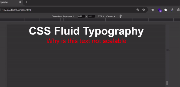
Here’s a basic webpage with an H1 tag and a P tag:
<!DOCTYPE html>
<html lang="en">
<head>
    <meta charset="UTF-8">
    <meta name="viewport" content="width=device-width, initial-scale=1.0">
    <title>CSS Fluid Typography</title>
</head>
    <style>
        *{
            margin: 0;
            padding: 0;
            box-sizing: border-box;
        }

        body{
            font-family: Arial, sans-serif;
            background: #333;
            color: white;
            text-align: center;
        }

        h1{
            font-size: 5rem;
        }

        p{
            font-size: 3rem;
            color: red;
        }
    </style>
<body>
    <h1>CSS Fluid Typography</h1>
    <p>Why is this text not scalable</p>
</body>
</html>
Now let's take a look at how the text behaves on different screen sizes
A simple way to make the text above responsive is to use media queries, but in this article, we’ll make the text responsive using the CSS clamp() function.
But before that, let's first look at the vw (viewport width) unit. The vw unit allows you to set your font size relative to the width of the viewport, making your text responsive.
Let's update our existing code with the following changes:
<style>
  h1 {
    font-size: 10vw; /* H1 size is 10% of the viewport width */
  }
  p {
    font-size: 5vw;  /* p size is 5% of the viewport width */
    color: red;
  }
</style>
If the viewport width is 1000px:
The h1 font size will be 100px
The p font size will be 50px
The font sizes for H1 and p will continue to grow or shrink as the viewport width changes.
Let's see how it looks:

From the GIF above, we can see that using vw works for responsive text but lacks constraints. As the viewport width increases, the font size will keep growing without limit, and similarly, it will keep shrinking when the viewport width decreases.
This is where the clamp() function comes into play. clamp() allows you to set a minimum, preferred, and maximum font size, providing control over how the text scales within a defined range.
The Solution
Using the clamp() function
The clamp() function in CSS allows you to set a range for your font size.
The general format is :
clamp(minimum, preferred, maximum)
- Minimum: The smallest size your text can shrink to.
- Preferred: The ideal size, often a percentage of the viewport width
- Maximum: The largest size your text can grow to.
Let's use the example from above and modify the code with the following
h1{
  font-size: clamp(24px, 5vw, 48px); /* Font size scales between 24px and 48px */
}

p{
  font-size: clamp(16px, 3vw, 24px) /* Font size scales between 16px and 24px)
}
Let's see how it looks on the browser:

Now, the h1 and p elements will be responsive, as their sizes will stay within the defined range, ensuring they don't become too large or too small.
Conclusion
In this article, we have learnt how to achieve fluid typography using the CSS clamp() function. Thank you for reading to this point. I ask that you drop a like and share this article with your peers who will benefit from this.
What are your thoughts on this article? Feel free to share your thoughts in the comments section below.
P.S. I'm currently looking for frontend developer opportunities. If you have any leads or are hiring, feel free to check out my resume or connect with me on LinkedIn. I'd love to hear from you!
The above is the detailed content of CSS Fluid Typography: A Guide to Using clamp() for Scalable Text. For more information, please follow other related articles on the PHP Chinese website!

Hot AI Tools

Undresser.AI Undress
AI-powered app for creating realistic nude photos

AI Clothes Remover
Online AI tool for removing clothes from photos.

Undress AI Tool
Undress images for free

Clothoff.io
AI clothes remover

Video Face Swap
Swap faces in any video effortlessly with our completely free AI face swap tool!

Hot Article
Hot Tools

Notepad++7.3.1
Easy-to-use and free code editor

SublimeText3 Chinese version
Chinese version, very easy to use

Zend Studio 13.0.1
Powerful PHP integrated development environment

Dreamweaver CS6
Visual web development tools

SublimeText3 Mac version
God-level code editing software (SublimeText3)
Hot Topics


 Vue 3
Apr 02, 2025 pm 06:32 PM
Vue 3
Apr 02, 2025 pm 06:32 PM
It's out! Congrats to the Vue team for getting it done, I know it was a massive effort and a long time coming. All new docs, as well.
 Building an Ethereum app using Redwood.js and Fauna
Mar 28, 2025 am 09:18 AM
Building an Ethereum app using Redwood.js and Fauna
Mar 28, 2025 am 09:18 AM
With the recent climb of Bitcoin’s price over 20k $USD, and to it recently breaking 30k, I thought it’s worth taking a deep dive back into creating Ethereum
 Can you get valid CSS property values from the browser?
Apr 02, 2025 pm 06:17 PM
Can you get valid CSS property values from the browser?
Apr 02, 2025 pm 06:17 PM
I had someone write in with this very legit question. Lea just blogged about how you can get valid CSS properties themselves from the browser. That's like this.
 Stacked Cards with Sticky Positioning and a Dash of Sass
Apr 03, 2025 am 10:30 AM
Stacked Cards with Sticky Positioning and a Dash of Sass
Apr 03, 2025 am 10:30 AM
The other day, I spotted this particularly lovely bit from Corey Ginnivan’s website where a collection of cards stack on top of one another as you scroll.
 A bit on ci/cd
Apr 02, 2025 pm 06:21 PM
A bit on ci/cd
Apr 02, 2025 pm 06:21 PM
I'd say "website" fits better than "mobile app" but I like this framing from Max Lynch:
 Comparing Browsers for Responsive Design
Apr 02, 2025 pm 06:25 PM
Comparing Browsers for Responsive Design
Apr 02, 2025 pm 06:25 PM
There are a number of these desktop apps where the goal is showing your site at different dimensions all at the same time. So you can, for example, be writing
 Using Markdown and Localization in the WordPress Block Editor
Apr 02, 2025 am 04:27 AM
Using Markdown and Localization in the WordPress Block Editor
Apr 02, 2025 am 04:27 AM
If we need to show documentation to the user directly in the WordPress editor, what is the best way to do it?
 Why are the purple slashed areas in the Flex layout mistakenly considered 'overflow space'?
Apr 05, 2025 pm 05:51 PM
Why are the purple slashed areas in the Flex layout mistakenly considered 'overflow space'?
Apr 05, 2025 pm 05:51 PM
Questions about purple slash areas in Flex layouts When using Flex layouts, you may encounter some confusing phenomena, such as in the developer tools (d...
