

jquery ui bootstrap implements custom style_jquery

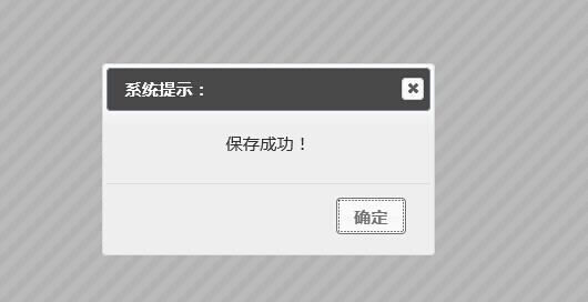
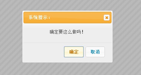
First take a look at the rendering of the custom prompt box
Alert ordinary prompts can of course be customized in style
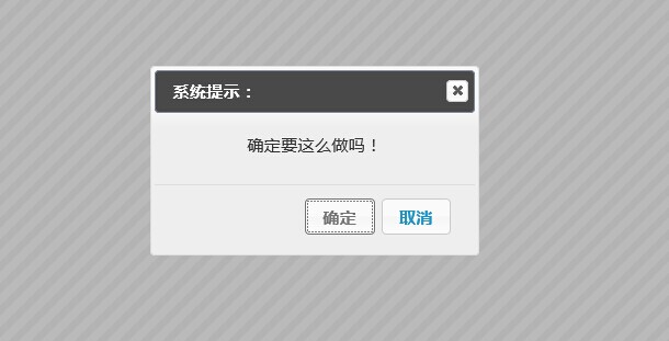
confrim confirmation box supports callback
//Message prompt information, callback(true/false) callback function
window.shconfirm = function (message, callback)
The callback function parameters are true/false
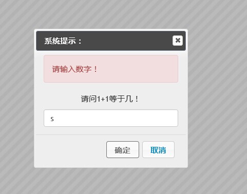
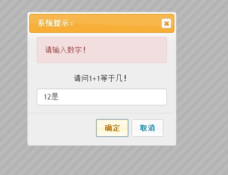
prompt invitation user input box
//message prompt information, callback(msg) callback function (message input by the user), param: regex input regular verification, regexmsg regular verification failed prompt
window.shprompt = function (message, callback, regex, regexmsg)
Here message is the prompt message *
Callback is the callback function * The return parameter is the value entered by the user (userinputmsg)
The two parameters regex and regexmsg are optional and are used to verify user input. Both parameters need to appear at the same time. Cannot be used alone.
The following is the implementation of js,
Currently this is an alert prompt that integrates jquery ui and bootstrap's own encapsulation.
(function () {
var _shconfirm = {};
var _shprompt = {};
//闭包初始化;
$(function () {
$("#dialogalert").dialog({
modal: true,
autoOpen: false,
show: {
effect: "blind",
duration: 500
},
hide: {
effect: "explode",
duration: 500
},
buttons: {
确定: function () {
$(this).dialog("close");
}
}
});
$("#dialogconfirm").dialog({
modal: true,
autoOpen: false,
show: {
effect: "slide",
duration: 500
},
hide: {
effect: "drop",
duration: 500
},
buttons: {
确定: function () {
_shconfirm.shconfirmCallBack(true);
$(this).dialog("close");
},
取消: function () {
_shconfirm.shconfirmCallBack(false);
$(this).dialog("close");
}
}
});
$("#dialogprompt").dialog({
modal: true,
autoOpen: false,
show: {
effect: "blind",
duration: 500
},
hide: {
effect: "puff",
duration: 500
},
buttons: {
确定: function () {
if (_shprompt.shpromptObj.regex) {
if (!_shprompt.shpromptObj.regex.test($("#dialogprompt .text").val())) {
$("#dialogprompt .alert .promptmsg").html(_shprompt.shpromptObj.regexmsg);
$("#dialogprompt .alert").slideDown();
return;
} else {
$("#dialogprompt .alert").hide();
}
}
_shprompt.shpromptObj.callback($("#dialogprompt .text").val());
$(this).dialog("close");
},
取消: function () {
_shprompt.shpromptObj.callback($("#dialogprompt .text").val());
$(this).dialog("close");
}
}
});
});
window.shalert = function (message) {
$("#dialogalert .msgcontent").html(message);
$("#dialogalert").dialog("open");
};
//message 提示的信息 ,callback(true/false)回调函数
window.shconfirm = function (message, callback) {
$("#dialogconfirm .msgcontent").html(message);
$("#dialogconfirm").dialog("open");
_shconfirm.shconfirmCallBack = callback;
};
//message 提示的信息 ,callback(msg)回调函数(用户输入的消息), param:regex 输入的 正则验证,regexmsg 正则验证不通过的提示
window.shprompt = function (message, callback, regex, regexmsg) {
$("#dialogprompt .msgcontent").html(message);
$("#dialogprompt").dialog("open");
_shprompt.shpromptObj = {
callback: callback,
regex: regex,
regexmsg: regexmsg
};
}
})();
The following is the calling code
confirm //Unfortunately, js cannot simulate js script pause, so we can only use the callback function to continue the next step.
function ShConfirm() {
shconfirm("Are you sure you want to do this!", function (result) {
if (result) {
alert("Clicked OK");
} else {
alert("Clicked Cancel");
}
});
}
function ShPrompt() {
shprompt("What is 1 1 equal to?", function (text) {
alert("The user entered: " text);
}, /^d{1,}$/, "Please enter a number!");
}
Just use shalert directly. It has the same effect as js alert.
I have put the source code on Baidu Netdisk. Everyone is welcome to learn and exchange.
Source code download address
http://pan.baidu.com/s/1c00Cl36
This control actually has reconfigurable parts, such as initialization methods, etc. These have not been extracted. Because the task is tight, I will use it like this first.
These issues will be addressed in the next optimization.
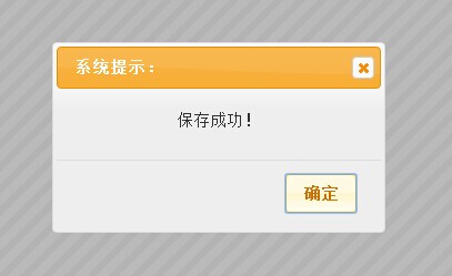
The original style is like this, which can be achieved by modifying the referenced css. There are detailed instructions in the demo.
The above is the entire content of this article. How about it, you will benefit a lot.

Hot AI Tools

Undresser.AI Undress
AI-powered app for creating realistic nude photos

AI Clothes Remover
Online AI tool for removing clothes from photos.

Undress AI Tool
Undress images for free

Clothoff.io
AI clothes remover

Video Face Swap
Swap faces in any video effortlessly with our completely free AI face swap tool!

Hot Article
Hot Tools

Notepad++7.3.1
Easy-to-use and free code editor

SublimeText3 Chinese version
Chinese version, very easy to use

Zend Studio 13.0.1
Powerful PHP integrated development environment

Dreamweaver CS6
Visual web development tools

SublimeText3 Mac version
God-level code editing software (SublimeText3)
Hot Topics


 How to get the bootstrap search bar
Apr 07, 2025 pm 03:33 PM
How to get the bootstrap search bar
Apr 07, 2025 pm 03:33 PM
How to use Bootstrap to get the value of the search bar: Determines the ID or name of the search bar. Use JavaScript to get DOM elements. Gets the value of the element. Perform the required actions.
 How to use bootstrap in vue
Apr 07, 2025 pm 11:33 PM
How to use bootstrap in vue
Apr 07, 2025 pm 11:33 PM
Using Bootstrap in Vue.js is divided into five steps: Install Bootstrap. Import Bootstrap in main.js. Use the Bootstrap component directly in the template. Optional: Custom style. Optional: Use plug-ins.
 How to do vertical centering of bootstrap
Apr 07, 2025 pm 03:21 PM
How to do vertical centering of bootstrap
Apr 07, 2025 pm 03:21 PM
Use Bootstrap to implement vertical centering: flexbox method: Use the d-flex, justify-content-center, and align-items-center classes to place elements in the flexbox container. align-items-center class method: For browsers that do not support flexbox, use the align-items-center class, provided that the parent element has a defined height.
 How to write split lines on bootstrap
Apr 07, 2025 pm 03:12 PM
How to write split lines on bootstrap
Apr 07, 2025 pm 03:12 PM
There are two ways to create a Bootstrap split line: using the tag, which creates a horizontal split line. Use the CSS border property to create custom style split lines.
 How to insert pictures on bootstrap
Apr 07, 2025 pm 03:30 PM
How to insert pictures on bootstrap
Apr 07, 2025 pm 03:30 PM
There are several ways to insert images in Bootstrap: insert images directly, using the HTML img tag. With the Bootstrap image component, you can provide responsive images and more styles. Set the image size, use the img-fluid class to make the image adaptable. Set the border, using the img-bordered class. Set the rounded corners and use the img-rounded class. Set the shadow, use the shadow class. Resize and position the image, using CSS style. Using the background image, use the background-image CSS property.
 How to set up the framework for bootstrap
Apr 07, 2025 pm 03:27 PM
How to set up the framework for bootstrap
Apr 07, 2025 pm 03:27 PM
To set up the Bootstrap framework, you need to follow these steps: 1. Reference the Bootstrap file via CDN; 2. Download and host the file on your own server; 3. Include the Bootstrap file in HTML; 4. Compile Sass/Less as needed; 5. Import a custom file (optional). Once setup is complete, you can use Bootstrap's grid systems, components, and styles to create responsive websites and applications.
 How to use bootstrap button
Apr 07, 2025 pm 03:09 PM
How to use bootstrap button
Apr 07, 2025 pm 03:09 PM
How to use the Bootstrap button? Introduce Bootstrap CSS to create button elements and add Bootstrap button class to add button text
 How to resize bootstrap
Apr 07, 2025 pm 03:18 PM
How to resize bootstrap
Apr 07, 2025 pm 03:18 PM
To adjust the size of elements in Bootstrap, you can use the dimension class, which includes: adjusting width: .col-, .w-, .mw-adjust height: .h-, .min-h-, .max-h-
