

HTML5 and CSS3 realize the switching effect of smart animation

This article will share with you a demo based on HTML5 CSS3 to achieve smart animated TAB switching effect. It is very good and has reference value. Friends who need it can refer to it.
The designer gave a rendering of tab switching. . Although it is a small function, front-end engineers still have many details to pay attention to when implementing it. I wrote a demo for your reference.
The final effect is as follows:
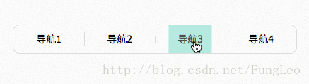
In order for the gif animation to show details, I extended the animation time to 3 seconds
Implementation ideas
Interval vertical lines, because they are not vertical, so borders cannot be used. I'm going to use pseudo-elements.
There are only 3 vertical bars, but there are 4 li s. This is simple and can be selected using the :not(:first-child) selector.
The switching background color changes, because I want to have an effect from small to large, so I can’t directly use the background color to achieve it. I am also going to use pseudo elements to achieve it.
If the size of the pseudo element is used to control it, the calculation will be more complicated, so I want to use box-shadow shadow to achieve it.
Okay, that’s it. Let’s start writing the code, as follows:
HTML code
  <p class="m">
    <ul class="tab">
      <li><a href="">导航1</a></li>
      <li><a href="">导航2</a></li>
      <li><a href="">导航3</a></li>
      <li><a href="">导航4</a></li>
    </ul>
</p>The above code structure has been written before. I think it is OK, so I won’t make any adjustments. There is no cumbersome code.
CSS code
.m { margin: 100px; }
.tab { width: 400px; margin: 0 auto; border: 1px solid #ddd; height: 40px; text-align: center; line-height: 40px; background: #fff; border-radius: 10px; overflow: hidden; }
.tab li { float: left; width: 100px; position: relative; overflow: hidden; }
.tab li:before, .tab li:after, .tab li a { -webkit-transition: all 0.25s ease-in-out; transition: all 0.25s ease-in-out; }
.tab li:before, .tab li:after { content: ""; display: block; }
.tab li:not(:first-child):after { background: #ddd; height: 20px; width: 1px; left: 0; top: 10px; position: absolute; }
.tab li a { display: block; position: relative; z-index: 2; color: #000; font-size: 14px; }
.tab li:before { width: 0; height: 0; top: 50%; left: 50%; z-index: 1; position: absolute; }
.tab li:hover a { color: #fff; }
.tab li:hover:before { box-shadow: 0 0 0 100px #36bc99; }
.tab li:hover + li:after, .tab li:hover:after { height: 0; top: 20px; }Code analysis:
Animation implementation It's very simple, just use the transition attribute.
To control your own pseudo-elements and the pseudo-elements of the next sibling element, just use the selector.
Other codes are relatively clear and simple, you can analyze them yourself.
It is very simple to achieve this effect. The focus is on daily accumulation and flexible matching of various parameters. Thinking of the implementation method and finally writing the code is very fast. And there is no high point of knowledge in it.
The reason why CSS is difficult is not that you don’t know how to do it, but that you don’t know how to match it.
Actually, only 99% of the design effect is restored. One of the two lines is inside the background and the other is outside the background. What should I do if I want to put the two dividing lines inside the background? What about implementation? You can think about it.
Let’s use scss. The css above is compiled. In fact, it is very convenient and fast to implement it with scss, and the code is more readable.
The demonstration is as follows:
.m {
  margin: 100px;
}
.tab {
  width: 400px;margin: 0 auto;border: 1px solid $cdd;height: 40px;text-align: center;line-height: 40px;
  background: $cff;border-radius: 10px;overflow: hidden;
  li {
    float: left;width: 100px;position: relative;overflow: hidden;
    &:before,&:after,a {@include dz();}
    &:before,&:after {
      content: "";display: block;
    }
    &:not(:first-child) {
      &:after {
        background: $cdd;height: 20px;width: 1px;left: 0;top: 10px;position: absolute;
      }
    }
    a {
      display: block;position: relative;z-index: 2;color: $c00;font-size: 14px;
    }
    &:before {
      width: 0;height: 0;top: 50%;left: 50%;z-index: 1;position: absolute;
    }
    &:hover {
      a {color: $cff;}
      &:before {
        box-shadow: 0 0 0 100px $cyan;
      }
      & + li:after,&:after {
        height: 0;top: 20px;
      }
    }
  }
}Of course, I used color variables and mixin code in this code. You cannot use it directly.
The above is the entire content of this article. I hope it will be helpful to everyone's study. For more related content, please pay attention to the PHP Chinese website!
Related recommendations:
How to use CSS3 linear gradient linear-gradient to create a border
How to hide the scroll bar in CSS
The above is the detailed content of HTML5 and CSS3 realize the switching effect of smart animation. For more information, please follow other related articles on the PHP Chinese website!

Hot AI Tools

Undresser.AI Undress
AI-powered app for creating realistic nude photos

AI Clothes Remover
Online AI tool for removing clothes from photos.

Undress AI Tool
Undress images for free

Clothoff.io
AI clothes remover

Video Face Swap
Swap faces in any video effortlessly with our completely free AI face swap tool!

Hot Article
Hot Tools

Notepad++7.3.1
Easy-to-use and free code editor

SublimeText3 Chinese version
Chinese version, very easy to use

Zend Studio 13.0.1
Powerful PHP integrated development environment

Dreamweaver CS6
Visual web development tools

SublimeText3 Mac version
God-level code editing software (SublimeText3)
Hot Topics


 Table Border in HTML
Sep 04, 2024 pm 04:49 PM
Table Border in HTML
Sep 04, 2024 pm 04:49 PM
Guide to Table Border in HTML. Here we discuss multiple ways for defining table-border with examples of the Table Border in HTML.
 Nested Table in HTML
Sep 04, 2024 pm 04:49 PM
Nested Table in HTML
Sep 04, 2024 pm 04:49 PM
This is a guide to Nested Table in HTML. Here we discuss how to create a table within the table along with the respective examples.
 HTML margin-left
Sep 04, 2024 pm 04:48 PM
HTML margin-left
Sep 04, 2024 pm 04:48 PM
Guide to HTML margin-left. Here we discuss a brief overview on HTML margin-left and its Examples along with its Code Implementation.
 HTML Table Layout
Sep 04, 2024 pm 04:54 PM
HTML Table Layout
Sep 04, 2024 pm 04:54 PM
Guide to HTML Table Layout. Here we discuss the Values of HTML Table Layout along with the examples and outputs n detail.
 HTML Input Placeholder
Sep 04, 2024 pm 04:54 PM
HTML Input Placeholder
Sep 04, 2024 pm 04:54 PM
Guide to HTML Input Placeholder. Here we discuss the Examples of HTML Input Placeholder along with the codes and outputs.
 HTML Ordered List
Sep 04, 2024 pm 04:43 PM
HTML Ordered List
Sep 04, 2024 pm 04:43 PM
Guide to the HTML Ordered List. Here we also discuss introduction of HTML Ordered list and types along with their example respectively
 Moving Text in HTML
Sep 04, 2024 pm 04:45 PM
Moving Text in HTML
Sep 04, 2024 pm 04:45 PM
Guide to Moving Text in HTML. Here we discuss an introduction, how marquee tag work with syntax and examples to implement.
 HTML onclick Button
Sep 04, 2024 pm 04:49 PM
HTML onclick Button
Sep 04, 2024 pm 04:49 PM
Guide to HTML onclick Button. Here we discuss their introduction, working, examples and onclick Event in various events respectively.
