
 Web Front-end
HTML Tutorial
Detailed explanation of relative positioning, absolute positioning and fixed positioning
Web Front-end
HTML Tutorial
Detailed explanation of relative positioning, absolute positioning and fixed positioning
Detailed explanation of relative positioning, absolute positioning and fixed positioning

The position of the element in the document flow is determined by the position of the element in (X)HTML. This is the most primitive ordinary flow. The float mentioned earlierCSS Study Notes 08 FloatYou can change the position of the element in the document flow. In addition to this, we can also re-determine the position of the element in the document flow by using the position property of CSS.
position attribute value
static: The default document flow layout method. Block-level elements generate a rectangular box as part of the document flow. Inline elements will Creates one or more line boxes, placed within their parent element. (Ignore top, bottom, left, right or z-index declarations).
relative: Offset relative to the original position. The completion process is to first generate an element in static (float) mode. Relative to the previous position, the movement direction and amplitude are determined by left , right, top, bottom attributes are determined, the space it originally occupied is still retained.
absolute: The element box is completely deleted from the document flow, and the space originally occupied by the element in the normal document flow will be closed,As if the element does not exist originally, positioning is performed according to the parent container (must be a non-static positioned container). The element generates a block-level box after positioning, regardless of what type of box it originally generated in the normal flow.
fixed: Fixed at a certain location in the browser and will not change when the browser scrolls.
static is the default layout method and will not be introduced here.
relative Relative positioning
1 <!DOCTYPE html> 2 <html lang="en"> 3 <head> 4 <meta charset="UTF-8"> 5 <title>CSS相对定位</title> 6 7 <style type="text/css"> 8 div {height: 100px; width: 100px; border: 1px solid #000; background-color: yellow;} 9 </style>10 </head>11 <body>12 <div class="box1">box1</div>13 <div class="box2">box2</div>14 <div class="box3">box3</div>15 </body>16 </html> 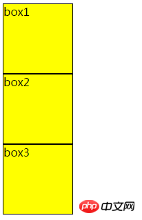
At this time, box1 and box2 are positioned on the page according to the static layout method. Now box2 Relative positioning

#The result is as follows, the position of box2 is offset (this offset is relative to the original position of box2), and does not affect box1 Position with box3
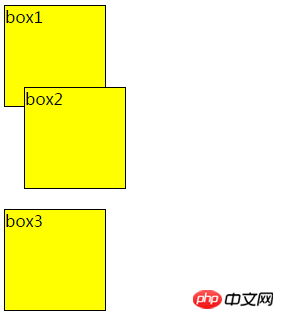
Note that when using relative positioning, the element still occupies the original space regardless of whether it is moved or not. Therefore, moving an element causes it to cover other boxes.
absolute Absolute positioning
Absolute positioning makes the position of the element independent of the document flow, so it does not occupy space. This is different from relative positioning, which is actually considered part of the normal flow positioning model because the element's position is relative to its position in the normal flow.
1 <!DOCTYPE html> 2 <html lang="en"> 3 <head> 4 <meta charset="UTF-8"> 5 <title>CSS绝对定位</title> 6 7 <style type="text/css"> 8 .parent {height: 200px; width: 200px; background-color: yellow;} 9 .child {height: 100px; width: 100px; background-color: red; top: 0px; right: 0px; position: absolute;}10 </style>11 </head>12 <body>13 <div class="parent">14 parent15 <div class="child">16 child17 </div>18 </div>19 </body>20 </html>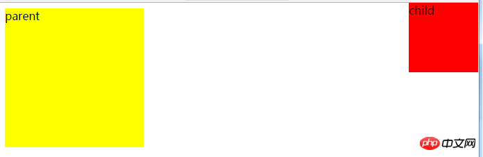
Now also add a positioning attribute to parent

The effect is as follows, you can see The position of the child has changed
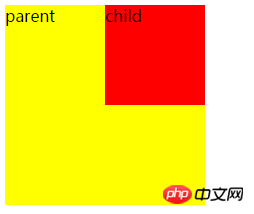
From the above phenomenon, one thing can be summarized: the position of an absolutely positioned element is relative to the nearest positioned ancestor If the element has no positioned ancestors, its position is relative to the original containing block (in this case, the body element and parent).
To use absolute positioning, there must be two conditions
1. The parent must be To add positioning attributes to an element, it is generally recommended to use position:relative
2. Add absolute positioning to the child element position:absolute, and also add direction attributes (referring to left, right, top , bottom attribute)
fixed fixed positioning
is similar to the absolute positioning type, but its relative movement coordinates are the view (web page window within the screen) itself. Since the view itself is fixed, it will not change as the scroll bar of the browser window scrolls, unless you move the screen position of the browser window on the screen, or change the display size of the browser window, so fixedly positioned elements will always be in A position within the view within the browser window that is not affected by the flow of the document.
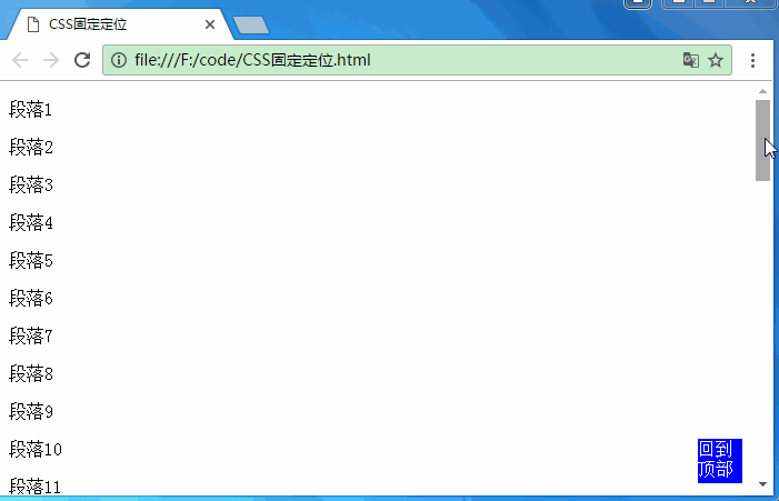
1 <!DOCTYPE html> 2 <html lang="en"> 3 <head> 4 <meta charset="UTF-8"> 5 <title>CSS固定定位</title> 6 <style type="text/css"> 7 .back-top {height: 40px; width: 40px; background-color: blue; color: #fff; position: fixed; bottom: 10px;right: 10px;} 8 </style> 9 </head>10 <body>11 <div class="back-top">回到顶部</div> 12 <p>段落1</p>13 <p>段落2</p>14 <p>段落3</p>15 ...16 <p>段落49</p>17 <p>段落50</p>18 </body>19 </html>The effect is as follows. The div back to the top is always in the same position, and the  on the blog page is also fixed positioning.
Summary
Absolute positioning is based on the parent element as the reference point. It will break away from the document flow and does not occupy the original position space.
Relative positioning is based on itself as the reference point, leaving the original position, but it will still occupy the original position space
Fixed positioning is based on the browser window as the reference point, it is always in the same position and will not move
The above is the detailed content of Detailed explanation of relative positioning, absolute positioning and fixed positioning. For more information, please follow other related articles on the PHP Chinese website!

Hot AI Tools

Undresser.AI Undress
AI-powered app for creating realistic nude photos

AI Clothes Remover
Online AI tool for removing clothes from photos.

Undress AI Tool
Undress images for free

Clothoff.io
AI clothes remover

Video Face Swap
Swap faces in any video effortlessly with our completely free AI face swap tool!

Hot Article
Hot Tools

Notepad++7.3.1
Easy-to-use and free code editor

SublimeText3 Chinese version
Chinese version, very easy to use

Zend Studio 13.0.1
Powerful PHP integrated development environment

Dreamweaver CS6
Visual web development tools

SublimeText3 Mac version
God-level code editing software (SublimeText3)
Hot Topics


 How to use bootstrap in vue
Apr 07, 2025 pm 11:33 PM
How to use bootstrap in vue
Apr 07, 2025 pm 11:33 PM
Using Bootstrap in Vue.js is divided into five steps: Install Bootstrap. Import Bootstrap in main.js. Use the Bootstrap component directly in the template. Optional: Custom style. Optional: Use plug-ins.
 The Roles of HTML, CSS, and JavaScript: Core Responsibilities
Apr 08, 2025 pm 07:05 PM
The Roles of HTML, CSS, and JavaScript: Core Responsibilities
Apr 08, 2025 pm 07:05 PM
HTML defines the web structure, CSS is responsible for style and layout, and JavaScript gives dynamic interaction. The three perform their duties in web development and jointly build a colorful website.
 How to write split lines on bootstrap
Apr 07, 2025 pm 03:12 PM
How to write split lines on bootstrap
Apr 07, 2025 pm 03:12 PM
There are two ways to create a Bootstrap split line: using the tag, which creates a horizontal split line. Use the CSS border property to create custom style split lines.
 How to set up the framework for bootstrap
Apr 07, 2025 pm 03:27 PM
How to set up the framework for bootstrap
Apr 07, 2025 pm 03:27 PM
To set up the Bootstrap framework, you need to follow these steps: 1. Reference the Bootstrap file via CDN; 2. Download and host the file on your own server; 3. Include the Bootstrap file in HTML; 4. Compile Sass/Less as needed; 5. Import a custom file (optional). Once setup is complete, you can use Bootstrap's grid systems, components, and styles to create responsive websites and applications.
 Understanding HTML, CSS, and JavaScript: A Beginner's Guide
Apr 12, 2025 am 12:02 AM
Understanding HTML, CSS, and JavaScript: A Beginner's Guide
Apr 12, 2025 am 12:02 AM
WebdevelopmentreliesonHTML,CSS,andJavaScript:1)HTMLstructurescontent,2)CSSstylesit,and3)JavaScriptaddsinteractivity,formingthebasisofmodernwebexperiences.
 How to insert pictures on bootstrap
Apr 07, 2025 pm 03:30 PM
How to insert pictures on bootstrap
Apr 07, 2025 pm 03:30 PM
There are several ways to insert images in Bootstrap: insert images directly, using the HTML img tag. With the Bootstrap image component, you can provide responsive images and more styles. Set the image size, use the img-fluid class to make the image adaptable. Set the border, using the img-bordered class. Set the rounded corners and use the img-rounded class. Set the shadow, use the shadow class. Resize and position the image, using CSS style. Using the background image, use the background-image CSS property.
 How to use bootstrap button
Apr 07, 2025 pm 03:09 PM
How to use bootstrap button
Apr 07, 2025 pm 03:09 PM
How to use the Bootstrap button? Introduce Bootstrap CSS to create button elements and add Bootstrap button class to add button text
 How to resize bootstrap
Apr 07, 2025 pm 03:18 PM
How to resize bootstrap
Apr 07, 2025 pm 03:18 PM
To adjust the size of elements in Bootstrap, you can use the dimension class, which includes: adjusting width: .col-, .w-, .mw-adjust height: .h-, .min-h-, .max-h-
