

Detailed explanation of the application of Bezier curve

Introduction
Bezier curves can produce many complex effects, such as the complex animation effect of a bouncing ball, which first accelerates down, stops, and then gradually decelerates when it bounces up.
Two commonly used URLs for using Bezier curves are as follows:
Easing function:
cubic-bezier:
How to use Bezier curves Drawing a curve
A standard cubic Bezier curve requires 4 points: the starting point, the ending point (also called the anchor point) and two mutually separated intermediate points.
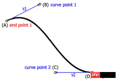
Regardless of SVG, Canvas or CSS3 animation, these four points are involved.
The combination of SVG and Bezier curve
svg scalable vector graphics (Scalable Vector Graphics), two-dimensional, XML markup, similar to the following:
<svg width="160px" height="160px">
  <path d="M10 80 ..." /></svg>
SVG is not expanded in detail (it can be serialized in several articles). Just mention one of the tags of path, and you can draw any path, including making bases with Bezier.
Cubic Bezier Curve Instructions: C x1 y1, x2 y2, x yTwo control points (x1,y1)and (x2,y2 ), (x,y) represents the end point of the curve. The letters C represent specific actions and behaviors. They need to be capitalized here and represent the standard cubic Bezier curve.
Look at some of the codes (fragments) describing Bezier curves below, you can feel it (the letters M represent specific actions moveTo, referring to The starting point of the drawing moves here).
<svg width="190px" height="160px">
  <path d="M10 10 C 20 20, 40 20, 50 10" stroke="3" fill="none"/>
  <path d="M70 10 C 70 20, 120 20, 120 10" stroke="3" fill="none"/>
  <path d="M130 10 C 120 20, 180 20, 170 10" stroke="3" fill="none"/>
  <path d="M10 60 C 20 80, 40 80, 50 60" stroke="3" fill="none"/>
  <path d="M70 60 C 70 80, 110 80, 110 60" stroke="3" fill="none"/>
  <path d="M130 60 C 120 80, 180 80, 170 60" stroke="3" fill="none"/>
  <path d="M10 110 C 20 140, 40 140, 50 110" stroke="3" fill="none"/>
  <path d="M70 110 C 70 140, 110 140, 110 110" stroke="3" fill="none"/>
  <path d="M130 110 C 120 140, 180 140, 170 110" stroke="3" fill="none"/></svg>
The curve effect is similar to the picture below:

You can see the starting point behind M, Add the three points after C to form the 4 points of the Bezier curve.
The combination of Canvas and Bezier curve
Canvas has a bezierCurveTo() method, the code is as follows:
var c=document.getElementById("myCanvas");var ctx=c.getContext("2d");
ctx.beginPath();
ctx.moveTo(20,20);
ctx.bezierCurveTo(20,100,200,100,200,20);
ctx.stroke();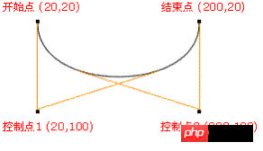
开始点:moveTo(20,20)
控制点 1:bezierCurveTo(20,100,200,100,200,20)
控制点 2:bezierCurveTo(20,100,200,100,200,20)
结束点:  bezierCurveTo(20,100,200,100,200,20)
The combination of CSS3 animation and Bezier curve
The usage is as follows:
transition:cubic-bezier(.25,.1,.25,1)
where.25,.1This coordinate is for the anchor point connected to the starting point; .25,1This coordinate is for the point at the top of the antenna on the end point.
Some people may wonder, the cubic-bezier value of CSS3 animation seems to have only two points~~
That’s because the starting point and end point of the Bezier curve of CSS3 animation Already fixed, they are (0,0) and (1,1) respectively.
Several animation effects commonly used in css3:
ease: cubic-bezier(0.25, 0.1, 0.25, 1.0)
linear: cubic-bezier(0.0, 0.0, 1.0, 1.0)
ease-in: cubic-bezier(0.42, 0, 1.0, 1.0)
ease-out: cubic-bezier(0, 0, 0.58, 1.0)
ease-in-out: cubic -bezier(0.42, 0, 0.58, 1.0)
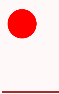
Achieve the effect of a pinball:
html code:
<div id="ball"></div><div id="floor"></div>
css code:
body{margin:0;padding:0;}#ball{
  background:red;
  height:100px;
  width:100px;
  position:absolute;
  top:10px;
  left:20px;
  border-radius:50px;
}#floor{
  position:absolute;
  bottom:10px;
  left:0px;
  width:350px;
  height:1px;
  border-top:5px solid brown;
}js code:
;(function(){
  var down=false,
      trans='transition',
      eventName='transitionend';  if(typeof document.body.style.webkitTransition==='string'){
      trans='webkitTransition';
      eventName='webkitTransitionEnd';
   }else if(typeof document.body.style.MozTransition==='string'){
      trans='MozTransition';
    }var ball=document.getElementById('ball');var floor=document.getElementById('floor');function bounce(){     if(down){
         ball.style[trans]="Top 1s cubic-bezier(0,.27,.32,1)";
         ball.style.top='10px';
         down=false;
    }else{
        ball.style[trans]="Top 1s cubic-bezier(1,0,0.96,0.91)";
        ball.style.top=(floor.offsetTop-100)+'px';
        down=true;
    }
}

ball.addEventListener(eventName,bounce);
bounce();

})(); Description: document.body.style.webkitTransition Gets the transition prefixed by webkit
In the WebKit engine browser, when the transition animation of css3 ends, the webkitTransitionEnd event is triggered.
The effect is shown in the figure:
Download address: "CSS3 Animation: Ball Bounce Animation"
Summary
canvas:
ctx.moveTo(0,0);
ctx.bezierCurveTo(x1,y1,x2,y2,1,1);
SVG:
<path d="M0 0 C x1 y1, x2, y2, 1 1"/>
CSS3 Bezier starting point is0,0; The end point is 1, 1;
cubic-bezier(x1,y1, x2,y2)
The above is the detailed content of Detailed explanation of the application of Bezier curve. For more information, please follow other related articles on the PHP Chinese website!

Hot AI Tools

Undresser.AI Undress
AI-powered app for creating realistic nude photos

AI Clothes Remover
Online AI tool for removing clothes from photos.

Undress AI Tool
Undress images for free

Clothoff.io
AI clothes remover

Video Face Swap
Swap faces in any video effortlessly with our completely free AI face swap tool!

Hot Article
Hot Tools

Notepad++7.3.1
Easy-to-use and free code editor

SublimeText3 Chinese version
Chinese version, very easy to use

Zend Studio 13.0.1
Powerful PHP integrated development environment

Dreamweaver CS6
Visual web development tools

SublimeText3 Mac version
God-level code editing software (SublimeText3)
Hot Topics


 How to use bootstrap in vue
Apr 07, 2025 pm 11:33 PM
How to use bootstrap in vue
Apr 07, 2025 pm 11:33 PM
Using Bootstrap in Vue.js is divided into five steps: Install Bootstrap. Import Bootstrap in main.js. Use the Bootstrap component directly in the template. Optional: Custom style. Optional: Use plug-ins.
 The Roles of HTML, CSS, and JavaScript: Core Responsibilities
Apr 08, 2025 pm 07:05 PM
The Roles of HTML, CSS, and JavaScript: Core Responsibilities
Apr 08, 2025 pm 07:05 PM
HTML defines the web structure, CSS is responsible for style and layout, and JavaScript gives dynamic interaction. The three perform their duties in web development and jointly build a colorful website.
 How to write split lines on bootstrap
Apr 07, 2025 pm 03:12 PM
How to write split lines on bootstrap
Apr 07, 2025 pm 03:12 PM
There are two ways to create a Bootstrap split line: using the tag, which creates a horizontal split line. Use the CSS border property to create custom style split lines.
 Understanding HTML, CSS, and JavaScript: A Beginner's Guide
Apr 12, 2025 am 12:02 AM
Understanding HTML, CSS, and JavaScript: A Beginner's Guide
Apr 12, 2025 am 12:02 AM
WebdevelopmentreliesonHTML,CSS,andJavaScript:1)HTMLstructurescontent,2)CSSstylesit,and3)JavaScriptaddsinteractivity,formingthebasisofmodernwebexperiences.
 How to insert pictures on bootstrap
Apr 07, 2025 pm 03:30 PM
How to insert pictures on bootstrap
Apr 07, 2025 pm 03:30 PM
There are several ways to insert images in Bootstrap: insert images directly, using the HTML img tag. With the Bootstrap image component, you can provide responsive images and more styles. Set the image size, use the img-fluid class to make the image adaptable. Set the border, using the img-bordered class. Set the rounded corners and use the img-rounded class. Set the shadow, use the shadow class. Resize and position the image, using CSS style. Using the background image, use the background-image CSS property.
 How to set up the framework for bootstrap
Apr 07, 2025 pm 03:27 PM
How to set up the framework for bootstrap
Apr 07, 2025 pm 03:27 PM
To set up the Bootstrap framework, you need to follow these steps: 1. Reference the Bootstrap file via CDN; 2. Download and host the file on your own server; 3. Include the Bootstrap file in HTML; 4. Compile Sass/Less as needed; 5. Import a custom file (optional). Once setup is complete, you can use Bootstrap's grid systems, components, and styles to create responsive websites and applications.
 How to use bootstrap button
Apr 07, 2025 pm 03:09 PM
How to use bootstrap button
Apr 07, 2025 pm 03:09 PM
How to use the Bootstrap button? Introduce Bootstrap CSS to create button elements and add Bootstrap button class to add button text
 How to resize bootstrap
Apr 07, 2025 pm 03:18 PM
How to resize bootstrap
Apr 07, 2025 pm 03:18 PM
To adjust the size of elements in Bootstrap, you can use the dimension class, which includes: adjusting width: .col-, .w-, .mw-adjust height: .h-, .min-h-, .max-h-
