
 Web Front-end
HTML Tutorial
Day 8 of building a website using web standards: Getting started with CSS layout
Web Front-end
HTML Tutorial
Day 8 of building a website using web standards: Getting started with CSS layout
Day 8 of building a website using web standards: Getting started with CSS layout

The biggest difference between CSS layout and traditional table layout is that the original positioning uses tables, and controls the spacing of text layout sections through the spacing of tables or using colorless and transparent GIF images; but now layers (divs) are used ) to position, and control the spacing of the sections through the margin, padding, border and other attributes of the layer. 1. Define DIV
Analyze a typical definition div example:
#sample{ MARGIN: 10px 10px 10px 10px;
PADDING:20px 10px 10px 20px;
BORDER-RIGHT: #CCC 2px solid;
BORDER-BOTTOM: # CCC 2px solid;
BORDER-LEFT: #CCC 2px solid;
BORDER-TOP: #CCC 2px solid;
BACKGROUND: url(images/bg_poem.jpg) #FEFEFE no-repeat right bottom;
COLOR: #666;
TEXT-ALIGN: center;
LINE-HEIGHT: 150%; WIDTH:60%; }
The description is as follows: The name of the
layer is sample, and
You can call this style.
MARGIN refers to the blank space left outside the border of the layer, used for page margins or to create a gap with other layers. "10px 10px 10px 10px" respectively represent the four margins of "top, right, bottom and left" (clockwise). If they are all the same, they can be abbreviated to "
MARGIN: 10px;
". If the margin is zero, write "
MARGIN: 0px;
". Note: When the value is zero, except for the RGB color value 0% which must be followed by a percent sign, in other cases the unit "px" does not need to be followed. MARGIN is a transparent element and cannot define a color.
PADDING refers to the space between the border of the layer and the content of the layer. Like margin, specify the distance from the top, right, bottom and left borders to the content respectively. If they are all the same, they can be abbreviated to "
PADDING:0px
". To specify the left side individually, you can write "PADDING-LEFT: 0px;". PADDING is a transparent element and cannot define color.
BORDER refers to the border of the layer. "BORDER-RIGHT: #CCC 2px solid;" defines the right border color of the layer as "#CCC", the width as "2px", and the style as "solid" straight line. If you want a dotted line style, you can use "dotted".
BACKGROUND is the background that defines the layer. It is defined in two levels. First define the image background and use "url(../images/bg_logo.gif)" to specify the background image path; secondly define the background color "#FEFEFE". "
no-repeat
" means that the background image does not need to be repeated. If you need to repeat it horizontally, use "
repeat-x
", to repeat vertically, use "
repeat-y
", to repeat it to cover the entire background. "repeat". The following "right bottom;" means that the background image starts from the lower right corner. If there is no background image, you can only define the background color
BACKGROUND: #FEFEFE
COLOR is used to define the font color, which has been introduced in the previous section.
TEXT-ALIGN is used to define the arrangement of content in the layer, center is in the middle, left is in the left, and right is in the right.
LINE-HEIGHT defines the line height. 150% means that the height is 150% of the standard height. It can also be written as:
LINE-HEIGHT:1.5
or LINE-HEIGHT:1.5em, which all have the same meaning.
WIDTH is the width of the defined layer, which can be a fixed value, such as 500px, or a percentage, like "60%" here. It should be noted that this width only refers to the width of your content, and does not include margin, border and padding. But it is not defined this way in some browsers, so you need to try more.
The following is the actual performance of this layer:

We can see that the border is 2px gray, the background image is not repeated in the lower right, the content is 20px away from the left border, and the content is centered. Everything is as expected. Hoho, although it doesn’t look good, it is the most basic. If you master it, you will have learned half of the CSS layout technology. That's it, it's not difficult! (What is the other half? The other half is the positioning between layers. I will explain it step by step later.)
2. CSS2 box model
Since the launch of CSS1 in 1996, the W3C organization has It is recommended that all objects on the web page be placed in a box. Designers can control the properties of this box by creating definitions. These objects include paragraphs, lists, titles, pictures, and layers

3. All auxiliary images must be background processed
Using XHTML+CSS layout, there is a technology that you are not used to at first. It should be said that it is a way of thinking that is different from the traditional table layout, that is: all auxiliary images Pictures are all realized with backgrounds. Something like this:
BACKGROUND: url(images/bg_poem.jpg) #FEFEFE no-repeat right bottom;
Although you can use to be inserted directly into the content, this is not recommended. The "auxiliary pictures" here refer to pictures that are not part of the content to be expressed on the page, but are only used for decoration, interval, and reminder. For example: pictures in photo albums, pictures in picture news, and the 3D box model pictures above are all part of the content. They can be directly inserted into the page using the
element, while others are similar to logos, title pictures, and list prefixes. Images must be displayed using background or other CSS methods.
There are two reasons for this:
Completely separate performance from structure (refer to reading another article: "Understanding the separation of performance and structure"), use CSS to control all appearance and performance, and facilitate revision.
Make the page more usable and friendly. For example, if a blind person uses a screen reader, pictures implemented using background technology will not be read aloud.
The above is the content of the 8th day of website building using web standards: getting started with CSS layout. For more related content, please pay attention to the PHP Chinese website (www.php.cn)!

Hot AI Tools

Undresser.AI Undress
AI-powered app for creating realistic nude photos

AI Clothes Remover
Online AI tool for removing clothes from photos.

Undress AI Tool
Undress images for free

Clothoff.io
AI clothes remover

Video Face Swap
Swap faces in any video effortlessly with our completely free AI face swap tool!

Hot Article
Hot Tools

Notepad++7.3.1
Easy-to-use and free code editor

SublimeText3 Chinese version
Chinese version, very easy to use

Zend Studio 13.0.1
Powerful PHP integrated development environment

Dreamweaver CS6
Visual web development tools

SublimeText3 Mac version
God-level code editing software (SublimeText3)
Hot Topics


 What are web standards?
Oct 18, 2023 pm 05:24 PM
What are web standards?
Oct 18, 2023 pm 05:24 PM
Web standards are a set of specifications and guidelines developed by W3C and other related organizations. It includes standardization of HTML, CSS, JavaScript, DOM, Web accessibility and performance optimization. By following these standards, the compatibility of pages can be improved. , accessibility, maintainability and performance. The goal of web standards is to enable web content to be displayed and interacted consistently on different platforms, browsers and devices, providing better user experience and development efficiency.
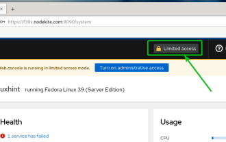 How to enable administrative access from the cockpit web UI
Mar 20, 2024 pm 06:56 PM
How to enable administrative access from the cockpit web UI
Mar 20, 2024 pm 06:56 PM
Cockpit is a web-based graphical interface for Linux servers. It is mainly intended to make managing Linux servers easier for new/expert users. In this article, we will discuss Cockpit access modes and how to switch administrative access to Cockpit from CockpitWebUI. Content Topics: Cockpit Entry Modes Finding the Current Cockpit Access Mode Enable Administrative Access for Cockpit from CockpitWebUI Disabling Administrative Access for Cockpit from CockpitWebUI Conclusion Cockpit Entry Modes The cockpit has two access modes: Restricted Access: This is the default for the cockpit access mode. In this access mode you cannot access the web user from the cockpit
 Questions frequently asked by front-end interviewers
Mar 19, 2024 pm 02:24 PM
Questions frequently asked by front-end interviewers
Mar 19, 2024 pm 02:24 PM
In front-end development interviews, common questions cover a wide range of topics, including HTML/CSS basics, JavaScript basics, frameworks and libraries, project experience, algorithms and data structures, performance optimization, cross-domain requests, front-end engineering, design patterns, and new technologies and trends. . Interviewer questions are designed to assess the candidate's technical skills, project experience, and understanding of industry trends. Therefore, candidates should be fully prepared in these areas to demonstrate their abilities and expertise.
 The evolution and application of CSS layout units: from pixels to relative units based on the font size of the root element
Jan 05, 2024 pm 05:41 PM
The evolution and application of CSS layout units: from pixels to relative units based on the font size of the root element
Jan 05, 2024 pm 05:41 PM
From px to rem: The evolution and application of CSS layout units Introduction: In front-end development, we often need to use CSS to implement page layout. Over the past few years, CSS layout units have evolved and developed. Initially we used pixels (px) as the unit to set the size and position of elements. However, with the rise of responsive design and the popularity of mobile devices, pixel units have gradually exposed some problems. In order to solve these problems, the new unit rem came into being and was gradually widely used in CSS layout. one
 what does web mean
Jan 09, 2024 pm 04:50 PM
what does web mean
Jan 09, 2024 pm 04:50 PM
The web is a global wide area network, also known as the World Wide Web, which is an application form of the Internet. The Web is an information system based on hypertext and hypermedia, which allows users to browse and obtain information by jumping between different web pages through hyperlinks. The basis of the Web is the Internet, which uses unified and standardized protocols and languages to enable data exchange and information sharing between different computers.
 CSS Layout Tips: Best Practices for Implementing Circular Grid Icon Layout
Oct 20, 2023 am 10:46 AM
CSS Layout Tips: Best Practices for Implementing Circular Grid Icon Layout
Oct 20, 2023 am 10:46 AM
CSS Layout Tips: Best Practices for Implementing Circular Grid Icon Layout Grid layout is a common and powerful layout technique in modern web design. The circular grid icon layout is a more unique and interesting design choice. This article will introduce some best practices and specific code examples to help you implement a circular grid icon layout. HTML structure First, we need to set up a container element and place the icon in this container. We can use an unordered list (<ul>) as a container, and the list items (<l
 Methods and techniques on how to implement waterfall flow layout through pure CSS
Oct 20, 2023 pm 06:01 PM
Methods and techniques on how to implement waterfall flow layout through pure CSS
Oct 20, 2023 pm 06:01 PM
Methods and techniques on how to implement waterfall flow layout through pure CSS. Waterfall layout (Waterfall Layout) is a common layout method in web design. It arranges content in multiple columns with inconsistent heights to form an image. Waterfall-like visual effects. This layout is often used in situations where a large amount of content needs to be displayed, such as picture display and product display, and has a good user experience. There are many ways to implement a waterfall layout, and it can be done using JavaScript or CSS.
 CSS Positions layout method to implement responsive image layout
Sep 26, 2023 pm 01:37 PM
CSS Positions layout method to implement responsive image layout
Sep 26, 2023 pm 01:37 PM
CSSPositions layout method to implement responsive image layout In modern web development, responsive design has become an essential skill. In responsive design, image layout is one of the important considerations. This article will introduce how to use CSSPositions layout to implement responsive image layout and provide specific code examples. CSSPositions is a layout method of CSS that allows us to position elements arbitrarily in the web page as needed. In responsive image layout,
