


CSS3 最新版参考手册
/ CSS3 文本效果
CSS3 文本效果
CSS3中包含几个新的文本特征。
在本章中您将了解以下文本属性:
text-shadow
box-shadow
text-overflow
word-wrap
word-break
浏览器支持
CSS3的文本阴影
CSS3中,text-shadow属性适用于文本阴影。
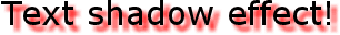
您指定了水平阴影,垂直阴影,模糊的距离,以及阴影的颜色:
实例
<!DOCTYPE html>
<html>
<head>
<meta charset="utf-8">
<title>php中文网(php.cn)</title>
<style>
h1
{
	text-shadow: 5px 5px 5px #FF0000;
}
</style>
</head>
<body>

<h1>Text-shadow effect!</h1>

<p><b>注意:</b> Internet Explorer 9 以及更早版本的浏览器不支持 text-shadow属性.</p>

</body>
</html>
运行实例 »
点击 "运行实例" 按钮查看在线实例
CSS3 box-shadow属性
CSS3中CSS3 box-shadow属性适用于盒子阴影
实例
<!DOCTYPE html>
<html>
<head>
<meta charset="utf-8">
<title>php中文网(php.cn)</title>
<style>
div
{
	width:300px;
	height:100px;
	background-color:yellow;
	box-shadow: 10px 10px 5px #888888;
}
</style>
</head>
<body>

<div></div>

</body>
</html>
运行实例 »
点击 "运行实例" 按钮查看在线实例
接下来给阴影添加颜色
实例
<!DOCTYPE html>
<html>
<head>
<meta charset="utf-8">
<title>php中文网(php.cn)</title>
<style>
div {
    width: 300px;
    height: 100px;
    padding: 15px;
    background-color: yellow;
    box-shadow: 10px 10px grey;
}
</style>
</head>
<body>

<div>This is a div element with a box-shadow</div>

</body>
</html>
运行实例 »
点击 "运行实例" 按钮查看在线实例
接下来给阴影添加一个模糊效果
实例
<!DOCTYPE html>
<html>
<head>
<meta charset="utf-8">
<title>php中文网(php.cn)</title>
<style>
div {
    width: 300px;
    height: 100px;
    padding: 15px;
    background-color: yellow;
    box-shadow: 10px 10px 5px grey;
}
</style>
</head>
<body>

<div>This is a div element with a box-shadow</div>

</body>
</html>
运行实例 »
点击 "运行实例" 按钮查看在线实例
你也可以在::befor和::after两个伪元素中添加阴影效果
实例
<!DOCTYPE html>
<html>
<head>
<meta charset="utf-8">
<title>php中文网(php.cn)</title>
<style>
#boxshadow {
    position: relative;
    -moz-box-shadow: 1px 2px 4px rgba(0, 0, 0,0.5);
    -webkit-box-shadow: 1px 2px 4px rgba(0, 0, 0, .5);
    box-shadow: 1px 2px 4px rgba(0, 0, 0, .5);
    padding: 10px;
    background: white;
}

/* Make the image fit the box */
#boxshadow img {
    width: 100%;
    border: 1px solid #8a4419;
    border-style: inset;
}

#boxshadow::after {
    content: '';
    position: absolute;
    z-index: -1; /* hide shadow behind image */
    -webkit-box-shadow: 0 15px 20px rgba(0, 0, 0, 0.3);
    -moz-box-shadow: 0 15px 20px rgba(0, 0, 0, 0.3);
    box-shadow: 0 15px 20px rgba(0, 0, 0, 0.3);
    width: 70%;
    left: 15%; /* one half of the remaining 30% */
    height: 100px;
    bottom: 0;
}
</style>
</head>
<body>

<div id="boxshadow">
  <img src="rock600x400.jpg" alt="Norway" width="600" height="400">
</div>

</body>
</html>
运行实例 »
点击 "运行实例" 按钮查看在线实例
阴影的一个使用特例是卡片效果
实例
<!DOCTYPE html>
<html>
<head>
<meta charset="utf-8">
<title>php中文网(php.cn)</title>
<style>
div.card {
  width: 250px;
  box-shadow: 0 4px 8px 0 rgba(0, 0, 0, 0.2), 0 6px 20px 0 rgba(0, 0, 0, 0.19);
  text-align: center;
}

div.header {
    background-color: #4CAF50;
    color: white;
    padding: 10px;
    font-size: 40px;
}

div.container {
    padding: 10px;
}
</style>
</head>
<body>

<h2>卡片</h2>

<p>box-shadow 属性用来可以创建纸质样式卡片:</p>

<div class="card">
  <div class="header">
    <h1>1</h1>
  </div>

  <div class="container">
    <p>January 1, 2016</p>
  </div>
</div>

</body>
</html>
文字卡片
点击 "运行实例" 按钮查看在线实例
实例
<!DOCTYPE html>
<html>
<head>
<meta charset="utf-8">
<title>php中文网(php.cn)</title>
<style>
div.polaroid {
  width: 250px;
  box-shadow: 0 4px 8px 0 rgba(0, 0, 0, 0.2), 0 6px 20px 0 rgba(0, 0, 0, 0.19);
  text-align: center;
}

div.container {
  padding: 10px;
}
</style>
</head>
<body>

<h2> 卡片</h2>

<p>box-shadow属性可以用来创建纸质样式卡片:</p>

<div class="polaroid">
  <img src="rock600x400.jpg" alt="Norway" style="width:100%">
  <div class="container">
    <p>Hardanger, Norway</p>
  </div>
</div>

</body>
</html>
运行实例 »
点击 "运行实例" 按钮查看在线实例
CSS3 Text Overflow属性
CSS3文本溢出属性指定应向用户如何显示溢出内容
实例
<!DOCTYPE html>
<html>
<head>
<meta charset="utf-8">
<title>php中文网(php.cn)</title>
<style>
div.test
{
	white-space:nowrap;
	width:12em;
	overflow:hidden;
	border:1px solid #000000;
}
</style>
</head>
<body>

<p>以下 div 容器内的文本无法完全显示,可以看到它被裁剪了。</p>
<p>div 使用 "text-overflow:ellipsis":</p>

<div class="test" style="text-overflow:ellipsis;">This is some long text that will not fit in the box</div>
<p>div 使用 "text-overflow:clip":</p>
<div class="test" style="text-overflow:clip;">This is some long text that will not fit in the box</div>
<p>div 使用自定义字符串 "text-overflow: >>"(只在 Firefox 浏览器下有效):</p>
<div class="test" style="text-overflow:'>>';">This is some long text that will not fit in the box</div>
</body>
</html>
运行实例 »
点击 "运行实例" 按钮查看在线实例
CSS3的换行
如果某个单词太长,不适合在一个区域内,它扩展到外面:
CSS3中,自动换行属性允许您强制文本换行 - 即使这意味着分裂它中间的一个字:
CSS代码如下:
实例
<!DOCTYPE html>
<html>
<head>
<meta charset="utf-8">
<title>php中文网(php.cn)</title>
<style>
p.test
{
	width:11em;
	border:1px solid #000000;
	word-wrap:break-word;
}
</style>
</head>
<body>

<p class="test"> This paragraph contains a very long word: thisisaveryveryveryveryveryverylongword. The long word will break and wrap to the next line.</p>

</body>
</html>
运行实例 »
点击 "运行实例" 按钮查看在线实例
CSS3 Word Breaking
CSS3 Word Breaking属性指定换行规则:
CSS代码如下:
实例
<!DOCTYPE html>
<html>
<head>
<meta charset="utf-8">
<title>php中文网(php.cn)</title>
<style>
p.test1
{
	width:9em;
	border:1px solid #000000;
	word-break:keep-all;
}

p.test2
{
	width:9em;
	border:1px solid #000000;
	word-break:break-all;
}
</style>
</head>
<body>

<p class="test1"> This paragraph contains some text. This line will-break-at-hyphenates.</p>
<p class="test2"> This paragraph contains some text: The lines will break at any character.</p>

<p><b>注意:</b>  word-break 属性不兼容 Opera.</p>

</body>
</html>
运行实例 »
点击 "运行实例" 按钮查看在线实例
| 属性 | 描述 | CSS |
|---|---|---|
| hanging-punctuation | 规定标点字符是否位于线框之外。 | 3 |
| punctuation-trim | 规定是否对标点字符进行修剪。 | 3 |
| text-align-last | 设置如何对齐最后一行或紧挨着强制换行符之前的行。 | 3 |
| text-emphasis | 向元素的文本应用重点标记以及重点标记的前景色。 | 3 |
| text-justify | 规定当 text-align 设置为 "justify" 时所使用的对齐方法。 | 3 |
| text-outline | 规定文本的轮廓。 | 3 |
| text-overflow | 规定当文本溢出包含元素时发生的事情。 | 3 |
| text-shadow | 向文本添加阴影。 | 3 |
| text-wrap | 规定文本的换行规则。 | 3 |
| word-break | 规定非中日韩文本的换行规则。 | 3 |
| word-wrap | 允许对长的不可分割的单词进行分割并换行到下一行。 | 3 |