
 Web Front-end
CSS Tutorial
Take a look at these front-end interview questions to help you master high-frequency knowledge points (3)
Web Front-end
CSS Tutorial
Take a look at these front-end interview questions to help you master high-frequency knowledge points (3)
Take a look at these front-end interview questions to help you master high-frequency knowledge points (3)

10 questions every day, after 100 days, you will have mastered all the high-frequency knowledge points of front-end interviews, come on! ! ! , while reading the article, I hope you don’t look at the answer directly, but first think about whether you know it, and if so, what is your answer? Think about it and then compare it with the answer. Would it be better? Of course, if you have a better answer than mine, please leave a message in the comment area and discuss the beauty of technology together.
Interviewer: What are the ways to clear floats?
Me: Uh~, floating elements will break away from the document flow (absolutely positioned elements will also break away from the document flow), resulting in the inability to calculate the accurate height. This problem is called: "High collapse”.
There are three common ways to clear floats. The entire code is as follows:
Trigger BFC: (It is defective and will Causes the content to overflow and hide)
<style>
    *{margin: 0;padding: 0;}
    ul {
        list-style: none;
        border: 10px solid #ccc;
        overflow: hidden; /*触发BFC清除浮动*/
    }
    ul li {
        width: 100px;
        height: 100px;
        background-color: #f00;
        float: left;
    }
</style>
<body>
    <ul>
        <li>1</li>
        <li>2</li>
        <li>3</li>
    </ul>
</body>Create one more box and add the style: clear:both; : (not recommended, this method is obsolete) [ Related recommendations: web front-end development】
<style>
    *{margin: 0;padding: 0;}
    ul {
        list-style: none;
        border: 10px solid #ccc;
    }
    ul li {
        width: 100px;
        height: 100px;
        background-color: #f00;
        float: left;
    }
    ul div{
        clear: both;
    }
</style>
<body>
    <ul>
        <li>1</li>
        <li>2</li>
        <li>3</li>
        <div></div>
    </ul>
</body>Add an after style to the floating parent element: (recommended)
<style>
    *{margin: 0;padding: 0;}
    ul {
        list-style: none;
        border: 10px solid #ccc;
    }
    ul li {
        width: 100px;
        height: 100px;
        background-color: #f00;
        float: left;
    }
    ul::after{
        content: '';
        display: block;
        clear: both;
    }
</style>
<body>
    <ul>
        <li>1</li>
        <li>2</li>
        <li>3</li>
    </ul>
</body>Interviewer: Should you use odd or even numbers of fonts in web pages?
Me: Uh~, you should use even numbers, because even numbers can make the text perform better on the browser, and the UI design drawings for the front end are generally even numbers, so Whether it’s layout or px conversion, it’s more convenient.
Interviewer: What are the values of position? What positioning are they based on?
Me: Uh~, position has the following five values:
static: default value, no positioning, top, right, bottom, left have no effect
relative: relative positioning, does not break away from the document flow, only left and top work
absolute: absolute positioning, breaks away from the document flow, the top, bottom, left, and right are based on the nearest positioned parent element as the reference system
fixed: Break away from the document flow, use the browser viewport as the reference system for top, bottom, left and right
sticky: a combination of relative and fixed
Take fixed as an example:
<style>
    *{margin: 0;padding: 0;}
    body{
        height: 2000px;
    }
    .main{
        width: 100px;
        height: 100px;
        left: 20px;
        top: 50px;
        background-color: #f00;
        position: fixed;
    }
</style>
<body>
    <div class="main">221</div>
</body>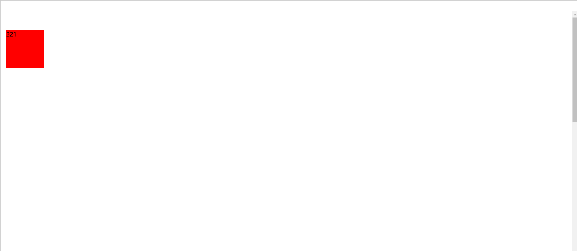
Interviewer: Write a left, middle and right layout that fills the screen. The left and right blocks have a fixed width of 200px and the middle block is adaptive. The middle block is required to be loaded first. Please write down the structure. and its style.
Me: Uh~, okay, the whole code is as follows:
<style>
    *{margin: 0;padding: 0;}
    body{width: 100vw;height: 100vh;}
    .container{
        height: 100%;
        width: 100%;
    }
    .container>div{
        float: left;
    }
    .zhong{
        height: 100vh;
        width: 100%;
        background-color: pink;
    }
    .zhong .main{
        margin: 0 200px;
    }
    .zuo{
        width: 200px;
        height: 100vh;
        background-color: #f00;
        margin-left: -100%;
    }
    .you{
        width: 200px;
        height: 100vh;
        background-color: #0f0;
        margin-left: -200px;
    }
</style>
</head>
<body>
    <div class="container">
        <div class="zhong">
            <div class="main">中</div>
        </div>
        <div class="zuo">左</div>
        <div class="you">右</div>
    </div>
</body>
Interviewer: What is CSS reset?
Me: Uh~, some CSS tags have specific styles by default, and we need to remove them because we don’t need these styles.
reset.css is a CSS file used to reset CSS styles. The official website is: resetcss
Normalize.css is a CSS style reset table to enhance cross-browser rendering consistency. Official website: Normalize.css
The difference between the two:
normalize.css: Useful styles will be retained. For example, the font size of h1
reset.css: resets all styles. For example, the font size of h1, h2, and h3 is reset and remains unstyled
If it is normal project, I personally prefer reset.css.
面试官:display: none; 与 visibility: hidden; 的区别?
我:呃~,display: none; :隐藏元素但不占用位置。visibility: hidden; :隐藏元素但占用位置
display: none; 和 visibility: hidden; 都会造成页面重绘,使得页面样式改变,但是display: none; 还会产生一次回流,改变了元素的位置。
面试官:opacity 和 rgba 的区别
共同性:实现透明效果。
1. opacity:取值范围0到1之间,0表示完全透明,1表示不透明
2. rgba:R表示红色,G表示绿色,B表示蓝色,取值可以在正整数或者百分数。A表示透明度取值0到1之间。
两者的区别:继承的区别,opacity会继承父元素的opacity属性,而RGBA设置的元素的后代元素不会继承不透明属性。整出代码如下:
<style>
    .opacity{
        width: 100%;
        height: 200px;
        font-size: 50px;
        font-weight: bold;
        background-color: #f00;
        opacity: 0.5;
    }
    .rgba{
        width: 100%;
        height: 200px;
        font-size: 50px;
        font-weight: bold;
        background-color: #f00;
        background: rgba(255, 0, 0, .5);
    }
</style>
<body>
    <div class="opacity">这是opacity</div>
    <hr>
    <div class="rgba">这是rgba</div>
</body>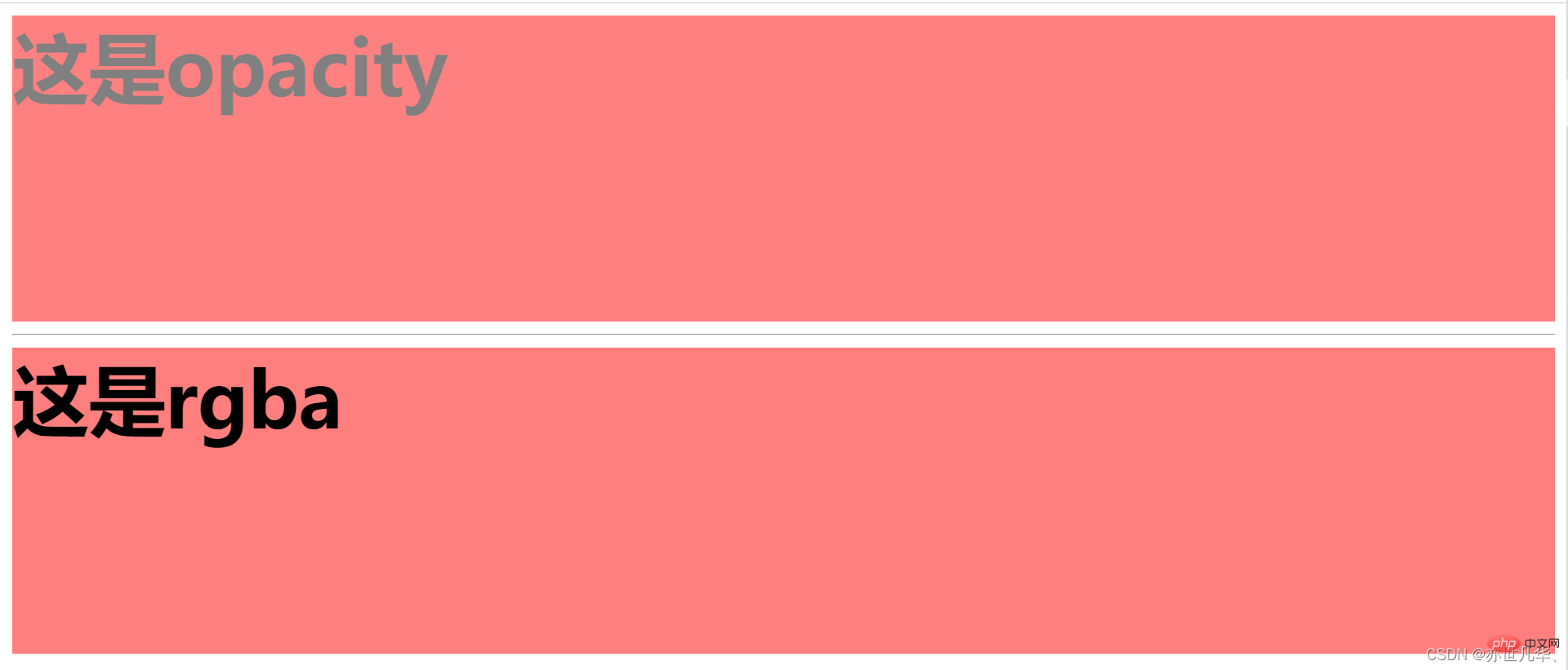
面试官:伪类与伪元素有什么区别?解释一下伪元素的作用
我:呃~,好的,两者的区别如下:
伪类使用单冒号,而伪元素使用双冒号。如 :hover 是伪类,::before 是伪元素
伪元素会在文档流生成一个新的元素,并且可以使用 content 属性设置内容
面试官:rem、em、vw、vh 的值各是什么意思?
我:呃~,好的,他们各值的意思如下:
rem:根据根元素(即 html)的 font-size
em:根据自身元素的 font-size
vw:viewport width
vh:viewport height
面试官:webkit表单输入框placeholder的颜色值能改变吗?
我:呃~,是可以修改的,整出代码如下:
<style>
    input::-webkit-input-placeholder{
        color: blue;
    }
</style>
<body>
    <input type="text" placeholder="请输入内容">
</body>
The above is the detailed content of Take a look at these front-end interview questions to help you master high-frequency knowledge points (3). For more information, please follow other related articles on the PHP Chinese website!

Hot AI Tools

Undresser.AI Undress
AI-powered app for creating realistic nude photos

AI Clothes Remover
Online AI tool for removing clothes from photos.

Undress AI Tool
Undress images for free

Clothoff.io
AI clothes remover

Video Face Swap
Swap faces in any video effortlessly with our completely free AI face swap tool!

Hot Article
Hot Tools

Notepad++7.3.1
Easy-to-use and free code editor

SublimeText3 Chinese version
Chinese version, very easy to use

Zend Studio 13.0.1
Powerful PHP integrated development environment

Dreamweaver CS6
Visual web development tools

SublimeText3 Mac version
God-level code editing software (SublimeText3)
Hot Topics
 1667
1667
 14
1426
52
1328
25
1273
29
1255
24
14
1426
52
1328
25
1273
29
1255
24

 How to use bootstrap in vue
Apr 07, 2025 pm 11:33 PM
How to use bootstrap in vue
Apr 07, 2025 pm 11:33 PM
Using Bootstrap in Vue.js is divided into five steps: Install Bootstrap. Import Bootstrap in main.js. Use the Bootstrap component directly in the template. Optional: Custom style. Optional: Use plug-ins.
 Understanding HTML, CSS, and JavaScript: A Beginner's Guide
Apr 12, 2025 am 12:02 AM
Understanding HTML, CSS, and JavaScript: A Beginner's Guide
Apr 12, 2025 am 12:02 AM
WebdevelopmentreliesonHTML,CSS,andJavaScript:1)HTMLstructurescontent,2)CSSstylesit,and3)JavaScriptaddsinteractivity,formingthebasisofmodernwebexperiences.
 The Roles of HTML, CSS, and JavaScript: Core Responsibilities
Apr 08, 2025 pm 07:05 PM
The Roles of HTML, CSS, and JavaScript: Core Responsibilities
Apr 08, 2025 pm 07:05 PM
HTML defines the web structure, CSS is responsible for style and layout, and JavaScript gives dynamic interaction. The three perform their duties in web development and jointly build a colorful website.
 React's Role in HTML: Enhancing User Experience
Apr 09, 2025 am 12:11 AM
React's Role in HTML: Enhancing User Experience
Apr 09, 2025 am 12:11 AM
React combines JSX and HTML to improve user experience. 1) JSX embeds HTML to make development more intuitive. 2) The virtual DOM mechanism optimizes performance and reduces DOM operations. 3) Component-based management UI to improve maintainability. 4) State management and event processing enhance interactivity.
 HTML: The Structure, CSS: The Style, JavaScript: The Behavior
Apr 18, 2025 am 12:09 AM
HTML: The Structure, CSS: The Style, JavaScript: The Behavior
Apr 18, 2025 am 12:09 AM
The roles of HTML, CSS and JavaScript in web development are: 1. HTML defines the web page structure, 2. CSS controls the web page style, and 3. JavaScript adds dynamic behavior. Together, they build the framework, aesthetics and interactivity of modern websites.
 The Future of HTML: Evolution and Trends in Web Design
Apr 17, 2025 am 12:12 AM
The Future of HTML: Evolution and Trends in Web Design
Apr 17, 2025 am 12:12 AM
The future of HTML is full of infinite possibilities. 1) New features and standards will include more semantic tags and the popularity of WebComponents. 2) The web design trend will continue to develop towards responsive and accessible design. 3) Performance optimization will improve the user experience through responsive image loading and lazy loading technologies.
 Understanding React's Primary Function: The Frontend Perspective
Apr 18, 2025 am 12:15 AM
Understanding React's Primary Function: The Frontend Perspective
Apr 18, 2025 am 12:15 AM
React's main functions include componentized thinking, state management and virtual DOM. 1) The idea of componentization allows splitting the UI into reusable parts to improve code readability and maintainability. 2) State management manages dynamic data through state and props, and changes trigger UI updates. 3) Virtual DOM optimization performance, update the UI through the calculation of the minimum operation of DOM replica in memory.
 Solve caching issues in Craft CMS: Using wiejeben/craft-laravel-mix plug-in
Apr 18, 2025 am 09:24 AM
Solve caching issues in Craft CMS: Using wiejeben/craft-laravel-mix plug-in
Apr 18, 2025 am 09:24 AM
When developing websites using CraftCMS, you often encounter resource file caching problems, especially when you frequently update CSS and JavaScript files, old versions of files may still be cached by the browser, causing users to not see the latest changes in time. This problem not only affects the user experience, but also increases the difficulty of development and debugging. Recently, I encountered similar troubles in my project, and after some exploration, I found the plugin wiejeben/craft-laravel-mix, which perfectly solved my caching problem.
