
 Web Front-end
CSS Tutorial
Take a look at these front-end interview questions to help you master high-frequency knowledge points (1)
Web Front-end
CSS Tutorial
Take a look at these front-end interview questions to help you master high-frequency knowledge points (1)
Take a look at these front-end interview questions to help you master high-frequency knowledge points (1)

10 questions every day, after 100 days, you will have mastered all the high-frequency knowledge points of front-end interviews, come on! ! ! , while reading the article, I hope you don’t look at the answers directly, but first think about whether you know it, and if so, what is your answer? Think about it and then compare it with the answer. Would it be better? Of course, if you have a better answer than mine, please leave a message in the comment area and discuss the beauty of technology together.
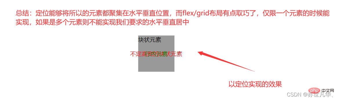
Interviewer: Given an element, how to achieve horizontal and vertical centering?
Me: Uh~, for this problem, I thought of three common ways: Positioning、 flex and grid layout. The entire code is as follows
Positioning: Because this element is not sure whether it is a block-level element (whether the block-level element has width and height) or an inline element, So you need to use the transform attribute to do a negative 50% movement (based on the current element width and height).
<style>
  html,body{
    margin: 0;
    padding: 0;
    height: 100%;
    position: relative;
  }
  .item{
    position: absolute;
    top: 50%;
    left: 50%;
    transform: translate(-50%, -50%);
  }
</style>

  <div>
    块状元素
  </div>
  <div>不定高宽的块状元素</div>
  <span>行内元素</span>
flex layout: Not only supports block elements, but also supports inline elements, and can be used for both fixed height and width and non-fixed height and width. [Related recommendations: web front-end development]
<style>
  html,body{
    margin: 0;
    padding: 0;
    width: 100%;
    height: 100%;
    display: flex;
  }
  .item{
    margin: auto;
  }
</style>

  <div>
    块状元素
  </div>
  <!-- <div class="item" style="color: red;">不定高宽的块状元素</div>
  <span class="item" style="color: green;">行内元素</span> -->
grid layout: Not only supports block elements, but also supports inline elements, for fixed height Both width and variable height and width can be used.
<style>
  html,body{
    margin: 0;
    padding: 0;
    width: 100%;
    height: 100%;
    display: grid;
    place-content: center;
  }
</style>

  <div>
    块状元素
  </div>
  <!-- <div class="item" style="color: red;">不定高宽的块状元素</div>
  <span class="item" style="color: green;">行内元素</span> -->
Interviewer: What is the difference between padding and margin?
Me: Uh~, padding is the inner margin that acts on itself, and margin is the outer margin that acts on external objects.
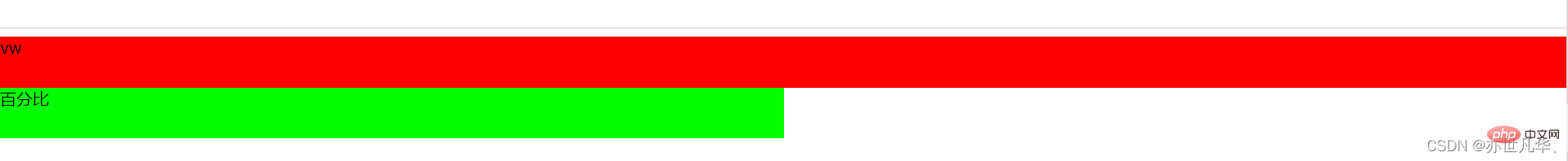
Interviewer: What is the difference between vw and percentage?
Me: Uh~, vw is only related to the width and height of the device, and % is related to inheritance. The entire code is as follows
<style>
  body{
    width: 50%;
  }
  .p1{
    width: 100vw;
    height: 50px;
    background-color: #f00;
  }
  .p2{
    width: 100%;
    height: 50px;
    background-color: #0f0;
  }
</style>

  <div>vw</div>
  <div>百分比</div>
Interviewer: What is the difference between inline elements and block-level elements?
Me: Uh~, the difference between inline elements and block-level elements is mainly reflected in the following points:
Attributes of the box model:
The width and height settings for inline elements are invalid (line-height can be set), margin top and bottom are invalid, and padding top and bottom are invalid.
Inclusion relationship:
Block-level elements can contain inline elements and block-level elements; inline elements cannot contain block-level elements.
Arrangement method:
Block-level elements will occupy one row and are arranged vertically. Inline elements do not occupy the entire row. They are arranged in a straight line. They are all in the same row and arranged horizontally.
The two types can be converted to each other:
Inline elements are converted into block elements: display:block; block elements are converted into inline elements: display :inline.
Interviewer: What are the inline elements in HTML tags?
Me: Uh~, common inline element labels include the following:
a, img, picture, span, input, textarea, select, label
Interviewer: How to make Google Chrome support small fonts?
Me: Uh~, the smallest font currently supported by Google Chrome is 12px. Normally this font is already the smallest. If you still want to make the font smaller, you can only use CSS The scaling attribute makes the font smaller, such as transform: scale(0.5). This attribute can reduce the original smallest font to one-half its original size.
面试官:HTML中有哪些是语义化标签?
我:呃~,常见的语义化标签有以下几种:
header、footer、main、aside、article、section、address、summary/details、menu、img
h1/h2/h3/h4/h5/h6、p、strong/italic
面试官:什么是HTML的实体编码?
我:呃~,HTML 实体编码是一段以连字号(&)开头、以分号(;)结尾的字符串。用以显示不可见字符及保留字符 (如 HTML 标签),在前端,一般为了避免 XSS 攻击,会将 编码为 < 与 >,这些就是 HTML 实体编码。
常见的实体编码如下:
不可分的空格:&nbsp;
&(与符号):&amp;
″(双引号):&quot;
'(单引号):&apos;
面试官:textarea 如何禁止拉伸?
我:呃~,使用 CSS 样式可以避免拉伸,属性为 resize: none;
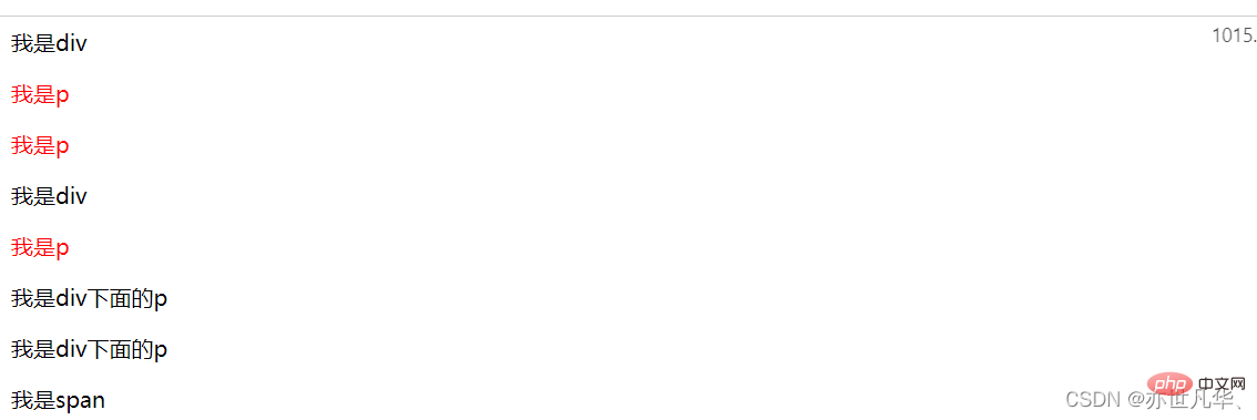
面试官:谈谈 + 与 ~ 选择器有什么不同?
我:呃~,两者的区别很简单如下:
+ 选择器匹配紧邻的兄弟元素
~ 选择器匹配随后的所有兄弟元素 整出代码如下:
<style>
    div+p { /* 第一个兄弟元素p标签变红色了 */
        color: red;
    }
    div~p { /* div后面的兄弟元素p标签都变成红色了 */
        color:red;
    }
</style>

  <div>我是div</div>
  <p>我是p</p>
  <p>我是p</p>
  <div>我是div</div>
  <p>我是p</p>
  <div>
    <p>我是div下面的p</p>
    <p>我是div下面的p</p>
  </div>
  <span>我是span</span>
The above is the detailed content of Take a look at these front-end interview questions to help you master high-frequency knowledge points (1). For more information, please follow other related articles on the PHP Chinese website!

Hot AI Tools

Undresser.AI Undress
AI-powered app for creating realistic nude photos

AI Clothes Remover
Online AI tool for removing clothes from photos.

Undress AI Tool
Undress images for free

Clothoff.io
AI clothes remover

Video Face Swap
Swap faces in any video effortlessly with our completely free AI face swap tool!

Hot Article
Hot Tools

Notepad++7.3.1
Easy-to-use and free code editor

SublimeText3 Chinese version
Chinese version, very easy to use

Zend Studio 13.0.1
Powerful PHP integrated development environment

Dreamweaver CS6
Visual web development tools

SublimeText3 Mac version
God-level code editing software (SublimeText3)
Hot Topics
 1667
1667
 14
1426
52
1328
25
1273
29
1255
24
14
1426
52
1328
25
1273
29
1255
24

 How to use bootstrap in vue
Apr 07, 2025 pm 11:33 PM
How to use bootstrap in vue
Apr 07, 2025 pm 11:33 PM
Using Bootstrap in Vue.js is divided into five steps: Install Bootstrap. Import Bootstrap in main.js. Use the Bootstrap component directly in the template. Optional: Custom style. Optional: Use plug-ins.
 Understanding HTML, CSS, and JavaScript: A Beginner's Guide
Apr 12, 2025 am 12:02 AM
Understanding HTML, CSS, and JavaScript: A Beginner's Guide
Apr 12, 2025 am 12:02 AM
WebdevelopmentreliesonHTML,CSS,andJavaScript:1)HTMLstructurescontent,2)CSSstylesit,and3)JavaScriptaddsinteractivity,formingthebasisofmodernwebexperiences.
 The Roles of HTML, CSS, and JavaScript: Core Responsibilities
Apr 08, 2025 pm 07:05 PM
The Roles of HTML, CSS, and JavaScript: Core Responsibilities
Apr 08, 2025 pm 07:05 PM
HTML defines the web structure, CSS is responsible for style and layout, and JavaScript gives dynamic interaction. The three perform their duties in web development and jointly build a colorful website.
 React's Role in HTML: Enhancing User Experience
Apr 09, 2025 am 12:11 AM
React's Role in HTML: Enhancing User Experience
Apr 09, 2025 am 12:11 AM
React combines JSX and HTML to improve user experience. 1) JSX embeds HTML to make development more intuitive. 2) The virtual DOM mechanism optimizes performance and reduces DOM operations. 3) Component-based management UI to improve maintainability. 4) State management and event processing enhance interactivity.
 HTML: The Structure, CSS: The Style, JavaScript: The Behavior
Apr 18, 2025 am 12:09 AM
HTML: The Structure, CSS: The Style, JavaScript: The Behavior
Apr 18, 2025 am 12:09 AM
The roles of HTML, CSS and JavaScript in web development are: 1. HTML defines the web page structure, 2. CSS controls the web page style, and 3. JavaScript adds dynamic behavior. Together, they build the framework, aesthetics and interactivity of modern websites.
 The Future of HTML: Evolution and Trends in Web Design
Apr 17, 2025 am 12:12 AM
The Future of HTML: Evolution and Trends in Web Design
Apr 17, 2025 am 12:12 AM
The future of HTML is full of infinite possibilities. 1) New features and standards will include more semantic tags and the popularity of WebComponents. 2) The web design trend will continue to develop towards responsive and accessible design. 3) Performance optimization will improve the user experience through responsive image loading and lazy loading technologies.
 Understanding React's Primary Function: The Frontend Perspective
Apr 18, 2025 am 12:15 AM
Understanding React's Primary Function: The Frontend Perspective
Apr 18, 2025 am 12:15 AM
React's main functions include componentized thinking, state management and virtual DOM. 1) The idea of componentization allows splitting the UI into reusable parts to improve code readability and maintainability. 2) State management manages dynamic data through state and props, and changes trigger UI updates. 3) Virtual DOM optimization performance, update the UI through the calculation of the minimum operation of DOM replica in memory.
 Solve caching issues in Craft CMS: Using wiejeben/craft-laravel-mix plug-in
Apr 18, 2025 am 09:24 AM
Solve caching issues in Craft CMS: Using wiejeben/craft-laravel-mix plug-in
Apr 18, 2025 am 09:24 AM
When developing websites using CraftCMS, you often encounter resource file caching problems, especially when you frequently update CSS and JavaScript files, old versions of files may still be cached by the browser, causing users to not see the latest changes in time. This problem not only affects the user experience, but also increases the difficulty of development and debugging. Recently, I encountered similar troubles in my project, and after some exploration, I found the plugin wiejeben/craft-laravel-mix, which perfectly solved my caching problem.
