
 Web Front-end
CSS Tutorial
CSS mask-composite advanced techniques: arbitrary color conversion of a single image
Web Front-end
CSS Tutorial
CSS mask-composite advanced techniques: arbitrary color conversion of a single image
CSS mask-composite advanced techniques: arbitrary color conversion of a single image

This article introduces you to an advanced image cutting technique based on CSS mask-composite to achieve any color conversion based on a single image. I hope it will be helpful to you!
mask-composite, we can use a picture to get various transformations about it, and even get various different Color transformation. [Recommended learning: css video tutorial]
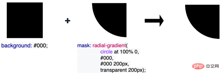
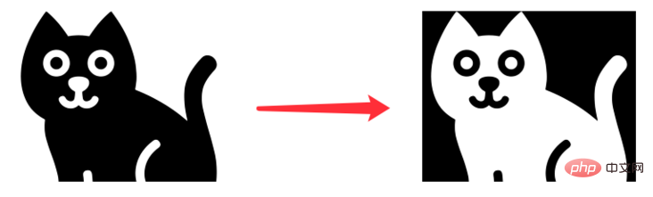
Get its reverse cut image through a single PNG/SVG
This is what happened Yes, one day, we got such a PNG/SVG picture:


mask-composite.
What is mask-composite?
So, what is mask-composite? Of course, at this stage, the browser prefix needs to be added, -webkit-mask-composite.
mask-composite, you must first know another very important and useful property in CSS -- mask.
mask, I suggest you read this article first--Wonderful CSS MASK
In using mask While the image is being masked and cut, we can also apply the mask-composite attribute at the same time. This is a very interesting element.
-webkit-mask-composite: Property specifies how multiple mask images applied to the same element are composited with each other.
In layman's terms, its function is that when an element has multiple masks, we can use -webkit-mask-composite to superimpose the effect. For example:<div></div>
.original {
    background: #000;
    mask: radial-gradient(circle at 0 0, #000, #000 200px, transparent 200px);
}radial-gradient as a mask to cut the original rectangle and get a new graphic.

<div></div>
.original {
    background: #000;
    mask: radial-gradient(circle at 100% 0, #000, #000 200px, transparent 200px);
}
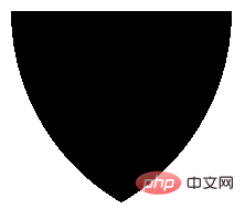
.mask {
    background: #000;
    mask: radial-gradient(circle at 100% 0, #000, #000 200px, transparent 200px),
        radial-gradient(circle at 0 0, #000, #000 200px, transparent 200px);
}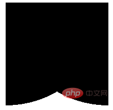
mask-composite:
.mask {
    background: #000;
    mask: radial-gradient(circle at 100% 0, #000, #000 200px, transparent 200px),
        radial-gradient(circle at 0 0, #000, #000 200px, transparent 200px);
    -webkit-mask-composite: source-in;
}-webkit-mask-composite: source-in, we can get the overlapping part of the two mask graphics, and then apply it to the entire mask based on this overlapping part Mask:

CodePen Demo -- mask-composite Demo: https://codepen.io/Chokcoco/pen/KKQjxMP
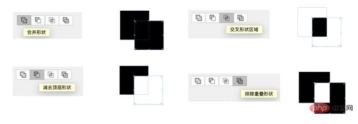
-webkit-mask-composite can also implement many different functions, including but not limited to:
-webkit-mask-composite: clear; /*清除,不显示任何遮罩*/
-webkit-mask-composite: copy; /*只显示上方遮罩,不显示下方遮罩*/
-webkit-mask-composite: source-over;
-webkit-mask-composite: source-in; /*只显示重合的地方*/
-webkit-mask-composite: source-out; /*只显示上方遮罩,重合的地方不显示*/
-webkit-mask-composite: source-atop;
-webkit-mask-composite: destination-over;
-webkit-mask-composite: destination-in; /*只显示重合的地方*/
-webkit-mask-composite: destination-out;/*只显示下方遮罩,重合的地方不显示*/
-webkit-mask-composite: destination-atop;
-webkit-mask-composite: xor; /*只显示不重合的地方*/
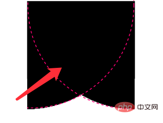
看看这张图,就一目了然(图片源自 CSS mask 实现鼠标跟随镂空效果)
使用 -webkit-mask-composite 实现图片的扩展
基于上述的知识铺垫,回到我们的主题,在我们有了一张透明图片(PNG/SVG)之后,我们可以轻松的利用 -webkit-mask-composite 得到它的反向镂空图:
.mask {
    background: #000;
    mask:
        url($img),
        linear-gradient(#fff, #000);
    mask-composite: exclude;
}
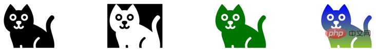
不仅如此,我们还可以利用这个技巧,使用图片本身作为 mask 遮罩,配合 -webkit-mask-composite,从而将一张纯色图片,扩展到各类不同颜色,甚至是渐变色!
<div></div>
<div></div>
<div></div>
<div></div>
.original {
    background: url($img);
    background-size: cover;
}
.mask {
    background: #000;
    mask:
        url($img),
        linear-gradient(#fff, #000);
    mask-composite: exclude;
}
.mask-color {
    background: green;
    mask:
        url($img),
        linear-gradient(#fff, #000);
    mask-composite: source-in;
}
.mask-gradient {
    background: linear-gradient(blue, yellowgreen);
    mask:
        url($img),
        linear-gradient(#fff, #000);
    mask-composite: source-in;
}
CodePen Demo -- Power of mask-composite:
https://codepen.io/Chokcoco/pen/YzaKLEr
这样,仅仅是利用一张 PNG/SVG 原图,我们就可以得到它的
反向镂空图
其他纯色图
渐变色图
可以有效的节省图片资源,起到一定的优化效果!
在之前,我也写过一种基于白底黑图的任意颜色转换,但是存在非常大的局限性:两行 CSS 代码实现图片任意颜色赋色技术,但是今天这个技巧是纯粹的,对原图没有要求的任意色彩转换!
当然,唯一的缺点,目前会受限于 mask-composite 和 -webkit-mask-composite 的兼容性,而且两者的语法存在一定的差异,实际使用的话需要注意。根据业务场景灵活选择。
(学习视频分享:web前端)
The above is the detailed content of CSS mask-composite advanced techniques: arbitrary color conversion of a single image. For more information, please follow other related articles on the PHP Chinese website!

Hot AI Tools

Undresser.AI Undress
AI-powered app for creating realistic nude photos

AI Clothes Remover
Online AI tool for removing clothes from photos.

Undress AI Tool
Undress images for free

Clothoff.io
AI clothes remover

Video Face Swap
Swap faces in any video effortlessly with our completely free AI face swap tool!

Hot Article
Hot Tools

Notepad++7.3.1
Easy-to-use and free code editor

SublimeText3 Chinese version
Chinese version, very easy to use

Zend Studio 13.0.1
Powerful PHP integrated development environment

Dreamweaver CS6
Visual web development tools

SublimeText3 Mac version
God-level code editing software (SublimeText3)
Hot Topics


 How to use bootstrap in vue
Apr 07, 2025 pm 11:33 PM
How to use bootstrap in vue
Apr 07, 2025 pm 11:33 PM
Using Bootstrap in Vue.js is divided into five steps: Install Bootstrap. Import Bootstrap in main.js. Use the Bootstrap component directly in the template. Optional: Custom style. Optional: Use plug-ins.
 The Roles of HTML, CSS, and JavaScript: Core Responsibilities
Apr 08, 2025 pm 07:05 PM
The Roles of HTML, CSS, and JavaScript: Core Responsibilities
Apr 08, 2025 pm 07:05 PM
HTML defines the web structure, CSS is responsible for style and layout, and JavaScript gives dynamic interaction. The three perform their duties in web development and jointly build a colorful website.
 Understanding HTML, CSS, and JavaScript: A Beginner's Guide
Apr 12, 2025 am 12:02 AM
Understanding HTML, CSS, and JavaScript: A Beginner's Guide
Apr 12, 2025 am 12:02 AM
WebdevelopmentreliesonHTML,CSS,andJavaScript:1)HTMLstructurescontent,2)CSSstylesit,and3)JavaScriptaddsinteractivity,formingthebasisofmodernwebexperiences.
 How to write split lines on bootstrap
Apr 07, 2025 pm 03:12 PM
How to write split lines on bootstrap
Apr 07, 2025 pm 03:12 PM
There are two ways to create a Bootstrap split line: using the tag, which creates a horizontal split line. Use the CSS border property to create custom style split lines.
 How to insert pictures on bootstrap
Apr 07, 2025 pm 03:30 PM
How to insert pictures on bootstrap
Apr 07, 2025 pm 03:30 PM
There are several ways to insert images in Bootstrap: insert images directly, using the HTML img tag. With the Bootstrap image component, you can provide responsive images and more styles. Set the image size, use the img-fluid class to make the image adaptable. Set the border, using the img-bordered class. Set the rounded corners and use the img-rounded class. Set the shadow, use the shadow class. Resize and position the image, using CSS style. Using the background image, use the background-image CSS property.
 How to use bootstrap button
Apr 07, 2025 pm 03:09 PM
How to use bootstrap button
Apr 07, 2025 pm 03:09 PM
How to use the Bootstrap button? Introduce Bootstrap CSS to create button elements and add Bootstrap button class to add button text
 How to set up the framework for bootstrap
Apr 07, 2025 pm 03:27 PM
How to set up the framework for bootstrap
Apr 07, 2025 pm 03:27 PM
To set up the Bootstrap framework, you need to follow these steps: 1. Reference the Bootstrap file via CDN; 2. Download and host the file on your own server; 3. Include the Bootstrap file in HTML; 4. Compile Sass/Less as needed; 5. Import a custom file (optional). Once setup is complete, you can use Bootstrap's grid systems, components, and styles to create responsive websites and applications.
 How to resize bootstrap
Apr 07, 2025 pm 03:18 PM
How to resize bootstrap
Apr 07, 2025 pm 03:18 PM
To adjust the size of elements in Bootstrap, you can use the dimension class, which includes: adjusting width: .col-, .w-, .mw-adjust height: .h-, .min-h-, .max-h-
