6 Tips for Drawing Triangles with CSS (Share)
This article will introduce you to N techniques for drawing triangles using CSS. It has certain reference value. Friends in need can refer to it. I hope it will be helpful to everyone.

In some interviews, you can often see that there will be a question about CSS How to use CSS to draw a triangle, and the answer is usually There is only one way to draw using borders.
With the development of CSS today, there are actually many interesting ways to draw triangles using only CSS. This article will list them in detail.
Through this article, you can learn 6 ways to draw triangles using CSS, and they are all very easy to master. Of course, this article is just an introduction. CSS is changing with each passing day. There may be some interesting methods that are missing from this article. You are welcome to add them in the message area~
Use border to draw triangles
Use The border implementation triangle should be mastered by most people, and it is also often seen in various aspects. It uses a container with zero height and width and a transparent border implementation.
The simple code is as follows:
div {
  border-top: 50px solid yellowgreen;
  border-bottom: 50px solid deeppink;
  border-left: 50px solid bisque;
  border-right: 50px solid chocolate;
}Container with zero height and width, set borders of different colors:
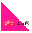
In this way, let any If the color of the borders on the three sides is transparent, it is very easy to get triangles at various angles:

CodePen Demo - Use border to implement triangles
https://codepen.io/Chokcoco/pen/GqrVpB
Use linear-gradient to draw triangles
Next, we use Linear gradientlinear-gradient implements triangles.
Its principle is also very simple. We implement a gradient of 45°:
div {
  width: 100px;
  height: 100px;
  background: linear-gradient(45deg, deeppink, yellowgreen);
}
Let its color change from gradient color to Change to two fixed colors:
div {
  width: 100px;
  height: 100px;
  background: linear-gradient(45deg, deeppink, deeppink 50%, yellowgreen 50%, yellowgreen 100%);
}
Then make one of the colors transparent:
div {
  background: linear-gradient(45deg, deeppink, deeppink 50%, transparent 50%, transparent 100%);
}
Passed Rotate rotate or scale, we can also get triangles of various angles and sizes. The complete Demo can be clicked here:
CodePen Demo - Use Linear gradient to implement triangles
https://codepen.io/Chokcoco/pen/RwKKOZw
Use conic-gradient to draw triangles
Still gradient, above we used linear gradient to implement triangles. Interestingly, in the gradient family, angular gradient conic-gradient can also be used to implement triangles.
The method is that the center point of the angular gradient can be set, and the center point of the circle similar to the radial gradient can also be set.
We set the center point of the angular gradient at 50% 0, which is center top, the middle of the top of the container, and then perform the angular gradient, gradient Within a certain angle range, they are all triangular shapes.
Suppose we have a 200px x 100px height and width container, and set its angular gradient center point to 50% 0:
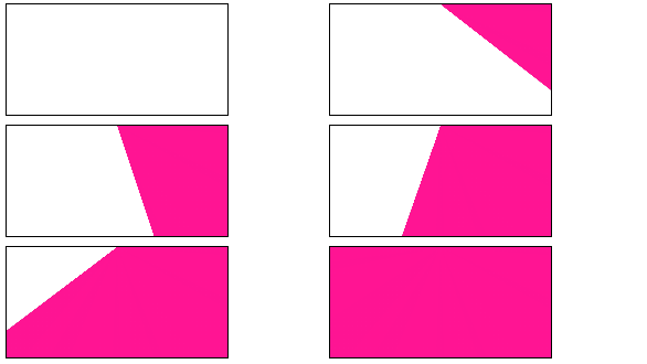
And set it to draw an angular gradient diagram starting from 90°. The schematic diagram is as follows:

As you can see, in the initial When the angular gradient graphic reaches the second side, it is all a triangle. We select a suitable angle and we can easily get a triangle:
div {
    background: conic-gradient(from 90deg at 50% 0, deeppink 0, deeppink 45deg, transparent 45.1deg);
}
deeppink 45deg, transparent 45.1deg in the above code is to simply eliminate the aliasing effect caused by the gradient. In this way, we pass conic-gradient, and also easily got a triangle. Similarly, with rotation rotate
scale, we can also get triangles of various angles and sizes. The complete demo can be clicked here: CodePen Demo - Implementing triangles using angular gradients
https://codepen.io/Chokcoco/pen/qBRRZJr##transform: rotate Drawing triangles with overflow: hidden
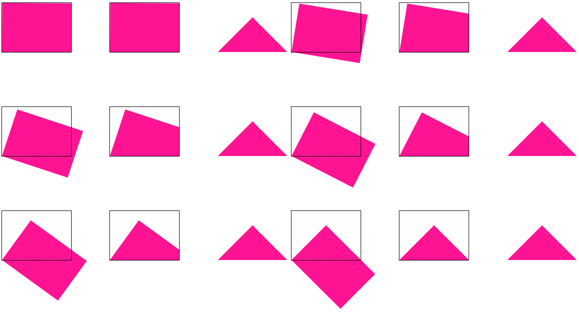
This method is relatively conventional, use transform: rotate with
overflow: hidden. You can understand it at a glance and learn it at a glance. The simple animation diagram is as follows: <p><img src="/static/imghw/default1.png" data-src="https://img.php.cn/upload/image/473/819/672/1622774914344263.gif" class="lazy" title="1622774914344263.gif" alt="6 Tips for Drawing Triangles with CSS (Share)"/></p><p>设置图形的旋转中心在左下角 <code>left bottom,进行旋转,配合 overflow: hidden。
完整的代码:
.triangle {
    width: 141px;
    height: 100px;
    position: relative;
    overflow: hidden;

    &::before {
        content: "";
        position: absolute;
        top: 0;
        left: 0;
        right: 0;
        bottom: 0;
        background: deeppink;
        transform-origin: left bottom;
        transform: rotate(45deg);
    }
}CodePen Demo - transform: rotate 配合 overflow: hidden 实现三角形
https://codepen.io/Chokcoco/pen/LYxyyPv
使用 clip-path 绘制三角形
clip-path 一个非常有意思的 CSS 属性。
clip-path CSS 属性可以创建一个只有元素的部分区域可以显示的剪切区域。区域内的部分显示,区域外的隐藏。剪切区域是被引用内嵌的 URL 定义的路径或者外部 SVG 的路径。
也就是说,使用 clip-path 可以将一个容器裁剪成任何我们想要的样子。
通过 3 个坐标点,实现一个多边形,多余的空间则会被裁减掉,代码也非常简单:
div {
    background: deeppink;
    clip-path: polygon(0 0, 100% 0, 0 100%, 0 0);
}
CodePen Demo - 使用 clip-path 实现三角形
https://codepen.io/Chokcoco/pen/GRrmEzY
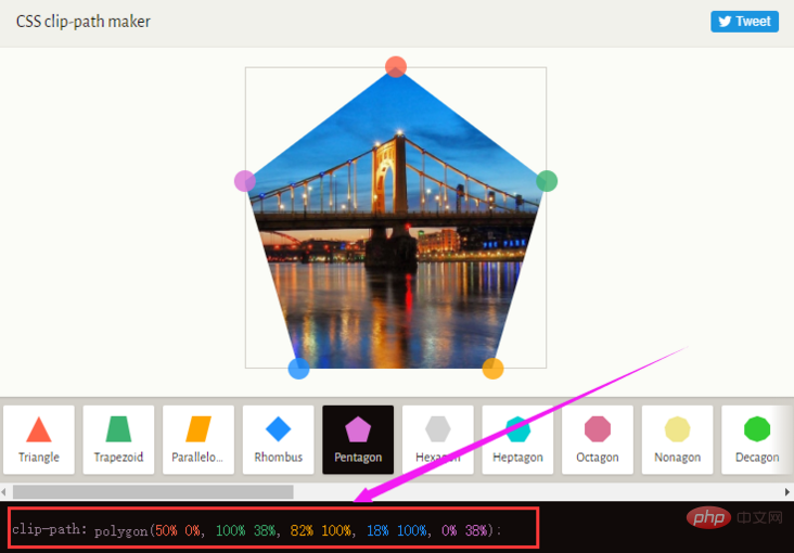
在这个网站中 -- CSS clip-path maker,你可以快捷地创建简单的 clip-path 图形,得到对应的 CSS 代码。

利用字符绘制三角形
OK,最后一种,有些独特,就是使用字符表示三角形。
下面列出一些三角形形状的字符的十进制 Unicode 表示码。
◄ : ◄
► : ►
▼ : ▼
▲ : ▲
⊿ : ⊿
△ : △
譬如,我们使用 ▼ 实现一个三角形 ▼,代码如下:
<div class="normal">▼ </div>
div {
    font-size: 100px;
    color: deeppink;
}效果还是不错的:
然而,需要注意的是,使用字符表示三角形与当前设定的字体是强相关的,不同的字体绘制出的同一个字符是不一样的,我在 Google Font 上随机选取了几个不同的字体,分别表示同一个字符,得到的效果如下:
可以看到,不同字体的形状、大小及基线都是不一样的,所以如果你想使用字符三角形,确保用户的浏览器安装了你指定的字体,否则,不要使用这种方式。
完整的对比 Demo,你可以戳这里:
CodePen Demo - 使用字符实现三角形
https://codepen.io/Chokcoco/pen/abpWyzy
最后
好了,本文到此结束,关于使用 CSS 绘制三角的 6 种不同方式,希望对你有帮助 :)
原文地址:https://segmentfault.com/a/1190000039808190
作者:chokcoco
更多编程相关知识,请访问:编程视频!!
The above is the detailed content of 6 Tips for Drawing Triangles with CSS (Share). For more information, please follow other related articles on the PHP Chinese website!

Hot AI Tools

Undresser.AI Undress
AI-powered app for creating realistic nude photos

AI Clothes Remover
Online AI tool for removing clothes from photos.

Undress AI Tool
Undress images for free

Clothoff.io
AI clothes remover

Video Face Swap
Swap faces in any video effortlessly with our completely free AI face swap tool!

Hot Article

Hot Tools

Notepad++7.3.1
Easy-to-use and free code editor

SublimeText3 Chinese version
Chinese version, very easy to use

Zend Studio 13.0.1
Powerful PHP integrated development environment

Dreamweaver CS6
Visual web development tools

SublimeText3 Mac version
God-level code editing software (SublimeText3)

Hot Topics
 How to use bootstrap in vue
Apr 07, 2025 pm 11:33 PM
Using Bootstrap in Vue.js is divided into five steps: Install Bootstrap. Import Bootstrap in main.js. Use the Bootstrap component directly in the template. Optional: Custom style. Optional: Use plug-ins.
 The Roles of HTML, CSS, and JavaScript: Core Responsibilities
Apr 08, 2025 pm 07:05 PM
HTML defines the web structure, CSS is responsible for style and layout, and JavaScript gives dynamic interaction. The three perform their duties in web development and jointly build a colorful website.
 Understanding HTML, CSS, and JavaScript: A Beginner's Guide
Apr 12, 2025 am 12:02 AM
WebdevelopmentreliesonHTML,CSS,andJavaScript:1)HTMLstructurescontent,2)CSSstylesit,and3)JavaScriptaddsinteractivity,formingthebasisofmodernwebexperiences.
 How to set up the framework for bootstrap
Apr 07, 2025 pm 03:27 PM
To set up the Bootstrap framework, you need to follow these steps: 1. Reference the Bootstrap file via CDN; 2. Download and host the file on your own server; 3. Include the Bootstrap file in HTML; 4. Compile Sass/Less as needed; 5. Import a custom file (optional). Once setup is complete, you can use Bootstrap's grid systems, components, and styles to create responsive websites and applications.
 How to write split lines on bootstrap
Apr 07, 2025 pm 03:12 PM
There are two ways to create a Bootstrap split line: using the tag, which creates a horizontal split line. Use the CSS border property to create custom style split lines.
 How to insert pictures on bootstrap
Apr 07, 2025 pm 03:30 PM
There are several ways to insert images in Bootstrap: insert images directly, using the HTML img tag. With the Bootstrap image component, you can provide responsive images and more styles. Set the image size, use the img-fluid class to make the image adaptable. Set the border, using the img-bordered class. Set the rounded corners and use the img-rounded class. Set the shadow, use the shadow class. Resize and position the image, using CSS style. Using the background image, use the background-image CSS property.
 How to use bootstrap button
Apr 07, 2025 pm 03:09 PM
How to use the Bootstrap button? Introduce Bootstrap CSS to create button elements and add Bootstrap button class to add button text
 How to resize bootstrap
Apr 07, 2025 pm 03:18 PM
To adjust the size of elements in Bootstrap, you can use the dimension class, which includes: adjusting width: .col-, .w-, .mw-adjust height: .h-, .min-h-, .max-h-


)
)


