How to use CSS display: contents?

display: contents is a relatively unfamiliar property. Although display is basically the most common CSS property, the value of contents is rarely used. But it has been supported by Firefox since 2016.
This article will take a closer look at this interesting attribute value.
Basic usage
According to W3C’s definition of display: contents.
The element itself does not generate any boxes, but its children and pseudo-elements still generate boxes and text runs as normal. For the purposes of box generation and layout, the element must be treated as if it had been replaced in the element tree by its contents (including both its source-document children and its pseudo-elements, such as ::before and ::after pseudo-elements, which are generated before/after the element's children as normal) .
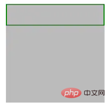
A simple translation means that the element itself with this attribute value set will not generate any boxes, but it will retain the normal display of its descendant elements.
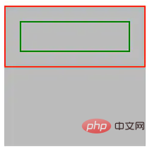
Look at a simple example. There is a simple three-layer structure as follows:
<div class="container">
    <div class="wrap">
        <div class="inner"></div>
    </div>
</div>The simple CSS is as follows:
.container {
    width: 200px;
    height: 200px;
    background: #bbb;
}
.wrap {
    border: 2px solid red;
    padding: 20px;
    box-sizing: border-box;
}
.inner {
    border: 2px solid green;
    padding: 20px;
    box-sizing: border-box;
}The performance is as follows:

<div class="container">
    <div class="wrap" style="display: contents">
        <div class="inner"></div>
    </div>
</div>
Acts as a semantic-less wrapping box
When I was writing React and Vue recently, I found that this attribute can play a very good role when writing JSX, and it is also very useful. In line with the positioning of this attribute itself. When we write React and RN, we often need to output a template.return (
<div class="wrap">
<h2 id="Title">Title</h2>
<div>...</div>
</div>
)return (
<div class="wrap" style="display: contents">
<h2 id="Title">Title</h2>
<div>...</div>
</div>
)Make the code more semantic
Consider this very practical Scenario, now our pages are filled with a large number of clickable buttons, or text and other elements that trigger corresponding functions. However, semantically speaking, they should be
Hot AI Tools

Undresser.AI Undress
AI-powered app for creating realistic nude photos

AI Clothes Remover
Online AI tool for removing clothes from photos.

Undress AI Tool
Undress images for free

Clothoff.io
AI clothes remover

Video Face Swap
Swap faces in any video effortlessly with our completely free AI face swap tool!

Hot Article

Hot Tools

Notepad++7.3.1
Easy-to-use and free code editor

SublimeText3 Chinese version
Chinese version, very easy to use

Zend Studio 13.0.1
Powerful PHP integrated development environment

Dreamweaver CS6
Visual web development tools

SublimeText3 Mac version
God-level code editing software (SublimeText3)

Hot Topics
 How to use bootstrap in vue
Apr 07, 2025 pm 11:33 PM
Using Bootstrap in Vue.js is divided into five steps: Install Bootstrap. Import Bootstrap in main.js. Use the Bootstrap component directly in the template. Optional: Custom style. Optional: Use plug-ins.
 The Roles of HTML, CSS, and JavaScript: Core Responsibilities
Apr 08, 2025 pm 07:05 PM
HTML defines the web structure, CSS is responsible for style and layout, and JavaScript gives dynamic interaction. The three perform their duties in web development and jointly build a colorful website.
 Understanding HTML, CSS, and JavaScript: A Beginner's Guide
Apr 12, 2025 am 12:02 AM
WebdevelopmentreliesonHTML,CSS,andJavaScript:1)HTMLstructurescontent,2)CSSstylesit,and3)JavaScriptaddsinteractivity,formingthebasisofmodernwebexperiences.
 How to set up the framework for bootstrap
Apr 07, 2025 pm 03:27 PM
To set up the Bootstrap framework, you need to follow these steps: 1. Reference the Bootstrap file via CDN; 2. Download and host the file on your own server; 3. Include the Bootstrap file in HTML; 4. Compile Sass/Less as needed; 5. Import a custom file (optional). Once setup is complete, you can use Bootstrap's grid systems, components, and styles to create responsive websites and applications.
 How to write split lines on bootstrap
Apr 07, 2025 pm 03:12 PM
There are two ways to create a Bootstrap split line: using the tag, which creates a horizontal split line. Use the CSS border property to create custom style split lines.
 How to insert pictures on bootstrap
Apr 07, 2025 pm 03:30 PM
There are several ways to insert images in Bootstrap: insert images directly, using the HTML img tag. With the Bootstrap image component, you can provide responsive images and more styles. Set the image size, use the img-fluid class to make the image adaptable. Set the border, using the img-bordered class. Set the rounded corners and use the img-rounded class. Set the shadow, use the shadow class. Resize and position the image, using CSS style. Using the background image, use the background-image CSS property.
 How to use bootstrap button
Apr 07, 2025 pm 03:09 PM
How to use the Bootstrap button? Introduce Bootstrap CSS to create button elements and add Bootstrap button class to add button text
 How to resize bootstrap
Apr 07, 2025 pm 03:18 PM
To adjust the size of elements in Bootstrap, you can use the dimension class, which includes: adjusting width: .col-, .w-, .mw-adjust height: .h-, .min-h-, .max-h-


