

CSS3 property: How to use text-shadow text shadow

The content of this article is about the CSS3 attribute: how to use text-shadow text shadow. It has certain reference value. Friends in need can refer to it. I hope it will be helpful to you.
When text-shadow didn’t appear, people generally used photoshop to create shadows in web design. Now with css3, you can directly use the text-shadow attribute to specify shadows. This property can have two purposes, producing shadows and blurring the subject. This can add texture to text when not using images.
text-shadow once appeared in css2, but was abandoned in css2.1 version, and now css3.0 version has picked it up again. This shows that the text-shadow attribute is very worthy of the attention of our front-end personnel. In many projects now, many properties of CSS3 are used by front-end engineers. I have introduced the use of gradient, transparency, and rounded corners in CSS3 before. Among the many properties of CSS3, I personally feel that text- Shadow is the most used attribute. As a front-end staff, I think it is necessary to learn and master this text-shadow attribute.
Syntax:
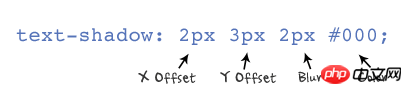
text-shadow : none | <length> none | [<shadow>, ] * <shadow> 或none | <color> [, <color> ]*
也就是:
text-shadow:[颜色(Color)  x轴(X Offset) y轴(Y Offset) 模糊半径(Blur)],[颜色(color) x轴(X Offset) y轴(Y Offset) 模糊半径(Blur)]...
或者
text-shadow:[x轴(X Offset) y轴(Y Offset)  模糊半径(Blur)  颜色(Color)],[x轴(X Offset) y轴(Y Offset)  模糊半径(Blur)  颜色(Color)]...
Value:
As shown below:
Explanation:
You can apply one or more groups to an object Shadow effects, as shown in the previous syntax, separated by commas. text-shadow: X-Offset Y-Offset Blur Color Y-Offset refers to the vertical offset distance of the shadow. If its value is positive, the shadow is offset downward. On the contrary, when its value is negative, the shadow is offset toward the top. Blur refers to the blur degree of the shadow. Its value cannot be Negative value, if the value is larger, the shadow will be blurred, otherwise the shadow will be clearer. If the shadow blur is not required, the Blur value can be set to 0; Color refers to the color of the shadow, which can use rgba color.
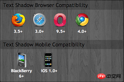
Browser compatibility:
Let’s take a look at an example
First give all DEMOs a Common styles and class names:
 .demo {
      background: #666666;
      width: 440px;
      padding: 30px;
      font: bold 55px/100% "微软雅黑", "Lucida Grande", "Lucida Sans", Helvetica, Arial, Sans;;
      color: #fff;
      text-transform: uppercase;
}Next, we add our own specific styles to each Demo, as follows:
.demo1 {
   text-shadow: red 0 1px 0;
}
The effect is good, but what gives us a headache is that IE does not support the text-shadow effect. However, in order to be compatible with this problem, we have to use the filter:shadow to deal with it (I do not advocate the use of filters). The filter:shadow filter is similar to dropshadow. It can also use objects to produce shadow effects. The difference is that shadow can produce a gradual effect, which is smoother when using shadows.
Filter syntax:
E {filter:shadow(Color=颜色值,Direction=数值,Strength=数值)}E is the element selector, Color is used to set the shadow color of the object; Direction is used to set the main direction of the projection, The value is 0 which is zero degree (indicating upward direction), 45 is upper right, 90 is right, 135 is lower right, 180 is lower, 225 is lower left, 270 is left, 315 is upper left; Strength is intensity, similar to The blur value in text-shadow.
Let’s not care about the effect under IE. I personally think that if text-shadow is used well, it can also produce very good effects like photoshop. Here I will list some better-looking examples for your reference. Please refer to
Note: All the following demos need to add this common style:
 .demo {
      background: #666666;
      width: 440px;
      padding: 30px;
      font: bold 55px/100% "微软雅黑", "Lucida Grande", "Lucida Sans", Helvetica, Arial, Sans;;
      color: #fff;
      text-transform: uppercase;
}Effect 1: Glow and Extra Glow effect (that is, NEON effect)
.demo2 {
  text-shadow: 0 0 20px red;
}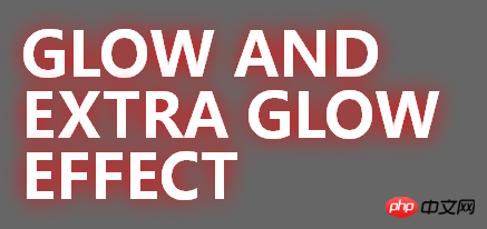
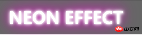
Glow effect, we set a larger blur radius to increase its glow effect, you can change different blur radius values to achieve different effect, of course you can also add several different radius values at the same time to create a variety of different shadow effects. Just like the NEON effect below.
.demo3 {
  text-shadow: 0 0 5px #fff, 0 0 10px #fff, 0 0 15px #fff, 0 0 40px #ff00de, 0 0 70px #ff00de;
}
Effect two: Apple Style Effect
.demo4 {
  color: #000;
  text-shadow: 0 1px 1px #fff;
}
##Effect three: Photoshop Emboss Effect
.demo5 {
  color: #ccc;
  text-shadow: -1px -1px 0 #fff,1px 1px 0 #333,1px 1px 0 #444;
}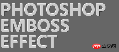
效果二和效果三,我想用photoshop的朋友一定很熟悉,是不是很类似我们 photoshop中的投影和浮雕效果的呀。应用这两个效果大家一定要注意,其模糊值一定要设置为0,使文本不具有任何模糊效果,主要用来增加其质感,你也可以像photoshop中制作一样,改变不同的投光角度,从而制作出不同的效果,这里我就不举例子了,感兴趣的朋友可以自己尝试一下。
效果四:Blurytext Effect
.demo6 {
  color: transparent;
  text-shadow: 0 0 5px #f96;
}
用text-shadow制作模糊的效果主要要注意一点就是,把文本的前景色设置为透明transparent,如果模糊值越大,其效果越糊糊;其二,我们不设置任何方向的偏移值。如果结合前面的photoshop emboss效果,可以让你等到不同的效果。提醒一下opera浏览器不支持这个效果。
我们结合前面的Photoshop Emboss效果,我们可以制作出一个带有模糊的浮雕效果:
.demo7 {
  color: transparent;
  text-shadow:0 0 6px #F96, -1px -1px  #FFF, 1px -1px  #444;
}
效果五:Inset text effect
.demo8 {
  color: #566F89;
  background: #C5DFF8;
  text-shadow: 1px 1px 0 #E4F1FF;
}
这种效果需要注意以:文字的前景色要比背景色暗,阴影颜色稍比背景色亮一点点,这一步很重要,如果阴影色太亮看起来会怪,如果太暗将没有效果显示。具体实现可能看看stylizedweb的制作。Inset效果是文本的影子效果,也是常见的一种效果,阴影是同一个小偏移量给人一种微妙的突出效果。
效果六:Stroke text effect
.demo9 {
  color: #fff;
  text-shadow: 1px 1px 0 #f96,-1px -1px 0 #f96;
}
描边效果跟我们在Photoshop相比,我承认效果差很多,出现断点,但有时还是可以试用达到一种特殊的描边效果,其主要运用两个阴影,第一个向左上投影,而第二向右下投影,还需注意,制作描边的阴影效果我们不使用模糊值。
效果七:3D text effect
.demo10 {
  color: #fff;
  text-shadow: 1px 1px rgba(197, 223, 248,0.8),2px 2px rgba(197, 223, 248,0.8),3px 3px rgba(197, 223, 248,0.8),4px 4px rgba(197, 223, 248,0.8),5px 5px rgba(197, 223, 248,0.8),6px 6px rgba(197, 223, 248,0.8);
}
我们换过投影方向可以制作出另外一种3D文字效果
.demo11 {
  color: #fff;
  text-shadow: -1px -1px rgba(197, 223, 248,0.8),-2px -2px rgba(197, 223, 248,0.8),-3px -3px rgba(197, 223, 248,0.8),-4px -4px rgba(197, 223, 248,0.8),-5px -5px rgba(197, 223, 248,0.8),-6px -6px rgba(197, 223, 248,0.8);
}
3D文字效果运用原理就是像Photoshop一样,我们在文字的下方或上方复制了多个图层,并把每一个层向左上或右下方向移动一个1px距离,从而制作出3D效果。同时我们层数越多,其越厚重。换成用text-shadow制作就是使用多个阴影,并把阴影色设置相同,给其使用rgba色效果更佳,如上面的实例。
效果八:Vintge/Retro text effect
.demo11 {
  color: #eee;
  text-shadow: 5px 5px 0 #666, 7px 7px 0 #eee;
}
Vintage retro这种风格的文字效果是由两个文本阴影合成的,这里需要注意的是:第一个阴影色和背景色相同;文本前景色和第二个阴影色相同
效果九:Anaglyphic text effect
.demo13 {
  color: rgba(255, 179, 140,0.5);
  text-shadow: 3px 3px 0 rgba(180,255,0,0.5);
}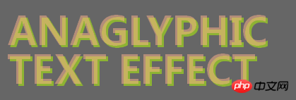
anaglyphic文字效果起到一种补色的效果,从而制作出一种三维效果图。其效果是用css重新使用的文字阴影和文本前景的rgba色组合而成。在文本的前景色和阴影上同时使用rgba色,使底层的文字是通过影子可见。
上面我主要列出了九个不同效果的实例,当然大家可以改变各种方式制作出一些特殊的效果,也再一次证实CSS3中的text-shadow实力是不浅的,希望大家能喜欢上这个属性,并能更好的使用这个属性。虽然现在IE不支持,但大家不要惧怕使用CSS3,因为我们做前端的迟早都会需要掌握这些新技术的。
相关推荐:
The above is the detailed content of CSS3 property: How to use text-shadow text shadow. For more information, please follow other related articles on the PHP Chinese website!

Hot AI Tools

Undresser.AI Undress
AI-powered app for creating realistic nude photos

AI Clothes Remover
Online AI tool for removing clothes from photos.

Undress AI Tool
Undress images for free

Clothoff.io
AI clothes remover

Video Face Swap
Swap faces in any video effortlessly with our completely free AI face swap tool!

Hot Article
Hot Tools

Notepad++7.3.1
Easy-to-use and free code editor

SublimeText3 Chinese version
Chinese version, very easy to use

Zend Studio 13.0.1
Powerful PHP integrated development environment

Dreamweaver CS6
Visual web development tools

SublimeText3 Mac version
God-level code editing software (SublimeText3)
Hot Topics
 1663
1663
 14
1420
52
1315
25
1266
29
1239
24
14
1420
52
1315
25
1266
29
1239
24

 Users encounter rare glitches: Samsung Watch smartwatches suddenly experience white screen issues
Apr 03, 2024 am 08:13 AM
Users encounter rare glitches: Samsung Watch smartwatches suddenly experience white screen issues
Apr 03, 2024 am 08:13 AM
You may have encountered the problem of green lines appearing on the screen of your smartphone. Even if you have never seen it, you must have seen related pictures on the Internet. So, have you ever encountered a situation where the smart watch screen turns white? On April 2, CNMO learned from foreign media that a Reddit user shared a picture on the social platform, showing the screen of the Samsung Watch series smart watches turning white. The user wrote: "I was charging when I left, and when I came back, it was like this. I tried to restart, but the screen was still like this during the restart process." Samsung Watch smart watch screen turned white. The Reddit user did not specify the smart watch. Specific model. However, judging from the picture, it should be Samsung Watch5. Previously, another Reddit user also reported
 How to achieve wave effect with pure CSS3? (code example)
Jun 28, 2022 pm 01:39 PM
How to achieve wave effect with pure CSS3? (code example)
Jun 28, 2022 pm 01:39 PM
How to achieve wave effect with pure CSS3? This article will introduce to you how to use SVG and CSS animation to create wave effects. I hope it will be helpful to you!
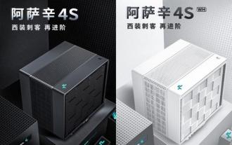 Kyushu Fengshen Assassin 4S Radiator Review Air-cooled 'Assassin Master' Style
Mar 28, 2024 am 11:11 AM
Kyushu Fengshen Assassin 4S Radiator Review Air-cooled 'Assassin Master' Style
Mar 28, 2024 am 11:11 AM
Speaking of ASSASSIN, I believe players will definitely think of the master assassins in "Assassin's Creed". They are not only skilled, but also have the creed of "devoting themselves to the darkness and serving the light". The ASSASSIN series of flagship air-cooled radiators from the appliance brand DeepCool coincide with each other. Recently, the latest product of this series, ASSASSIN4S, has been launched. "Assassin in Suit, Advanced" brings a new air-cooling experience to advanced players. The appearance is full of details. The Assassin 4S radiator adopts a double tower structure + a single fan built-in design. The outside is covered with a cube-shaped fairing, which has a strong overall sense. It is available in white and black colors to meet different colors. Tie
 Use CSS skillfully to realize various strange-shaped buttons (with code)
Jul 19, 2022 am 11:28 AM
Use CSS skillfully to realize various strange-shaped buttons (with code)
Jul 19, 2022 am 11:28 AM
This article will show you how to use CSS to easily realize various weird-shaped buttons that appear frequently. I hope it will be helpful to you!
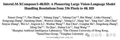 Easily understand 4K HD images! This large multi-modal model automatically analyzes the content of web posters, making it very convenient for workers.
Apr 23, 2024 am 08:04 AM
Easily understand 4K HD images! This large multi-modal model automatically analyzes the content of web posters, making it very convenient for workers.
Apr 23, 2024 am 08:04 AM
A large model that can automatically analyze the content of PDFs, web pages, posters, and Excel charts is not too convenient for workers. The InternLM-XComposer2-4KHD (abbreviated as IXC2-4KHD) model proposed by Shanghai AILab, the Chinese University of Hong Kong and other research institutions makes this a reality. Compared with other multi-modal large models that have a resolution limit of no more than 1500x1500, this work increases the maximum input image of multi-modal large models to more than 4K (3840x1600) resolution, and supports any aspect ratio and 336 pixels to 4K Dynamic resolution changes. Three days after its release, the model topped the HuggingFace visual question answering model popularity list. Easy to handle
 Huntkey MX750P full module power supply review: 750W of concentrated platinum strength
Mar 28, 2024 pm 03:20 PM
Huntkey MX750P full module power supply review: 750W of concentrated platinum strength
Mar 28, 2024 pm 03:20 PM
With its compact size, the ITX platform has attracted many players who pursue the ultimate and unique beauty. With the improvement of manufacturing processes and technological advancements, both Intel's 14th generation Core and RTX40 series graphics cards can exert their strength on the ITX platform, and gamers also There are higher requirements for SFX power supply. Game enthusiast Huntkey has launched a new MX series power supply. In the ITX platform that meets high-performance requirements, the MX750P full-module power supply has a rated power of up to 750W and has passed 80PLUS platinum level certification. Below we bring the evaluation of this power supply. Huntkey MX750P full-module power supply adopts a simple and fashionable design concept. There are two black and white models for players to choose from. Both use matte surface treatment and have a good texture with silver gray and red fonts.
 Exquisite light and shadow art in spring, Haqu H2 is the cost-effective choice
Apr 17, 2024 pm 05:07 PM
Exquisite light and shadow art in spring, Haqu H2 is the cost-effective choice
Apr 17, 2024 pm 05:07 PM
With the arrival of spring, everything revives and everything is full of vitality and vitality. In this beautiful season, how to add a touch of color to your home life? Haqu H2 projector, with its exquisite design and super cost-effectiveness, has become an indispensable beauty in this spring. This H2 projector is compact yet stylish. Whether placed on the TV cabinet in the living room or next to the bedside table in the bedroom, it can become a beautiful landscape. Its body is made of milky white matte texture. This design not only makes the projector look more advanced, but also increases the comfort of the touch. The beige leather-like material adds a touch of warmth and elegance to the overall appearance. This combination of colors and materials not only conforms to the aesthetic trend of modern homes, but also can be integrated into
 Colorful Hidden Star P15 24 Review: A hard-core all-round gaming laptop with both good looks and performance
Mar 06, 2024 pm 04:40 PM
Colorful Hidden Star P15 24 Review: A hard-core all-round gaming laptop with both good looks and performance
Mar 06, 2024 pm 04:40 PM
In the current era of rapid technological development, laptops have become an indispensable and important tool in people's daily life and work. For those players who have high performance requirements, a laptop with powerful configuration and excellent performance can meet their hard-core needs. With its excellent performance and stunning design, the Colorful Hidden Star P15 notebook computer has become the leader of the future and can be called a model of hard-core notebooks. Colorful Hidden Star P1524 is equipped with a 13th generation Intel Core i7 processor and RTX4060Laptop GPU. It adopts a more fashionable spaceship design style and has excellent performance in details. Let us first take a look at the features of this notebook. Supreme equipped with Intel Core i7-13620H processing
