

CSS3 animation properties: Introduction to the transform property

The content of this article is about the attributes of CSS3 animation: Introduction to the transform attribute, which has certain reference value. Friends in need can refer to it. I hope it will be helpful to you.
Transform literally means deformation and change. In CSS3, transform mainly includes the following types: rotate, distortion skew, scale and move translate and matrix Transform matrix. Let's take a look at how to implement the rotation, skew, scale and translate of transform in CSS3. As usual, let's start with the syntax of transform.
Grammar:
   transform : none | <transform-function> [ <transform-function> ]*
   也就是:
   transform: rotate | scale | skew | translate |matrix;
none: means no transformation;
Value:
The transform attribute implements some of the same functions that can be implemented with SVG. It can be used on inline elements and block elements. It allows us to rotate, scale and move elements. It has several attribute value parameters: rotate; translate; scale; skew; matrix. Below we will introduce the specific usage of these attribute value parameters respectively:
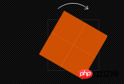
1. Rotate rotate
rotate(
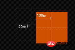
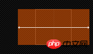
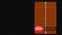
2. Move translate
Move translate We can divide it into three situations: translate (x,y) moves horizontally and vertically at the same time (that is, the X-axis and Y-axis move simultaneously); translateX(x) only moves horizontally (X-axis moves); translateY(Y) only moves vertically (Y-axis moves) ), the specific usage is as follows:
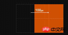
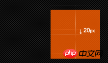
1. translate(
2, translateX(
1. scale(
2. scaleX(
4. Distortion skew
There are three types of distortion skew like translate and scale. Situation: skew(x,y) causes the element to be distorted in both the horizontal and vertical directions (the X-axis and the Y-axis are distorted at a certain angle at the same time); skewX(x) only causes the element to be distorted in the horizontal direction (the X-axis is distorted) Deformation); skewY(y) only distorts the element in the vertical direction (Y-axis distortion), the specific use is as follows: 1, skew(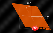 ##2, skewX(
##3, skewY(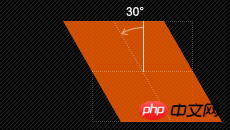
 5. Matrix
matrix(
Change the base point of the element transform-origin
We mentioned transform-origin many times before. Its main function is to allow us to Change the base point position of the element, because the default base point of our element is its center position. In other words, when we do not use transform-origin to change the base point position of the element, the operations such as rotate, translate, scale, skew, and matrix performed by transform are all based on The element's center position changes. But sometimes we need to perform these operations on elements at different positions, then we can use transform-origin to change the base point position of the element so that the base point of the element is no longer at the center position to achieve the base point position you need. Let's mainly take a look at its usage rules:
transform-origin(X,Y): Used to set the base point (reference point) of the movement of the element. The default point is the center point of the element. The values of X and Y can be percentage values, em, px, and X can also be character parameter values left, center, and right; Y, like X, can also set character values top, center, and bottom in addition to percentage values. This looks a bit like our background-position setting; below I list their corresponding writing methods: 1. top left | left top is equivalent to 0 0 | 0% 0%2. top | top center | center top is equivalent to 50% 03. right top | top right is equivalent to 100% 04、left | left center | center left 等价于 0 50% | 0% 50%
5、center | center center 等价于 50% 50%(默认值)
6、right | right center | center right 等价于 100% 50%
7、bottom left | left bottom 等价于 0 100% | 0% 100%
8、bottom | bottom center | center bottom 等价于 50% 100%
9、bottom right | right bottom 等价于 100% 100%
其中 left,center right是水平方向取值,对应的百分值为left=0%;center=50%;right=100%而top center bottom是垂直方向的取值,其中top=0%;center=50%;bottom=100%;如果只取一个值,表示垂直方向值不变,我们分别来看看以下几个实例
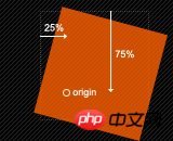
(1)transform-origin:(left,top):
(2)transform-origin:right
(3)transform-origin(25%,75%)
更多的改变中心基点办法,大家可以在本地多测试一下,多体会一下,这里还要提醒大家一点的是,transform-origin并不是transform中的属性值,他具有自己的语法,前面我也说过了,说简单一点就是类似于我们的background-position的用法,但又有其不一样,因为我们background-position不需要区别浏览器内核不同的写法,但transform-origin跟其他的css3属性一样,我们需要在不同的浏览内核中加上相应的前缀,下面列出各种浏览器内核下的语法规则:
  //Mozilla内核浏览器:firefox3.5+
  -moz-transform-origin: x y;
  //Webkit内核浏览器:Safari and Chrome
  -webkit-transform-origin: x y;
  //Opera
  -o-transform-origin: x y ;
  //IE9
  -ms-transform-origin: x y;
  //W3C标准
  transform-origin: x y ;
transform在不同浏览器内核下的书写规则
  //Mozilla内核浏览器:firefox3.5+
  -moz-transform: rotate | scale | skew | translate ;
 //Webkit内核浏览器:Safari and Chrome
  -webkit-transform: rotate | scale | skew | translate ;
 //Opera
  -o-transform: rotate | scale | skew | translate ;
 //IE9
  -ms-transform: rotate | scale | skew | translate ;
 //W3C标准
  transform: rotate | scale | skew | translate ;
上面列出是不同浏览内核transform的书写规则,如果需要兼容各浏览器的话,以上写法都需要调用。
支持transform浏览器
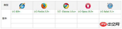
同样的transform在IE9下版本是无法兼容的,之所以有好多朋友说,IE用不了,搞这个做什么?个人认为,CSS3推出来了,他是一门相对前沿的技术,做为Web前端的开发者或者爱好者都有必要了解和掌握的一门新技术,如果要等到所有浏览器兼容,那我们只能对css3说NO,我用不你。因为IE老大是跟不上了,,,,纯属个人观点,不代表任何。还是那句话,感兴趣的朋友跟我一样,不去理会IE,我们继续看下去。
在上面我们详细介绍了CSS3中transform的各种属性值的设置以及其各自的参数,下面我们通过一个实例来看看每一种属性值的使用,为了节约空间和大家的时间,我们后面的实例都是在这个html基础上实现,主要是我们在下面的菜单中的a:hover中分别使用不同的transform的设置,换句话说,当你移动到链接上时,相应的每一个菜单项有不同的变化,因为我们在每个菜单中使用了transform。具体每一步我们可以看下面的实例:
HTML Code:
<p class="menu">
<ul class="clearfix">
<li class="item translate"><a href="#">Translate</a></li>
<li class="item translate-x"><a href="#">TranslateX</a></li>
<li class="item translate-y"><a href="#">TranslateY</a></li>
<li class="item rotate"><a href="#">Rotate</a></li>
<li class="item scale"><a href="#">Scale</a></li>
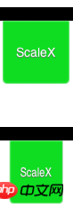
<li class="item scale-x"><a href="#">ScaleX</a></li>
<li class="item scale-y"><a href="#">ScaleY</a></li>
<li class="item skew"><a href="#">Skew</a></li>
<li class="item skew-x"><a href="#">SkewX</a></li>
<li class="item skew-y"><a href="#">SkewY</a></li>
<li class="item matrix"><a href="#">Matrix</a></li>
</ul>
</p>为了效果更好一点,我们给上面的导航菜单加上一点CSS样式:
 .menu ul {
    border-top: 15px solid black;
    padding: 0 10px;
 }
 .menu ul li a{
    color: #fff;
    float: left;
    margin: 0 5px;
    font-size: 14px;
    height: 50px;
    line-height: 50px;
    text-align: center;
    width: 65px;
    padding: 10px 5px;
    background: #151515;
    -moz-border-radius: 0 0 5px 5px;
    -webkit-border-radius: 0 0 5px 5px;
    border-radius: 0 0 5px 5px;
    -moz-box-shadow: 0 0 1px #ccc,inset 0 0 2px #fff;
    -webkit-box-shadow: 0 0 1px #ccc,inset 0 0 2px #fff;
    box-shadow: 0 0 1px #ccc,inset 0 0 2px #fff;
    text-shadow: 0 1px 1px #686868;
    text-decoration: none;
 }
 .menu ul li.translate a{
    background: #2EC7D2;
 }
 .menu ul li.translate-x a {
    background: #8FDD21;
 }
 .menu ul li.translate-y a {
    background: #F45917;
 }
 .menu ul li.rotate a {
    background: #D50E19;
 }
 .menu ul li.scale a {
    background: #cdddf2;
 }
 .menu ul li.scale-x a {
   background: #0fDD21;
 }
 .menu ul li.scale-y a {
   background: #cd5917;
 }
 .menu ul li.skew a {
   background: #519;
 }
 .menu ul li.skew-x a {
   background: #D50;
 }
 .menu ul li.skew-y a {
   background: #E19;
 }
 .menu ul li.matrix a {
   background: #919;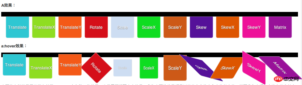
}在这里我们使用了一些前面所进的CSS3的属性制作出来的导航,如果你跟着做的话,在你本地一定能看到一个非常靓丽的导航菜单,这里由于无法链接demo原页面,只好贴上缩略图,让大家有一个初步效果视觉初步的效果如下:
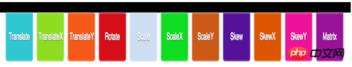
从效果图上我们可以清楚的看到菜单上我们分别对应的是transform中的Translate、TranslateX、TranslateY、Rotate、Scale、ScaleX、ScaleY、Skew、SkewX、SkewY和Matrix,下面我们就在相应的a:hover加上各自的效果:
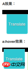
1、transform:translate(x,y):
  .menu ul li.translate a:hover {
     -moz-transform: translate(-10px,-10px);
     -webkit-transform: translate(-10px,-10px);
     -o-transform: translate(-10px,-10px);
     -ms-transform: translate(-10px, -10px);
     transform: translate(-10px,-10px);
}效果:
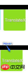
2、transform:translateX(x)
  .menu ul li.translate-x a:hover {
    -moz-transform: translateX(-10px);
    -webkit-transform: translateX(-10px);
    -o-transform: translateX(-10px);
    -ms-transform: translateX(-10px);
    transform: translateX(-10px);
}效果:
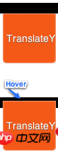
3、transform:translateY(y)
  .menu ul li.translate-y a:hover {
     -moz-transform: translateY(-10px);
     -webkit-transform: translateY(-10px);
     -o-transform: translateY(-10px);
     -ms-transform: translateY(-10px);
     transform: translateY(-10px);
}效果:
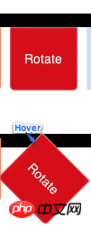
4、transform:rotate(角度值)
 .menu ul li.rotate a:hover {
   -moz-transform: rotate(45deg);
   -webkit-transform: rotate(45deg);
   -o-transform: rotate(45deg);
   -ms-transform: rotate(45deg);
   transform: rotate(45deg);
}效果:
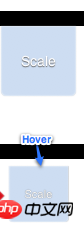
5、transform:scale(x,y)
 .menu ul li.scale a:hover {
   -moz-transform: scale(0.8,0.8);
   -webkit-transform: scale(0.8,0.8);
   -o-transform: scale(0.8,0.8);
   -ms-transform: scale(0.8,0.8);
   transform: scale(0.8,0.8);
}效果:
6、transform:scaleX(x)
  .menu ul li.scale-x a:hover {
    -moz-transform: scaleX(0.8);
    -webkit-transform: scaleX(0.8);
    -o-transform: scaleX(0.8);
    -ms-transform: scaleX(0.8);
    transform: scaleX(0.8);
}效果:
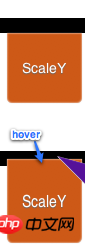
7、transform:scaleY(y)
  .menu ul li.scale-y a:hover {
     -moz-transform: scaleY(1.2);
     -webkit-transform: scaleY(1.2);
     -o-transform: scaleY(1.2);
     -ms-transform: scaleY(1.2);
     transform: scaleY(1.2);
}效果:
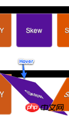
8、transform:skew(x,y)
  .menu ul li.skew a:hover {
     -moz-transform: skew(45deg,15deg);
     -webkit-transform: skew(45deg,15deg);
     -o-transform: skew(45deg,15deg);
     -ms-transform: skew(45deg,15deg);
     transform: skew(45deg,15deg);
}效果:
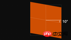
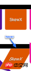
9、transform:skewX(x)
  .menu ul li.skew-x a:hover {
    -moz-transform: skewX(-30deg);
    -webkit-transform: skewX(-30deg);
    -o-transform: skewX(-30deg);
    -ms-transform: skewX(-30deg);
    transform: skewX(-30deg);
}效果:
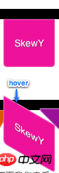
10、transform:skewY(y)
  .menu ul li.skew-y a:hover {
    -moz-transform: skewY(30deg);
    -webkit-transform: skewY(30deg);
    -o-transform: skewY(30deg);
    -ms-transform: skewY(30deg);
    transform: skewY(30deg);
}效果:
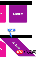
11、transform:matrix(a,b,c,d,e,f)
  .menu ul li.matrix a:hover {
    -moz-transform: matrix(1,1,-1,0,0,0);
    -webkit-transform: matrix(1,1,-1,0,0,0);
    -o-transform: matrix(1,1,-1,0,0,0);
    -ms-transform: matrix(1,1,-1,0,0,0);
    transform: matrix(1,1,-1,0,0,0);
}效果:
transform中的matrix是相对的复杂,如果感兴趣的朋友可以点这里进去学民更多有关于Matrix的用法,我在这里就不多说了,说了也讲不清楚。
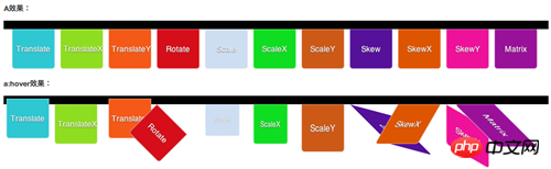
下面我们来看看最终的效果图,如果你在本地跟着这个实例做了的话,那么你就能看到非常好的效果了。
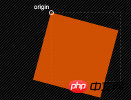
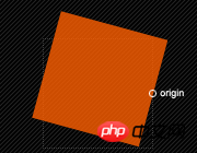
上面的实例效果展示了有关于transform中各种风格效果,这里需要提醒大家,我们上面的效果都是以元素自身的中心点为基点的,下面我们来看一个改变元素基点的实例
我们在前面的实例基础改变一下所有a标签基点位置为left top(前面默认是center center)
  .menu ul li.transform-origin a {
    -moz-transform-origin: left top;
    -webkit-transform-origin: left top;
    -o-transform-origin: left top;
    -ms-transform-origin: left top;
    transform-origin: left top;
}大家一起看看改变了a标签基点后transform下各种效果有什么样的变化:
从效果图中大家可以明显的看出,改变元素的基点后。元素进行transform任何属性值的设置都会有影响,换句话说,我们transform进行任何动作变化都是以元素的中心为基点,同时我们可以通过transform-origin来改变任何元素的基点,从而达到不同的效果。感兴趣的朋友可以去了解更多有关这方面的知识。
最后我们再来看一个transform运用多个属性值的效果实例
 .demo a{
   width: 100px;
   padding: 5px;
   background: red;
   display: block;
 }
 .demo a:hover {
   -moz-transform: rotate(45deg) scale(0.8,1.2) skew(60deg,-30deg);
   -webkit-transform: rotate(45deg) scale(0.8,1.2) skew(60deg,-30deg);
   -o-transform: rotate(45deg) scale(0.8,1.2) skew(60deg,-30deg);
   -ms-transform: rotate(45deg) scale(0.8,1.2) skew(60deg,-30deg);
   transform: rotate(45deg) scale(0.8,1.2) skew(60deg,-30deg);
}这里需要注意的是使用多个属性值时,其之间不能用逗号(“,”)分隔,必须使用空格分隔,记住了是空格分隔,如上面代码所示。
相关文章推荐:
CSS3中伪元素实现气泡框的代码(before、after)
The above is the detailed content of CSS3 animation properties: Introduction to the transform property. For more information, please follow other related articles on the PHP Chinese website!

Hot AI Tools

Undresser.AI Undress
AI-powered app for creating realistic nude photos

AI Clothes Remover
Online AI tool for removing clothes from photos.

Undress AI Tool
Undress images for free

Clothoff.io
AI clothes remover

Video Face Swap
Swap faces in any video effortlessly with our completely free AI face swap tool!

Hot Article
Hot Tools

Notepad++7.3.1
Easy-to-use and free code editor

SublimeText3 Chinese version
Chinese version, very easy to use

Zend Studio 13.0.1
Powerful PHP integrated development environment

Dreamweaver CS6
Visual web development tools

SublimeText3 Mac version
God-level code editing software (SublimeText3)
Hot Topics


 How to speed up animation effects in Windows 11: 2 methods explained
Apr 24, 2023 pm 04:55 PM
How to speed up animation effects in Windows 11: 2 methods explained
Apr 24, 2023 pm 04:55 PM
When Microsoft launched Windows 11, it brought a lot of changes. One of the changes is an increase in the number of user interface animations. Some users want to change the way things appear, and they have to find a way to do it. Having animations makes it feel better and more user-friendly. Animation uses visual effects to make the computer look more attractive and responsive. Some of them include sliding menus after a few seconds or minutes. There are many animations on your computer that can affect PC performance, slow it down, and interfere with your work. In this case you have to turn off animation. This article will introduce several ways that users can improve the speed of their animations on PC. You can apply the changes using Registry Editor or a custom file you run. How to improve animations in Windows 11
![Animation not working in PowerPoint [Fixed]](https://img.php.cn/upload/article/000/887/227/170831232982910.jpg?x-oss-process=image/resize,m_fill,h_207,w_330) Animation not working in PowerPoint [Fixed]
Feb 19, 2024 am 11:12 AM
Animation not working in PowerPoint [Fixed]
Feb 19, 2024 am 11:12 AM
Are you trying to create a presentation but can't add animation? If animations are not working in PowerPoint on your Windows PC, then this article will help you. This is a common problem that many people complain about. For example, animations may stop working during presentations in Microsoft Teams or during screen recordings. In this guide, we will explore various troubleshooting techniques to help you fix animations not working in PowerPoint on Windows. Why aren't my PowerPoint animations working? We have noticed that some possible reasons that may cause the animation in PowerPoint not working issue on Windows are as follows: Due to personal
 CSS Animation: How to Achieve the Flash Effect of Elements
Nov 21, 2023 am 10:56 AM
CSS Animation: How to Achieve the Flash Effect of Elements
Nov 21, 2023 am 10:56 AM
CSS animation: How to achieve the flash effect of elements, specific code examples are needed. In web design, animation effects can sometimes bring a good user experience to the page. The glitter effect is a common animation effect that can make elements more eye-catching. The following will introduce how to use CSS to achieve the flash effect of elements. 1. Basic implementation of flash First, we need to use the animation property of CSS to achieve the flash effect. The value of the animation attribute needs to specify the animation name, animation execution time, and animation delay time
 How to set up ppt animation to enter first and then exit
Mar 20, 2024 am 09:30 AM
How to set up ppt animation to enter first and then exit
Mar 20, 2024 am 09:30 AM
We often use ppt in our daily work, so are you familiar with every operating function in ppt? For example: How to set animation effects in ppt, how to set switching effects, and what is the effect duration of each animation? Can each slide play automatically, enter and then exit the ppt animation, etc. In this issue, I will first share with you the specific steps of entering and then exiting the ppt animation. It is below. Friends, come and take a look. Look! 1. First, we open ppt on the computer, click outside the text box to select the text box (as shown in the red circle in the figure below). 2. Then, click [Animation] in the menu bar and select the [Erase] effect (as shown in the red circle in the figure). 3. Next, click [
 After a two-year delay, the domestic 3D animated film 'Er Lang Shen: The Deep Sea Dragon' is scheduled to be released on July 13
Jan 26, 2024 am 09:42 AM
After a two-year delay, the domestic 3D animated film 'Er Lang Shen: The Deep Sea Dragon' is scheduled to be released on July 13
Jan 26, 2024 am 09:42 AM
This website reported on January 26 that the domestic 3D animated film "Er Lang Shen: The Deep Sea Dragon" released a set of latest stills and officially announced that it will be released on July 13. It is understood that "Er Lang Shen: The Deep Sea Dragon" is produced by Mihuxing (Beijing) Animation Co., Ltd., Horgos Zhonghe Qiancheng Film Co., Ltd., Zhejiang Hengdian Film Co., Ltd., Zhejiang Gongying Film Co., Ltd., Chengdu The animated film produced by Tianhuo Technology Co., Ltd. and Huawen Image (Beijing) Film Co., Ltd. and directed by Wang Jun was originally scheduled to be released in mainland China on July 22, 2022. Synopsis of the plot of this site: After the Battle of the Conferred Gods, Jiang Ziya took the "Conferred Gods List" to divide the gods, and then the Conferred Gods List was sealed by the Heavenly Court under the deep sea of Kyushu Secret Realm. In fact, in addition to conferring divine positions, there are also many powerful evil spirits sealed in the Conferred Gods List.
 How to use Vue to implement typewriter animation effects
Sep 19, 2023 am 09:33 AM
How to use Vue to implement typewriter animation effects
Sep 19, 2023 am 09:33 AM
How to use Vue to implement typewriter animation special effects Typewriter animation is a common and eye-catching special effect that is often used in website titles, slogans and other text displays. In Vue, we can achieve typewriter animation effects by using Vue custom instructions. This article will introduce in detail how to use Vue to achieve this special effect and provide specific code examples. Step 1: Create a Vue project First, we need to create a Vue project. You can use VueCLI to quickly create a new Vue project, or manually
 How to disable animations in Windows 11
Apr 16, 2023 pm 11:34 PM
How to disable animations in Windows 11
Apr 16, 2023 pm 11:34 PM
Microsoft Windows 11 includes many new features and functions. The user interface has been updated and the company has also introduced some new effects. By default, animation effects are applied to controls and other objects. Should I disable these animations? Although Windows 11 features visually appealing animations and fade effects, they can cause your computer to feel sluggish to some users as they add a bit of lag to certain tasks. It's easy to turn off animations for a more responsive user experience. After we see what other changes have been made to the operating system, we'll walk you through how to turn animation effects on or off in Windows 11. We also have an article on how to
 The final trailer for Netflix's claymation film 'Chicken Run 2” has been announced and will be released on December 15
Nov 20, 2023 pm 01:21 PM
The final trailer for Netflix's claymation film 'Chicken Run 2” has been announced and will be released on December 15
Nov 20, 2023 pm 01:21 PM
The final trailer for Netflix's claymation film "Chicken Run 2" has been released. The film is expected to be released on December 15. This site noticed that the trailer for "Chicken Run 2" shows Chicken Loki and King Kong. Jay launches an operation to find his daughter Molly. Molly is taken away by a truck at FunLand Farm, and Rocky and Ginger risk their lives to retrieve their daughter. The film is directed by Sam Fehr and stars Sandy Way Newton, Zachary Levi, Bella Ramsey, Imelda Staunton and David Bradley. It is understood that "Chicken Run 2" is the sequel to "Chicken Run" after more than 20 years. The first work was released in China on January 2, 2001. It tells the story of a group of chickens who face the fate of being turned into chicken pies in a chicken factory.
