

css3 realizes the effect of moving menu button (menu)

This article introduces you to the CSS3 effect of moving menu buttons. It has certain reference value. Friends in need can refer to it. I hope it will be helpful to you.
I need to make a custom animated button effect, but the small front-end doesn’t know how to implement it. I took a look at the desired effect and wrote a simple demo for him.
The designer gave two pictures, one is a menu icon like 三, and the other is an icon that turns into X when clicked. I hope there will be an animation switching effect between these two icons.
Because the icons are very simple, we can use css to draw these two icons, and then create an animation transition effect. The code is as follows:
html code
  <p class="box">
    <p class="menu"></p>
</p> The .box outside is just to hold up the page and has no actual effect. What is useful is a .menu.
CSS code
.box { margin: 200px; }

.menu { width: 100px; height: 100px; position: relative; }
.menu:before, .menu:after { content: ""; display: block; width: 100px; height: 16px; background: #000; border-radius: 8px; position: absolute; left: 0; -webkit-transition: all 0.15s ease-in-out; transition: all 0.15s ease-in-out; }
.menu:before { top: 5px; box-shadow: 0 37px #000; }
.menu:after { bottom: 5px; }
.menu:hover:before { top: 42px; box-shadow: none; -webkit-transform: rotate(225deg); transform: rotate(225deg); }
.menu:hover:after { bottom: 42px; -webkit-transform: rotate(135deg); transform: rotate(135deg); }Key explanation:
An element is added transition: all 0.15s ease-in-out; Code like this , then when any of his attributes change, there will be a switching effect. For more information, please refer to the CSS3 transition attribute
Because there are three horizontal lines, the two pseudo-elements :before and :after are not enough. I don't want to add another element to have more things to control. So, I used a box-shadow: 0 37px #000; shadow method to achieve the effect of the horizontal line in the middle. :before and :after are placed above and below respectively.
When switching X, there are only two elements, I just need to remove the shadow added above box-shadow: none;.
Then it’s time to change the position and add rotation. Location changes are not indicated. Rotation is implemented using the transform: rotate(225deg); attribute. For more information, please refer to the CSS3 transform attribute
The final effect is as follows:
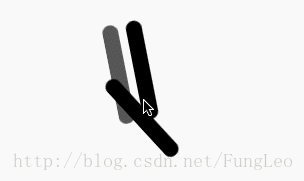
Okay, the effect is achieved. I put the above animation on the switch for 3 seconds in order to see the details of the animation clearly.
In fact, after understanding this idea, we can make many simple animation effects.
Recommended related articles:
Display in css: flex attribute to implement the code for vertical centering of elements
How to realize a single line of text scrolling upward Effect (with code)
The above is the detailed content of css3 realizes the effect of moving menu button (menu). For more information, please follow other related articles on the PHP Chinese website!

Hot AI Tools

Undresser.AI Undress
AI-powered app for creating realistic nude photos

AI Clothes Remover
Online AI tool for removing clothes from photos.

Undress AI Tool
Undress images for free

Clothoff.io
AI clothes remover

Video Face Swap
Swap faces in any video effortlessly with our completely free AI face swap tool!

Hot Article
Hot Tools

Notepad++7.3.1
Easy-to-use and free code editor

SublimeText3 Chinese version
Chinese version, very easy to use

Zend Studio 13.0.1
Powerful PHP integrated development environment

Dreamweaver CS6
Visual web development tools

SublimeText3 Mac version
God-level code editing software (SublimeText3)
Hot Topics


 Vue 3
Apr 02, 2025 pm 06:32 PM
Vue 3
Apr 02, 2025 pm 06:32 PM
It's out! Congrats to the Vue team for getting it done, I know it was a massive effort and a long time coming. All new docs, as well.
 Building an Ethereum app using Redwood.js and Fauna
Mar 28, 2025 am 09:18 AM
Building an Ethereum app using Redwood.js and Fauna
Mar 28, 2025 am 09:18 AM
With the recent climb of Bitcoin’s price over 20k $USD, and to it recently breaking 30k, I thought it’s worth taking a deep dive back into creating Ethereum
 Can you get valid CSS property values from the browser?
Apr 02, 2025 pm 06:17 PM
Can you get valid CSS property values from the browser?
Apr 02, 2025 pm 06:17 PM
I had someone write in with this very legit question. Lea just blogged about how you can get valid CSS properties themselves from the browser. That's like this.
 Stacked Cards with Sticky Positioning and a Dash of Sass
Apr 03, 2025 am 10:30 AM
Stacked Cards with Sticky Positioning and a Dash of Sass
Apr 03, 2025 am 10:30 AM
The other day, I spotted this particularly lovely bit from Corey Ginnivan’s website where a collection of cards stack on top of one another as you scroll.
 A bit on ci/cd
Apr 02, 2025 pm 06:21 PM
A bit on ci/cd
Apr 02, 2025 pm 06:21 PM
I'd say "website" fits better than "mobile app" but I like this framing from Max Lynch:
 Comparing Browsers for Responsive Design
Apr 02, 2025 pm 06:25 PM
Comparing Browsers for Responsive Design
Apr 02, 2025 pm 06:25 PM
There are a number of these desktop apps where the goal is showing your site at different dimensions all at the same time. So you can, for example, be writing
 Using Markdown and Localization in the WordPress Block Editor
Apr 02, 2025 am 04:27 AM
Using Markdown and Localization in the WordPress Block Editor
Apr 02, 2025 am 04:27 AM
If we need to show documentation to the user directly in the WordPress editor, what is the best way to do it?
 Why are the purple slashed areas in the Flex layout mistakenly considered 'overflow space'?
Apr 05, 2025 pm 05:51 PM
Why are the purple slashed areas in the Flex layout mistakenly considered 'overflow space'?
Apr 05, 2025 pm 05:51 PM
Questions about purple slash areas in Flex layouts When using Flex layouts, you may encounter some confusing phenomena, such as in the developer tools (d...
