

About how to draw hexagons in CSS3

The following brings you a simple implementation of CSS3 drawing hexagons. The content is quite good, so I will share it with you now and give it as a reference.
Because it is very simple, let’s summarize it first: using CSS3 to draw hexagons mainly uses pseudo-classes: before and :after to draw before and after the source element. Two elements, and use the border style of css3 to turn these two elements into triangles and place them at both ends of the source element.
(Because I have worked in a biological company before, I feel that hexagons are closer to concepts such as biomolecules and genes. Including when we search for pictures of biomolecules, genes, etc. on the Internet, many of them also have hexagonal styles, so At that time, if you do some functional navigation or tags on the page, you will feel that the hexagon is closer).
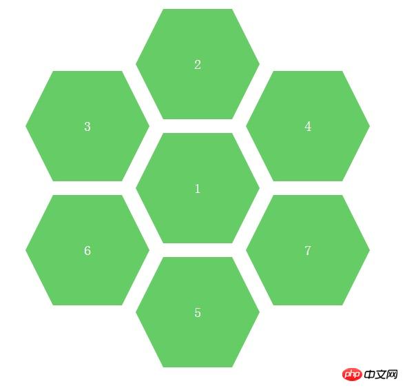
The complete page effect is as shown below: (In fact, multiple hexagons are positioned like this. Of course, you can also set the colors of different hexagons, so that you can better distinguish different module functions. ).
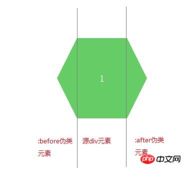
We can propose a separate hexagon for analysis, as shown below:
After knowing the analysis idea, we You can first learn how to draw triangles. There are many examples on the Internet, but you don’t have to look for unused children’s shoes. The code and examples are also given below, as follows:
Rendering:
CSS code:
.arrow{
display: inline-block;
width:0px;
height: 0px;
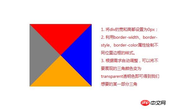
border-style: solid;
border-width: 100px; //与padding、margin属性类似,顺序为上、右、下、左
border-color: red blue orange gray; //顺序为上、右、下、左}HTML code:
<p class="arrow"></p>
As shown in the picture above , use the border attribute to fill the color we don’t want with a transparent color, and then we can get a certain part of the triangle. The code and picture effects are as follows.
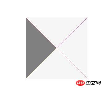
Rendering: (The triangle on the left is what we need, the others are set to transparent colors)
CSS code:
.arrow{
              display: inline-block;
              width:0px;
              height: 0px;
              border-bottom: 100px solid transparent;  //设置透明色
              border-top: 100px solid transparent;   //设置透明色
              border-right: 100px solid transparent;  //设置透明色
              border-left: 100px solid gray;
}HTML code:
<p class="arrow"></p>
Okay. Now that we know how to draw a triangle, we can use the CSS pseudo-classes :before and :after to complete the hexagon we want to draw.
: before is to insert content in front of the element
: after is to insert content after the element
If we want to insert some textual content, we can enter the text that needs to be displayed in its content attribute, such as content: "HELLO WORLD", but our example does not need to display additional information. We just need to turn the two pseudo-elements before and after into triangles and place them in fixed positions.
The complete code is given as follows:
<!DOCTYPE html>
<html>
<head lang="en">
    <meta charset="UTF-8">
    <title></title>
    <style type="text/css">
     .sharp:before{
         content:"";  //不需要展现文字等内容,所以设置为空字符
         width:0px;
         border-bottom:80px solid transparent;
         border-top:80px solid transparent;
         border-right:40px solid #6c6;
         position:absolute;
         left:-40px;
         top:0px;
     }
     .sharp{
         min-width:100px;
         height:160px;
         background:#6c6;
         display: inline-block;
         position: absolute;
         line-height: 160px;
         color:#FFFFFF;
         font-size: 20px;
         text-align: center;
     }
     .sharp:after{
         content:"";  //不需要展现文字等内容,所以设置为空字符
         width:0px;
         border-bottom:80px solid transparent;
         border-top:80px solid transparent;
         border-left-width:40px;
         border-left-style: solid;
         border-left-color:#6c6;
         position:absolute;
         right:-40px;
         top:0px;
     }
        #sharpContainer{
            width:100%;
            height: 600px;
        }
        #sharpContainer .center{
            top:200px;
            left:300px;
        }
         #sharpContainer .top{
             top:20px;
             left:300px;
         }
         #sharpContainer .top-left{
             top:110px;
             left:140px;
         }
         #sharpContainer .top-right{
             top:110px;
             left:460px;
         }
         #sharpContainer .bottom{
             top:380px;
             left:300px;
         }
         #sharpContainer .bottom-left{
             top:290px;
             left:140px;
         }
         #sharpContainer .bottom-right{
             top:290px;
             left:460px;
         }
    </style>
</head>
<body>
<p id="sharpContainer">
    <p class="sharp center">
    </p>
    <p class="sharp top">
    </p>
    <p class="sharp top-left">
    </p>
    <p class="sharp top-right">
    </p>
    <p class="sharp bottom">
    </p>
    <p class="sharp bottom-left">
    </p>
    <p class="sharp bottom-right">
    </p>
</p>
</body>
</html> Hexagon drawing is actually a very simple effect, as long as we understand how to draw triangles and use:before,:after Pseudo-class style is enough. In the future, we can add more irregular graphics to the project
The above is the entire content of this article. I hope it will be helpful to everyone's learning. For more related content, please pay attention to the PHP Chinese website !
Related recommendations:
How to implement the animation effect of tilting and rotating at the same time in CSS3
Using the border-radius of CSS3 Realize the drawing of Tai Chi and love patterns
CSS3 realizes the extended content display on mouse hover
The above is the detailed content of About how to draw hexagons in CSS3. For more information, please follow other related articles on the PHP Chinese website!

Hot AI Tools

Undresser.AI Undress
AI-powered app for creating realistic nude photos

AI Clothes Remover
Online AI tool for removing clothes from photos.

Undress AI Tool
Undress images for free

Clothoff.io
AI clothes remover

Video Face Swap
Swap faces in any video effortlessly with our completely free AI face swap tool!

Hot Article
Hot Tools

Notepad++7.3.1
Easy-to-use and free code editor

SublimeText3 Chinese version
Chinese version, very easy to use

Zend Studio 13.0.1
Powerful PHP integrated development environment

Dreamweaver CS6
Visual web development tools

SublimeText3 Mac version
God-level code editing software (SublimeText3)
Hot Topics


 How to achieve wave effect with pure CSS3? (code example)
Jun 28, 2022 pm 01:39 PM
How to achieve wave effect with pure CSS3? (code example)
Jun 28, 2022 pm 01:39 PM
How to achieve wave effect with pure CSS3? This article will introduce to you how to use SVG and CSS animation to create wave effects. I hope it will be helpful to you!
 Can the floor plan be drawn directly in architectural ppt?
Mar 20, 2024 am 08:43 AM
Can the floor plan be drawn directly in architectural ppt?
Mar 20, 2024 am 08:43 AM
ppt is widely used in many fields and work, especially in education, architecture, etc. When it comes to architectural ppt, we must first think of the presentation of some architectural drawings. If we do not use professional drawing software, can we directly draw a simple architectural plan? In fact, we can complete the operation here. Below, we will draw a relatively simple floor plan to give you an idea. I hope you can complete better floor plan drawings based on this idea. 1. First, we double-click to open the ppt software on the desktop and click to create a new presentation blank document. 2. We find Insert→Shape→Rectangle in the menu bar. 3. After drawing the rectangle, double-click the graphic and modify the fill color type. Here we can modify
 Use CSS skillfully to realize various strange-shaped buttons (with code)
Jul 19, 2022 am 11:28 AM
Use CSS skillfully to realize various strange-shaped buttons (with code)
Jul 19, 2022 am 11:28 AM
This article will show you how to use CSS to easily realize various weird-shaped buttons that appear frequently. I hope it will be helpful to you!
 Specific steps to create a hexagonal cluster layout in PPT
Mar 26, 2024 pm 03:21 PM
Specific steps to create a hexagonal cluster layout in PPT
Mar 26, 2024 pm 03:21 PM
1. First start PPT2010, execute the insert-picture command, insert a landscape picture material, and adjust the size. 2. Execute the insert command again, select smartart and then bring up the select smartart graphics dialog box. 3. Switch to the Picture tab, select the hexagonal cluster, and click the OK button to view the effect. 4. Then execute the Format-Add Shape command and click multiple times to add. Of course, adding shapes should be based on your actual situation. 5. Select the hexagon cluster and execute the Design-Convert-Convert to Shape command to convert it into a graphic. 6. Select the image to execute the Cut command, right-click the shape and select the Format Shape command from the drop-down menu. 7. In the Format Shape dialog box, set the fill to a picture or texture.
 How to hide elements in css without taking up space
Jun 01, 2022 pm 07:15 PM
How to hide elements in css without taking up space
Jun 01, 2022 pm 07:15 PM
Two methods: 1. Using the display attribute, just add the "display:none;" style to the element. 2. Use the position and top attributes to set the absolute positioning of the element to hide the element. Just add the "position:absolute;top:-9999px;" style to the element.
 How to draw geometric shapes on a picture using Python
Aug 18, 2023 pm 01:02 PM
How to draw geometric shapes on a picture using Python
Aug 18, 2023 pm 01:02 PM
How to use Python to draw geometric shapes on pictures Introduction: Python, as a powerful programming language, can not only perform advanced technologies such as data processing and machine learning, but also perform image processing and graphics drawing. In image processing, it is often necessary to draw various geometric shapes on pictures. This article will introduce how to use Python to draw geometric shapes on pictures. 1. Environment preparation and library installation. Before starting, we first need to install several necessary libraries for Python, mainly including OpenCV.
 How to draw lines with arrows in OpenCV using Java?
Aug 20, 2023 pm 02:41 PM
How to draw lines with arrows in OpenCV using Java?
Aug 20, 2023 pm 02:41 PM
The org.opencv.imgproc package of the JavaOpenCV library contains a class called Imgproc that provides various methods to process input images. It provides a set of methods for drawing geometric shapes on images. To draw an arrowed line, you need to call the arrowedLine() method of this class. The method accepts the following parameters: a Mat object representing the image on which the line is to be drawn. A Point object representing two points between lines. drawn. A Scalar object representing the line color. (BGR) An integer representing the thickness of the line (default: 1). Example importorg.opencv.core.Core;importo
 How to implement lace borders in css3
Sep 16, 2022 pm 07:11 PM
How to implement lace borders in css3
Sep 16, 2022 pm 07:11 PM
In CSS, you can use the border-image attribute to achieve a lace border. The border-image attribute can use images to create borders, that is, add a background image to the border. You only need to specify the background image as a lace style; the syntax "border-image: url (image path) offsets the image border width inward. Whether outset is repeated;".
