

Analysis of mobile attributes in css3

This article mainly introduces the detailed explanation of the mobile attributes of the CSS3 learning series. The content is quite good. I will share it with you now and give it as a reference.
transform function
Zoom
Use the sacle method to realize the scaling of text or images, specified in the parameters Zoom ratio, for example, sacle(0.5) means to reduce the size by 50%. The example is as follows:
<!DOCTYPE html>
<html lang="en">
<head>
    <meta charset="UTF-8">
    <title>scale方法使用示例</title>
    <style>
        p {
            width: 300px;
            margin: 150px auto;
            background-color: yellow;
            text-align: center;
            -webkit-transform: scale(0.5);
            -moz-transform: scale(0.5);
            -o-transform: scale(0.5);
        }
    </style>
</head>
<body>
<p>示例文字</p>
</body>
</html>In addition, you can specify the horizontal magnification and vertical magnification of the element separately. Magnification, examples are as follows:
<!DOCTYPE html>
<html lang="en">
<head>
    <meta charset="UTF-8">
    <title>scale方法使用示例</title>
    <style>
        p {
            width: 300px;
            margin: 150px auto;
            background-color: yellow;
            text-align: center;
            -webkit-transform: scale(0.5,2);
            -moz-transform: scale(0.5,2);
            -o-transform: scale(0.5,2);
        }
    </style>
</head>
<body>
<p>示例文字</p>
</body>
</html>Tilt
Use the skew method to implement text Or image tilt processing, specify the tilt angle in the horizontal direction and the tilt angle in the vertical direction respectively in the parameters. For example, "skew(30deg,30deg)" means tilting 30 degrees in the horizontal direction and tilting 30 degrees in the vertical direction. The example is as follows :
<!DOCTYPE html>
<html lang="en">
<head>
    <meta charset="UTF-8">
    <title>skew方法使用示例</title>
    <style>
        p {
            width: 300px;
            margin: 150px auto;
            background-color: yellow;
            text-align: center;
            -webkit-transform: skew(30deg, 30deg);
            -moz-transform: skew(30deg,30deg);
            -o-transform: skew(30deg,30deg);
        }
    </style>
</head>
<body>
<p>示例文字</p>
</body>
</html>Rotation
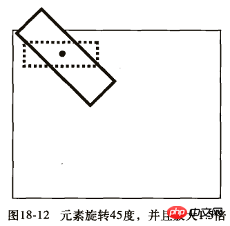
Use the rotate method to rotate the element, with one parameter. "Angle", the unit deg means degree, a positive number means clockwise rotation, and a negative number means counterclockwise rotation. Examples are as follows:
<!DOCTYPE html>
<html lang="en">
<head>
    <meta charset="UTF-8">
    <title>对元素使用多重变形的示例</title>
    <style>
        p {
            margin: 100px;
            width: 300px;
            background-color: yellow;
            text-align: center;
            -webkit-transform:rotate(30deg);
            -moz-transform:rotate(30deg);
            -o-transform:rotate(30deg);
        }
    </style>
</head>
<body>
<p>示例文字</p>
</body>
</html>Move
Use the translate method to translate text or images To move, specify the moving distance in the horizontal direction and the moving distance in the vertical direction in the parameters. For example:
<!DOCTYPE html>
<html lang="en">
<head>
    <meta charset="UTF-8">
    <title>translate方法使用示例</title>
    <style>
        p {
            width: 300px;
            margin: 150px auto;
            background-color: yellow;
            text-align: center;
            -webkit-transform: translate(50px,50px);
            -moz-transform: translate(50px,50px);
            -o-transform: translate(50px,50px);
        }
    </style>
</head>
<body>
<p>示例文字</p>
</body>
</html>Deformation example
Example 1:
<!DOCTYPE html>
<html lang="en">
<head>
<meta charset="UTF-8">
<title>对元素使用多重变形的示例</title>
<style>
p {
width: 300px;
background-color: yellow;
text-align: center;
-webkit-transform: translate(150px,200px) rotate(45deg) scale(1.5);
-moz-transform: translate(50px,50px) rotate(45deg) scale(1.5);
-o-transform: translate(50px,50px) rotate(45deg) scale(1.5);
}
</style>
</head>
<body>
<p>示例文字</p>
</body>
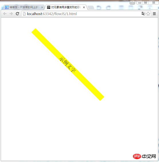
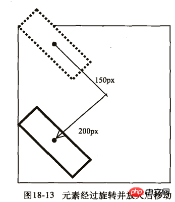
</html>This example is to move first, then rotate, and finally scale
Effect:
Example 2 :
<!DOCTYPE html>
<html lang="en">
<head>
    <meta charset="UTF-8">
    <title>对元素使用多重变形的示例</title>
    <style>
        p {
            width: 300px;
            background-color: yellow;
            text-align: center;
            -webkit-transform:rotate(45deg) scale(1.5) translate(150px,200px);
            -moz-transform:rotate(45deg) scale(1.5) translate(150px,200px);
            -o-transform: rotate(45deg) scale(1.5) translate(150px,200px);
        }
    </style>
</head>
<body>
<p>示例文字</p>
</body>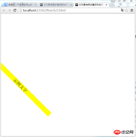
</html>First rotate, then scale, and finally move
Effect:
We can see from the running results of the two examples that the positions of the elements on the two pages are not the same. Let’s take a look at their detailed steps:
First example:
1) First move 150px to the right and 200px down.
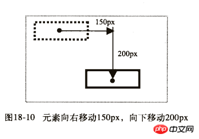
2) Then rotate 45 degrees and magnify 1.5 times.
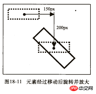
Second example:
1) First rotate 45 degrees and magnify 1.5 times.
2) Then move 150px to the right and 200px down.
The above is the entire content of this article. I hope it will be helpful to everyone’s study. For more related content, please pay attention to the PHP Chinese website!
Related recommendations:
How to use the table-layout attribute of CSS
About the use of the background-attachment attribute of css
The above is the detailed content of Analysis of mobile attributes in css3. For more information, please follow other related articles on the PHP Chinese website!

Hot AI Tools

Undresser.AI Undress
AI-powered app for creating realistic nude photos

AI Clothes Remover
Online AI tool for removing clothes from photos.

Undress AI Tool
Undress images for free

Clothoff.io
AI clothes remover

Video Face Swap
Swap faces in any video effortlessly with our completely free AI face swap tool!

Hot Article
Hot Tools

Notepad++7.3.1
Easy-to-use and free code editor

SublimeText3 Chinese version
Chinese version, very easy to use

Zend Studio 13.0.1
Powerful PHP integrated development environment

Dreamweaver CS6
Visual web development tools

SublimeText3 Mac version
God-level code editing software (SublimeText3)
Hot Topics


 How to achieve wave effect with pure CSS3? (code example)
Jun 28, 2022 pm 01:39 PM
How to achieve wave effect with pure CSS3? (code example)
Jun 28, 2022 pm 01:39 PM
How to achieve wave effect with pure CSS3? This article will introduce to you how to use SVG and CSS animation to create wave effects. I hope it will be helpful to you!
 How to use CSS to achieve the rotating background animation effect of elements
Nov 21, 2023 am 09:05 AM
How to use CSS to achieve the rotating background animation effect of elements
Nov 21, 2023 am 09:05 AM
How to use CSS to implement rotating background image animation effects of elements. Background image animation effects can increase the visual appeal and user experience of web pages. This article will introduce how to use CSS to achieve the rotating background animation effect of elements, and provide specific code examples. First, we need to prepare a background image, which can be any picture you like, such as a picture of the sun or an electric fan. Save the image and name it "bg.png". Next, create an HTML file and add a div element in the file, setting it to
 Use CSS skillfully to realize various strange-shaped buttons (with code)
Jul 19, 2022 am 11:28 AM
Use CSS skillfully to realize various strange-shaped buttons (with code)
Jul 19, 2022 am 11:28 AM
This article will show you how to use CSS to easily realize various weird-shaped buttons that appear frequently. I hope it will be helpful to you!
 How to hide elements in css without taking up space
Jun 01, 2022 pm 07:15 PM
How to hide elements in css without taking up space
Jun 01, 2022 pm 07:15 PM
Two methods: 1. Using the display attribute, just add the "display:none;" style to the element. 2. Use the position and top attributes to set the absolute positioning of the element to hide the element. Just add the "position:absolute;top:-9999px;" style to the element.
 How to implement lace borders in css3
Sep 16, 2022 pm 07:11 PM
How to implement lace borders in css3
Sep 16, 2022 pm 07:11 PM
In CSS, you can use the border-image attribute to achieve a lace border. The border-image attribute can use images to create borders, that is, add a background image to the border. You only need to specify the background image as a lace style; the syntax "border-image: url (image path) offsets the image border width inward. Whether outset is repeated;".
 How to enlarge the image by clicking the mouse in css3
Apr 25, 2022 pm 04:52 PM
How to enlarge the image by clicking the mouse in css3
Apr 25, 2022 pm 04:52 PM
Implementation method: 1. Use the ":active" selector to select the state of the mouse click on the picture; 2. Use the transform attribute and scale() function to achieve the picture magnification effect, the syntax "img:active {transform: scale(x-axis magnification, y Axis magnification);}".
 It turns out that text carousel and image carousel can also be realized using pure CSS!
Jun 10, 2022 pm 01:00 PM
It turns out that text carousel and image carousel can also be realized using pure CSS!
Jun 10, 2022 pm 01:00 PM
How to create text carousel and image carousel? The first thing everyone thinks of is whether to use js. In fact, text carousel and image carousel can also be realized using pure CSS. Let’s take a look at the implementation method. I hope it will be helpful to everyone!
 How to set animation rotation speed in css3
Apr 28, 2022 pm 04:32 PM
How to set animation rotation speed in css3
Apr 28, 2022 pm 04:32 PM
In CSS3, you can use the "animation-timing-function" attribute to set the animation rotation speed. This attribute is used to specify how the animation will complete a cycle and set the speed curve of the animation. The syntax is "element {animation-timing-function: speed attribute value;}".
