

Introduction to css3 flexible box model

This article mainly introduces the introduction of the css3 flexible box model. It has a certain reference value. Now I share it with you. Friends in need can refer to it.
Css3 introduces a new box model—— The flexbox model determines how a box is distributed among other boxes and how to handle the available space. Using this model, you can easily create a fluid layout that adapts to the browser window or a flexible layout that adapts to the font size
Css3 introduces a new box model - the flexbox model, which determines how a box is distributed among other boxes and how the available space is handled. This is similar to XUL (the user interaction language used by Firefox), and other languages also use the same box model, such as XAML and GladeXML. Using this model, you can easily create a fluid layout that adapts to the browser window or a flexible layout that adapts to the font size. The examples in this article use the following HTML code:
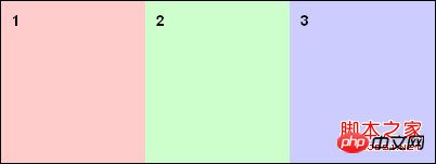
<body>
<p id="box1">1</p>
<p id="box2">2</p>
<p id="box3">3</p>
</body>
The traditional box model arranges boxes in the vertical direction based on HTML flow. Using the flexbox model you can specify a specific order and reverse it. To enable the flexible box model, just set the display attribute value of the box with child boxes to box (or inline-box).
display: box;
Horizontal or vertical distribution
"box-orient" defines the coordinate axis of the distribution: vertical and horizional. These two values define how the box is displayed.
body{
display: box;
box-orient: horizontal;
}
Reverse distribution
"box-direction" can set the order in which the boxes appear. By default, you only need to define the distribution axis - the boxes are distributed with the html flow. If it is a horizontal axis, it is distributed from left to right; if it is a vertical axis, it is distributed from top to bottom. Define the attribute value of "box-direction" as "reverse" to reverse the order of the boxes.
body {
display: box;
box-orient: vertical;
box-direction: reverse;
}
Specific distribution
The attribute "box-ordinal-group" defines the order of box distribution. The order of distribution can be controlled at will. The groups are defined with a number starting from "1" and the box model will distribute these groups first and all these boxes will be in each group. The distribution will be arranged from small to large.
body {
display: box;
box-orient: vertical;
box-direction : reverse;
}
#box1 {box-flex:1;box-ordinal-group: 2;}
#box2 {box-flex:2;box-ordinal-group: 2;}
#box3 {box-flex:2;box-ordinal-group: 1;}Box size
By default, the box is not elastic. If the property value of box-flex is at least 1, it becomes elastic. How box-flex divides the width of the parent container. The three sub-blocks are set to 1, 2, and 2 respectively. That is to say, the parent container is divided into 5 parts, occupying 1/5 (100px) and 2/ of the width of the parent structure respectively. 5(200px), 2/5(200px). If the box is not elastic, it will be as wide as possible so that its contents are visible without any overflow, and its size is determined by "width" and "height" (or min-height, min-width, max-width, max- height).
The above is the entire content of this article. I hope it will be helpful to everyone's study. For more related content, please pay attention to the PHP Chinese website!
Related recommendations:
The above is the detailed content of Introduction to css3 flexible box model. For more information, please follow other related articles on the PHP Chinese website!

Hot AI Tools

Undresser.AI Undress
AI-powered app for creating realistic nude photos

AI Clothes Remover
Online AI tool for removing clothes from photos.

Undress AI Tool
Undress images for free

Clothoff.io
AI clothes remover

Video Face Swap
Swap faces in any video effortlessly with our completely free AI face swap tool!

Hot Article
Hot Tools

Notepad++7.3.1
Easy-to-use and free code editor

SublimeText3 Chinese version
Chinese version, very easy to use

Zend Studio 13.0.1
Powerful PHP integrated development environment

Dreamweaver CS6
Visual web development tools

SublimeText3 Mac version
God-level code editing software (SublimeText3)
Hot Topics


 How to achieve wave effect with pure CSS3? (code example)
Jun 28, 2022 pm 01:39 PM
How to achieve wave effect with pure CSS3? (code example)
Jun 28, 2022 pm 01:39 PM
How to achieve wave effect with pure CSS3? This article will introduce to you how to use SVG and CSS animation to create wave effects. I hope it will be helpful to you!
 Use CSS skillfully to realize various strange-shaped buttons (with code)
Jul 19, 2022 am 11:28 AM
Use CSS skillfully to realize various strange-shaped buttons (with code)
Jul 19, 2022 am 11:28 AM
This article will show you how to use CSS to easily realize various weird-shaped buttons that appear frequently. I hope it will be helpful to you!
 How to hide elements in css without taking up space
Jun 01, 2022 pm 07:15 PM
How to hide elements in css without taking up space
Jun 01, 2022 pm 07:15 PM
Two methods: 1. Using the display attribute, just add the "display:none;" style to the element. 2. Use the position and top attributes to set the absolute positioning of the element to hide the element. Just add the "position:absolute;top:-9999px;" style to the element.
 How to implement lace borders in css3
Sep 16, 2022 pm 07:11 PM
How to implement lace borders in css3
Sep 16, 2022 pm 07:11 PM
In CSS, you can use the border-image attribute to achieve a lace border. The border-image attribute can use images to create borders, that is, add a background image to the border. You only need to specify the background image as a lace style; the syntax "border-image: url (image path) offsets the image border width inward. Whether outset is repeated;".
 It turns out that text carousel and image carousel can also be realized using pure CSS!
Jun 10, 2022 pm 01:00 PM
It turns out that text carousel and image carousel can also be realized using pure CSS!
Jun 10, 2022 pm 01:00 PM
How to create text carousel and image carousel? The first thing everyone thinks of is whether to use js. In fact, text carousel and image carousel can also be realized using pure CSS. Let’s take a look at the implementation method. I hope it will be helpful to everyone!
 How to set animation rotation speed in css3
Apr 28, 2022 pm 04:32 PM
How to set animation rotation speed in css3
Apr 28, 2022 pm 04:32 PM
In CSS3, you can use the "animation-timing-function" attribute to set the animation rotation speed. This attribute is used to specify how the animation will complete a cycle and set the speed curve of the animation. The syntax is "element {animation-timing-function: speed attribute value;}".
 Cleverly use CSS3 filters to create text flash switching animation effects!
Jul 20, 2022 am 10:55 AM
Cleverly use CSS3 filters to create text flash switching animation effects!
Jul 20, 2022 am 10:55 AM
This article will show you how to use CSS3 filters to achieve a high-end text flash switching animation effect. I hope it will be helpful to you!
 css3 what is adaptive layout
Jun 02, 2022 pm 12:05 PM
css3 what is adaptive layout
Jun 02, 2022 pm 12:05 PM
Adaptive layout, also known as "responsive layout", refers to a web page layout that can automatically recognize the screen width and make corresponding adjustments; such a web page can be compatible with multiple different terminals instead of making a specific version for each terminal. . Adaptive layout was born to solve the problem of mobile web browsing, and can provide a good user experience for users using different terminals.
