

Use css to implement a switch button imitating ios7

This article mainly introduces a switch button imitating ios7 implemented in pure css, without the need to include js code. Two colors and three different sizes of demos are given in the implementation. Friends who need it can refer to
Today I will introduce to you a switch button that imitates ios7. This button is also implemented in pure CSS. No need to include js code. In the implementation, demos of two colors and three different sizes are given. Let’s take a look at the renderings:
Implemented code.
html code:
<p class="wrap" style="width: 600px; margin: auto;">
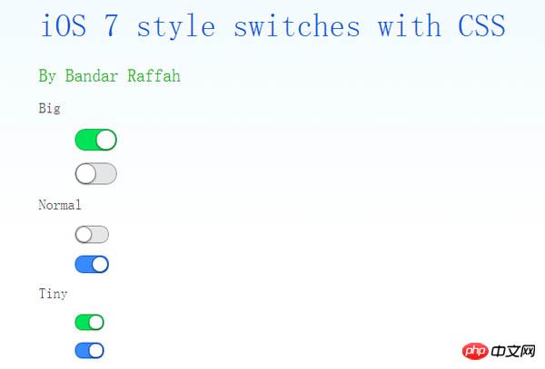
<h1>
iOS 7 style switches with CSS</h1>
<h2>
By Bandar Raffah</h2>
<label>
Big<input type="checkbox" class="ios-switch green bigswitch" checked /><p>
<p>
</p>
</p>
</label>
<label>
<input type="checkbox" class="ios-switch bigswitch" checked /><p>
<p>
</p>
</p>
</label>
<label>
Normal<input type="checkbox" class="ios-switch green" /><p>
<p>
</p>
</p>
</label>
<label>
<input type="checkbox" class="ios-switch" /><p>
<p>
</p>
</p>
</label>
<label>
Tiny<input type="checkbox" class="ios-switch green tinyswitch" checked /><p>
<p>
</p>
</p>
</label>
<label>
<input type="checkbox" class="ios-switch tinyswitch" checked /><p>
<p>
</p>
</p>
</label>
</p>css code:
input[type="checkbox"]
        {
            position: absolute;
            opacity: 0;
        }
        /* Normal Track */
        input[type="checkbox"].ios-switch + p
        {
            vertical-align: middle;
            width: 40px;
            height: 20px;
            border: 1px solid rgba(0,0,0,.4);
            border-radius: 999px;
            background-color: rgba(0, 0, 0, 0.1);
            -webkit-transition-duration: .4s;
            -webkit-transition-property: background-color, box-shadow;
            box-shadow: inset 0 0 0 0px rgba(0,0,0,0.4);
            margin: 15px 1.2em 15px 2.5em;
        }
        /* Checked Track (Blue) */
        input[type="checkbox"].ios-switch:checked + p
        {
            width: 40px;
            background-position: 0 0;
            background-color: #3b89ec;
            border: 1px solid #0e62cd;
            box-shadow: inset 0 0 0 10px rgba(59,137,259,1);
        }
        /* Tiny Track */
        input[type="checkbox"].tinyswitch.ios-switch + p
        {
            width: 34px;
            height: 18px;
        }
        /* Big Track */
        input[type="checkbox"].bigswitch.ios-switch + p
        {
            width: 50px;
            height: 25px;
        }
        /* Green Track */
        input[type="checkbox"].green.ios-switch:checked + p
        {
            background-color: #00e359;
            border: 1px solid rgba(0, 162, 63,1);
            box-shadow: inset 0 0 0 10px rgba(0,227,89,1);
        }
        /* Normal Knob */
        input[type="checkbox"].ios-switch + p > p
        {
            float: left;
            width: 18px;
            height: 18px;
            border-radius: inherit;
            background: #ffffff;
            -webkit-transition-timing-function: cubic-bezier(.54,1.85,.5,1);
            -webkit-transition-duration: 0.4s;
            -webkit-transition-property: transform, background-color, box-shadow;
            -moz-transition-timing-function: cubic-bezier(.54,1.85,.5,1);
            -moz-transition-duration: 0.4s;
            -moz-transition-property: transform, background-color;
            box-shadow: 0px 2px 5px rgba(0, 0, 0, 0.3), 0px 0px 0 1px rgba(0, 0, 0, 0.4);
            pointer-events: none;
            margin-top: 1px;
            margin-left: 1px;
        }
        /* Checked Knob (Blue Style) */
        input[type="checkbox"].ios-switch:checked + p > p
        {
            -webkit-transform: translate3d(20px, 0, 0);
            -moz-transform: translate3d(20px, 0, 0);
            background-color: #ffffff;
            box-shadow: 0px 2px 5px rgba(0, 0, 0, 0.3), 0px 0px 0 1px rgba(8, 80, 172,1);
        }
        /* Tiny Knob */
        input[type="checkbox"].tinyswitch.ios-switch + p > p
        {
            width: 16px;
            height: 16px;
            margin-top: 1px;
        }
        /* Checked Tiny Knob (Blue Style) */
        input[type="checkbox"].tinyswitch.ios-switch:checked + p > p
        {
            -webkit-transform: translate3d(16px, 0, 0);
            -moz-transform: translate3d(16px, 0, 0);
            box-shadow: 0px 2px 5px rgba(0, 0, 0, 0.3), 0px 0px 0 1px rgba(8, 80, 172,1);
        }
        /* Big Knob */
        input[type="checkbox"].bigswitch.ios-switch + p > p
        {
            width: 23px;
            height: 23px;
            margin-top: 1px;
        }
        /* Checked Big Knob (Blue Style) */
        input[type="checkbox"].bigswitch.ios-switch:checked + p > p
        {
            -webkit-transform: translate3d(25px, 0, 0);
            -moz-transform: translate3d(16px, 0, 0);
            box-shadow: 0px 4px 8px rgba(0, 0, 0, 0.3), 0px 0px 0 1px rgba(8, 80, 172,1);
        }
        /* Green Knob */
        input[type="checkbox"].green.ios-switch:checked + p > p
        {
            box-shadow: 0px 2px 5px rgba(0, 0, 0, 0.3), 0 0 0 1px rgba(0, 162, 63,1);
        }
        /* Needless Page Decoration */
        body
        {
            -webkit-user-select: none;
            cursor: default;
            font: 18px "Helvetica Neue";
            color: rgba(0, 0, 0, 0.77);
            font-weight: 200;
            padding-left: 30px;
            padding-top: 0px;
            background: -webkit-linear-gradient(top, #f2fbff 0%, #ffffff 64%) no-repeat;
            background: -moz-linear-gradient(top, #f2fbff 0%, #ffffff 64%) no-repeat;
            background: -ms-linear-gradient(top, #f2fbff 0%, #ffffff 64%) no-repeat;
            background: linear-gradient(to bottom, #f2fbff 0%, #ffffff 64%) no-repeat;
        }
        h1
        {
            font-weight: 100;
            font-size: 40px;
            color: #135ae4;
        }
        h2
        {
            font-weight: 200;
            font-size: 22px;
            color: #03b000;
        }
        h3
        {
            font-weight: 200;
            font-size: 18px;
            color: rgba(0, 0, 0, 0.77);
            margin-top: 50px;
        }
        a:link
        {
            text-decoration: none;
            color: #f06;
        }
        a:visited
        {
            text-decoration: none;
            color: #f06;
        }
        a:hover
        {
            text-decoration: underline;
        }
        a:active
        {
            text-decoration: underline;
} The above is the entire content of this article, I hope it will help everyone learn Helpful, please pay attention to the PHP Chinese website for more related content!
Related recommendations:
About CSS image stitching technology
##Using css to achieve shadow effects
The above is the detailed content of Use css to implement a switch button imitating ios7. For more information, please follow other related articles on the PHP Chinese website!

Hot AI Tools

Undresser.AI Undress
AI-powered app for creating realistic nude photos

AI Clothes Remover
Online AI tool for removing clothes from photos.

Undress AI Tool
Undress images for free

Clothoff.io
AI clothes remover

Video Face Swap
Swap faces in any video effortlessly with our completely free AI face swap tool!

Hot Article
Hot Tools

Notepad++7.3.1
Easy-to-use and free code editor

SublimeText3 Chinese version
Chinese version, very easy to use

Zend Studio 13.0.1
Powerful PHP integrated development environment

Dreamweaver CS6
Visual web development tools

SublimeText3 Mac version
God-level code editing software (SublimeText3)
Hot Topics


 How to use bootstrap in vue
Apr 07, 2025 pm 11:33 PM
How to use bootstrap in vue
Apr 07, 2025 pm 11:33 PM
Using Bootstrap in Vue.js is divided into five steps: Install Bootstrap. Import Bootstrap in main.js. Use the Bootstrap component directly in the template. Optional: Custom style. Optional: Use plug-ins.
 The Roles of HTML, CSS, and JavaScript: Core Responsibilities
Apr 08, 2025 pm 07:05 PM
The Roles of HTML, CSS, and JavaScript: Core Responsibilities
Apr 08, 2025 pm 07:05 PM
HTML defines the web structure, CSS is responsible for style and layout, and JavaScript gives dynamic interaction. The three perform their duties in web development and jointly build a colorful website.
 Understanding HTML, CSS, and JavaScript: A Beginner's Guide
Apr 12, 2025 am 12:02 AM
Understanding HTML, CSS, and JavaScript: A Beginner's Guide
Apr 12, 2025 am 12:02 AM
WebdevelopmentreliesonHTML,CSS,andJavaScript:1)HTMLstructurescontent,2)CSSstylesit,and3)JavaScriptaddsinteractivity,formingthebasisofmodernwebexperiences.
 How to set up the framework for bootstrap
Apr 07, 2025 pm 03:27 PM
How to set up the framework for bootstrap
Apr 07, 2025 pm 03:27 PM
To set up the Bootstrap framework, you need to follow these steps: 1. Reference the Bootstrap file via CDN; 2. Download and host the file on your own server; 3. Include the Bootstrap file in HTML; 4. Compile Sass/Less as needed; 5. Import a custom file (optional). Once setup is complete, you can use Bootstrap's grid systems, components, and styles to create responsive websites and applications.
 How to write split lines on bootstrap
Apr 07, 2025 pm 03:12 PM
How to write split lines on bootstrap
Apr 07, 2025 pm 03:12 PM
There are two ways to create a Bootstrap split line: using the tag, which creates a horizontal split line. Use the CSS border property to create custom style split lines.
 How to insert pictures on bootstrap
Apr 07, 2025 pm 03:30 PM
How to insert pictures on bootstrap
Apr 07, 2025 pm 03:30 PM
There are several ways to insert images in Bootstrap: insert images directly, using the HTML img tag. With the Bootstrap image component, you can provide responsive images and more styles. Set the image size, use the img-fluid class to make the image adaptable. Set the border, using the img-bordered class. Set the rounded corners and use the img-rounded class. Set the shadow, use the shadow class. Resize and position the image, using CSS style. Using the background image, use the background-image CSS property.
 How to use bootstrap button
Apr 07, 2025 pm 03:09 PM
How to use bootstrap button
Apr 07, 2025 pm 03:09 PM
How to use the Bootstrap button? Introduce Bootstrap CSS to create button elements and add Bootstrap button class to add button text
 How to resize bootstrap
Apr 07, 2025 pm 03:18 PM
How to resize bootstrap
Apr 07, 2025 pm 03:18 PM
To adjust the size of elements in Bootstrap, you can use the dimension class, which includes: adjusting width: .col-, .w-, .mw-adjust height: .h-, .min-h-, .max-h-
