

Use CSS3 to create special effects for photo walls

This article mainly introduces the specific steps of making a beautiful photo wall with CSS3 in detail. It has certain reference value. Interested friends can refer to it.
The examples in this article are to share with you the use of CSS3 The detailed steps for creating an animated photo wall are for your reference. The specific content is as follows
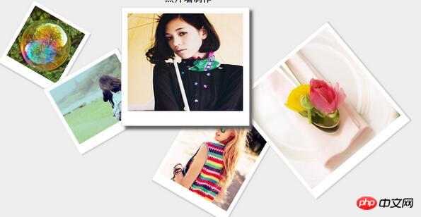
The first effect:
The Html code is as follows:
<body>
<h2>照片墙制作</h2>
<p class="container">
<img class="img1" src="img/img (1).jpg" height="150" width="150" alt="">
<img class="img2" src="img/img (2).jpg" height="160" width="200" alt="">
<img class="img3" src="img/img (3).jpg" height="170" width="200" alt="">
<img class="img4" src="img/img (4).jpg" height="240" width="200" alt="">
<img class="img5" src="img/img (5).jpg" height="300" width="300" alt="">
</p>
</body>
The CSS code is as follows:
<style>
* {margin:0; padding:0;}
body { background-color: #eee; padding-top: 50px;}
h2 { text-align: center;}
.container { position: relative; width:1000px; height:700px; margin:0px auto; }
img { position: absolute; top:50px; left:100px; cursor: pointer;
padding:10px 10px 25px; background-color: #fff; border:1px solid #ddd;
transition:0.5s; box-shadow: 3px 3px 3px #ccc;
}
.img1 { left:40px; top:20px; transform:rotate(30deg); z-index: 1;}
.img2 { left:156px; top:156px; transform:rotate(-30deg); z-index: 1;}
.img3 { left:381px; top:60px; transform:rotate(30deg); z-index: 1;}
.img4 { left:458px; top:256px; transform:rotate(30deg); z-index: 1;}
.img5 { left:684px; top:110px; transform:rotate(-40deg); z-index: 1;}
img:hover { transform:rotate(0deg); transform:scale(1.5); box-shadow: 6px 6px 6px #656565; z-index: 2;}
</style>Effect picture:
The second implementation effect:

Part One: HTML
Here we first put ten pictures on the page. (If you have any beautiful photos, please post them!)
<p class="content">
    <img class="pic1" src="img/1.jpg" />
    <img class="pic2" src="img/2.jpg" />
    <img class="pic3" src="img/3.jpg" />
    <img class="pic4" src="img/4.jpg" />
    <img class="pic5" src="img/5.jpg" />
    <img class="pic6" src="img/6.jpg" />
    <img class="pic7" src="img/7.jpg" />
    <img class="pic8" src="img/8.jpg" />
    <img class="pic9" src="img/9.jpg" />
    <img class="pic10" src="img/10.jpg" />
</p>Part 2: CSS3
This part is the focus of our section, As shown in the picture above, the positions of the photos are different. We will definitely use the following knowledge points of CSS3:
CSS3 rotation rotate
CSS3 scaling
CSS3 shadow box- shadow
Yes, with these functions we can make a beautiful photo wall. Let’s take a look at our code. Only part of the code is shown here. Smart friends must know how to do it!
body{
    background: url(../img/bg1.jpg) no-repeat top center fixed;
    background-size: 100% auto;
}
.content{
    width: 900px;
    height: 1000px;
    overflow: hidden;
    margin: 100px auto;
    position: relative;
}
img{
    z-index: 1;
    width: 20%;
    height: auto;
    position: absolute;
    padding: 10px 10px 15px 10px;
    background: #ffffff;
    border: 1px solid #CCCCCC;
    /* 动画的时间 */
    -moz-transition: 0.5s;
    -webkit-transition: 0.5s;
    transition: 0.5s;
 }
img:hover{
    z-index: 2;
    transform: scale(1.5);
    -moz-transform: scale(1.5) ;
    -webkit-transform: scale(1.5) ;
    box-shadow: -10px 10px 20px #000000;
    -moz-box-shadow: -10px 10px 20px #000000;
    -webkit-box-shadow: -10px 10px 20px #000000;
}
.pic1{
    left: 100px;
    top: 50px;
    -webkit-transform: rotate(20deg);
    -moz-transform: rotate(20deg);
    transform: rotate(20deg);
}
.pic2{
    left: 280px;
    top: 60px;
    -webkit-transform: rotate(-10deg);
    -moz-transform: rotate(-10deg);
    transform: rotate(-10deg);
}
/* 下面的代码大同小异就不依依展示了 */Such a simple code can achieve the effect shown in the picture above. Friends, if you are interested, try it yourself and post your beautiful photos to see.
PS: CSS3 can also create more wonderful and gorgeous effects. If you are interested, you can study it in depth!
The above is the entire content of this article. I hope it will be helpful to everyone's study. For more related content, please pay attention to the PHP Chinese website!
Related recommendations:
How to implement single-line and multi-line text overflow display ellipses using CSS
How to implement css icons Align with text
The above is the detailed content of Use CSS3 to create special effects for photo walls. For more information, please follow other related articles on the PHP Chinese website!

Hot AI Tools

Undresser.AI Undress
AI-powered app for creating realistic nude photos

AI Clothes Remover
Online AI tool for removing clothes from photos.

Undress AI Tool
Undress images for free

Clothoff.io
AI clothes remover

Video Face Swap
Swap faces in any video effortlessly with our completely free AI face swap tool!

Hot Article
Hot Tools

Notepad++7.3.1
Easy-to-use and free code editor

SublimeText3 Chinese version
Chinese version, very easy to use

Zend Studio 13.0.1
Powerful PHP integrated development environment

Dreamweaver CS6
Visual web development tools

SublimeText3 Mac version
God-level code editing software (SublimeText3)
Hot Topics


 How to achieve wave effect with pure CSS3? (code example)
Jun 28, 2022 pm 01:39 PM
How to achieve wave effect with pure CSS3? (code example)
Jun 28, 2022 pm 01:39 PM
How to achieve wave effect with pure CSS3? This article will introduce to you how to use SVG and CSS animation to create wave effects. I hope it will be helpful to you!
 Use CSS skillfully to realize various strange-shaped buttons (with code)
Jul 19, 2022 am 11:28 AM
Use CSS skillfully to realize various strange-shaped buttons (with code)
Jul 19, 2022 am 11:28 AM
This article will show you how to use CSS to easily realize various weird-shaped buttons that appear frequently. I hope it will be helpful to you!
 How to hide elements in css without taking up space
Jun 01, 2022 pm 07:15 PM
How to hide elements in css without taking up space
Jun 01, 2022 pm 07:15 PM
Two methods: 1. Using the display attribute, just add the "display:none;" style to the element. 2. Use the position and top attributes to set the absolute positioning of the element to hide the element. Just add the "position:absolute;top:-9999px;" style to the element.
 How to implement lace borders in css3
Sep 16, 2022 pm 07:11 PM
How to implement lace borders in css3
Sep 16, 2022 pm 07:11 PM
In CSS, you can use the border-image attribute to achieve a lace border. The border-image attribute can use images to create borders, that is, add a background image to the border. You only need to specify the background image as a lace style; the syntax "border-image: url (image path) offsets the image border width inward. Whether outset is repeated;".
 It turns out that text carousel and image carousel can also be realized using pure CSS!
Jun 10, 2022 pm 01:00 PM
It turns out that text carousel and image carousel can also be realized using pure CSS!
Jun 10, 2022 pm 01:00 PM
How to create text carousel and image carousel? The first thing everyone thinks of is whether to use js. In fact, text carousel and image carousel can also be realized using pure CSS. Let’s take a look at the implementation method. I hope it will be helpful to everyone!
 How to enlarge the image by clicking the mouse in css3
Apr 25, 2022 pm 04:52 PM
How to enlarge the image by clicking the mouse in css3
Apr 25, 2022 pm 04:52 PM
Implementation method: 1. Use the ":active" selector to select the state of the mouse click on the picture; 2. Use the transform attribute and scale() function to achieve the picture magnification effect, the syntax "img:active {transform: scale(x-axis magnification, y Axis magnification);}".
 How to set animation rotation speed in css3
Apr 28, 2022 pm 04:32 PM
How to set animation rotation speed in css3
Apr 28, 2022 pm 04:32 PM
In CSS3, you can use the "animation-timing-function" attribute to set the animation rotation speed. This attribute is used to specify how the animation will complete a cycle and set the speed curve of the animation. The syntax is "element {animation-timing-function: speed attribute value;}".
 Does css3 animation effect have deformation?
Apr 28, 2022 pm 02:20 PM
Does css3 animation effect have deformation?
Apr 28, 2022 pm 02:20 PM
The animation effect in css3 has deformation; you can use "animation: animation attribute @keyframes ..{..{transform: transformation attribute}}" to achieve deformation animation effect. The animation attribute is used to set the animation style, and the transform attribute is used to set the deformation style. .
