

Create rounded images and oval images with CSS3

This article mainly teaches you the specific implementation code for making rounded images and elliptical images using CSS3. It has a certain reference value. Interested friends can refer to it.
The examples in this article are shared with you. The method of making rounded and oval images with CSS3 is for your reference. The specific content is as follows
1. Rounded images
XML/HTML CodeCopy content to clipboard
<!DOCTYPE html>
<html>
<head>
<style>
img {
    border-radius: 8px;
}
</style>
</head>
<body>
<h2>圆角图片</h2>
<p>使用 border-radius 属性来创建圆角图片:</p>
<img src="paris.jpg" alt="Paris" width="400" height="300">
</body>
</html>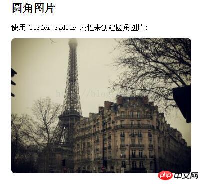
##2. Oval image
##XML/ HTML CodeCopy content to clipboard Use pure CSS Example of realizing dynamic text effects The above is the detailed content of Create rounded images and oval images with CSS3. For more information, please follow other related articles on the PHP Chinese website!<!DOCTYPE html>
<html>
<head>
<style>
img {
border-radius: 50%;
}
</style>
</head>
<body>
<h2>椭圆形图片</h2>
<p>使用 border-radius 属性来创建椭圆形图片:</p>
<img src="paris.jpg" alt="Paris" width="400" height="300">
</body>
</html> ##Related recommendations:
CSS text font color setting method (CSS color)

Hot AI Tools

Undresser.AI Undress
AI-powered app for creating realistic nude photos

AI Clothes Remover
Online AI tool for removing clothes from photos.

Undress AI Tool
Undress images for free

Clothoff.io
AI clothes remover

Video Face Swap
Swap faces in any video effortlessly with our completely free AI face swap tool!

Hot Article
Hot Tools

Notepad++7.3.1
Easy-to-use and free code editor

SublimeText3 Chinese version
Chinese version, very easy to use

Zend Studio 13.0.1
Powerful PHP integrated development environment

Dreamweaver CS6
Visual web development tools

SublimeText3 Mac version
God-level code editing software (SublimeText3)
Hot Topics


 How to achieve wave effect with pure CSS3? (code example)
Jun 28, 2022 pm 01:39 PM
How to achieve wave effect with pure CSS3? (code example)
Jun 28, 2022 pm 01:39 PM
How to achieve wave effect with pure CSS3? This article will introduce to you how to use SVG and CSS animation to create wave effects. I hope it will be helpful to you!
 Use CSS skillfully to realize various strange-shaped buttons (with code)
Jul 19, 2022 am 11:28 AM
Use CSS skillfully to realize various strange-shaped buttons (with code)
Jul 19, 2022 am 11:28 AM
This article will show you how to use CSS to easily realize various weird-shaped buttons that appear frequently. I hope it will be helpful to you!
 Guide to modifying win11 window corners to rounded corners
Dec 31, 2023 pm 08:35 PM
Guide to modifying win11 window corners to rounded corners
Dec 31, 2023 pm 08:35 PM
After updating the win11 system, many friends found that the win11 interface window adopts a new rounded corner design. But some people don’t like this rounded corner design and want to modify it to the previous interface, but they don’t know how to modify it. Let’s take a look below. How to modify rounded corners in win11 1. The rounded corner design of win11 is a built-in system setting that cannot be modified at present. 2. So if you don’t like using the rounded corner design of win11, you can wait for Microsoft to provide a modification method. 3. If you are really not used to it, you can also choose to return to the previous win10 system. 4. If you don’t know how to roll back, you can check out the tutorials provided on this site. 5. If you cannot go back using the tutorial above, you can still
 How to hide elements in css without taking up space
Jun 01, 2022 pm 07:15 PM
How to hide elements in css without taking up space
Jun 01, 2022 pm 07:15 PM
Two methods: 1. Using the display attribute, just add the "display:none;" style to the element. 2. Use the position and top attributes to set the absolute positioning of the element to hide the element. Just add the "position:absolute;top:-9999px;" style to the element.
 How to implement lace borders in css3
Sep 16, 2022 pm 07:11 PM
How to implement lace borders in css3
Sep 16, 2022 pm 07:11 PM
In CSS, you can use the border-image attribute to achieve a lace border. The border-image attribute can use images to create borders, that is, add a background image to the border. You only need to specify the background image as a lace style; the syntax "border-image: url (image path) offsets the image border width inward. Whether outset is repeated;".
 How to enlarge the image by clicking the mouse in css3
Apr 25, 2022 pm 04:52 PM
How to enlarge the image by clicking the mouse in css3
Apr 25, 2022 pm 04:52 PM
Implementation method: 1. Use the ":active" selector to select the state of the mouse click on the picture; 2. Use the transform attribute and scale() function to achieve the picture magnification effect, the syntax "img:active {transform: scale(x-axis magnification, y Axis magnification);}".
 It turns out that text carousel and image carousel can also be realized using pure CSS!
Jun 10, 2022 pm 01:00 PM
It turns out that text carousel and image carousel can also be realized using pure CSS!
Jun 10, 2022 pm 01:00 PM
How to create text carousel and image carousel? The first thing everyone thinks of is whether to use js. In fact, text carousel and image carousel can also be realized using pure CSS. Let’s take a look at the implementation method. I hope it will be helpful to everyone!
 How to set animation rotation speed in css3
Apr 28, 2022 pm 04:32 PM
How to set animation rotation speed in css3
Apr 28, 2022 pm 04:32 PM
In CSS3, you can use the "animation-timing-function" attribute to set the animation rotation speed. This attribute is used to specify how the animation will complete a cycle and set the speed curve of the animation. The syntax is "element {animation-timing-function: speed attribute value;}".
