
 Web Front-end
CSS Tutorial
The difference between nth-child and nth-of-type in CSS3 and their usage tips
Web Front-end
CSS Tutorial
The difference between nth-child and nth-of-type in CSS3 and their usage tips
The difference between nth-child and nth-of-type in CSS3 and their usage tips
This time I will bring you the differences and usage tips between nth-child and nth-of-type in CSS3. What are the precautions when using nth-child and nth-of-type? Here are Let’s take a look at practical cases.
The difference between nth-child and nth-of-type in CSS3 is actually very simple: Why is :nth-of-type called :nth-of-type? Because it is distinguished by "type". That is to say: ele:nth-of-type(n) refers to the nth ele element under the parent element, and ele:nth-child(n) refers to the nth element under the parent element and this element is ele. If If not, the selection fails.
The text may sound rather obscure and is easier to understand. Here is a small example:
<!DOCTYPE html>
<html lang="en">
<head>
<meta charset="UTF-8">
<title>demo</title>
</head>
<style>
.demo li:nth-child(2){
color: #ff0000;
}
.demo li:nth-of-type(2){
color: #00ff00;
}
</style>
<body>
<p>
<ul class="demo">
<p>zero</p>
<li>one</li>
<li>two</li>
</ul>
</p>
</body>
</html>The results are as follows:
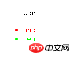
The above For example, .demo li:nth-child(2) selects the
But what if no tags are specified before nth-child and nth-of-type?
.demo :nth-child(2){
color: #ff0000;
}
.demo :nth-of-type(2){
color: #00ff00;
}What will be the result of this? Look at the html structure:
<ul class="demo">
<p>first p</p>
<li>first li</li>
<li>second li</li>
<p>second p</p>
</ul>
Result:
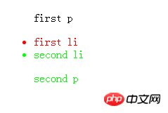
As can be seen above, before them Without specifying the tag type, :nth-child(2) still selects the second element, no matter what tag it is. And :nth-type-of(2) selects two elements, which are the second p tag and the second li tag in the parent.demo. It can be seen that when the tag type is not specified, :nth-type -of(2) will select the second of all type tags.
We have already understood the basic usage and differences of nth-child and nth-of-type, then go further in nth-of-type(n) and nth-child(n) What is n?
nth-of-type(n) and nth-child(n) n can be a number, keyword or formula. Numbers: This is the use of the above examples, so I won’t go into details. Keywords: Odd, even
Odd and even are keywords that can be used to match sub-elements with odd or even subscripts
Note: the first sub-element The subscript of is 1
Here, we specify two different background colors for odd and even p elements:
p:nth-of-type(odd)
{
background:#ff0000;
}
p:nth-of-type(even)
{
background:#0000ff;
}Formula: Or arithmeticExpression
Use the formula (an + b). Description: Indicates the length of the period, n is the counter (starting from 0), and b is the offset value.
Here, we specify the background color of all p elements whose subscripts are multiples of 3:
p:nth-of-type(3n+0)
{
background:#ff0000;
}I believe you have mastered the method after reading the case in this article. Please pay attention to php for more exciting things. Other related articles on the Chinese website!
Recommended reading:
Detailed explanation of the new attribute box-sizing of css3
css3 to achieve animated bicycle effect
The above is the detailed content of The difference between nth-child and nth-of-type in CSS3 and their usage tips. For more information, please follow other related articles on the PHP Chinese website!

Hot AI Tools

Undresser.AI Undress
AI-powered app for creating realistic nude photos

AI Clothes Remover
Online AI tool for removing clothes from photos.

Undress AI Tool
Undress images for free

Clothoff.io
AI clothes remover

Video Face Swap
Swap faces in any video effortlessly with our completely free AI face swap tool!

Hot Article
Hot Tools

Notepad++7.3.1
Easy-to-use and free code editor

SublimeText3 Chinese version
Chinese version, very easy to use

Zend Studio 13.0.1
Powerful PHP integrated development environment

Dreamweaver CS6
Visual web development tools

SublimeText3 Mac version
God-level code editing software (SublimeText3)
Hot Topics


 How to achieve wave effect with pure CSS3? (code example)
Jun 28, 2022 pm 01:39 PM
How to achieve wave effect with pure CSS3? (code example)
Jun 28, 2022 pm 01:39 PM
How to achieve wave effect with pure CSS3? This article will introduce to you how to use SVG and CSS animation to create wave effects. I hope it will be helpful to you!
 Use CSS skillfully to realize various strange-shaped buttons (with code)
Jul 19, 2022 am 11:28 AM
Use CSS skillfully to realize various strange-shaped buttons (with code)
Jul 19, 2022 am 11:28 AM
This article will show you how to use CSS to easily realize various weird-shaped buttons that appear frequently. I hope it will be helpful to you!
 How to hide elements in css without taking up space
Jun 01, 2022 pm 07:15 PM
How to hide elements in css without taking up space
Jun 01, 2022 pm 07:15 PM
Two methods: 1. Using the display attribute, just add the "display:none;" style to the element. 2. Use the position and top attributes to set the absolute positioning of the element to hide the element. Just add the "position:absolute;top:-9999px;" style to the element.
 How to implement lace borders in css3
Sep 16, 2022 pm 07:11 PM
How to implement lace borders in css3
Sep 16, 2022 pm 07:11 PM
In CSS, you can use the border-image attribute to achieve a lace border. The border-image attribute can use images to create borders, that is, add a background image to the border. You only need to specify the background image as a lace style; the syntax "border-image: url (image path) offsets the image border width inward. Whether outset is repeated;".
 It turns out that text carousel and image carousel can also be realized using pure CSS!
Jun 10, 2022 pm 01:00 PM
It turns out that text carousel and image carousel can also be realized using pure CSS!
Jun 10, 2022 pm 01:00 PM
How to create text carousel and image carousel? The first thing everyone thinks of is whether to use js. In fact, text carousel and image carousel can also be realized using pure CSS. Let’s take a look at the implementation method. I hope it will be helpful to everyone!
 How to enlarge the image by clicking the mouse in css3
Apr 25, 2022 pm 04:52 PM
How to enlarge the image by clicking the mouse in css3
Apr 25, 2022 pm 04:52 PM
Implementation method: 1. Use the ":active" selector to select the state of the mouse click on the picture; 2. Use the transform attribute and scale() function to achieve the picture magnification effect, the syntax "img:active {transform: scale(x-axis magnification, y Axis magnification);}".
 How to set animation rotation speed in css3
Apr 28, 2022 pm 04:32 PM
How to set animation rotation speed in css3
Apr 28, 2022 pm 04:32 PM
In CSS3, you can use the "animation-timing-function" attribute to set the animation rotation speed. This attribute is used to specify how the animation will complete a cycle and set the speed curve of the animation. The syntax is "element {animation-timing-function: speed attribute value;}".
 Does css3 animation effect have deformation?
Apr 28, 2022 pm 02:20 PM
Does css3 animation effect have deformation?
Apr 28, 2022 pm 02:20 PM
The animation effect in css3 has deformation; you can use "animation: animation attribute @keyframes ..{..{transform: transformation attribute}}" to achieve deformation animation effect. The animation attribute is used to set the animation style, and the transform attribute is used to set the deformation style. .
