

Several ways to implement Footer at the bottom in CSS
This time I will bring you several ways to implement Footer at the bottom in CSS. What are the precautions for implementing Footer at the bottom in CSS? The following is a practical case, let’s take a look.
Sticky footer means that the footer part of the web page is always at the bottom of the browser window. When the content of the web page is long enough to exceed the visual height of the browser, the footer will be pushed to the bottom of the web page along with the content; but if the content of the web page is not long enough, the bottom footer will remain in the browser bottom of window.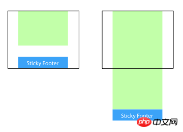
Method 1: Set the margin-bottom of the content part to a negative number
<p class="wrapper">
    <!-- content -->
    <p class="push"></p>
</p>
<p class="footer">footer</p>
html, body {
  margin: 0;
  padding: 0;
  height: 100%;
}
.wrapper {
  min-height: 100%;
  margin-bottom: -50px; /* 等于footer的高度 */
}
.footer, .push {
  height: 50px;
}Method 2: Set the margin-top of the footer to a negative number
Add a parent element outside the content, And make thepadding-bottom of the content part equal to the height of the footer.
<p class="content">
  <p class="content-inside">
    <!-- content -->
  </p>
</p>
<p class="footer">footer</p>
html, body {
  margin: 0;
  padding: 0;
  height: 100%;
}
.content {
  min-height: 100%;
}
.content-inside {
  padding: 20px;
  padding-bottom: 50px;
}
.footer {
  height: 50px;
  margin-top: -50px;
}Method 3: Use calc() to set the content height
<p class="content">
  <!-- content -->
</p>
<p class="footer">footer</p>
.content {
  min-height: calc(100vh - 70px);
}
.footer {
  height: 50px;
}Method 4: Use flexbox layout
The footer height of the above three methods is fixed Yes, if there is too much content in the footer, the layout may be destroyed.<p class="content"> <!-- content --> </p> <p class="footer">footer</p>
html {
height: 100%;
}
body {
min-height: 100%;
display: flex;
flex-direction: column;
}
.content {
flex: 1;
}Method Five: Use Grid Grid Layout
<p class="content">
  <!-- content -->
</p>
<p class="footer">footer</p>
html {
  height: 100%;
}
body {
  min-height: 100%;
  display: grid;
  grid-template-rows: 1fr auto;
}
.footer {
  grid-row-start: 2;
  grid-row-end: 3;
}React and CSS3 implement WeChat red envelope opening animation
Advanced usage of background-attachment in css
The above is the detailed content of Several ways to implement Footer at the bottom in CSS. For more information, please follow other related articles on the PHP Chinese website!

Hot AI Tools

Undresser.AI Undress
AI-powered app for creating realistic nude photos

AI Clothes Remover
Online AI tool for removing clothes from photos.

Undress AI Tool
Undress images for free

Clothoff.io
AI clothes remover

Video Face Swap
Swap faces in any video effortlessly with our completely free AI face swap tool!

Hot Article
Hot Tools

Notepad++7.3.1
Easy-to-use and free code editor

SublimeText3 Chinese version
Chinese version, very easy to use

Zend Studio 13.0.1
Powerful PHP integrated development environment

Dreamweaver CS6
Visual web development tools

SublimeText3 Mac version
God-level code editing software (SublimeText3)
Hot Topics


 How to use bootstrap in vue
Apr 07, 2025 pm 11:33 PM
How to use bootstrap in vue
Apr 07, 2025 pm 11:33 PM
Using Bootstrap in Vue.js is divided into five steps: Install Bootstrap. Import Bootstrap in main.js. Use the Bootstrap component directly in the template. Optional: Custom style. Optional: Use plug-ins.
 The Roles of HTML, CSS, and JavaScript: Core Responsibilities
Apr 08, 2025 pm 07:05 PM
The Roles of HTML, CSS, and JavaScript: Core Responsibilities
Apr 08, 2025 pm 07:05 PM
HTML defines the web structure, CSS is responsible for style and layout, and JavaScript gives dynamic interaction. The three perform their duties in web development and jointly build a colorful website.
 Understanding HTML, CSS, and JavaScript: A Beginner's Guide
Apr 12, 2025 am 12:02 AM
Understanding HTML, CSS, and JavaScript: A Beginner's Guide
Apr 12, 2025 am 12:02 AM
WebdevelopmentreliesonHTML,CSS,andJavaScript:1)HTMLstructurescontent,2)CSSstylesit,and3)JavaScriptaddsinteractivity,formingthebasisofmodernwebexperiences.
 How to write split lines on bootstrap
Apr 07, 2025 pm 03:12 PM
How to write split lines on bootstrap
Apr 07, 2025 pm 03:12 PM
There are two ways to create a Bootstrap split line: using the tag, which creates a horizontal split line. Use the CSS border property to create custom style split lines.
 How to set up the framework for bootstrap
Apr 07, 2025 pm 03:27 PM
How to set up the framework for bootstrap
Apr 07, 2025 pm 03:27 PM
To set up the Bootstrap framework, you need to follow these steps: 1. Reference the Bootstrap file via CDN; 2. Download and host the file on your own server; 3. Include the Bootstrap file in HTML; 4. Compile Sass/Less as needed; 5. Import a custom file (optional). Once setup is complete, you can use Bootstrap's grid systems, components, and styles to create responsive websites and applications.
 How to insert pictures on bootstrap
Apr 07, 2025 pm 03:30 PM
How to insert pictures on bootstrap
Apr 07, 2025 pm 03:30 PM
There are several ways to insert images in Bootstrap: insert images directly, using the HTML img tag. With the Bootstrap image component, you can provide responsive images and more styles. Set the image size, use the img-fluid class to make the image adaptable. Set the border, using the img-bordered class. Set the rounded corners and use the img-rounded class. Set the shadow, use the shadow class. Resize and position the image, using CSS style. Using the background image, use the background-image CSS property.
 How to use bootstrap button
Apr 07, 2025 pm 03:09 PM
How to use bootstrap button
Apr 07, 2025 pm 03:09 PM
How to use the Bootstrap button? Introduce Bootstrap CSS to create button elements and add Bootstrap button class to add button text
 How to resize bootstrap
Apr 07, 2025 pm 03:18 PM
How to resize bootstrap
Apr 07, 2025 pm 03:18 PM
To adjust the size of elements in Bootstrap, you can use the dimension class, which includes: adjusting width: .col-, .w-, .mw-adjust height: .h-, .min-h-, .max-h-
