
 Web Front-end
CSS Tutorial
Detailed graphic and text explanation of the double flying wing layout and the holy grail layout
Web Front-end
CSS Tutorial
Detailed graphic and text explanation of the double flying wing layout and the holy grail layout
Detailed graphic and text explanation of the double flying wing layout and the holy grail layout
This time I will bring you detailed graphic and text explanations of the Double Flying Wing layout and the Holy Grail layout. What are the precautions when using the Double Flying Wing layout and the Holy Grail layout. The following is a practical case, let’s take a look at it together.
Both the double flying wing layout and the holy grail layout are ways to achieve an adaptive three-column layout with a fixed middle on both sides. I have recently been sorting out notes on how to implement a three-column layout, and decided to pull it out and write it down. These two classic layouts.
1. Holy Grail Layout
Floating, negative margins, relative positioning, no additional tags
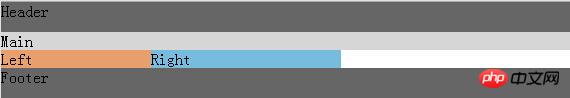
Rendering

DOM structure:
<p class="header">Header</p>
<p class="bd">
    <p class="main">Main</p>
    <p class="left">Left</p>
    <p class="right">Right
    </p>
</p>
<p class="footer">Footer</p>Style:
<style>
        body{padding:0;margin:0}
        .header,.footer{width:100%;  background: #666;height:30px;clear:both;}
        .bd{
            padding-left:150px;
            padding-right:190px;
        }
        .left{
            background: #E79F6D;
            width:150px;
            float:left;
            margin-left:-100%;
            position: relative;
            left:-150px;
        }
        .main{
            background: #D6D6D6;
            width:100%;
            float:left;

        }
        .right{
            background: #77BBDD;
            width:190px;
            float:left;
            margin-left:-190px;
            position:relative;
            right:-190px;
        }
</style>Style change process of left, middle and right parts
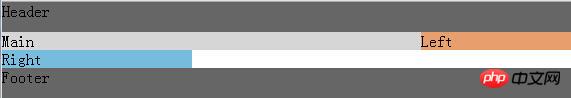
1. The middle part needs to change according to the change of the browser width, so 100% is used. Here, the left, middle and right are set to float to the left, because the middle part is 100%, and the left and right layers are not at all Move the position up
      .left{
            background: #E79F6D;
            width:150px;
            float:left;
        }
        .main{
            background: #D6D6D6;
            width:100%;
            float:left;

        }
        .right{
            background: #77BBDD;
            width:190px;
            float:left;
        }
2. After reducing the margin of the left layer by 150, I found that the left layer went up. Because it was so negative that the window had no position, I could only move it up
.left{
   background: #E79F6D;
   width:150px;
   float:left;
   margin-left:-150px;
}
#3. Then according to the second step, you can find that it only needs to move the width of the window to be as wide as the leftmost, using negative margins, Position the left and right columns
.left{
  background: #E79F6D;
  width:150px;
  float:left;
  margin-left:-100%;
}
.right{
  background: #77BBDD;
  width:190px;
  float:left;
  margin-left:-190px;
}
4. However, the problem came, the middle was blocked by the left and right columns, so I had to add padding to the outer layer
.bd{
  padding-left:150px;
  padding-right:190px;
}
5. But after adding it, the left and right columns were also indented, so I used the relative positioning method to move themselves out relative to each other to get the final result
.left{
  background: #E79F6D;
  width:150px;
  float:left;
  margin-left:-100%;
  position: relative;
  left:-150px;
}
.right{
  background: #77BBDD;
  width:190px;
  float:left;
  margin-left:-190px;
  position:relative;
  right:-190px;
}
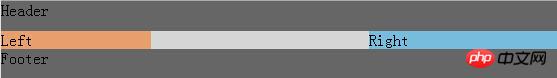
2. Double flying wing layout
The Holy Grail layout is perfect without adding additional tags. The Holy Grail layout uses relative Positioning, the layout will have limitations in the future, and there are many places to change the width control, so is there any other method that is more concise and convenient?
In the discussion of Taobao UED, adding one more p eliminates the need for relative layout and only uses floating and negative margins. This is what we call the double flying wing layout.
DOM structure: A p
<p class="header">Header</p>
<p class="bd">
  <p class="main">
    <p class="inner"> Main </p>*
  </p>
  <p class="left">Left</p>
  <p class="right">Right </p>
</p>
<p class="footer">Footer</p>is added to the main inner layer. Style:
The relative positioning of the left and right columns is removed.
Remove the wrapping layer padding, replace the margin of p in the middle column
        body{
          padding:0;
          margin:0
        }
        .header,.footer{
          width:100%;
          background:#666;
          height:30px;clear:both;
        }
        .bd{
            /*padding-left:150px;*/
            /*padding-right:190px;*/
        }
        .left{
            background: #E79F6D;
            width:150px;
            float:left;
            margin-left:-100%;
            /*position: relative;*/
            /*left:-150px;*/
        }
        .main{
            background: #D6D6D6;
            width:100%;
            float:left;
        }
        .right{
            background: #77BBDD;
            width:190px;
            float:left;
            margin-left:-190px;
            /*position:relative;*/
            /*right:-190px;*/
        }
        .inner{
            margin-left:150px;
margin-right:190px;3. The difference between double flying wing layout and Holy Grail layout
Solution to Holy Grail layout and double flying wing layout The solution to the problem is the same as in the first half, that is:
The width of the middle column is set to 100%
All three columns are float
Add negative margin to the left and right columns so that they are side by side with the middle column p to form a three-column layout.
The difference lies in the different ideas for solving the problem of the middle column p content not being blocked.
Holy Grail Layout
Set the left and right padding-left and padding-right of the outer wrapping layer of the three columns
Set the left and right The two ps use relative layout position: relative and match the right and left attributes respectively. They move relative to themselves so as not to block the middle p
Double Flying Wing Layout
Create a sub-p inside the middle p to place content
In this sub-p, use margin-left and margin-right to leave space for the left and right columns p
There is one more p, and 4 less css attributes are used (the two attributes of adding-left and padding-right of pp in the middle of Holy Grail layout, plus the two ps on the left and right, use relative layout position: relative and The corresponding right and left have a total of 4 attributes, a total of 6; while the double-wing layout sub-p uses margin-left and margin-right, a total of 2 attributes, 6-2=4).
Moreover, the double flying wing layout has another advantage. It turns the Main into a BFC element. When the screen width is reduced, the Main will not be squeezed out, and the Holy Grail layout will be squeezed out.
I believe you have mastered the method after reading the case in this article. For more exciting information, please pay attention to other related articles on the php Chinese website!
Recommended reading:
Transition smooth transition menu bar implementation in css3
How to make a 0.5 pixel line in css
The above is the detailed content of Detailed graphic and text explanation of the double flying wing layout and the holy grail layout. For more information, please follow other related articles on the PHP Chinese website!

Hot AI Tools

Undresser.AI Undress
AI-powered app for creating realistic nude photos

AI Clothes Remover
Online AI tool for removing clothes from photos.

Undress AI Tool
Undress images for free

Clothoff.io
AI clothes remover

Video Face Swap
Swap faces in any video effortlessly with our completely free AI face swap tool!

Hot Article
Hot Tools

Notepad++7.3.1
Easy-to-use and free code editor

SublimeText3 Chinese version
Chinese version, very easy to use

Zend Studio 13.0.1
Powerful PHP integrated development environment

Dreamweaver CS6
Visual web development tools

SublimeText3 Mac version
God-level code editing software (SublimeText3)
Hot Topics


 Detailed explanation of obtaining administrator rights in Win11
Mar 08, 2024 pm 03:06 PM
Detailed explanation of obtaining administrator rights in Win11
Mar 08, 2024 pm 03:06 PM
Windows operating system is one of the most popular operating systems in the world, and its new version Win11 has attracted much attention. In the Win11 system, obtaining administrator rights is an important operation. Administrator rights allow users to perform more operations and settings on the system. This article will introduce in detail how to obtain administrator permissions in Win11 system and how to effectively manage permissions. In the Win11 system, administrator rights are divided into two types: local administrator and domain administrator. A local administrator has full administrative rights to the local computer
 Detailed explanation of the mode function in C++
Nov 18, 2023 pm 03:08 PM
Detailed explanation of the mode function in C++
Nov 18, 2023 pm 03:08 PM
Detailed explanation of the mode function in C++ In statistics, the mode refers to the value that appears most frequently in a set of data. In C++ language, we can find the mode in any set of data by writing a mode function. The mode function can be implemented in many different ways, two of the commonly used methods will be introduced in detail below. The first method is to use a hash table to count the number of occurrences of each number. First, we need to define a hash table with each number as the key and the number of occurrences as the value. Then, for a given data set, we run
 Detailed explanation of division operation in Oracle SQL
Mar 10, 2024 am 09:51 AM
Detailed explanation of division operation in Oracle SQL
Mar 10, 2024 am 09:51 AM
Detailed explanation of division operation in OracleSQL In OracleSQL, division operation is a common and important mathematical operation, used to calculate the result of dividing two numbers. Division is often used in database queries, so understanding the division operation and its usage in OracleSQL is one of the essential skills for database developers. This article will discuss the relevant knowledge of division operations in OracleSQL in detail and provide specific code examples for readers' reference. 1. Division operation in OracleSQL
 Detailed explanation of remainder function in C++
Nov 18, 2023 pm 02:41 PM
Detailed explanation of remainder function in C++
Nov 18, 2023 pm 02:41 PM
Detailed explanation of the remainder function in C++ In C++, the remainder operator (%) is used to calculate the remainder of the division of two numbers. It is a binary operator whose operands can be any integer type (including char, short, int, long, etc.) or a floating-point number type (such as float, double). The remainder operator returns a result with the same sign as the dividend. For example, for the remainder operation of integers, we can use the following code to implement: inta=10;intb=3;
 Guide to solving misalignment of WordPress web pages
Mar 05, 2024 pm 01:12 PM
Guide to solving misalignment of WordPress web pages
Mar 05, 2024 pm 01:12 PM
Guide to solving misaligned WordPress web pages In WordPress website development, sometimes we encounter web page elements that are misaligned. This may be due to screen sizes on different devices, browser compatibility, or improper CSS style settings. To solve this misalignment, we need to carefully analyze the problem, find possible causes, and debug and repair it step by step. This article will share some common WordPress web page misalignment problems and corresponding solutions, and provide specific code examples to help develop
 Detailed explanation of the role and usage of PHP modulo operator
Mar 19, 2024 pm 04:33 PM
Detailed explanation of the role and usage of PHP modulo operator
Mar 19, 2024 pm 04:33 PM
The modulo operator (%) in PHP is used to obtain the remainder of the division of two numbers. In this article, we will discuss the role and usage of the modulo operator in detail, and provide specific code examples to help readers better understand. 1. The role of the modulo operator In mathematics, when we divide an integer by another integer, we get a quotient and a remainder. For example, when we divide 10 by 3, the quotient is 3 and the remainder is 1. The modulo operator is used to obtain this remainder. 2. Usage of the modulo operator In PHP, use the % symbol to represent the modulus
 Detailed explanation of the linux system call system() function
Feb 22, 2024 pm 08:21 PM
Detailed explanation of the linux system call system() function
Feb 22, 2024 pm 08:21 PM
Detailed explanation of Linux system call system() function System call is a very important part of the Linux operating system. It provides a way to interact with the system kernel. Among them, the system() function is one of the commonly used system call functions. This article will introduce the use of the system() function in detail and provide corresponding code examples. Basic Concepts of System Calls System calls are a way for user programs to interact with the operating system kernel. User programs request the operating system by calling system call functions
 Detailed explanation of Linux curl command
Feb 21, 2024 pm 10:33 PM
Detailed explanation of Linux curl command
Feb 21, 2024 pm 10:33 PM
Detailed explanation of Linux's curl command Summary: curl is a powerful command line tool used for data communication with the server. This article will introduce the basic usage of the curl command and provide actual code examples to help readers better understand and apply the command. 1. What is curl? curl is a command line tool used to send and receive various network requests. It supports multiple protocols, such as HTTP, FTP, TELNET, etc., and provides rich functions, such as file upload, file download, data transmission, proxy
